


What Can We Learn from the Best Architecture Portfolios?
A portfolio is an organized collection of your best work that showcases your skills, capabilities, and accomplishments, especially in a creative field such as architecture where it becomes a requirement and has to be well designed to be able to satisfy the client/firm. Here are some of the tips and lessons we shall learn from the best architecture portfolios.
- Aleksandra Soboleva

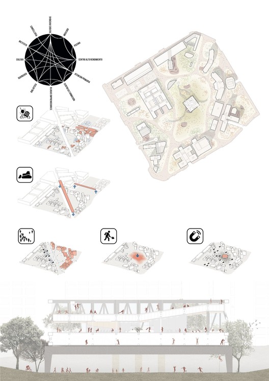
Are you a great visual storyteller? Do you want your portfolio to be visually exciting? Then take inspiration from Aleksandra Soboleva. Every project in the portfolio tells a story only through visuals but nothing else. The use of colors and composition is the one you have to learn from this portfolio. The graphic collages all over the portfolio are excellent, and they highlight the activities that happen in the space/context by zooming out on the humans, showing how humans use that particular space. It is also about the artistic sense of images and illustrations in the spreads which we should learn from this portfolio.
- Farhang Alipur
If you have so much to say through your portfolio, but also make it minimal and neat, Farhang Alipur’s portfolio would be a good choice of reference. The composition of the portfolio is the key to making it minimal. It is a magazine-like portfolio with lots of information and images but still engages the viewers’ attention. This is achieved through the selection of appropriate typography, font, placement of pictures, background and foreground colors, shapes, and colors. His visuals would admire you and it is one of the best visual graphics in an architecture portfolio.
- Greg Whitney

Design with details in a portfolio would make it boring at times. But Greg Whitney makes it more colorful and engaging yet with details. Greg Whitney uses pop colors of blues and pinks throughout his portfolio. This creates a distinct contrast in the portfolio and makes it colorful and interesting. These pop colors also pop out the details of the design and make it more professional at the same time. The portfolio strikes a good balance between the colors and details. Do you want your portfolio to be crazy yet showcase the design and details, you should refer to this portfolio.
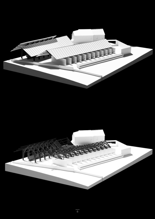
- Lazar Belic
When you have one design that you feel showcases the best of everything you have to offer, there’s no better way to present it than this. Yes, Lazar Belic’s portfolio has only one project, with its design methodologies, concepts, and the process behind it. The project starts with the textual description of the concept and context, accompanied by the general info, keywords, and visualization. There is a hierarchical organization of the presentation: introduction to the site, general massing, structure, space organization, interiors, and details. In this way, one project covers different scales and topics. Overall, the portfolio is like a media release, which gives a complete insight into the project in as little time as possible.
- Mael Barbe
Mael Barbe’s portfolio has a variety of projects expressed through various media such as sketches, models, drawings, etc. But his portfolio excellently combines the variety into a single theme. His monochrome design of the portfolio is highly contrasting and unifies the number of presentation techniques seamlessly in a single booklet. Through this approach, the character of the projects is intensified and releases the essence of the desired atmosphere. The monochrome portfolio also highlights every line and the point of sketches, drawings, and models and makes the presentation neat and clear.

- Miguel Roig Burgal
The perfect example of a proper minimalist portfolio. The portfolio is very minimalistic, without too much information and drawings, only the ones I consider enough to explain the projects. The portfolio makes an appealing composition that embraces the negative space. From the typography to the position of the images and schemes, the whole portfolio is very light and elegant which is an accurate reflection of minimalism. One of the most striking things about this design is the way each image is cropped to the edge of its content rather than to a simple rectangle. There are no skies in the renderings, which along with the orientation of plans and diagrams creates an interesting and flexible white space that changes with every page.
- Wilmar Coronado
In an online world, it’s brave to create a portfolio that only works when sent physically, and in a parcel rather than an envelope, no less. In this case, we think that bravery pays off, and no architect will forget receiving this portfolio. For those who believe their projects have to be felt to experience and understand their beauty, this brave portfolio can come as a great inspiration.
Download 250+ Portfolio Templates


A Guide to Maximizing Product Appeal Without Sacrificing Store Orderliness
A successful retail environment combines visually appealing product displays with a sense...

Maximizing Your Space: The Advantages of an Accessory Dwelling Unit
Accessory dwelling units (ADUs) are becoming an increasingly popular solution for many...

Common Signs Your Pond Needs Dredging
Ponds can be beautiful centerpieces for gardens or landscapes, but they require...

Make Your Business Smarter with These Essential Tools
Running a business requires constant adaptation and innovation. With the right tools,...

Leave a comment