

Artist of the Week 2: Rebecca Lee
Rebecca Lee is a spatial designer specializing in retail experiences, known for her geometric compositions and use of pastel colors to create harmonious environments.
 Aysegul Tozak10 February 20192 Mins read394

Table of Contents Show
This week’s artist is Rebecca Lee who has a very unique design approach and conspicuous talent. Maybe some of you saw her works on media platforms especially some of the design blogs or magazines that share her work on their Instagram feed or story.
In addition, You can check Rebecca Lee’s Instagram in which you can take a look at her works. She also has an artistic Instagram feed that can inspire you. My plan for today is to present and introduce you Rebecca Lee.

Rebecca Lee is a spatial designer with a focus on the retail experience. She completed her bachelor which is Furniture Design in the Rhode Island School of Design. recently she was Store Design Manager at Urban Outfitters. She is currently based in Cape Town, South Africa but freelancing globally.

When I saw her artworks on Instagram, I was under the influence of the simplicity of geometry. She uses geometry in such a harmonic way, I can feel the mystical power of the design. The relationship between solid and void appears tı be flawless. Apart from these characteristics, She mostly attracts attention through her use of colors in her designs. She mainly focuses on using pastel colors in a monochromatic way. She uses an object which seems to have a symbolic meaning. For instance, she makes use of a ball which most of the time stands on the floor. There may be many interpretations that totally depends on the individual.


What Spatial Design Means in Retail
Spatial design sits between interior architecture and experience design. Rather than focusing only on a single room, a spatial designer shapes how a person moves through a place, what they notice first, and how the atmosphere changes from the entrance to the back of a store. In retail this discipline carries real commercial weight, because the way shelves, lighting, and circulation are arranged directly affects how long visitors stay and what they remember. Rebecca Lee’s background in furniture design gives her an advantage here, since she understands both the large gesture of a room and the small detail of an object you can touch.
Reading Her Use of Geometry and Color
The strongest signature in Lee’s work is restraint. She tends to build compositions from clear geometric volumes, then let a single recurring element, such as a sphere resting on the floor, act as a focal point. Pastel and monochromatic palettes keep the eye calm so the form can lead the conversation. If you want to study her approach, look at how she balances solid masses against empty space, and notice how shadow is used as a material in its own right. These are habits any designer can practice, regardless of software or budget.
How to Build Your Own Design Portfolio on Instagram
Designers like Lee show that a consistent visual feed can function as a professional portfolio. A few practical tips: keep a steady color story across posts so the grid reads as one body of work, photograph or render projects against neutral backgrounds, and write short captions that explain the idea rather than just the result. Posting at a regular rhythm matters more than posting often. Over time this consistency signals to clients and studios that you have a recognizable point of view, which is exactly what helped Lee gain attention internationally.
Lessons for Emerging Designers
Lee’s path from a Furniture Design degree at the Rhode Island School of Design to a Store Design Manager role at Urban Outfitters, and then to global freelancing, offers a useful model. It shows that a strong formal education, real in-house experience, and a clear personal aesthetic can combine into an independent career. For students wondering whether to specialize early, her example suggests that mastering one craft deeply, in her case furniture and objects, can become the foundation for a broader spatial practice later on.


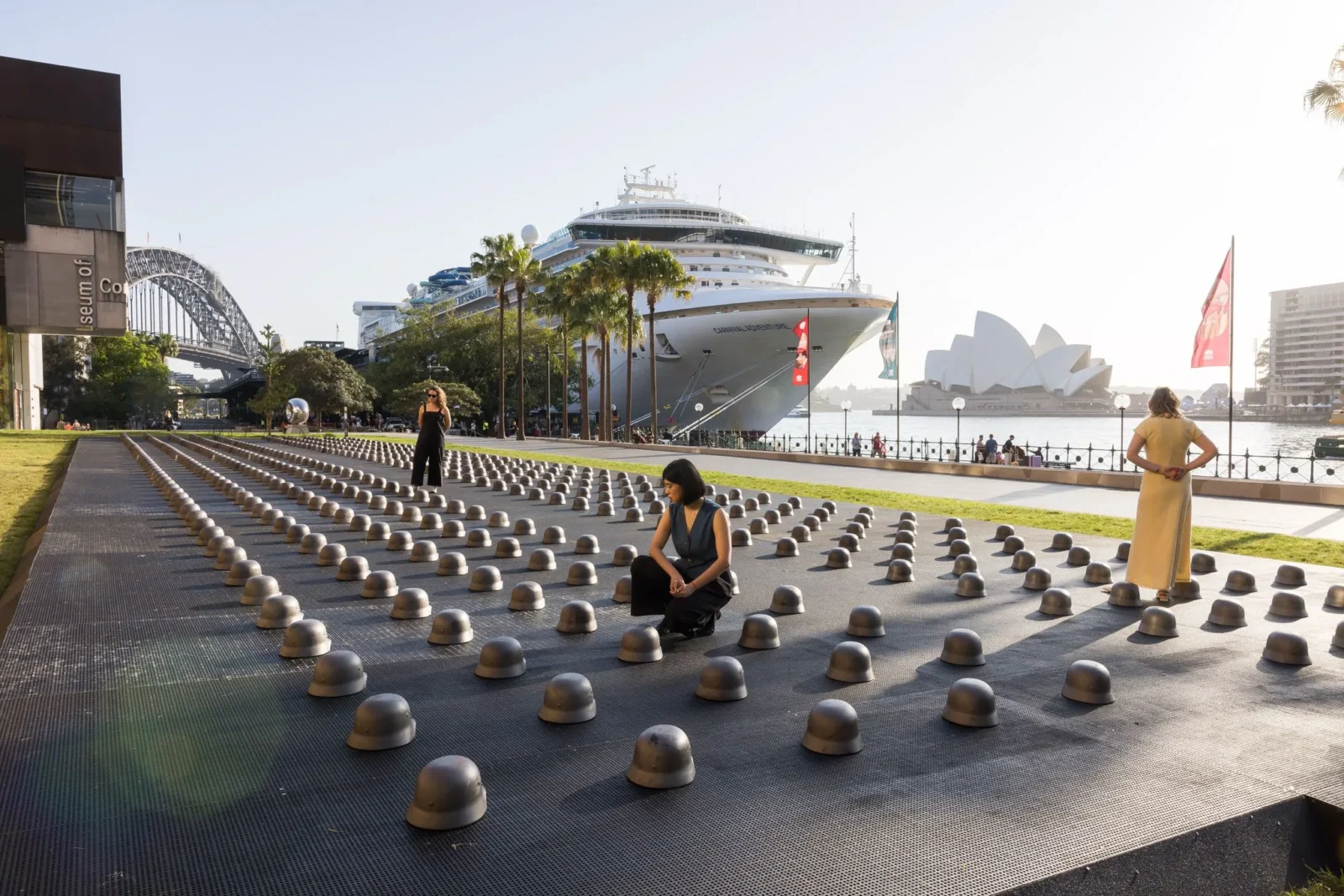
Ai Weiwei Installs 500 Cast-Iron Helmets Outside Sydney Museum
Ai Weiwei's 500 cast-iron helmets opened outside Sydney's MCA on 25 September,...
 illustrarch Editoral Team2 Mins read
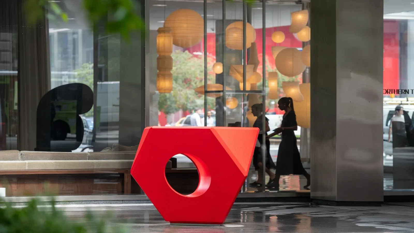
Isamu Noguchi at Lever House Traces Sculptor’s Decades-Long Collaboration with Bunshaft
Lever House's new exhibition pairs Noguchi sculptures with unbuilt garden designs made...
illustrarch Editoral Team2 Mins read
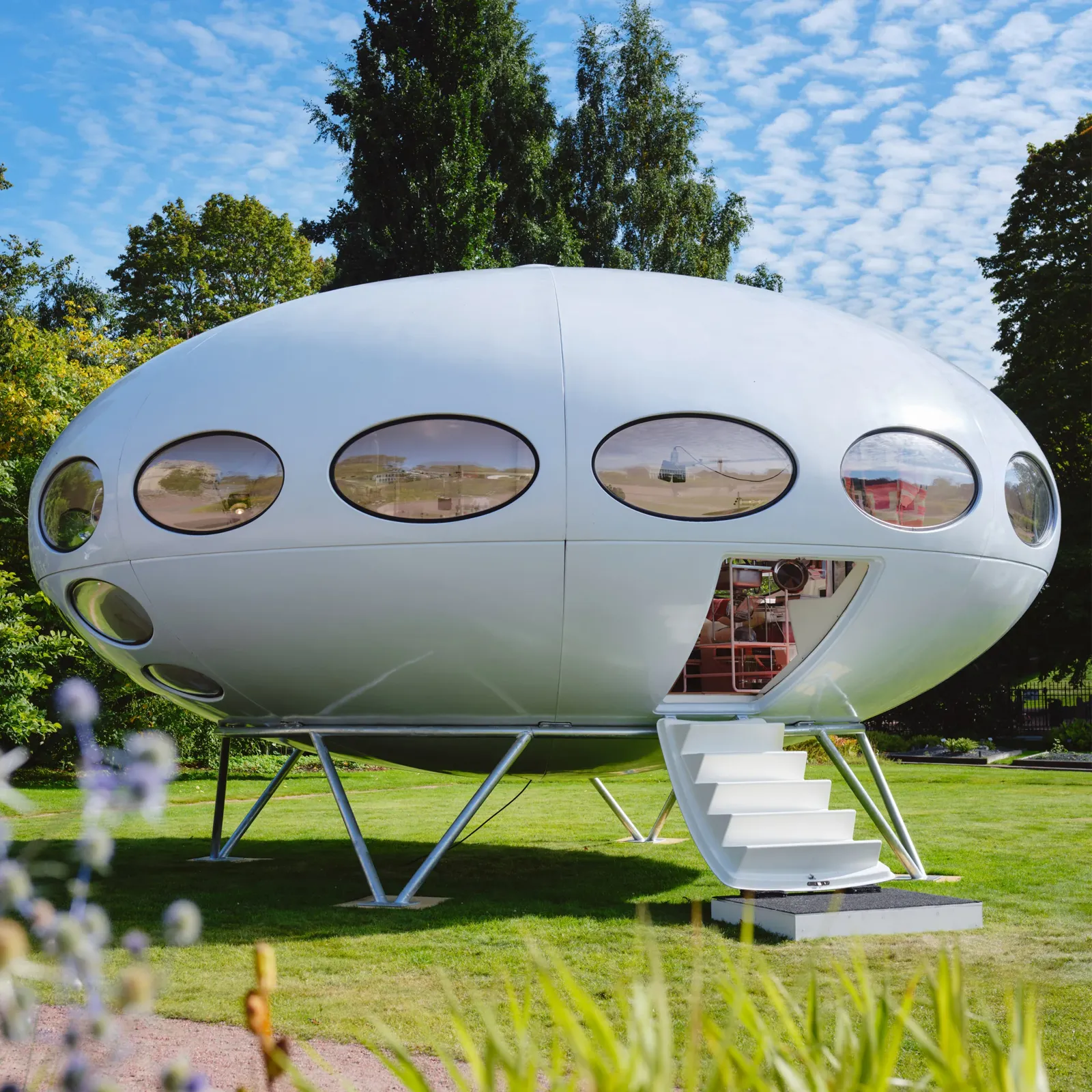
Futuro House Production Revived in Finland After Decades-Long Hiatus
A Facebook listing for abandoned moulds led to the first new Futuro...
illustrarch Editoral Team3 Mins read
Building Your Dream Home in NSW: What You Should Know About Montgomery Homes
Montgomery Homes has been building across Sydney, Newcastle, the Hunter, Wollongong and...
illustrarch Editoral Team4 Mins read


Leave a comment