- Home
- Articles
- Architectural Portfolio
- Architectral Presentation
- Inspirational Stories
- Architecture News
- Visualization
- BIM Industry
- Facade Design
- Parametric Design
- Career
- Landscape Architecture
- Construction
- Artificial Intelligence
- Sketching
- Design Softwares
- Diagrams
- Writing
- Architectural Tips
- Sustainability
- Courses
- Concept
- Technology
- History & Heritage
- Future of Architecture
- Guides & How-To
- Art & Culture
- Projects
- Competitions
- Jobs
- Events
- Store
- Tools
- More
5 Essential Principles of Architecture Design for Lasting Impact
Discover the five essential principles of architectural design that transform mere structures into inspiring, functional, and sustainable spaces. Dive into the art and science of design, exploring Balance, Unity, Functionality, Rhythm, and Emphasis, to create enduring and innovative environments.

Table of Contents Show
Architecture is more than just constructing buildings; it’s about creating spaces that inspire and endure. As we explore the world of architecture, we find that certain guiding principles shape the way we design our environments. These principles help architects balance aesthetics, functionality, and sustainability, ensuring that structures not only meet our needs but also enhance our lives.
In today’s rapidly evolving world, understanding the core principles of architecture design is crucial for creating spaces that are both innovative and timeless. By delving into these foundational concepts, we can appreciate the artistry and thoughtfulness that go into every architectural masterpiece. Let’s uncover the five essential principles that serve as the backbone for successful architectural design and see how they transform our built environment.
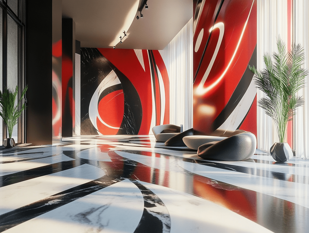
Understanding Architecture Design
Architecture design encompasses the art and science of creating spaces that serve both functional and aesthetic purposes. It’s a meticulous process that integrates various elements, such as form, materials, and technology, to craft environments that resonate with users. Successful architecture design addresses the needs of the occupants while reflecting cultural and contextual influences.
In evaluating design, it’s crucial to consider factors like sustainability and adaptability. Sustainable architecture minimizes environmental impact by optimizing energy use and resources. Adaptive design ensures that spaces can evolve to meet changing requirements over time.
Architectural projects require collaboration among architects, engineers, and stakeholders. This collaborative effort ensures that designs are feasible, meet safety standards, and align with the project’s vision. By harmonizing diverse perspectives, architecture design becomes a comprehensive approach to creating ideal spaces.
Modern architecture design frequently employs digital tools and modeling software. These technologies facilitate visualization, allowing designers to explore variations and improve precision. They also streamline the design process, enabling efficient communication and real-time modifications.

The First Principle: Balance
Balance in architecture ensures that a design achieves harmony and stability. It influences how spaces feel and function, making it essential for creating appealing environments.
Types of Balance in Architecture
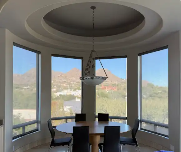
Various types of balance exist in architecture, each playing a unique role. Symmetrical Balance, where identical elements are evenly placed on either side of an axis, provides a sense of order and formality, as seen in classical structures. Asymmetrical Balance, which uses varying elements with equal visual weight, leads to more dynamic, informal designs, often found in modern architecture. Radial Balance involves elements arranged around a central point, creating equilibrium and focus, typical in circular or spherical layouts.
Achieving Visual Symmetry
Visual symmetry is fundamental in producing balanced architectural designs. It enhances aesthetic appeal, drawing attention to crucial architectural features. To achieve symmetry, architects often align key elements like windows, doors, and columns. In interiors, symmetry can be used strategically in furniture placement, lighting, and décor. Digital modeling and software tools greatly assist in perfecting these alignments, ensuring precise and visually pleasing outcomes.
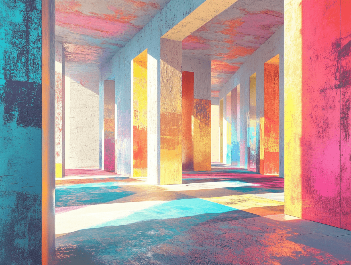
The Second Principle: Unity
Unity is essential in architecture design, providing a cohesive and integrated vision. It ensures every element contributes harmoniously to the overall aesthetic.
Harmonizing Elements
Harmonizing elements form the backbone of unity in architecture. These components, like colors, materials, and textures, must work together to create a seamless experience. By selecting a consistent color palette, architects connect different spaces visually. Materials such as wood, metal, and glass can blend textures when architects use them thoughtfully. Combining these elements strategically enhances a building’s aesthetic coherence, making the space feel whole and purposeful.
Consistency in Design
Consistency in design is crucial to achieving unity. Spatial layouts, patterns, and themes should align across different parts of a structure. By maintaining consistent spatial arrangements, architects ensure users experience a natural flow throughout the building. Repeated patterns and motifs help establish a familiar visual language. When architects apply thematic consistency, they provide a unified identity that resonates through all project aspects. Consistency in design not only fosters unity but also strengthens brand recognition for the structures.

The Third Principle: Functionality
Architecture encompasses more than aesthetics. Functionality anchors design, ensuring that spaces serve their intended purposes efficiently and effectively.
Designing with Purpose
When designing functional spaces, we start by identifying the primary activities that the space will support. This involves understanding user needs and how they will interact with the environment. For instance, in a residential building, common areas like kitchens and living rooms are designed for social interaction, while bedrooms focus on privacy and relaxation. We employ flexible layouts to accommodate varying uses, ensuring that form follows function.
Practical Considerations
We focus on optimizing space to enhance usability and accessibility. This includes considering circulation patterns that allow easy movement between areas. Ergonomics play a vital role in ensuring comfortable and efficient use of space. Integrating storage solutions and utilities seamlessly into design prevents clutter and maximizes efficiency. We utilize durable materials to extend the lifespan of high-traffic areas and incorporate technology to manage environmental controls, enhancing user experience while conserving resources.

The Fourth Principle: Rhythm
Rhythm in architecture orchestrates the visual flow within a structure, guiding the observer’s eye through a harmonious sequence of elements. It’s a fundamental component that brings cohesion and continuity.
Creating Visual Flow
Rhythm establishes a visual flow by arranging design elements to maintain viewer engagement. Regular spacing of windows or columns can guide movement and create anticipation. By using a repetitive sequence of features, this principle connects disparate parts of a design, allowing different sections to feel like part of a cohesive whole. As rhythm can be expressed through repetition, alternation, or progression, each approach offers varied effects. Alternating colors or materials, for instance, can evoke movement while progressive scaling of elements can direct the eye upwards, creating a vertical narrative.
Repeating Patterns and Structures
Repeating patterns and structures are the backbone of rhythm. Through the use of these elements, designs achieve predictability and order. Rhythmic repetition in facades, such as brick patterns or louver arrangements, can unify exterior aesthetics. We can consider structures like colonnades which impart a sense of timelessness through repeated vertical elements. In interiors, floor tiles or ceiling beams that follow a consistent pattern ensure aesthetic motivation and functional reliance. Such repetition not only enhances a building’s identity but also communicates intentionality and design intelligence.
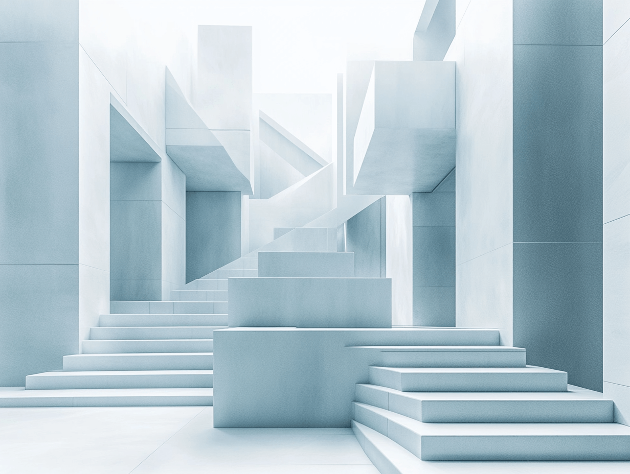
The Fifth Principle: Emphasis
Emphasis in architectural design directs attention to specific elements within a space, enhancing the overall experience. By strategically highlighting features, a design gains structure and meaning.
Highlighting Focal Points
Focal points anchor the design and guide the viewer’s gaze. We achieve this by using elements like contrast, color, and scale. For instance, a large staircase in the center of a lobby attracts focus due to its size and position. Additionally, architects might use lighting to accentuate artwork or architectural details, ensuring these elements stand out among the surrounding features.
Techniques for Drawing Attention
Architects employ various techniques to ensure key elements gain prominence. Contrast is a powerful tool, where differing colors or materials create visual interest. For example, a brightly painted door on a neutral facade immediately captures interest. Proportion also plays a role; a tall tower juxtaposed against low-rise buildings becomes a natural point of emphasis. Additionally, using alignment can create a sightline that draws viewers from one element to another, maintaining engagement throughout a space.
Conclusion
Exploring these five principles—Balance, Unity, Functionality, Rhythm, and Emphasis—enriches our understanding of architectural design. These guidelines don’t just inform aesthetic choices but unify construction with purpose, ensuring spaces are both inspired and practical. When architects integrate these principles, their designs not only meet user needs but also stand as enduring symbols of innovation and art. As we’ve seen, each principle contributes uniquely, from creating visual harmony to directing focus and enhancing usability. Together, they form a blueprint for creating spaces that resonate with both beauty and functionality in our built environment.
- Architecture design principles
- architecture design strategies
- architecture for lasting impact
- effective architecture design techniques
- enduring architectural design principles
- essential architecture principles
- fundamentals of architecture design
- impactful architecture design
- innovative architecture solutions
- key architectural design concepts
- lasting architectural impact
- modern architecture design principles.
- principles of sustainable architecture
- Sustainable Architectural Design
- timeless architecture design
Architect/Tifa Studio Founder/Writer ▪️Sherlock Holmes, but for cities ▪️Architect | PhD | Professional outsider ▪️I see what you walk past 🔮 AI × Architecture × Unpopular opinions
Submit your architectural projects
Follow these steps for submission your project. Submission FormLatest Posts
Why Removing Old Stumps Can Boost Your Property’s Value
Table of Contents Show Understanding the Impact of Stumps on Property ValueFirst...
The Role of Shades and Blinds in Clean Architectural Interiors
A clean interior can start to feel less clean once the windows...
Ready for Every Horizon: The Resilient Design of the OPPO Reno15 F 5G
January 2026 brought fresh hardware to the Polish market, an introduction that...
Sell Distressed Property: Why Structural and Aesthetic Condition Matters to Modern Buyers
Table of Contents Show What’s Covered:Why Modern Buyers Are More Condition-Sensitive Than...





Leave a comment