

Space in Architecture: A Concept and Experience Guide
Space in architecture is more than walls. This guide explains positive and negative space, void, enclosure, and how light and movement shape the way a building feels.
 Sinan Ozen26 April 20255 Mins read648

Table of Contents Show
Space in architecture is the volume a building shapes and the open areas around it, not just its walls. It includes positive and negative space, void, enclosure, and the way light and movement let people feel a room. These spatial qualities decide how a place is actually experienced.
Walls, columns, and roofs get most of the attention, yet the part of a building people occupy is the air held between them. Space is the real medium architects work in, the same way a sculptor works in stone. A corridor that tightens and then opens into a bright hall changes how you feel without a single word of explanation.
This article stays on the concept and the experience of space: the void, enclosure, flow, and how the senses read a room. For the practical side of arranging rooms and circulation, see our guide to space planning in architecture. Here the focus is what space is and how it shapes perception.

What Space Means in Architecture
Talking about space in architecture means treating emptiness as something designed rather than left over. A room is defined by its boundaries, but the experience lives in the gap those boundaries surround. Architectural theory often borrows the term from physics and philosophy, where space is the field in which events happen. In a building, those events are people moving, pausing, gathering, and looking out.
The discipline that studies this directly is architectural phenomenology, which examines how a place feels to the body rather than how it looks in a photograph. Ceiling height, the width of a doorway, the angle of daylight, and the sound of footsteps all feed into a single impression. Two rooms with identical floor areas can read as cramped or generous depending on how their space is shaped.
🎓 Expert Insight
“The space within becomes the reality of the building.” Frank Lloyd Wright
Wright, drawing on a passage from Lao Tzu, argued that the usable void, not the masonry, is the point of a structure. The idea reframes design around the experience inside rather than the silhouette outside.
Positive and Negative Space
Borrowed from drawing and sculpture, the pairing of positive and negative space is one of the most useful ways to read a building. Positive space is the solid mass: the walls, slabs, and columns that you can touch. Negative space is everything those solids carve out, including the rooms inside and the gaps between buildings outside.
Architects shift the balance between the two on purpose. A heavy stone monastery leans on positive space and feels grounded and protective. A glass pavilion does the opposite, dissolving its mass so the negative space flows almost uninterrupted. This figure and ground relationship also works at city scale, where a public square reads as a carved void inside a block of buildings. The way public space is shaped depends on the same logic of solid against open.
The relationship can also flip. When the open areas become more memorable than the objects that frame them, the negative space turns into the figure and the building becomes the background. Outdoor rooms such as cloisters, light wells, and entry courts work this way, holding shape even though they are made of nothing but contained air. Designers who think in these terms treat the gap as a thing to be modelled, with edges, proportion, and a clear sense of where it begins and ends.
📌 Did You Know?
Japanese design has a dedicated word for negative space: ma, often translated as the meaningful interval or gap. Rather than empty leftover area, ma treats the pause between elements as an active part of the composition, an idea that shaped traditional teahouses and still guides much minimalist architecture today.
Void, Enclosure, and Transition
Three spatial conditions do most of the emotional work in a building. The void is a deliberate empty volume, a double height atrium or a sunken courtyard that gives the eye somewhere to travel. Enclosure describes how completely a space wraps around you, ranging from a fully sealed vault to a loose canopy of columns. Transition is the threshold, the doorway, stair, or porch that prepares you to move from one condition to the next.
Skilled designers sequence these moments so a path feels composed rather than accidental. Compression at an entrance makes the release of a tall room land harder. A glazed link between two wings turns a simple corridor into a moment of pause. The dialogue between inside and outside, explored further in our look at architecture inside out, is really a study of enclosure and transition at the building edge.
Degrees of enclosure also tap into something older than design. People are drawn to spots that offer a sheltered back and an open view ahead, a pattern researchers call prospect and refuge. A window seat tucked into a thick wall reads as safe yet connected, which is why such corners get used long after the rest of a room sits empty. Reading enclosure this way turns an abstract idea into a practical test: does this spot make a body want to stay or move on.
🏗️ Real-World Example
The Pantheon (Rome, completed around 126 AD): Its coffered dome encloses a near perfect hemisphere of air, and the single open oculus at the top pulls daylight down into the void. The space, not the concrete, is what visitors remember almost two thousand years later.
How People Experience Space
Spatial experience is sensory before it is intellectual. Light is the first signal: a shaft of sun, the soft wash from a clerestory, or the deep shadow of a portico tells you how a room wants to be used. Daylight that moves across a wall through the day keeps a static space feeling alive.
Movement matters just as much. The route you take, the rhythm of narrow and wide, the points where you can stop and look back, all build a memory of the place. Scale ties it together. A ceiling within reach feels intimate, while one far overhead reads as civic or sacred. Sound, temperature, and even smell round out the impression, which is why a real visit beats any rendering.

A Quick Map of Spatial Concepts
The table below sums up the core ideas behind space in architecture, what each one means, and a recognisable example of it in built form.
| Spatial Concept | What It Means | Example |
|---|---|---|
| Positive space | The solid mass of walls, columns, and structure you can touch. | Thick stone walls of a Romanesque church. |
| Negative space | The open volume the solids define, inside and out. | A plaza framed by surrounding buildings. |
| Void | A deliberate empty volume that draws the eye through a building. | The domed interior of the Pantheon. |
| Enclosure | How completely a space wraps and shelters the body. | A sealed crypt versus an open colonnade. |
| Transition | The threshold that links one spatial condition to the next. | A porch, vestibule, or glazed bridge. |
💡 Pro Tip
When reviewing a plan, shade the negative space black and the solids white, then look again. Reading the drawing as a figure and ground study quickly reveals whether the open volumes are shaped on purpose or just left over between rooms.
Reference sources such as ArchDaily document how built projects handle these moves, while broader background sits in the entries on architectural space and the cultural idea of ma.
The Bigger Picture
It is easy to judge a building by its facade because that is what fits in a photo. The real test is the walk through it, the moment a low entry gives way to a flood of light, or a tight stair lands in a calm courtyard. Once you start reading the empty parts as carefully as the solid ones, ordinary rooms reveal decisions you never noticed, and the gap between good and forgettable architecture starts to make sense.




Interior Design for Commercial Spaces: Enhancing Functionality and Brand Identity
Commercial interior design has to serve brand, function and regulation at once....
 Begum Gumusel4 Mins read
Overlapping Concrete Walls and One Roof Shape a House in Okinawa
IGArchitects built Overlapping Spaces in Okinawa from reinforced concrete walls, columns and...
 illustrarch Editoral Team1 Mins read
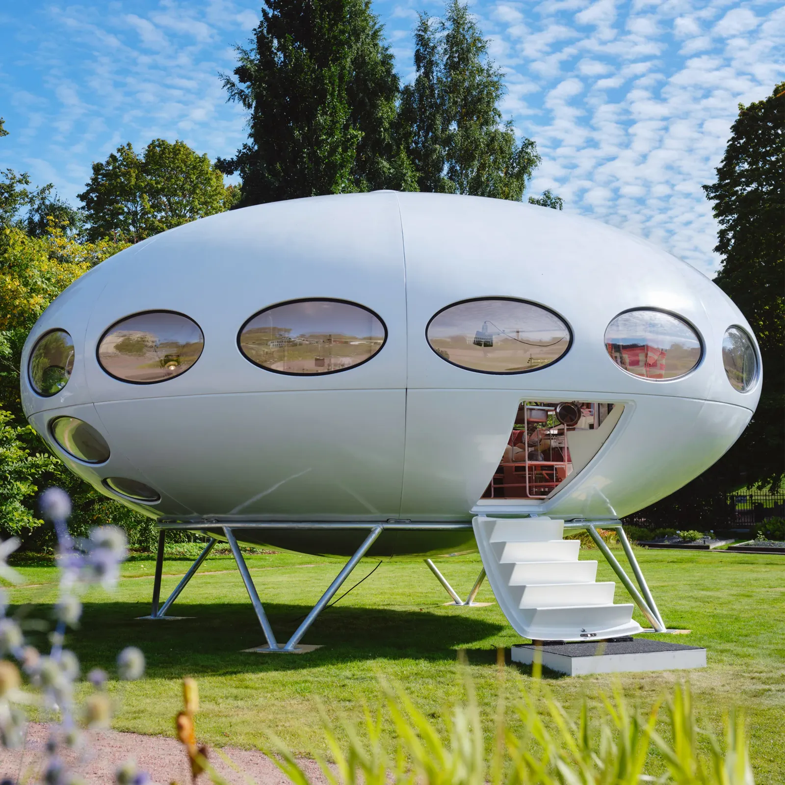
Futuro House Production Revived in Finland After Decades-Long Hiatus
A Facebook listing for abandoned moulds led to the first new Futuro...
illustrarch Editoral Team3 Mins read
Building Your Dream Home in NSW: What You Should Know About Montgomery Homes
Montgomery Homes has been building across Sydney, Newcastle, the Hunter, Wollongong and...
illustrarch Editoral Team4 Mins read


Leave a comment