- home
- Articles
- Architectural Portfolio
- presentation
- Architecture News
- visualization
- Freelance Architecture
- Schooling
- Facade Design
- Parametric Design
- Landscape Architecture
- Construction
- Interior Design
- Facade Design
- Schooling
- Artificial Intelligence
- sketching
- Design Softwares
- diagrams
- writing
- Architectural Tips
- Roofing
- sustainability
- courses
- concept
- technology
- projects
- visualization
- Competitions
- Store
- Contact
- My account

Color Palette in Architectural Presentations
Architectural presentations are very critical for the best transfer of projects. In addition to developing presentation techniques to make architectural presentations in the best way, colors have a great role. In this article, we will talk about colors, which are one of the most important elements in architecture. In the rest of the article, we talked about colors as an element in architecture, the role of colors in architectural presentation and the right color choices.
Color in Architecture

Color in architecture, like light, affects people in a space quite significantly. Color choices have a great impact on human psychology and perception of space. Color in architecture is one of the most important issues not only in spaces but also in architectural presentations. Choosing the best colors in architectural presentations allows you to manage the parts of your presentation that you want to highlight. You will also be able to manage the perspective of the project with your color choices.
Importance of Color in Architectural Presentation
If our subject is architectural presentations and improving these presentations, it is definitely not possible not to talk about color selection. Color selection is the most important issue for visuals in architectural presentations. Because architectural presentations prepared with a good color palette create powerful effects that will take your project to a higher level. Some projects are suitable for creating balanced presentations by working with the color palette. However, some projects are presented by monochrome except a highlight color. For example, you can work on black-white drawings and emphasize your main elements with a red or yellow color. Color decisions or color palette creations should be done according to projects’ situation. In the best architectural presentations, colors are the most important elements. If you want to make consistent presentations, you should follow similar color palettes for your each project. Due to have a successful architectural portfolio, color selections should be compatible for per page.
On the other hand, if you work for your own company or architectural firm, you need to prepare presentations on a specific color palette. Because if the style and color choices of your drawings are not consistent, you may experience difficulties in creating your architectural identity in professional life. At least, if you make your presentations through different tones of the same color or similar color palettes, it is quite good and successful for you.

Affects of Colors
Let’s examine how color choices, which are very important both in space and in architectural presentations, affect people psychologically:
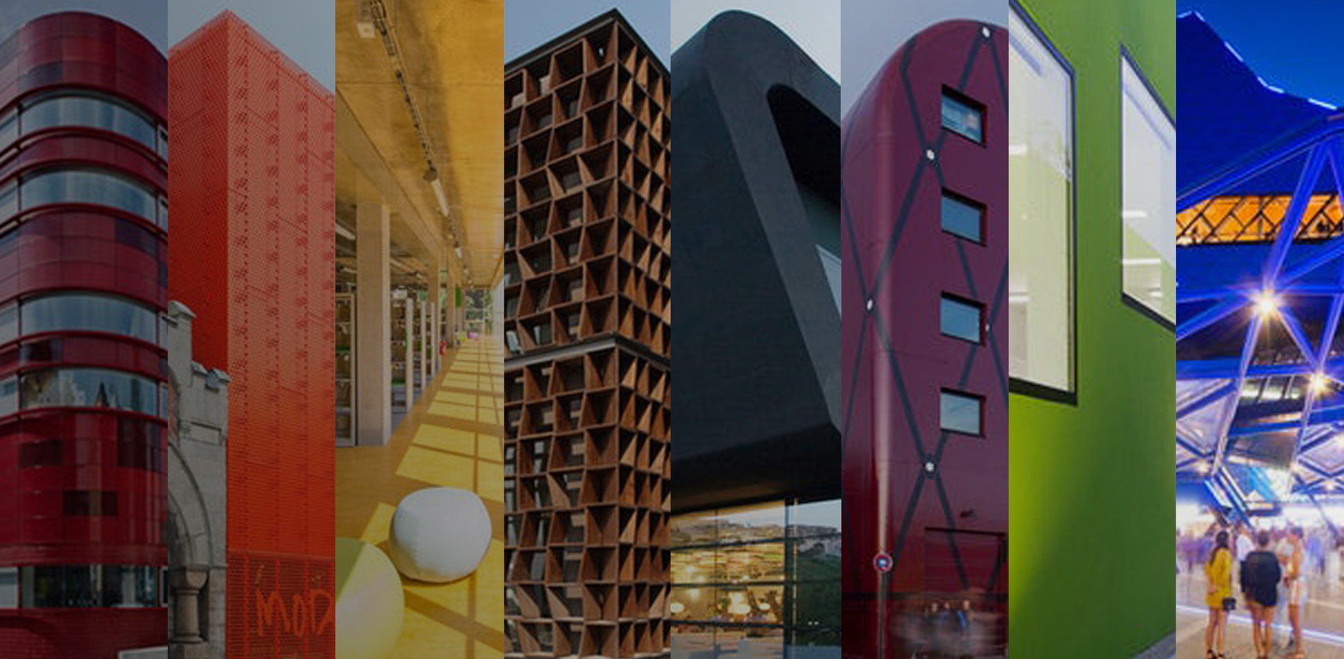
Blue: Exudes feelings of optimism, assurance, and security. It is frequently used in commercial and business settings, including banks, offices, and businesses.
Yellow: Depicts hope, curiosity, and a cheerful environment. It is widely utilized in retail establishments or dining establishments to attract customers.
Red: This hue denotes vitality, enthusiasm, and impulse. Because it conveys a certain compulsive and consumer want, it is frequently utilized in commercial settings like retailers and fast food restaurants.
Green: Conjures feelings of peace, tranquillity, and wellbeing. It is frequently utilized in settings related to health and wellbeing, including hospitals and spas.
Orange: Orange, which is produced when yellow and red are combined, conveys the ideas of passion, creativity, exhilaration, and enthusiasm. It is frequently utilized in businesses, studios, and educational settings that foster creativity. When combined with blue, it evokes impulsivity and trust, and as a result, banking institutions and offices utilize it.
Violet: It carries feelings of contentment, serenity, and gentleness.

Best Websites To Create Color Palette
Working with the best color palettes is essential to bring your architectural presentations to their best versions. It is important to create a color palette and stick to it in all presentations and representations of your architectural design. Below are 3 website recommendations where you can create color palettes that you will use in architectural presentations. It is possible to copy the color codes from the color palettes you will create with these websites and use the colors on the sites where you create your architectural presentations such as Adobe Photoshop or Adobe Illustrator. When creating a color palette, you can arrange your color wheel in many different ways, such as similar colors, complementary colors, colors that shade each other. Here are the websites to create a color palette that every designer should know and use:
Submit your architectural projects
Follow these steps for submission your project. Submission FormLatest Posts
How Creative Professionals Can Build an Engaging Digital Portfolio That Stands Out
Building an online portfolio is a bit like throwing a party. You...
Protecting Your Architectural Visualizations: Practical Tips for Digital Rights Management
Architectural visualization is dazzling. Picture shimmering glass skyscrapers reflecting sunlight, all brought...
Transforming Spaces: The Power of Behavioral Architecture for Well-Being and Connection
Discover how behavioral architecture shapes our environments and influences our actions in...
Modern vs Traditional Architecture: Understanding Their Impact on Culture and Community
Discover the fascinating interplay between modern and traditional architecture in this insightful...


Leave a comment