- Home
- Articles
- Architectural Portfolio
- Architectral Presentation
- Inspirational Stories
- Architecture News
- Visualization
- BIM Industry
- Facade Design
- Parametric Design
- Career
- Landscape Architecture
- Construction
- Artificial Intelligence
- Sketching
- Design Softwares
- Diagrams
- Writing
- Architectural Tips
- Sustainability
- Courses
- Concept
- Technology
- History & Heritage
- Future of Architecture
- Guides & How-To
- Art & Culture
- Projects
- Competitions
- Jobs
- Events
- Store
- Tools
- More
Best Fonts for Architectural Portfolio Design – Top 10 Picks
Choosing the right fonts for your architecture portfolio is essential for a professional presentation. This guide covers the 10 best architectural typefaces — from free options like Spartan and Montserrat to premium choices like Neutra Display and Futura — along with font pairing strategies and typography best practices for 2025.

Table of Contents Show
- Why Font Choice Matters in Architectural Portfolio Design
- What Makes a Good Font for an Architecture Portfolio?
- 1. Spartan
- 2. Poppins
- 3. Open Sans
- 4. Neutra Display
- 5. Lato
- 6. Helvetica
- 7. Century Gothic
- 8. Consolas
- 9. Futura
- 10. Montserrat
- Free Architectural Fonts vs. Premium Options
- Architectural Writing Styles: Script and Handwriting Fonts
- How to Choose the Best Font for Your Architecture Portfolio
- Font Pairing Tips for Architecture Portfolios
- Best Practices for Typography in Architectural Portfolios
- Where to Download the Best Fonts for Architecture Portfolios
- Final Thoughts on Selecting Architecture Portfolio Fonts
The best fonts for architectural portfolio design include geometric sans-serifs like Futura, Helvetica, and Montserrat, along with free alternatives such as Spartan, Poppins, and Open Sans. These typefaces offer clean lines, multiple weights for visual hierarchy, and strong legibility at small sizes, all of which are essential for professional architecture portfolio layouts in both print and digital formats.
Choosing the best fonts for architecture portfolio projects is one of the most important decisions you will make during your architectural portfolio design process. In their schematic design of their works, architects and designers use graphic elements continuously as expressive means. The drawings in a constant range of techniques, styles and patterns are among them the most common. But one particular fragment that helps them to compose and to identify are the elements comprising boards, panels and drawings, techniques and models, namely the font. Whether you are an architecture student preparing a university submission or a professional updating your portfolio for job applications, the right architecture portfolio fonts, from geometric sans-serifs to elegant architectural typeface options, can set your entire presentation apart. This guide covers the best architect fonts, pairing strategies, and typography best practices used by professionals in 2026.
Why Font Choice Matters in Architectural Portfolio Design
Typography is a silent but powerful communicator in any design project. The impact of font choice in architectural design goes beyond aesthetics; it affects readability, visual hierarchy, and the overall perception of your work. When reviewers or potential employers open your portfolio, the font in architecture layouts sets the tone before they even look at your drawings. A well-chosen font for architecture portfolio pages communicates professionalism, attention to detail, and design sensibility. As typographer Massimo Vignelli demonstrated throughout his career, typography and architecture share a deep connection rooted in structure, proportion, and clarity. According to the American Institute of Architects (AIA), a polished portfolio is one of the most effective tools for career advancement, and the right portfolio font choices are a key part of that polish. Your font selection signals whether you think like a designer across all scales, from building details to page layout. For a broader look at how typography functions within the built environment, read our article on font usage in architectural designs.
💡 Pro Tip
When selecting your portfolio typeface, print a test page at actual size before committing. Fonts that look great on screen at 100% zoom can feel heavy or thin at 300 DPI print resolution. Test your top two or three candidates at 9pt body text and 28pt heading size on the same paper stock you plan to use for the final portfolio.
What Makes a Good Font for an Architecture Portfolio?
Before going through the list, it is worth understanding what makes certain architectural portfolio fonts better suited than others. The best fonts for architecture portfolio projects share several characteristics: geometric simplicity that echoes architectural forms, excellent legibility at various sizes, a range of available weights for creating visual hierarchy, and a clean, professional appearance that does not distract from your design work. Sans-serif typefaces are generally preferred in the architecture field due to their minimalist lines, though a well-chosen serif can add elegance when used for body text or specific headings. When working in tools like Adobe InDesign or other portfolio software, having access to multiple weights within the same font family is essential for building consistent layouts.
Key Qualities of Strong Architectural Design Fonts
When evaluating architectural design fonts, look for these specific traits that separate professional-grade typography from generic options. First, geometric construction: the best portfolio fonts for architecture mirror the precision of technical drawings with mathematically consistent letterforms. Second, a comprehensive weight range (light through bold) allows you to establish clear visual hierarchy without introducing additional font families. Third, strong legibility at small sizes matters because portfolio body text and annotations are often set at 9 to 11pt. Finally, the best architecture fonts maintain their character whether printed at 300 DPI or displayed on a screen, ensuring your portfolio looks polished across all formats.
How Do Variable Fonts Improve Architecture Portfolio Design?
Variable font technology has changed how designers approach typography in 2026. Unlike traditional static font files where each weight requires a separate file, a single variable font file contains an entire range of weights and widths along a continuous axis. This means you can fine-tune the exact weight of your headings, body text, and captions without being locked into preset options like “Regular” or “Bold.” For web-based architecture portfolios, variable fonts also reduce page load times significantly because one file replaces what previously required five or six separate downloads. Google Fonts now offers variable versions of popular architectural typefaces including Montserrat, Poppins, and Open Sans. If you are building a digital portfolio, switching to variable fonts gives you more typographic control with better performance.
Here are 10 best fonts to use in your next architecture portfolio:
| Font | Classification | Designer | Year | Available Weights | Free / Premium | Best Use in Portfolio |
|---|---|---|---|---|---|---|
| Spartan | Geometric Sans-Serif | Matt Bailey | 2019 | 9 (Thin–Black) | ✅ Free (Google Fonts) | Headings, subheadings, portfolio boards |
| Poppins | Geometric Sans-Serif | Indian Type Foundry | 2014 | 18 (Thin–Black + Italics) | ✅ Free (Google Fonts) | Headings, body text, digital portfolios |
| Open Sans | Humanist Sans-Serif | Steve Matteson | 2011 | 10 (Light–ExtraBold + Italics) | ✅ Free (Google Fonts) | Body text, web portfolios, descriptions |
| Neutra Display | Geometric Sans-Serif | Christian Schwartz | 2002 | 6 (Thin–Bold) | 💰 Premium (Adobe Fonts) | Display headings, architectural identity |
| Lato | Humanist Sans-Serif | Łukasz Dziedzic | 2010 | 18 (Hairline–Black + Italics) | ✅ Free (Google Fonts) | Body text, descriptions, resumes |
| Helvetica | Neo-Grotesque Sans-Serif | Max Miedinger & Eduard Hoffmann | 1957 | 50+ (Neue family) | 💰 Premium (Monotype) | Titles, universal use, branding |
| Century Gothic | Geometric Sans-Serif | Monotype Design Studio | 1991 | 4 (Regular, Bold + Italics) | 🖥️ System Font (Win/macOS) | Covers, presentation boards |
| Consolas | Monospaced Sans-Serif | Lucas de Groot | 2004 | 4 (Regular, Bold + Italics) | 🖥️ System Font (Windows) | Technical annotations, dimensions |
| Futura | Geometric Sans-Serif | Paul Renner | 1927 | 22+ (Light–ExtraBold + Condensed) | 💰 Premium (Paratype) | Headings, titles, visual identity |
| Montserrat | Geometric Sans-Serif | Julieta Ulanovsky | 2011 | 18 (Thin–Black + Italics) | ✅ Free (Google Fonts) | Headlines, body text, all-purpose |
1. Spartan

An open-source typeface based on early 20th century American geometric sans serifs. Built out of necessity. Originally designed by Matt Bailey. Spartan is an excellent choice among best fonts for architecture portfolio projects because its geometric structure mirrors the precision found in architectural drawings. Its clean lines work particularly well for headings and subheadings on portfolio boards, and its open-source nature means it is freely available across platforms including InDesign, Illustrator, and web-based design tools. As one of the most accessible free architectural fonts, Spartan is particularly popular among architecture students building their first portfolios. For tips on structuring your first portfolio, see our guide on creating a successful architectural portfolio.
2. Poppins

Geometric sans serif typefaces have been a popular design tool ever since these actors took to the world’s stage. Poppins is one of the new comers to this long tradition. With support for the Devanagari and Latin writing systems, it is an internationalist take on the genre. Many of the Latin glyphs (such as the ampersand) are more constructed and rationalist than is typical. The Devanagari design is particularly new, and is the first ever Devanagari typeface with a range of weights in this genre. Just like the Latin, the Devanagari is based on pure geometry, particularly circles.
Each letterform is nearly monolinear, with optical corrections applied to stroke joints where necessary to maintain an even typographic color. The Devanagari base character height and the Latin ascender height are equal; Latin capital letters are shorter than the Devanagari characters, and the Latin x-height is set rather high. Poppins is one of the best architecture portfolio fonts available on Google Fonts, making it a top pick for both digital and print portfolio fonts formats. Its variable font version, released in recent years, allows even finer control over weight and spacing for digital portfolio pages.
3. Open Sans
 Open Sans is a humanist sans serif typeface designed by Steve Matteson, Type Director of Ascender Corp. This version contains the complete 897 character set, which includes the standard ISO Latin 1, Latin CE, Greek and Cyrillic character sets. Open Sans was designed with an upright stress, open forms and a neutral, yet friendly appearance. It was optimized for print, web, and mobile interfaces, and has excellent legibility characteristics in its letterforms. It is one of the most versatile fonts for architecture portfolios and pairs beautifully with geometric display fonts like Futura or Montserrat. Many leading architecture firms featured on ArchDaily use Open Sans for web-based portfolio presentations.
4.  Neutra Display
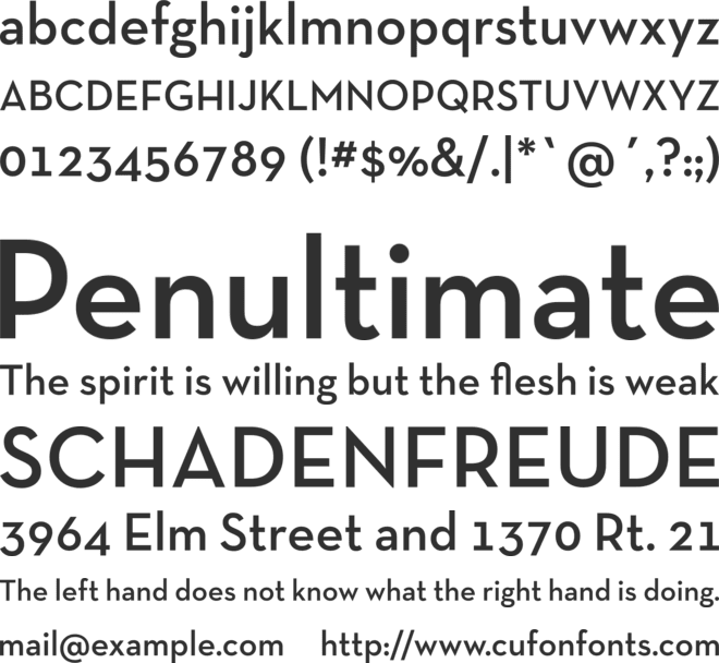 In honor of the important modernist architect Richard Neutra, graphic designer Christian Schwartz took care of designing the alphabet according to the architect’s layout. Julius Schulman and Dion Neutra also participated in the process. It is highly used in the works of Architecture and Design as a competitor for Futura. If you are wondering what font to use for architecture portfolio projects that aim for a distinctly architectural identity, Neutra Display is among the strongest options; it was literally designed with architecture in mind. This premium architectural typeface is available through Adobe Fonts and commercial licensing.
📌 Did You Know?
Neutra Display is one of the few typefaces directly named after an architect. Christian Schwartz designed it in 2002 to honor Richard Neutra’s mid-century modernist legacy, using proportions derived from the lettering found on Neutra’s original building signage in Los Angeles. The typeface development involved Neutra’s own son, Dion Neutra, making it a rare collaboration between typographic and architectural lineage.
5. Lato

Lato is a sans serif typeface family started in the summer of 2010 by Warsaw-based designer Łukasz Dziedzic (“Lato” means “Summer” in Polish). In December 2010 the Lato family was published under the Open Font License by his foundry tyPoland, with support from Google. Lato is considered a good font for architecture portfolio work because it balances warmth and professionalism. Its semi-rounded letterforms feel approachable while maintaining the clean structure that architectural presentations demand. As a free architectural font, it remains one of the most downloaded typefaces on Google Fonts. For architecture students on a budget, pairing Lato with Spartan creates a polished combination at zero cost.
6. Helvetica

The majority of architects, even without advanced knowledge of graphic design, intuitively select sans serif typefaces, due to its minimalism and straight lines. Among the most used texts, as well as the previous case, Helvetica is notorious among professionals. Built in the twentieth century, by Max Miedinger and Eduard Hoffmann, it is strongly associated with modern graphic design, due to its set of lines and layout its designer sought a neutral and concise design. For anyone asking what is the best font for architecture portfolio layouts, Helvetica remains the definitive answer for many professionals. Its neutrality lets the architectural work take center stage. Firms like Herzog & de Meuron and OMA have used Helvetica in their brand identity, reinforcing its status as the quintessential architects font.
🎓 Expert Insight
“Typography is not about typefaces. It is about organizing information in a way that is accessible and memorable.” — Massimo Vignelli, Vignelli Associates
Vignelli, who famously limited his work to a handful of typefaces including Helvetica, believed that restraint in font selection mirrors the discipline architects apply to materials and form. His philosophy remains a guiding principle for portfolio typography: fewer fonts, used with greater intention.
7. Century Gothic
 Century Gothic Font is a sans-serif typeface that has been highly used for advertisement purpose since it releases. It is an elegant typeface that is based on an extended Gothic family. The font family came into being many years ago, after which several Versions and styles originated. The Century Gothic font is one of them that is highly used and highly recommended for different purposes. Its geometric proportions make it a reliable pick among fonts to use for architecture portfolio covers and presentation boards. The architectural font is bundled with Windows and macOS, making it a convenient choice for quick portfolio drafts.
8. Consolas

Widely used for long texts, this font is ideal for competitions and university boards, or even text boxes in graphic details, because of its clean aesthetics and proportion of lines allows long readings without tiring the reader. The typography, designed by Lucas deGroot, is also widely used in books and specialized Architecture magazines. On Windows, this font along with other five (Cambria, Constantia, Corbel, Candara, and Calibri) are among the most used typologies, with no need for external acquisition. Consolas is a monospaced architect font that works especially well for technical annotations, dimensions, and specification text on portfolio boards. Its fixed-width characters align numerical data cleanly, which is particularly useful when displaying project areas, dimensions, or material quantities on competition boards.
9. Futura

Created by Paul Renner in the 1920s, this font is a classic Modern Graphic Design. Inspired by Bauhaus techniques, it uses straight lines and curves in syntony, providing balance in the textual set. However, despite the visual cleaning, this font should not be used in long texts, due to the visual exhaustion provoked. Indicated to punctual texts in the architectural boards, such as titles and subtitles. It is highly used for visual identity in corporate buildings. Futura consistently ranks as one of the best architecture fonts for portfolio headings and is a favorite among firms worldwide. Its direct lineage from the Bauhaus movement makes it arguably the most historically significant architectural typeface in modern design. If you are looking at fonts for architectural presentation boards, Futura remains a strong starting point.
10. Montserrat

Inspired by the old posters and signs in the traditional Montserrat neighborhood of Buenos Aires, this typeface by Julieta Ulanovsky has become one of the most popular fonts for portfolio architecture projects worldwide. Available in 18 weights on Google Fonts, Montserrat offers incredible flexibility for creating visual hierarchy, from bold headlines to light body text, all within a single font family. It is one of the strongest best fonts for portfolio use overall, and its versatility makes it equally effective for project showcases and resume layouts alike. Montserrat also works well as a display font on Instagram portfolio profiles, where geometric clarity helps text stand out at small thumbnail sizes.
| Feature | Free Fonts (Google Fonts) | Premium Fonts |
|---|---|---|
| Available Fonts from This List | Spartan, Poppins, Open Sans, Lato, Montserrat | Neutra Display, Helvetica Neue, Futura |
| Cost | $0 | $25–$300+ per family (or included with Adobe CC) |
| Web Embedding | ✅ Easy (Google Fonts CDN) | ⚠️ Requires separate web license |
| Cross-Platform Consistency | ✅ Excellent (web-hosted) | ⚠️ Must embed in PDF or outline |
| Weight Range | Good (9–18 weights typical) | Excellent (up to 50+ with Helvetica Neue) |
| Uniqueness / Distinction | ⚠️ Widely used, less distinctive | ✅ More distinctive, professional edge |
| Best For | Students, digital portfolios, web-based work | Professionals, printed portfolios, firm branding |
Free Architectural Fonts vs. Premium Options
One common question when selecting fonts for architecture projects is whether to invest in premium typefaces or stick with free architectural fonts. The good news is that many of the best options are completely free. Spartan, Poppins, Open Sans, Lato, and Montserrat are all available at no cost through Google Fonts. These fonts for portfolio use are production-quality and offer extensive weight ranges. Premium fonts like Neutra Display, Helvetica Neue, and Futura require licensing but offer distinctive character and historical significance that can set your portfolio apart. If you are working within an Adobe Creative Cloud subscription, many premium architectural fonts are included through Adobe Fonts at no additional cost. For students with limited budgets, the free Google Fonts listed here produce professional results that rival premium alternatives. The key difference often comes down to how widely used a font is: premium typefaces appear in fewer portfolios, which helps your work feel more distinctive during reviews.
⚠️ Common Mistake to Avoid
Many architecture students use three or four different font families across their portfolio, thinking variety creates visual interest. The opposite is true: mixing too many typefaces makes your layout look disorganized and draws attention away from your design work. Stick to one or two font families maximum, and use weight variations (Light, Regular, SemiBold, Bold) within those families to create hierarchy instead.
Architectural Writing Styles: Script and Handwriting Fonts
While clean sans-serif typefaces dominate most portfolios, some designers incorporate an architecture handwriting font or architectural script font for specific elements like personal statements, concept sketch annotations, or cover pages. An architectural writing font inspired by the hand-lettering tradition of technical drawings can add a personal, human touch to your work. Popular architect script font options include Architect’s Daughter (available free on Google Fonts) and various architectural writing styles that emulate the precise, slanted lettering seen on hand-drafted blueprints. However, use these sparingly: an architecture writing font works best for short accent text rather than body copy, and should complement rather than replace your primary architectural font selections. For more on integrating hand-drawn elements with digital layouts, see our article on understanding fonts in architectural design.
How to Choose the Best Font for Your Architecture Portfolio
Selecting the best font for architectural portfolio work depends on several factors. First, consider the type of projects you are showcasing. Minimalist, modern projects pair well with geometric sans-serifs like Futura or Spartan, while portfolios featuring historical or contextual work might benefit from the warmth of Lato or Open Sans. Second, think about your output format. If you are designing in InDesign, you have access to the full Adobe Fonts library, making premium typefaces like Neutra Display easily available, which is why it is among the best fonts for architecture portfolio InDesign workflows. For web-based or PDF portfolios, sticking with Google Fonts ensures consistent rendering across devices. Third, consider your audience: firms like those featured on Dezeen tend to favor clean, modern fonts for architecture presentations that let the work speak for itself. For more guidance on choosing the right typeface based on your portfolio’s purpose and audience, see our detailed guide on how to choose the right font for an architectural portfolio.
What Font Size Should You Use in an Architecture Portfolio?
Font size is just as important as font selection. Using sizes that are too large wastes space that could show your design work; too small, and reviewers will strain to read your descriptions. The table below provides recommended sizes for each portfolio element, based on standard A3 and A4 page formats commonly used in architecture portfolios. If you are working on a different portfolio size or format, adjust proportionally while maintaining the same relative hierarchy between headings, body text, and captions.
| Pairing | Heading Font | Body Font | Style & Character | Cost | Best For |
|---|---|---|---|---|---|
| Futura + Open Sans | Futura | Open Sans | Geometric precision meets humanist warmth | Mixed (Premium + Free) | Modern / minimalist portfolios |
| Helvetica + Lato | Helvetica | Lato | Classic neutrality with friendly readability | Mixed (Premium + Free) | Professional / corporate portfolios |
| Montserrat + Poppins | Montserrat | Poppins | Versatile geometric duo, web-friendly | Free (Both Google Fonts) | Digital / online portfolios |
| Neutra Display + Consolas | Neutra Display | Consolas | Architectural identity with technical precision | Mixed (Premium + System) | Technical / competition boards |
| Spartan + Lato | Spartan | Lato | Clean geometric headers with warm body text | Free (Both Google Fonts) | Student / academic portfolios |
| Montserrat + Open Sans | Montserrat | Open Sans | Bold character contrast with neutral body | Free (Both Google Fonts) | All-purpose / versatile layouts |
Font Pairing Tips for Architecture Portfolios
One of the most important rules in architectural portfolio typography is restraint. Using more than two or three fonts can make your portfolio design look cluttered and inconsistent. Here are proven pairing strategies that work well for best fonts to use for architecture portfolio layouts:
Futura + Open Sans: Futura for headings with Open Sans for body text creates a balanced combination of geometric precision and readability. Helvetica + Lato: A classic pairing where Helvetica handles titles and Lato provides a friendlier feel for longer descriptions. Montserrat + Poppins: Both are Google Fonts with extensive weight options, making this pairing ideal for digital portfolios and online portfolio presentations. Neutra Display + Consolas: For a distinctly architectural identity, Neutra for display headings and Consolas for technical text or annotations. The key to successful font pairing is contrast in classification (geometric + humanist, display + monospaced) combined with consistency in visual weight and x-height proportion.
💡 Pro Tip
Before finalizing your font pairing, create a single test spread with your most text-heavy project. Set all headings, body text, captions, and technical annotations using your chosen fonts at their intended sizes. If the spread feels cohesive and readable without drawing attention to the typography itself, you have found the right combination. The best portfolio typography is invisible; it supports the work without competing with it.
| Element | Recommended Size (pt) | Recommended Weight | Line Spacing (Leading) | Notes |
|---|---|---|---|---|
| Project Titles | 24–36 pt | Bold or SemiBold | 120% of font size | Use geometric fonts like Futura, Montserrat, or Spartan |
| Section Headings | 14–18 pt | Medium or SemiBold | 130% of font size | Same font as titles or a complementary weight |
| Body Text | 9–11 pt | Regular or Light | 140–150% of font size | Humanist fonts like Open Sans or Lato work best |
| Captions & Labels | 7–9 pt | Regular or Light | 130% of font size | Choose highly legible fonts at small sizes |
| Technical Annotations | 7–8 pt | Regular | 120% of font size | Monospaced fonts like Consolas ideal here |
| Page Numbers / Footers | 7–8 pt | Light or Thin | Auto | Keep minimal and unobtrusive |
Best Practices for Typography in Architectural Portfolios
Beyond choosing the right architecture portfolio font, how you apply typography matters just as much. Maintain consistent font sizes throughout your portfolio to create a clear hierarchy: typically 24 to 36pt for project titles, 14 to 18pt for section headings, and 9 to 11pt for body text. Pay attention to line spacing (leading), as a value of 120 to 150% of your font size generally ensures comfortable reading. Align text consistently, preferring left-aligned or justified text over centered blocks for longer descriptions. When preparing your portfolio for presentation, always export fonts as outlines or embed them in your PDF to prevent substitution issues. For additional guidance on layout composition, the Royal Institute of British Architects (RIBA) publishes helpful resources on professional presentation standards.
Color also plays a role in typographic effectiveness. Black text on white backgrounds provides the highest contrast and readability, but dark gray (#333333 or #2C2C2C) can feel less harsh on the eye while maintaining strong legibility. Avoid using colored text for body copy; reserve color accents for headings or pull quotes only. For more on combining color and layout in your designs, read our guide on how to use color and layout in your architecture presentation board.
Where to Download the Best Fonts for Architecture Portfolios
Knowing where to find reliable font downloads saves time and avoids licensing issues. Here are the most trusted sources for architecture portfolio fonts:
Google Fonts is the largest free and open-source font library, hosting Spartan, Poppins, Open Sans, Lato, and Montserrat. All fonts are licensed for commercial use and can be embedded in web-based portfolios with a single line of code. Adobe Fonts (formerly Typekit) is included with any Adobe Creative Cloud subscription and offers premium typefaces like Neutra Display, Futura PT, and Helvetica Neue. Fonts sync directly to InDesign, Illustrator, and Photoshop. Monotype offers standalone licensing for premium fonts including Helvetica Neue and the full Futura family, suitable for firms that need permanent desktop and web licenses. For students, many universities provide institutional access to premium font libraries through their design labs, so check with your school’s IT department before purchasing individually.
✅ Key Takeaways
- Geometric sans-serif fonts like Futura, Montserrat, and Spartan are the most widely recommended typefaces for architecture portfolio headings and titles.
- Limit your portfolio to one or two font families and use weight variations (Light, Regular, Bold) instead of adding more typefaces.
- Free Google Fonts (Spartan, Poppins, Open Sans, Lato, Montserrat) produce professional results comparable to premium alternatives.
- Variable fonts offer finer weight control and better web performance for digital portfolios in 2026.
- Always test fonts at actual print size before committing, and export as outlines or embedded fonts to prevent substitution issues in PDF portfolios.
- Pair a geometric heading font with a humanist body font for the strongest contrast and readability.
Final Thoughts on Selecting Architecture Portfolio Fonts
Finally, you have to notice that using a lot of architectural fonts in your portfolio is not positive. I would rather choose one or two fonts with their various weights. By doing this, the consistency of your portfolio will be emphasized and the portfolio design language will be clear. I included the fonts and used them in the portfolio templates that I prepared to make it easier and faster for you to create your portfolio to impress your teachers and future employers! Whether you are seeking the best font for portfolio architecture projects or just starting to explore typography for the first time, focusing on clean, geometric sans-serif typefaces will serve you well. For more inspiration on building a standout portfolio, explore our guide on the essential elements for a successful architectural portfolio, our collection of 10 best architecture portfolio examples, and our expert portfolio tips and strategies.
- architect font
- architect fonts
- architect script font
- architects font
- architectural design fonts
- architectural font
- Architectural Fonts
- architectural portfolio design
- Architectural Portfolio Fonts
- architectural portfolio templates
- Architectural Presentation Techniques
- architectural script font
- architectural typeface
- architectural writing font
- architectural writing styles
- architecture font
- architecture fonts
- architecture fonts for portfolio
- architecture handwriting font
- architecture portfolio font
- architecture portfolio fonts
- architecture portfolio typefaces
- architecture writing font
- best architecture fonts for portfolio
- best architecture portfolio fonts
- best font architecture portfolio
- best font for architectural portfolio
- best font for architecture portfolio
- best font for portfolio architecture
- best fonts for architectural portfolio
- best fonts for architecture portfolio
- best fonts for architecture portfolio indesign
- best fonts for portfolio
- best fonts for portfolio architecture
- best fonts to use for architecture portfolio
- best indesign fonts for architecture portfolio
- best portfolio fonts
- clean fonts for portfolio
- Creative Typography
- Design Tools
- elegant fonts for architectural design
- font for architecture portfolio
- font for portfolio architecture
- font in architecture
- fonts for architecture
- fonts for architecture portfolio
- fonts for architecture portfolios
- fonts for portfolio
- fonts for portfolio architecture
- Fonts Selection
- fonts to use for architecture portfolio
- free architectural fonts
- good fonts for architecture portfolio
- how to design portfolio
- illustrarch portfolio designs
- is adobe std l font and architecture portfolio
- modern fonts for architects
- Portfolio Aesthetics
- portfolio design for architects
- portfolio font
- Portfolio fonts
- portfolio fonts architecture
- portfolio templates
- portfolio templates for architects
- professional fonts for portfolio
- Professional Presentation
- Typography for Architects
- what font to use for architecture portfolio
- what is the best font for architecture portfolio
Architect/Tifa Studio Founder/Writer ▪️Sherlock Holmes, but for cities ▪️Architect | PhD | Professional outsider ▪️I see what you walk past 🔮 AI × Architecture × Unpopular opinions
4 Comments
Submit your architectural projects
Follow these steps for submission your project. Submission FormLatest Posts
Sell Distressed Property: Why Structural and Aesthetic Condition Matters to Modern Buyers
Table of Contents Show What’s Covered:Why Modern Buyers Are More Condition-Sensitive Than...
Diamond Schmitt and MVRDV Reveal Toronto Research Building for University of Toronto
Diamond Schmitt and MVRDV, with Two Row Architect, have revealed the design...
Smart Lawn Care Practices for a Healthier Yard
Table of Contents Show Proper Mowing TechniquesThoughtful Watering HabitsSeasonal FertilizationWeed ManagementAeration for...
SaaS Tools for Architects: The Best Cloud Platforms to Use in 2026
The shift to cloud-based SaaS tools has changed how architectural firms handle...








I didn’t know there were so many fonts to choose from. Some of them look nice, but I’m not sure which one I would pick for my project.
I really liked the list of fonts! They seem so cool and helpful for creating a portfolio. I can’t wait to try some of them out in my projects. Thanks for sharing!
I think the article has some useful information about fonts. It explains why font choice is important for architecture portfolios. I like that it mentions different fonts and their features.
The post talks about selecting fonts for portfolios, which seems relevant for students and professionals. It covers a variety of font options but I am not sure how to apply them yet.