- Home
- Articles
- Architectural Portfolio
- Architectral Presentation
- Inspirational Stories
- Architecture News
- Visualization
- BIM Industry
- Facade Design
- Parametric Design
- Career
- Landscape Architecture
- Construction
- Artificial Intelligence
- Sketching
- Design Softwares
- Diagrams
- Writing
- Architectural Tips
- Sustainability
- Courses
- Concept
- Technology
- History & Heritage
- Future of Architecture
- Guides & How-To
- Art & Culture
- Projects
- Competitions
- Jobs
- Events
- Store
- Tools
- More
5 Mistakes to Avoid When You Create Your Portfolio

Table of Contents Show
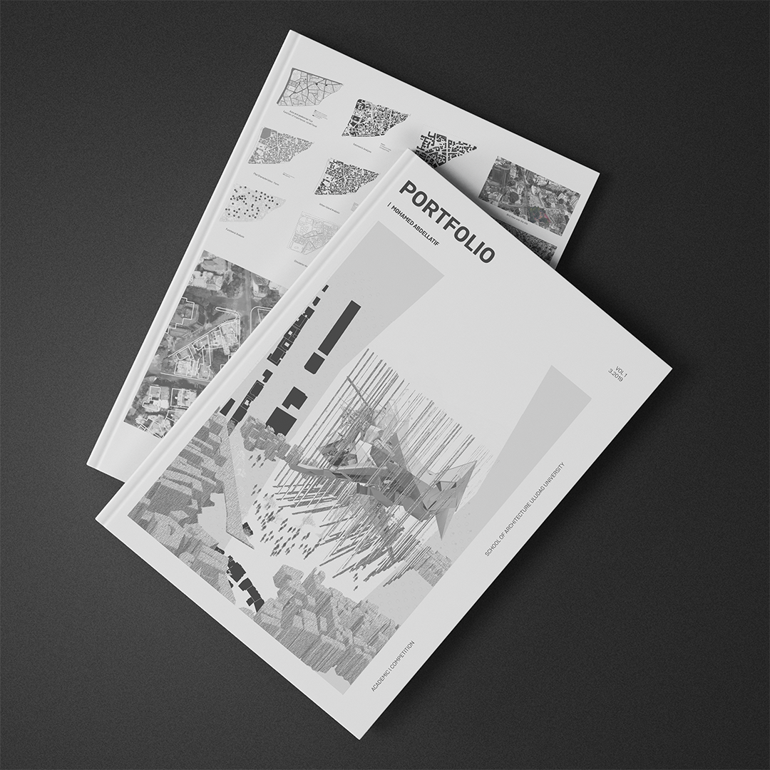
Our portfolio is a reflection of our character and skills, that is why we should be really careful about how we design it, these are 5 mistakes we should avoid when we design our portfolio:
Too long texts
Generally they have just 30 seconds to look at your portfolio, no one would have the time to read too long texts, and visually they aren’t appealing in general!
What to do instead?
Try to add brief text to the project and the visuals that can help the reader to understand your project easily and without putting too much effort!

Old works
Including your old works would make your employers think that your work may be outdated. They would like to see how your works at the moment and according to this they will evaluate your skills.
What to do instead?
Keep your portfolio updated, the focus should be on what you have been doing in the recent 2-3 years.
Too many pages
Making a 100 page portfolio isn’t always a good idea, there may be hundreds of applications coming to the office, and the hiring responsible wouldn’t have the time to examine thoroughly a huge number of pages.
What to do instead?
If the employer or university doesn’t ask in particular for a detailed portfolio, the ideal page number should be around 25-35 pages.
Non-consistency
The language of your layout shouldn’t differ across your projects, there should be consistency that makes your portfolio legible and easy to check quickly.
What to do instead?
You can try to use our Portfolio Layout which will help you to have a great consistency in your portfolio. Reach them through this link:
Reach Our Portfolio Templates!

Irrelevant hobbies
We know it is cool that you like surfing, but you shouldn’t include such hobbies in your portfolio! Try to show interests that are relevant by a way or another to the position you’re applying to!
Video Suggestions
- architectural portfolio design
- architectural portfolio templates
- architecture portfolio application
- architecture portfolio cover
- architecture portfolio examples
- architecture portfolio issuu
- architecture portfolio pdf
- architecture portfolio template
- how to design portfolio
- portfolio design for architects
- portfolio templates
- portfolio templates for architects
Architect/Tifa Studio Founder/Writer ▪️Sherlock Holmes, but for cities ▪️Architect | PhD | Professional outsider ▪️I see what you walk past 🔮 AI × Architecture × Unpopular opinions
Submit your architectural projects
Follow these steps for submission your project. Submission FormLatest Posts
SEO for Architecture Firms: A Practical Guide to Winning More Clients Online
Learn how SEO for architecture firms can turn a portfolio-heavy website into...
David Chipperfield: The Quiet Modernist Who Transforms Historic Buildings with Timeless Elegance
David Chipperfield is a British architect whose restrained, civic-minded buildings have redefined...
Best Architectural Ebooks: 12 Top Picks for Students and Professionals
A focused selection of the best architectural ebooks available today, covering design...
How to Choose the Best Drainage Channel Manufacturer
Table of Contents Show Which Manufacturer Should You Choose for Your Project?Urban...


Leave a comment