- Home
- Articles
- Architectural Portfolio
- Architectral Presentation
- Inspirational Stories
- Architecture News
- Visualization
- BIM Industry
- Facade Design
- Parametric Design
- Career
- Landscape Architecture
- Construction
- Artificial Intelligence
- Sketching
- Design Softwares
- Diagrams
- Writing
- Architectural Tips
- Sustainability
- Courses
- Concept
- Technology
- History & Heritage
- Future of Architecture
- Guides & How-To
- Art & Culture
- Projects
- Competitions
- Jobs
- Events
- Store
- Tools
- More
How to Make Your Architectural Presentation Sheets Stand Out
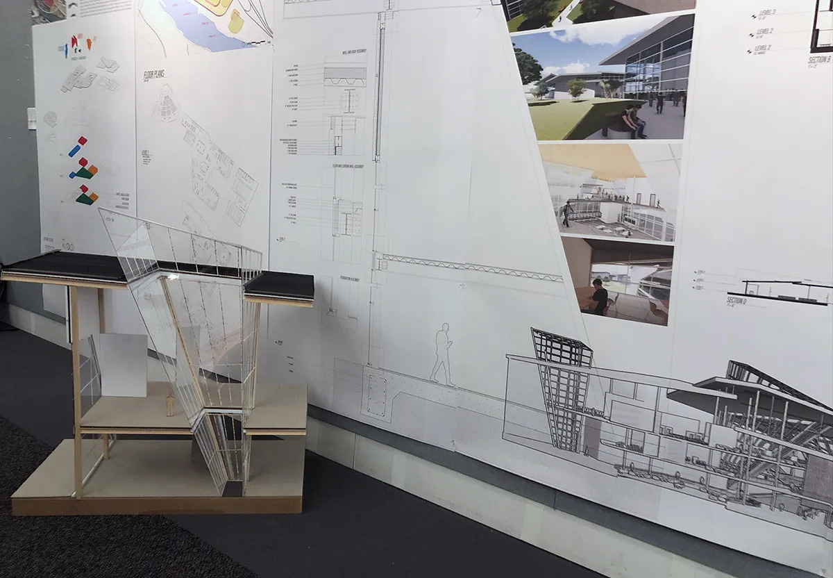
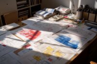
In the world of architecture, a well-crafted presentation sheet can be the difference between a lukewarm reception and a standing ovation. These sheets not only showcase your architectural design but also demonstrate your storytelling skills, attention to detail, and aesthetic sensibilities.
While it is crucial to adhere to the fundamentals of architectural presentation, it can also be beneficial to incorporate unique and innovative methods into your presentations. In a world filled with architectural designs and concepts, here are some unique ways to make your presentation sheets stand out.
Standing out in architectural presentations can confer numerous benefits, both in the immediate context of the presentation and the broader sphere of professional recognition. Here are a few advantages:
In an architectural competition, where numerous designs are vying for attention, a presentation that stands out can grab the jury’s attention and significantly improve the chance of winning.
Also, in a client meeting, an outstanding presentation can make the difference between securing a contract or not. Clients often make decisions based on first impressions, and an innovative, unique presentation can tip the balance in your favor.
Projects with a public component, such as community buildings or urban planning proposals, a standout presentation can attract media attention and generate public interest and engagement. This can lead to increased public support for a project.
Over time, consistently exceptional presentations can become a hallmark of your professional practice. This can lead to increased recognition in the architectural community, invitations to speak or judge at events, and other career-enhancing opportunities.

Leverage Digital Technology: In this digital age, why not leverage technology to make your sheets more interactive and engaging? Augmented Reality (AR) and Virtual Reality (VR) can add a fascinating layer of interactivity to your presentation sheets. Viewers can virtually walk through your design, which is an experience that traditional 2D designs cannot match.
- Hand Sketching: In a digital world, a hand-drawn sketch can make a memorable impact. A sketch can convey the humanity behind the design, giving a personal touch that can sometimes get lost in purely digital renderings. Combining hand sketches with digital elements can create a captivating juxtaposition.
- Narrative Illustration: Don’t just show your design; tell a story. Use your sheets to create a narrative around your design, helping the viewer understand not just the what, but the why of your design. This could include illustrating the daily life of people interacting with the building, seasonal changes, or even potential future developments.
- Color and Contrast: Utilize color and contrast wisely to emphasize critical aspects of your design. While monochromatic sheets can look professional, a well-placed splash of color can make your design pop and draw the viewer’s attention to crucial elements.
- Experimental Materials: Consider printing on unconventional materials like cloth, translucent paper, or metal sheets for a tactile experience that goes beyond the visual. Different materials can communicate different moods and themes, adding an extra layer of intrigue to your presentation.
- Incorporate Infographics: Infographics can convey complex information in an easily digestible format. Using these on your sheets can help communicate the more technical aspects of your design in a visually appealing way, making your presentation more comprehensive and engaging.
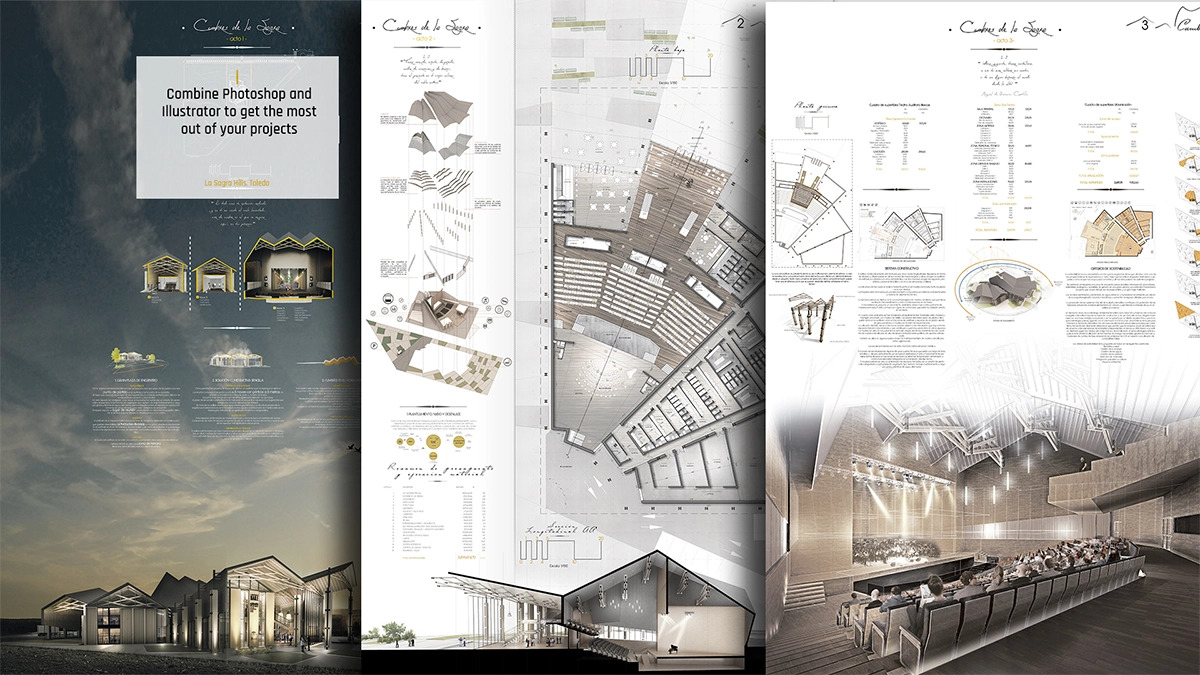
- Unique Layouts: Consider breaking free from traditional grid layouts. An asymmetrical layout or a dynamic collage-style presentation can make your sheets more visually intriguing. However, ensure the layout still guides the viewer’s eye in a logical flow and doesn’t create confusion.
- Craft a Strong Concept Statement: Your concept statement is as critical as the design itself. Make sure it is succinct yet compelling, outlining the vision, rationale, and uniqueness of your design. This could be the key to making a strong impression.
- Create a Design Branding: Give your project a unique branding, including a name, logo, or specific color scheme. This not only makes your project instantly recognizable but also presents it as a complete and thoughtful package.
- Feedback Loop: Always keep an open feedback loop. Show your work to others and invite constructive criticism. Different perspectives can help refine your presentation, and it also prepares you for the kinds of questions or feedback you might receive during your actual presentation.
Remember, the ultimate goal of your presentation sheets is to communicate your design in the most engaging, effective, and concise way possible. While pushing the boundaries with these unique suggestions, it’s essential to ensure your presentation remains clear, coherent, and true to the core of your design. After all, your design should be the star of the show. The presentation sheet is simply the stage that allows it to shine.
Submit your architectural projects
Follow these steps for submission your project. Submission FormLatest Posts
Proportion in Architecture: Why Every Architect Should Master This Principle
Proportion in architecture governs the dimensional relationships between a building's elements and...
Al-Masjid an-Nabawi Architectural Styles: The Evolution of a Sacred Core
A detailed look at how Al-Masjid an-Nabawi evolved from a palm-trunk courtyard...
Why Removing Old Stumps Can Boost Your Property’s Value
Table of Contents Show Understanding the Impact of Stumps on Property ValueFirst...
The Role of Shades and Blinds in Clean Architectural Interiors
A clean interior can start to feel less clean once the windows...







Leave a comment