

Architect Handwriting: A Guide to Precise Lettering
Architect handwriting is the disciplined, uppercase lettering architects use to keep drawings legible. Learn what defines the style, why it still matters, and how to practise it.
 Furkan Sen3 February 20257 Mins read592

Table of Contents Show
Architect handwriting is a disciplined lettering style built on uppercase geometric letters, even stroke weight, and steady spacing. Architects use it so that drawings, dimensions, and notes stay readable across an entire project team. The style pairs technical accuracy with a bit of personal character, which is why it still feels recognisable even in fully digital workflows.
Have you ever noticed how an architect’s handwriting has a distinct look? It is not about neatness for its own sake. The lettering works as a visual language that carries precision, clarity, and a sense of order. For generations, this style has been tied to the profession, joining form and function much like the drawings themselves.
What follows is a practical look at architect handwriting: what sets it apart, why it still matters on real projects, how the skill is built, and which tools help you write the same way. The lettering looks simple, but the discipline behind it is what keeps a drawing legible on site.

What Makes Architect Handwriting Unique?
Architect handwriting sets itself apart from ordinary script through training that rewards precision and legibility. The goal is simple: plans and annotations should be understandable to anyone reading them, whether that person is an engineer, a contractor, or a fabricator on the shop floor.
Geometric forms carry the style. Sharp lines, even proportions, and mostly uppercase letters create uniformity and remove ambiguity from a note or a dimension. That attention to shape helps readers interpret design elements correctly, regardless of language or how familiar they are with architectural terms. The letters also sit neatly on grids and layout lines, which keeps the visual order of architectural plans intact.
Consistency in stroke weight and spacing reflects the discipline of daily practice. That uniform look supports readability even in dense drawings, and it echoes the balance architects value in the buildings themselves. Practicality is the point: the lettering carries technical detail and a touch of creative expression at once, which makes it useful for sharing complex ideas in visual form.
📌 Did You Know?
The single-stroke uppercase lettering most people call “architect handwriting” grew out of drafting practice standardised in the early twentieth century, when engineer Charles W. Reinhardt promoted a clean, vertical, single-stroke Gothic alphabet for technical drawings. The style stuck because it stayed legible after copying, scaling, and reproduction.

The Characteristics of Architect Handwriting
Architect handwriting rests on precision, consistency, and a recognisable aesthetic that serves both function and expression. A few defining traits make it a working tool rather than a decorative one.
Precision and Clarity
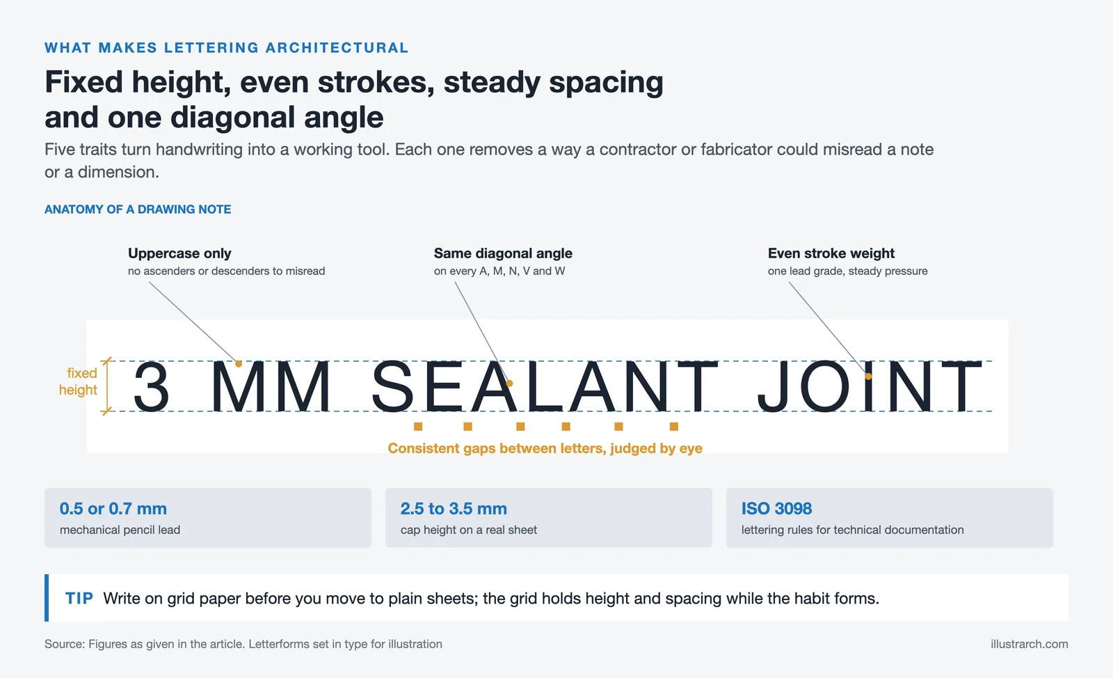
Letters and numbers are drawn carefully so a note reads the same way to everyone. Straight lines, defined angles, and even spacing hold up even in scaled-down drawings or crowded layouts. Capital letters are common because they cut down on misreading, which matters when a wrong digit changes a dimension.
Consistent Letterforms
Uniformity defines the style. Each letter is built with steady proportions so it aligns with design grids and layout systems. Stroke weights stay even, and the space between characters is regular. This visual order fits the organised nature of a drawing set and follows the same logic as the international lettering rules set out in ISO 3098 for technical product documentation.
A Distinct Aesthetic
Angular forms, clean intersections, and simple geometric shapes give the writing its look while keeping it professional. Personal variations, such as a slight slope or a subtle serif, add individuality without hurting clarity. That balance between form and function makes the lettering an identifiable mark of the trade, and it explains why technical lettering has its own place in drafting history.
Traits, Why They Matter, and How to Apply Them
The table below breaks down the core traits of architect handwriting, the reason each one counts on a real drawing, and a quick way to practise it.
| Lettering Trait | Why It Matters | Practice Tip |
|---|---|---|
| Uppercase letters | Removes ambiguity in notes and dimensions | Drill a full A to Z between two guide lines |
| Even stroke weight | Keeps text legible after copying or scaling | Use steady, light pressure and one lead grade |
| Consistent spacing | Aligns text with grids and layout systems | Write on grid paper before moving to plain sheets |
| Sharp geometric angles | Reinforces the clean, professional look | Finish each stroke fully before lifting the pen |
| Fixed letter height | Creates rhythm and a tidy overall block of text | Set top and bottom guide lines for every line |
Why Handwriting Still Matters in Architecture
Handwriting keeps a role in architecture because it joins technical precision with a personal mark. It builds a closer link between the person and the design, and it keeps communication clear when drawings pass between many hands.
Communication and Understanding
Handwriting is still a direct way to carry ideas on a drawing. Legible annotations make complex concepts easier for a mixed team to follow, and accurate lettering cuts down on misreading, keeping architects, engineers, and builders aligned. Consistent letterforms help prevent errors during fabrication or on-site adjustments, where a single unclear note can cost time and money.
Technical Drawings and Notations
Handwritten notes fit naturally into technical drawings. Architects add dimensions, symbols, and instructions by hand across a layout, and those marks hold the set together as a bridge between concept and construction. Uppercase letters, sharp characters, and even spacing keep everything readable inside a dense architectural drawing.
A Personal Touch in Designs
A distinct hand adds individuality to architectural work, showing a designer’s character through small variations in stroke and weight. That personal signature adds authenticity during presentations and design reviews. Even as digital tools take over most production, handwritten annotations stay relevant by keeping a human connection to each drawing, a quality that publications such as ArchDaily continue to document through hand-drawing features.

How Architects Develop Their Handwriting Style
Architect handwriting grows through steady training and the habits picked up in school and practice. The process rewards precision, consistency, and a working balance between clarity and character.
Training and Practice
Repetition shapes the hand. During architectural education, students trace letters again and again to build control and a steady stroke. Exercises often center on uppercase lettering to lock in uniformity, and that structured repetition builds the muscle memory behind consistent characters. Real projects then reinforce the skill, since architects annotate sketches and drawings under time pressure and learn to write cleanly at speed.
Influence of Architectural Education
Drafting and design courses stress proportional letterforms, sharp angles, and alignment with grid systems. Instructors push legibility in technical documentation, which builds the discipline needed for uniform annotations. Studio critiques add another layer: feedback from peers and mentors sharpens attention to detail and encourages a steady style. Students see first-hand how their handwriting affects communication when ideas move across a design team.
🏗️ Real-World Example
Louis Kahn’s Salk Institute drawings (La Jolla, 1965): Kahn’s studies and construction drawings show tight, hand-lettered notes sitting beside pencil sketches. The lettering carries dimensions and material notes with the same care as the drawing itself, a habit that helped translate his concepts into built concrete.
Architecture Handwriting Practice: A Seven-Step Drill
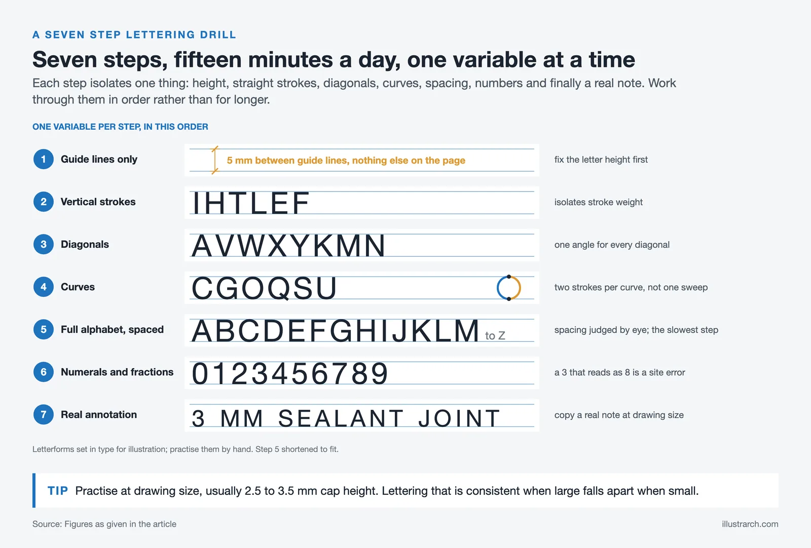
Architecture handwriting is trained rather than acquired, and the training is boring and short: fifteen minutes a day for a few weeks produces a consistent hand. Working through the steps in order matters more than the time spent, because each one isolates a single variable.
| Step | Focus | What to do | Why this step exists |
|---|---|---|---|
| 1 | Guide lines only | Draw two parallel guide lines 5 mm apart across a page. Nothing else. | Every consistent hand starts with a fixed letter height. Without guides the height drifts. |
| 2 | Vertical strokes | Fill a line with the letters I, H, T, L, E, F between the guides. | These letters are all straight strokes. They isolate stroke weight before curves complicate it. |
| 3 | Diagonals | Add A, V, W, X, Y, K, M, N. Keep every diagonal at the same angle. | Inconsistent diagonal angle is the most visible flaw in architectural lettering. |
| 4 | Curves | Add C, G, O, Q, S, U. Draw each curve as two strokes, not one sweep. | Single-sweep curves wobble. Two controlled strokes stay even. |
| 5 | Full alphabet, spaced | A to Z between guides, with a consistent gap. | Spacing is judged optically, not measured. This is the step that takes longest. |
| 6 | Numerals and fractions | 0 to 9, then common fractions and dimension strings. | Numbers carry the dimensions. A 3 that reads as an 8 is a site error. |
| 7 | Real annotation | Copy a real drawing note at the size you would write it on a sheet. | Practice at drawing size, not at comfortable size. They are different skills. |
Two rules that apply throughout. Write at the size you will actually use on a drawing, usually 2.5 to 3.5 mm cap height, because lettering that is consistent at large size falls apart at small size. And stop when it stops being deliberate: fifteen careful minutes beats an hour of drifting.
Tools and Techniques to Emulate Architect Handwriting
Matching architect handwriting comes down to the right tools and a few deliberate habits. Both push you toward clean, precise, and consistent letterforms.
Recommended Writing Tools
The right tools make it much easier to reproduce the clean, structured lines of architectural lettering.
- Mechanical pencils: Good for consistent line thickness and sharp detail. A 0.5mm or 0.7mm lead gives you control over each stroke.
- Technical pens: Tools such as the Rapidograph or fine liner pens create smooth, even lines with a steady ink flow.
- Grid paper: Graph or drafting paper helps you align letters and hold spacing while you build the habit.
- Rulers and lettering guides: Templates keep shapes uniform and help you hold scale while practising geometric forms.
💡 Pro Tip
When you start out, draw two light guide lines for every row of text and never let a letter break past them. Fixing letter height first solves most legibility problems, since uneven cap heights are the fastest giveaway of untrained lettering. Drop the guide lines only once the height feels automatic.
Tips for Improving Your Lettering
Deliberate practice with a few clear rules will move your writing toward an architect’s style.
- Focus on uppercase letters first for uniformity and to cut down on misreading.
- Keep letters even in height and spacing, using a 1:1 grid guide until it feels natural.
- Control stroke weight with steady pressure so thickness stays consistent across a line.
- Favour sharp angles and clean geometric shapes to match the professional look.
- Practise a little every day, working on rhythm and neatness rather than speed.
With these tools and habits, most people can build handwriting that carries the clarity of the profession.
The Bigger Picture
It is easy to read architect handwriting as a relic of the drafting table, yet the discipline behind it outlasts any single tool. The instincts that keep a handwritten note legible, which are order, restraint, and clarity for the reader, are the same ones good digital documentation needs. Learn to letter by hand and you are really training how you communicate a design, whichever medium you work in.








Books by Rem Koolhaas Every Architect Should Read
Rem Koolhaas books have shaped contemporary architectural discourse like no other body...
 Begum Gumusel5 Mins read
Top Architecture Magazines Every Architect Should Read Today
Architecture magazines remain vital platforms for critical thought, cultural reflection, and professional...
 Sinan Ozen5 Mins read

Tips for Writing a Good Architectural Essay
Writing a compelling architecture essay requires balancing technical knowledge with creative storytelling....
 Elif Ayse Sen7 Mins read

10 Tips for Aspiring Architectural Writers
Architectural writing transforms built environments into meaningful stories and insights. This guide...
Begum Gumusel8 Mins read


Leave a comment