- Home
- Articles
- Architectural Portfolio
- Architectral Presentation
- Inspirational Stories
- Architecture News
- Visualization
- BIM Industry
- Facade Design
- Parametric Design
- Career
- Landscape Architecture
- Construction
- Artificial Intelligence
- Sketching
- Design Softwares
- Diagrams
- Writing
- Architectural Tips
- Sustainability
- Courses
- Concept
- Technology
- History & Heritage
- Future of Architecture
- Guides & How-To
- Art & Culture
- Projects
- Competitions
- Jobs
- Events
- Store
- Tools
- More
Successful Architectural Presentation Boards #5
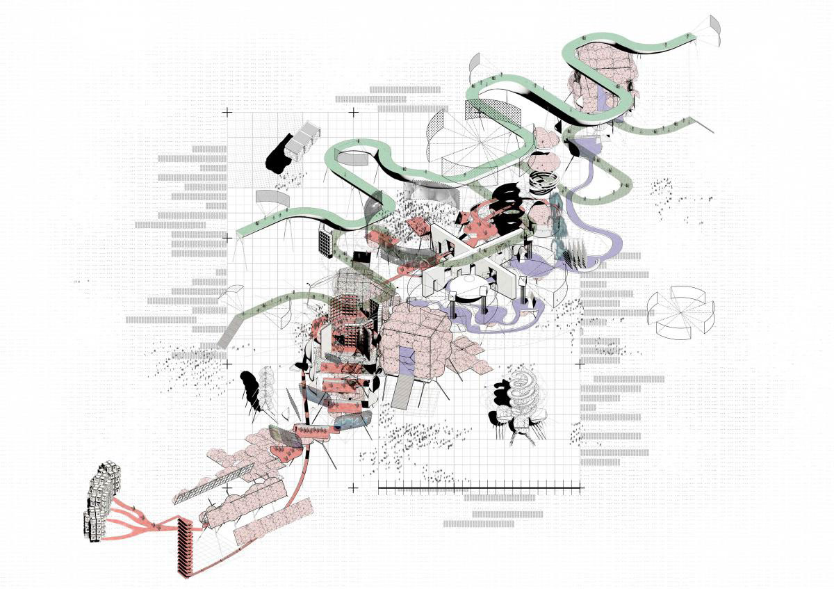
In this series of article, we try to share successful architectural presentation boards from architectural competitions, architectural design school presentations by students and proffesional project presentation boards by architecture firms. We have understood that a successful presentation board should have a clear and organized layout that allows viewers to easily understand the information presented. The layout should be visually pleasing, with balanced use of space, color, and typography. Also the use of high-quality images and graphics is essential to create a visually engaging and informative presentation board. The images should be clear and well-lit, and the graphics should be well-designed and easy to read. Architects need to consider the information presented on the board should be concise, focused, and relevant to the design concept. It should not be cluttered with unnecessary details or information that is not related to the project. In the 5th series of successful architectural presentation board articles, you will see more examples below.

First example is a presentation board that in a landscape format. We do not used to see landscape format in architectural presentation boards because landscape format causes space occupation sometimes. However in this presentation board, designer use the spaces as two portrait posters in a landscape format. The left of the poster include abstract and concrete drawings but we can see more abstract visuals on the right. The designer of the poster has tried to make balance in his work. Also linear shapes are an important design element in this architectural presentation board. Linear shapes are defined as shapes that are created by lines or curves and are one-dimensional in nature. They can be straight or curved, and can be used to create a variety of effects in architectural presentation boards.

Like in the first example, we can see linear shapes in this presentation board. These shapes can be used to create a sense of depth and perspective. By using converging lines or vanishing points, the eye is drawn into the image, creating a sense of depth and perspective. This can be particularly effective in showing the spatial relationships between different elements of a building or space. They can also be used to create a sense of structure and order in architectural presentation boards. By using horizontal or vertical lines, a sense of stability and order can be created, which can be particularly effective in showing the structural elements of a building or the organization of space. Also, pastel colors are a popular choice in architectural presentation boards due to their soft and muted appearance. Pastel colors are created by adding white to pure hues, resulting in colors that are less intense and more subdued than their pure counterparts. Pastel colors are often associated with femininity, sweetness, and tranquility.

Showing architectural details and layers is an essential component of architectural presentation boards. The details and layers of a building provide crucial information about the design, construction, and materials used, and are important in conveying the overall aesthetic and functionality of the building. One way to show architectural details in presentation boards is to use close-up images that highlight specific details. These images can be used to showcase the intricate details of the building, such as ornamental details, material textures, or the intersection of different building elements.

Another way to show architectural details is to use exploded or exploded axonometric views. These views break down the building into its individual components, highlighting how they fit together and creating a clear understanding of the construction and design details.
Layering can also be effectively used in architectural presentation boards to convey the different functional and spatial elements of a building. By using different layers or colors, the presentation board can visually separate the different parts of the building, such as the structural elements, mechanical systems, and interior finishes. This creates a clear understanding of the functional and spatial relationships between different building elements. The use of diagrams and sections can also be helpful in showing architectural details and layers. Diagrams can help to explain the design concept or process, while sections can reveal how the building is organized vertically and horizontally, as well as how the different elements fit together.
- arch projects presentation
- architectural presentation
- Architectural Presentation Boards
- architectural presentation boards guide
- architectural presentation sheets
- Architecture Student Presentation
- Fonts for Presentation
- How to create architectural presentation
- how to prepare jury presentation
- jury presentations
Submit your architectural projects
Follow these steps for submission your project. Submission FormLatest Posts
Le Corbusier: Design Philosophy of His Famous Buildings
A focused guide to Le Corbusier's design philosophy, the Five Points of...
Strong Personal Brand Online: 9 Steps Every Architect Should Take
A focused guide for architects who want to build a strong personal...
Proportion in Architecture: Why Every Architect Should Master This Principle
Proportion in architecture governs the dimensional relationships between a building's elements and...
Al-Masjid an-Nabawi Architectural Styles: The Evolution of a Sacred Core
A detailed look at how Al-Masjid an-Nabawi evolved from a palm-trunk courtyard...







Leave a comment