

Bubble Diagram Examples: Annotated Samples for Architectural Layouts
A gallery of bubble diagram examples for architects, with annotated samples grouped by space type, a reference table, real inspiration sources, and practical tips for redrawing them by hand or in software.
 Elif Ayse Sen5 May 20237 Mins read1k


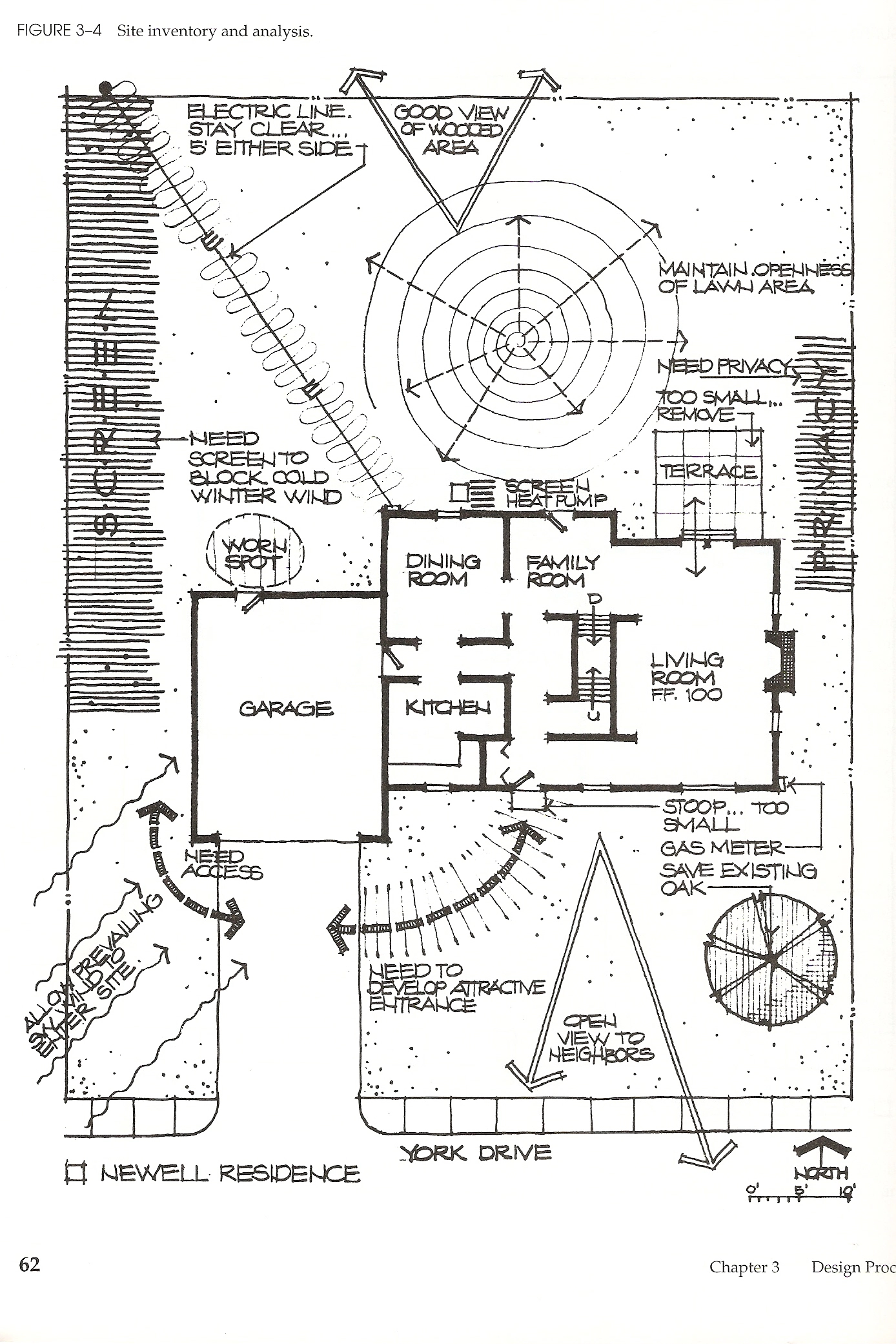


Table of Contents Show
Bubble diagram examples show how architects turn a list of rooms into an organized spatial plan before any walls are drawn. Each circle stands for a function or space, and the connecting lines map circulation and adjacency. Studying real samples helps you read those relationships quickly and apply them to your own projects.
Architects rely on bubble diagrams during the earliest stage of design, when the goal is to test ideas fast rather than commit to a fixed layout. A well-made bubble diagram in architecture keeps the focus on how spaces work together: which rooms need to sit side by side, which should stay separate, and how people move between them. The bubble diagram examples below are drawn from real design work, so you can see how these principles play out on paper and on screen.
💡 Pro Tip
When you study a sample, look at bubble size and line weight first, not the labels. Larger bubbles signal priority spaces, and heavier lines mark the strongest adjacencies. Reading a diagram this way trains you to communicate hierarchy in your own sketches without writing a single note.
What Makes a Strong Bubble Diagram Example?
A strong sample communicates three things at a glance: the relative importance of each space, the physical distance between spaces, and the circulation paths that link them. Size carries meaning, so a lobby or open-plan living area is usually drawn larger than a storage closet. Proximity carries meaning too, since bubbles placed close together suggest a direct relationship, while separated bubbles imply buffered or private zones.
The best examples also stay loose. Because a bubble diagram is a thinking tool, clean geometry is less useful than quick, editable marks. If you want a full breakdown of what each part represents, the elements of a bubble diagram guide covers bubbles, connectors, and zoning conventions in detail.
One more marker of a useful sample is honesty about what stays undecided. Early diagrams often leave a few bubbles floating without firm connections, which signals that the designer has not yet resolved that relationship. Rather than a weakness, this openness is part of the value: the diagram records questions as clearly as it records answers, and those open questions guide the next round of decisions.
Bubble Diagram Examples by Space Type
Different building types call for different priorities. A house organizes around private and shared zones, while an office balances collaboration space against quiet work. A clinic sorts everything by who is allowed where, and a gallery arranges rooms into a deliberate sequence. Recognizing these patterns lets you reach for the right starting structure instead of inventing one from scratch each time. The table below groups common bubble diagram examples by the space type they represent and what each one is designed to reveal.
| Sample / Use | Space Type | What It Shows |
|---|---|---|
| Home layout study | Residential | Split between private bedrooms and shared living, kitchen, and dining zones |
| Workplace plan | Office | Balance of open desks, meeting rooms, and quiet focus areas |
| Clinic or ward study | Healthcare | Separation of public waiting, staff-only, and treatment zones |
| Garden or site plan | Landscape | Flow between outdoor rooms, planting beds, and access paths |
| Gallery route study | Cultural | A guided sequence through exhibition spaces and shared circulation |
Reading the Samples: What to Notice in Each One
The images on this page span several drawing styles, and each one teaches a slightly different lesson. Walking through them the way a reviewer would makes the underlying logic easier to copy.
The color-coded studies use a distinct hue for every function, so grouping is instant even from across the room. This approach suits presentation drawings and works well when a client needs to understand zoning without reading labels. Notice how spaces of the same category share a color family, which quietly reinforces which rooms belong together.
The hand-drawn samples show the opposite priority. Uneven circles and quick connector lines keep the focus on relationships rather than polish, and the labels do the work that color would otherwise handle. These are the diagrams that change the most between drafts, and they are worth studying if you tend to over-refine too early.
The landscape-derived example is a reminder that spatial thinking crosses disciplines. Outdoor rooms, planting zones, and access paths follow the same adjacency rules as interior spaces, and the movement lines between them read exactly like circulation inside a building. Borrowing from landscape samples can loosen up a plan that has become too boxy.
⚖️ Pros & Cons at a Glance
✔️ Pros: Fast to sketch, easy to revise, clarifies adjacencies early, works before any measurements exist
✖️ Cons: No true scale, can oversimplify complex programs, needs translation into a real floor plan later
Free Online Bubble Diagram Maker
Rather than starting from a blank page, you can build your own version and compare it against the samples on this page. Our tool lets you place bubbles, size them by importance, and connect them to test adjacencies in seconds.
Try Our Free Bubble Diagram Maker ToolCompetition Bubble Diagram Examples
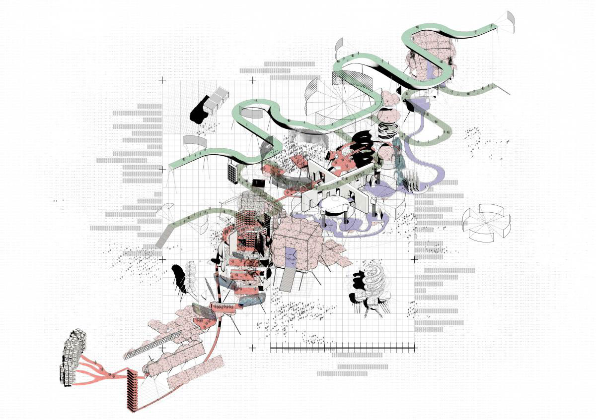
Competition diagrams are worth studying separately, because they are drawn for a reader who has a few minutes and a stack of entries. Everything unnecessary has been stripped out, which makes the underlying logic unusually easy to read.

Notice what this one does with the brief. Every space named in the competition programme appears as a bubble, so a juror can check the requirements off without reading a word of the description. That is the first job of a competition diagram: proving the entry is complete.
Museum Bubble Diagram Example

A museum bubble diagram is organised around a route rather than a set of adjacencies, which makes it different from almost every other building type. The galleries form a sequence, and the diagram’s job is to show the order a visitor experiences them in, where the sequence can be broken to leave early, and where the servicing spaces attach without crossing the public route. Read the connectors here as a one-way path, not as neighbourly relationships.
Urban and Masterplan Examples

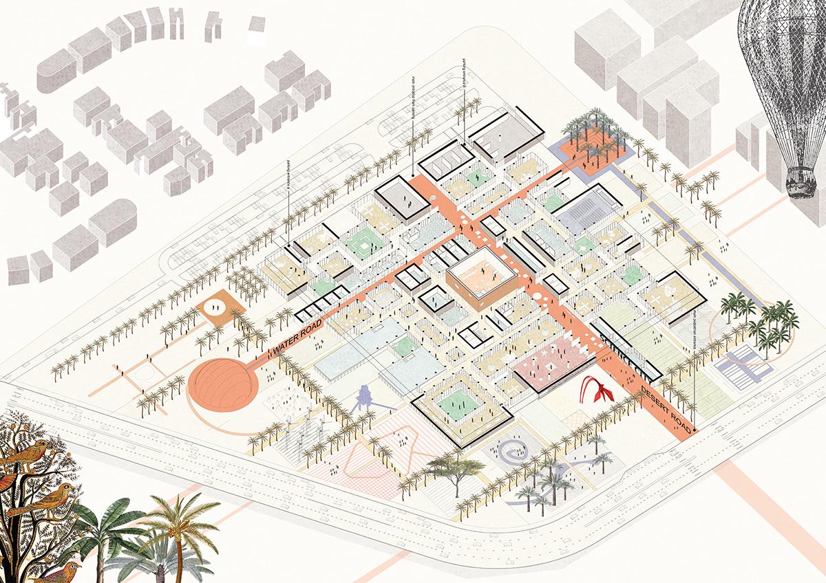
At urban scale the bubbles stop being rooms and start being programmes: a market, a performance space, a green edge. The technique survives the change of scale because the question is the same, which things belong next to each other and how do people move between them.

In this masterplan sample, size carries density rather than floor area, and the connectors are routes measured in minutes rather than doorways. Same grammar, different units.
What Competition Diagrams Do Differently
Four habits are worth borrowing even on projects that will never be judged:
- Every brief item appears. If the programme lists it, the diagram shows it. Completeness is the point.
- The site is in the diagram. Topography, views, and existing structures get their own bubbles, so the arrangement visibly responds to the place rather than floating free of it.
- Several versions are drawn. Competition teams produce a handful of arrangements and choose, rather than refining the first idea until it is too late to change.
- It reads without a caption. If a diagram needs a paragraph of explanation, it has failed at the job it was drawn for.
Where Architects Find Inspiration for Bubble Diagrams
Good diagrams rarely appear from nothing. They grow out of research, client conversations, and a close reading of the site. These four sources give architects the raw material for arranging spaces in a way that fits the project.
- Site analysis: Topography, views, solar orientation, and existing structures all push spaces toward certain positions. A bedroom might gravitate to a quiet corner, while a living area opens toward the best view.
- Client requirements: A clear read of how the client lives or works keeps the diagram grounded in real needs rather than generic layouts.
- Precedent studies: Reviewing successful projects with similar programs reveals adjacency patterns worth borrowing and pitfalls worth avoiding.
- Creative exercises: Loose sketching, doodling, and rapid iteration surface arrangements that a purely logical process would miss.
📌 Did You Know?
Bubble diagrams share their visual logic with landscape planning. The technique of grouping outdoor rooms and connecting them with movement paths appears in garden design manuals, which is why some of the clearest samples come from landscape work rather than building interiors.
Recreating These Examples: By Hand or Digitally
You can reproduce any of these bubble diagram examples with a pencil or with software, and both approaches have a place in practice. Hand sketching is faster for the messy first pass, since a pencil keeps you from fussing over neat circles while ideas are still forming. Use different shades for each bubble, vary line thickness to show how strong a relationship is, and revise freely as the plan settles.
Digital versions take over once the concept firms up. Tools such as SketchUp, AutoCAD, and vector illustration software let you resize and rearrange bubbles cleanly, layer them over a site wireframe, and share the file with collaborators. For a full walkthrough of both methods, see our guide on how to create bubble diagrams, and for context on where the tool fits in contemporary practice, read about the role of bubble diagrams in modern architecture.
💡 Pro Tip
Keep an early hand sketch even after you move to software. Comparing the loose original against the tidy digital version often exposes adjacencies you dropped while cleaning up. Publications like ArchDaily and Dezeen are useful for spotting how built projects resolved those same relationships.
Where to Go From Here
Your Next Step: pick one sample from the table above that matches your current project type, then redraw it from memory using your own room list. Working from a real reference rather than a blank page is the fastest way to build the instinct for spatial organization that these examples are meant to teach.

1 Comment





Flooring Rentals Los Angeles vs Permanent Event Flooring When a Flooring Rental in Los Angeles Makes More Sense
Creating a memorable event starts from the ground up—literally. Whether you're planning...
 illustrarch Editoral Team3 Mins read

Sustainable Landscape Design Balancing Artificial Turf Cost, Artificial Grass in Los Angeles, and Turf Installation for Modern Outdoor Spaces
Artificial grass in Los Angeles has become a practical part of sustainable...
illustrarch Editoral Team6 Mins read

Marble Feature Walls: The Interior Design Trend That Turns Any Room Into a Gallery
There is a moment in every renovation where a room stops being...
illustrarch Editoral Team3 Mins read

Planning Large Residential and Commercial Projects with Lowboy Dumpster Rentals, 6 Yard Dumpsters, and Dumpster Rentals for Less
A lowboy dumpster rental can make a surprisingly big difference when a...
illustrarch Editoral Team6 Mins read




This article explains bubble diagrams pretty well. I learned that they can help organize spaces in buildings. The steps for making them seem simple enough.