

Architecture in Album Covers: 9 Iconic Design Examples
These nine album covers use real architecture as their central image, from Battersea Power Station and Marina City to the CN Tower, and show how buildings shape a record's visual identity.

Table of Contents Show
Architecture in album covers is the use of real buildings, monuments, and structures as the central image on a record sleeve. From Pink Floyd’s Battersea Power Station to Drake’s CN Tower, these designs borrow a structure’s scale, geometry, and sense of place to give the music an instant visual identity that a portrait or abstract graphic rarely delivers.
Music, movies, photography, design, architecture and many more. Art has many categories that inspire us each and every day. A song can spark a film, and a photograph can shape a sculpture. The possibilities feel endless, and part of staying fresh as a designer is letting one field feed another. Album art is one of the clearest places to watch that cross over happen, because a sleeve has to say something about the music before a single note plays.
Below are nine records where a building, monument, or landscape does exactly that. Some use a famous structure as a badge of place, others turn raw concrete into mood. Read together, they show how visual design and the built environment keep borrowing from one another.
Nine Album Covers Built on Real Architecture
Unknown Mortal Orchestra / Unknown Mortal Orchestra (2011)
Cover: The Petrova Gora Monument, Croatia

The cover pulls in one of the former Yugoslavia’s abstract war memorials, a spomenik whose futuristic concrete shell looks more like a spacecraft than a monument. Its strangeness matches the band’s woozy, lo-fi sound.
Pink Floyd / Animals (1977)
Cover: Battersea Power Station, South West London

Designed by Storm Thorgerson’s studio Hipgnosis, the Animals sleeve frames the four brick chimneys of Battersea Power Station with an inflatable pig floating between them. The industrial cathedral gives the record its grey, political weight.
Baio / The Names (2015)
Cover: Residential block, Hamburg

A single Hamburg apartment facade becomes a flat grid of windows and balconies. The repetition reads almost like a printed pattern, which is why modernist housing photographs so well on a square sleeve.
Wilco / Yankee Hotel Foxtrot (2002)
Cover: Marina City twin towers, Chicago

Bertrand Goldberg’s Marina City towers, often called the “corn cobs”, give the cover its stacked semicircular balconies. The record was even named after the towers appearing in a shortwave radio recording.
Drake / Views (2016)
Cover: CN Tower, Toronto
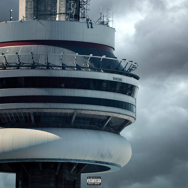
Drake perches on top of the CN Tower, turning Toronto’s tallest structure into a personal landmark. Here the building works as pure geography, tying the artist to his home city in one glance.
Architecture in Helsinki / Places Like This (2007)
Cover: Artwork by Big Active

The band’s name already nods to design, and the sleeve leans into playful, constructed shapes rather than a single real building. It is a reminder that the idea of architecture can drive a cover even without a specific site.
Air / 10,000 Hz Legend (2001)
Cover: Monument Valley, Arizona and Utah

Not every structure is man made. The natural rock towers of Monument Valley act as geological architecture, their vertical forms carrying the same sense of scale a skyscraper would.
Peter Bjorn and John / Writer’s Block (2006)
Cover: Artwork by Kerstin Hanson and Graham Samuels

Illustrated birds sit against a spare, graphic backdrop. The cover shows how an architectural sensibility, clean lines and generous negative space, can shape a sleeve that never pictures a building at all.
Led Zeppelin / Physical Graffiti (1975)
Cover: Tenement building on St. Mark’s Place, New York

The famous die-cut sleeve shows a pair of New York tenements, with windows cut out so inner sleeves peek through. The Physical Graffiti design turned a plain facade into an interactive object.
Album Covers and Their Buildings at a Glance
The table below lines up each record with the structure on its cover and what the building brings to the design.
| Album (Year) | Building / Architecture | What It Adds |
|---|---|---|
| Unknown Mortal Orchestra (2011) | Petrova Gora Monument, Croatia | Futuristic concrete strangeness |
| Animals (1977) | Battersea Power Station, London | Industrial weight and grit |
| The Names (2015) | Residential block, Hamburg | Repeating modernist grid |
| Yankee Hotel Foxtrot (2002) | Marina City towers, Chicago | Curved balconies as pattern |
| Views (2016) | CN Tower, Toronto | Instant geography and place |
| Physical Graffiti (1975) | Tenements, St. Mark’s Place, NYC | Die-cut facade as object |
Why Architecture Works So Well on Album Covers
A building gives a record sleeve something a portrait or abstract illustration rarely can: scale, geometry and a sense of place that the eye reads in an instant. A brutalist monument or a power station’s silhouette is strong enough to survive being shrunk to a thumbnail on a streaming app, which is where most covers are seen today. Architecture also carries mood without a single word. Concrete suggests weight and isolation, glass towers suggest ambition, and a familiar skyline tells you exactly where the music was made. That visual shorthand is why so many designers reach for buildings when they want a cover to feel both timeless and specific.
🎓 Expert Insight
“A strong building already has a point of view built into it, so the sleeve borrows a whole atmosphere before you add a single line of type.”
Graphic designer with 20+ years in music packaging
That instinct explains why sleeve designers so often choose structures with a clear, recognisable form rather than fussy detail that disappears at small sizes.
Architectural Styles That Recur on Sleeves
Look across the covers above and a few patterns appear. Brutalism, with its raw concrete and bold sculptural forms, turns up again and again because its drama photographs so cleanly. Modernist towers such as Chicago’s Marina City offer repeating curves and balconies that read almost like a printed pattern. Industrial heritage buildings, the kind Pink Floyd used, lend an album grit and a hint of decay. Landmark structures like the CN Tower work as instant geography. When choosing a building for a cover, the most reliable picks tend to share three traits: a clear outline, strong contrast between light and shadow, and a shape that stays legible at small sizes.
📌 Did You Know?
The abstract monument on the Unknown Mortal Orchestra cover belongs to a group of former Yugoslav war memorials known as spomeniks. Built mostly between the 1960s and 1980s, their science-fiction concrete forms have found a second life on album art, in fashion shoots, and in video games.
The lesson for designers is that a distinctive structure can outlive its original purpose entirely. A memorial built to mark a wartime uprising now signals mood and mystery on a pop record, which shows how flexible architecture in album covers can be once it is lifted out of context.
🏗️ Real-World Example
Battersea Power Station (London, cover shot 1976): Hipgnosis photographed the coal-fired station’s four chimneys and floated a helium pig, Algie, between them for Pink Floyd’s Animals. The building later sat derelict for decades before its long redevelopment, yet the sleeve kept its brick profile famous the whole time.
Clearing Rights Before You Shoot a Building
Using a real building on a commercial release is not always as free as it looks. Many countries protect their public spaces under freedom of panorama, which lets you photograph and publish structures visible from the street. Others, including France, are far more restrictive, and recently designed landmarks can be treated as protected works. Before committing a building to a sleeve, photographers usually check three things: whether the structure is in public view, whether the architect or owner asserts any rights, and whether a model or property release is needed. When in doubt, a short licence request to the building’s owner saves a great deal of trouble later.
💡 Pro Tip
Photograph the building yourself instead of licensing a stock image whenever you can. Owning the raw file removes one licensing layer, and shooting at your own angle gives the cover a look no other release will share. Keep a dated record of where you stood, since that proves the shot was taken from public space.
Rights and freedom of panorama rules vary by country and change over time. Confirm the current position with a qualified professional before releasing commercial artwork.
Borrowing the Idea for Your Own Project
You do not need a famous monument to use this approach. Start by matching the building’s character to the music: a sparse acoustic record might suit a quiet modernist house, while a heavier sound calls for concrete and steel. Shoot in flat morning or evening light so harsh shadows do not break the form, and frame the structure with room around it for the artist name and title. If a real location is out of reach, a clean architectural render or a single strong detail, such as a staircase or a facade pattern, can carry the same feeling. The goal is consistency, so the cover, the music and the visual world of the release all point in one direction.
The Bigger Picture
Look closely and the traffic runs both ways. Buildings shape how we hear a record, and album art in turn keeps a structure alive in the public eye long after the concrete starts to age. A power station, a Croatian memorial, a Toronto broadcast tower: each was designed for a job that has nothing to do with music, yet a single sleeve fixed its shape in millions of memories. The next time a building stops you on the street, it is worth asking what song it could be the face of.


1 Comment


Sydney’s Buildings Are Ageing Faster Than Most Owners Realise
There is a wave of building deterioration moving through Sydney's property stock...

Famous Buildings in Asia: 6 Imperial Palaces That Shaped a Continent
A focused look at six iconic buildings in Asia, each an imperial...

10 Signs It’s Time to Upgrade Your Property Fence
Table of Contents Show Repairs Keep Piling UpPosts Are LeaningBoards Are Cracked...

Walt Disney Concert Hall: Frank Gehry’s Stainless Steel Symphony in Los Angeles
Frank Gehry's Walt Disney Concert Hall took 16 years from initial design...

Last cover photo is originally from Hong-Kong; Kowloon City.