

Composition in Architecture: Key Principles for Harmonious Design
Composition in architecture is the craft of arranging form, space, and detail into a unified whole, guided by balance, rhythm, proportion, hierarchy, and symmetry.
 Begum Gumusel29 March 20255 Mins read620

Table of Contents Show
Composition in architecture is the deliberate arrangement of form, space, and visual elements into a unified whole. It draws on principles such as balance, rhythm, proportion, hierarchy, and symmetry to guide how a building reads, how it functions, and how people respond to it as they move through and around it.
Every memorable building, from a Greek temple to a glass office tower, carries a sense of order that feels intentional rather than accidental. That order is the result of compositional choices made early in design and refined through every drawing. Understanding these choices gives architects and students a shared language for discussing why one elevation feels resolved while another feels restless. This article breaks down the core principles, shows how they appear in real projects, and offers practical ways to apply them in your own work.
What Is Composition in Architecture?
Composition in architecture refers to the way individual parts of a building relate to one another and to the whole. Windows, walls, columns, voids, roof lines, and materials are not placed in isolation. They are organized so the eye can read the structure as a coherent object with a clear logic. A well-composed building tells you where the entrance is, which parts matter most, and how the spaces connect, often before you read a single sign.

The concept borrows heavily from the visual arts, where artists arrange shapes, tones, and lines on a canvas. Architects work in three dimensions and add the variables of structure, circulation, and human use. A facade is not just a flat picture. It is the face of rooms, stairs, and systems behind it, so good facade design has to satisfy both the eye and the plan at the same time.
Composition operates at several scales at once. At the level of the site, it governs how a building sits against its surroundings. At the level of the elevation, it controls the pattern of solid and void. At the level of a single room, it shapes the relationship between a window, a ceiling height, and a door. Strong design keeps these scales in agreement so the parts reinforce a single idea.
🎓 Expert Insight
“Architecture is the learned game, correct and magnificent, of forms assembled in the light.” Le Corbusier, Towards a New Architecture (1923)
Le Corbusier framed composition as a disciplined act of arranging form so that light reveals its order. His point still guides designers who treat the play of volume, shadow, and proportion as the real subject of a facade.
The Core Principles of Architectural Composition
Several principles work together to give a design its sense of order. None of them functions alone, and skilled designers move between them constantly. The table below summarizes the five that appear most often in practice, what each one means, and a building where it is easy to see.
Five Principles and Where to See Them
| Principle | What It Means | Example |
|---|---|---|
| Balance | Visual weight distributed so no side feels heavier than another | Parthenon, Athens |
| Rhythm | Repeating elements that create pattern and movement across a surface | Colosseum arcades, Rome |
| Proportion | Size relationships between parts and the whole that feel resolved | Villa Rotonda, Vicenza |
| Hierarchy | A clear order of importance that directs attention to key parts | Notre-Dame west front, Paris |
| Symmetry | Mirrored arrangement around a central axis for stability and calm | Taj Mahal, Agra |
Balance and Symmetry
Balance is the sense that visual weight is shared across a design. It comes in two forms. Symmetrical balance mirrors elements around a central axis and reads as formal, stable, and calm, which is why so many civic and religious buildings use it. Asymmetrical balance distributes different elements of unequal size so they still feel settled, a strategy modern designers often prefer because it allows more freedom in plan. A deeper look at balance in architecture shows how both approaches can produce equally resolved results.
Rhythm and Repetition
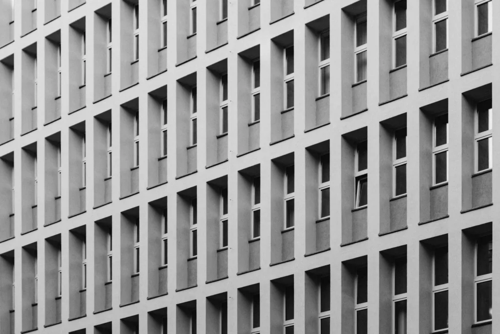
Rhythm gives a building movement. Repeating windows, columns, bays, or structural frames set up a beat that the eye follows along a facade. Designers vary that beat to avoid monotony, grouping elements, changing spacing, or interrupting a pattern with a single bold feature. The arcades of Roman aqueducts and the window grids of early skyscrapers both rely on rhythm to make large surfaces feel ordered rather than repetitive.
Proportion and Scale
Proportion deals with the size relationship between parts, while scale measures elements against the human body and the surroundings. A doorway that is too small makes a hall feel awkward, and a column that is too thin makes a portico feel unstable. Getting these relationships right is one of the oldest concerns in the field, and the study of proportion in architecture reaches back to ancient treatises that tried to fix ideal ratios for every part of a building. Many architects also test how scale and proportion read together before committing to a final elevation.
📐 Technical Note
The golden ratio, roughly 1:1.618, has guided proportional systems for centuries and still appears in modern grids. Le Corbusier built his Modulor system on it, scaling rooms and openings to human dimensions. You can apply the ratio to a window, a bay width, or an overall facade rectangle to test whether the parts relate cleanly. See how the golden ratio works in architectural design for worked examples.
Hierarchy
Hierarchy ranks the parts of a building by importance and uses size, position, material, or detail to signal that ranking. A cathedral makes its main portal larger and richer than the side doors so visitors instantly read where to enter. In a house, a double-height living space can become the clear focus while service rooms recede. Without hierarchy, every element competes for attention and the design loses its sense of direction. Clear hierarchy also supports better architecture design principles across a whole project, since it keeps decisions consistent from the plan to the smallest detail.
Why Composition Shapes the Way a Building Works
Composition is not only about appearance. The same decisions that order an elevation also order how people use a space. A clear hierarchy guides visitors toward an entrance and through a sequence of rooms. Balanced proportions make ceiling heights and corridor widths feel comfortable. Rhythm in a structural grid keeps construction efficient because repeated bays simplify framing and detailing.
This is where composition meets planning. The way volumes are arranged affects daylight, ventilation, and circulation long before any decoration is added. Thoughtful space planning treats composition and function as one problem rather than two, so a building that looks resolved also works well for the people inside it.
📌 Did You Know?
The Roman architect Vitruvius set out three qualities that a building should hold in balance: firmitas, utilitas, and venustas, meaning durability, usefulness, and beauty. Written around 30 to 15 BCE in his treatise De architectura, this triad is one of the earliest recorded attempts to define what makes architectural composition succeed.
🏗️ Real-World Example
Villa Savoye (Poissy, 1931): Le Corbusier lifted the white box on slender pillars and ran a continuous ribbon window around it, holding the volume in careful proportion. The composition reads as a calm, floating rectangle, yet the ramp and roof garden inside set up a moving sequence that ties the look of the building to the way it is used.
Applying Composition in Your Own Design
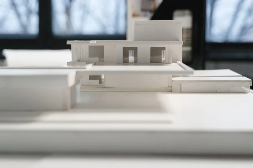
Strong composition rarely happens by chance. It comes from testing arrangements early, often with quick sketches or massing models, before details lock in. Start by deciding what should dominate, then arrange the supporting parts so they reinforce that focus rather than fight it. Check the elevation for a clear axis or organizing line, look for a rhythm that holds the surface together, and confirm that the proportions feel settled at both building and room scale.
It also helps to study how recognized buildings solve the same problems. Sketching the elevations of works you admire reveals the grids, ratios, and points of emphasis their architects relied on. Resources such as ArchDaily’s coverage of composition collect built examples across styles and periods, and the entry on proportion in architecture traces the systems behind them. For the broader artistic background, the principles of composition in the visual arts and the long history covered in the Encyclopaedia Britannica entry on architecture give useful context for translating two-dimensional ideas into built form.
Putting It All Together
Bottom Line: Composition in architecture is the craft of arranging form, space, and detail so a building reads as one clear idea. Master balance, rhythm, proportion, hierarchy, and symmetry, test them against both the eye and the plan, and the result will feel resolved rather than assembled.





Overlapping Concrete Walls and One Roof Shape a House in Okinawa
IGArchitects built Overlapping Spaces in Okinawa from reinforced concrete walls, columns and...
 illustrarch Editoral Team1 Mins read

Futuro House Production Revived in Finland After Decades-Long Hiatus
A Facebook listing for abandoned moulds led to the first new Futuro...
illustrarch Editoral Team3 Mins read

Building Your Dream Home in NSW: What You Should Know About Montgomery Homes
Montgomery Homes has been building across Sydney, Newcastle, the Hunter, Wollongong and...
illustrarch Editoral Team4 Mins read

Designing a Home Theater: Where Drapery Fits Into the Plan
In a media room the curtains are a performance layer, not decoration....
illustrarch Editoral Team3 Mins read


Leave a comment