

Best Fonts For Architectural Presentation Boards
One of the significant parts of the design process is presentation boards. Architectural presentations are your biggest chance to convey your style and ideas. Choosing the right font means designing your presentations and portfolio in the appropriate language.

Table of Contents Show
Quick Answer: The best fonts for architectural presentation boards are clean, legible and understated, letting the design lead. Sans-serif typefaces like Helvetica, Futura, Montserrat and Avenir are popular for their modern, neutral look. Pair a clear heading font with a readable body font, and keep to one or two families for a professional board.
The best fonts for architectural presentation boards are geometric sans-serif typefaces that balance readability with visual clarity. Fonts like Futura, Helvetica, Gotham, Neutraface, and Brandon Grotesque remain the top choices for architects and architecture students in 2026, offering clean lines and professional appeal that complement technical drawings and renders without distracting from the design itself.
One of the significant parts of the design process is presentation boards. Architectural presentations are your biggest chance to convey your style and ideas. Choosing the right font means designing your presentations and portfolio in the appropriate language.
However, thousands of unique and impressive fonts are available online, making it harder for people to choose the correct format. If you are also confused about which particular font can beautify your content, explore fontgenerators.net. Here, you will find many impressive fonts to uplift your presentation game.
If you don’t want to explore tons of fonts and want to know some common fonts for architectural presentation boards, here are the best options!
Why Does Font Choice Matter in Architecture Presentations?
Typography plays a silent but powerful role in any architectural presentation board. The font you select affects readability, visual hierarchy, and how viewers perceive your entire project. Juries, clients, and reviewers often scan boards quickly rather than reading them line by line, so your font needs to guide the eye and communicate professionalism within seconds.
According to the American Institute of Architects (AIA), effective visual communication is central to the architectural profession. A well-chosen typeface reinforces your design intent, while a poor one can undermine even the strongest concept. The goal is to select fonts that mirror the precision and structure found in architectural drawings themselves.
💡 Pro Tip
Limit yourself to two fonts per presentation board: one for headings and one for body text. Using more than two typefaces creates visual noise that distracts from your drawings and renders. Pair a bold geometric sans-serif for titles with a lighter weight of the same family (or a complementary typeface) for descriptions.
What to Look for in an Architecture Presentation Font
Not every attractive font works well on a presentation board. Architects and students should evaluate fonts based on a few specific criteria before committing to a typeface for their project:
First, check legibility at multiple sizes. Your title might be set at 72pt, but annotations and descriptions could be as small as 9pt. The font should remain clear and readable across that full range. Second, look for a typeface with multiple weight options (light, regular, medium, bold). A family with at least four weights gives you enough range to build a clear typographic hierarchy without introducing a second font. Third, consider the tone of the font. A brutalist housing project calls for a different typographic voice than a residential villa surrounded by landscape. The typeface should support, not contradict, your architectural concept.
What Are the Best Fonts for Presentation Boards in 2026?
Architect: Geometric Typeface
Architect is a digital typeface inspired by the early era of personal computers. Architect can easily pair with many fonts in your project. It creates impactful layouts with headers, logos, and subtexts. This font is able to use for headlines, logos, layouts and content.
Futura
The sans-serif font was created by Paul Renner and released commercially in 1927 by the Bauer Type Foundry in Frankfurt, Germany. It is a geometric typeface rooted in modernist graphic design and influenced by Bauhaus principles, though Renner himself was not directly part of the school. This font can cause visual fatigue when it is used in long texts. In architectural boards, Futura should be used as titles and subtitles. Its geometric construction, based on circles, triangles, and straight lines, mirrors the structural logic found in architectural drawings.
Futura has been used in countless iconic applications, from the Apollo 11 lunar plaque to branding for Nike, Volkswagen, and Louis Vuitton. For architects, this history of precision and clarity makes it a natural fit for presentation sheets and competition boards.

📌 Did You Know?
Futura was the font chosen for the commemorative plaque left on the Moon by the Apollo 11 astronauts in 1969. Its geometric clarity was considered ideal for a message meant to endure for centuries, reflecting Paul Renner’s original vision of a typeface built for the future.
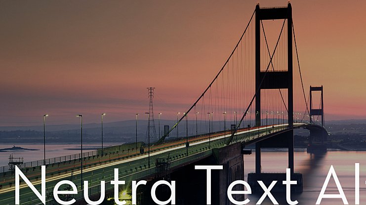
Neutraface
Neutraface is a geometric sans-serif typeface designed by Christian Schwartz for House Industries, released in 2002. It was influenced by the work of modernist architect Richard Neutra and was developed with the assistance of Neutra’s son and former partner, Dion Neutra. Schwartz studied the signage and lettering on Neutra’s buildings, then expanded the character set to include lowercase letters and a full range of weights. It is highly used in architectural presentations as a direct competitor to Futura, offering a slightly warmer geometric alternative.
Neutraface has become so widespread in architectural and real estate signage that it has been informally called the “gentrification font.” Despite this reputation, its roots in actual architectural practice make it one of the most authentic typeface choices for architects who want their typography to reference the built environment directly.
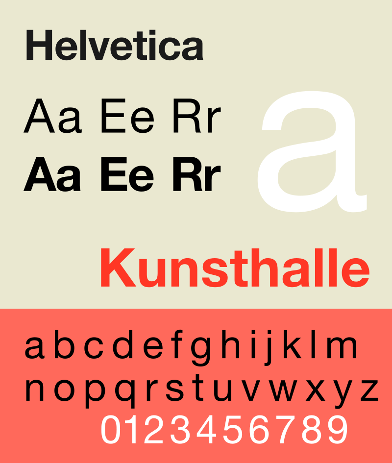
Helvetica
For presentations that have a minimalistic and modern theme, Helvetica is one of the most important fonts to consider. Designed in 1957 by Max Miedinger and Eduard Hoffmann at the Haas Type Foundry in Switzerland, the font was originally named Neue Haas Grotesk before being renamed Helvetica (Latin for “Swiss”) in 1960. It is one of the most widely used typefaces in the world, thanks to its neutral, balanced design and exceptional legibility at any size.
Helvetica became a hallmark of the International Typographic Style that emerged from Swiss designers in the 1950s and 1960s. Designer Massimo Vignelli famously used Helvetica for the New York City subway signage system, demonstrating how effective it is for guiding people through complex environments. That same principle applies to architectural boards: Helvetica helps viewers move through your content without friction.
🎓 Expert Insight
“Typography and architecture share a deep connection rooted in structure, proportion, and clarity.” — Massimo Vignelli, Designer and Typographer
Vignelli’s career demonstrated this principle repeatedly. His insistence on Helvetica for the NYC subway system and his broader advocacy for disciplined typography influenced how architects think about visual communication on their own boards and publications.
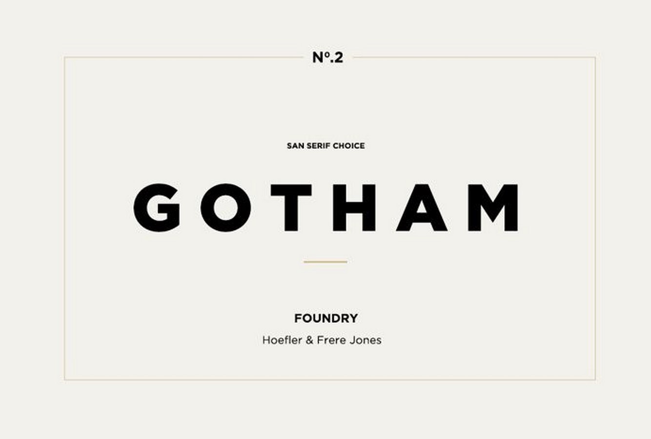
Gotham
Gotham was designed by Tobias Frere-Jones and released in the early 2000s. This geometric sans-serif font was originally inspired by the architectural signage of mid-twentieth-century New York City, particularly the lettering found above building entrances and storefronts. Gotham can be readily used for paragraphs as well as headers. In architecture, this font works well for business cards and logos because its clean, confident lines convey a sense of credibility and trustworthiness.
Gotham gained additional recognition when it was selected as the primary typeface for Barack Obama’s 2008 presidential campaign. For architectural portfolio design and presentation boards, Gotham offers the versatility to function at both display and body text sizes without losing its visual character.
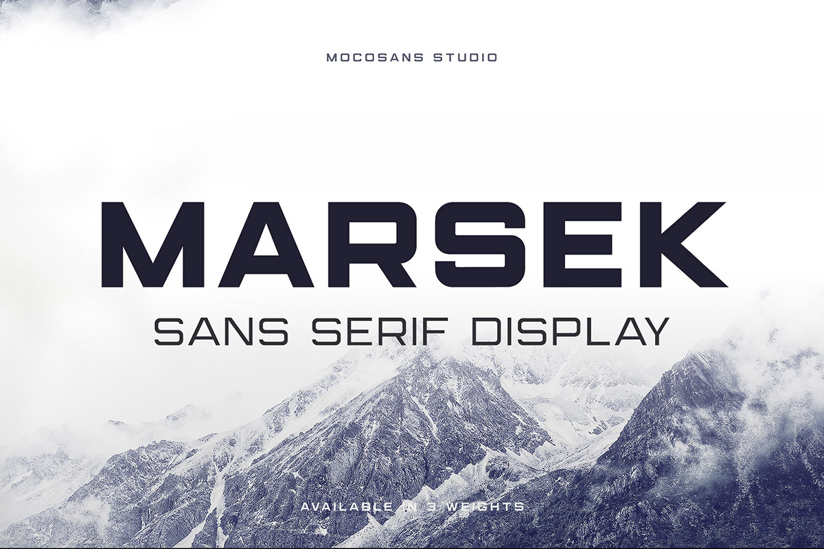
Marsek Display
Marsek is a solid display font, created to emphasize big headlines, titles, and single characters. It can also be used for short descriptive paragraphs. This sans-serif font comes in three sophisticated weights you can mix and match, or use on their own. It is ideal for use in titles, logos, and posters. For architecture students working on competition boards, Marsek adds a bold visual statement to header areas while remaining clean enough to pair with more neutral body text fonts.
RNS Sanz
RNS Sanz is an architectural font that is clear and clean. It is a functional font with 7 weights, ranging from light to black, small caps, and files prepared for webfont use. This makes it particularly useful for architects who create both printed boards and digital presentations. Its rational, structured appearance pairs well with technical drawings and site analysis diagrams.

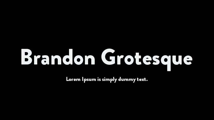
Brandon Grotesque
Brandon Grotesque was designed by Hannes von Döhren with the geometrical, sans-serif style from the early nineties. The lower width-to-height ratio of the font provides an elegant typeface for architectural presentations. Its compact proportions make it a practical choice for boards where space is limited, and it has appeared in corporate layouts for brands such as Comedy Central and in architectural portfolios by emerging designers.
What Other Fonts Work Well for Architecture Boards?
Beyond the core selections above, several other typefaces have gained popularity among architects and design students for presentation work:
Montserrat is a free Google Font with geometric proportions that echo the tradition of classic sans-serifs. It offers ten weights, making it one of the most versatile free options available. For students on a budget, Montserrat provides a professional-grade alternative to premium fonts like Gotham.
DIN (Deutsches Institut für Normung) was originally developed for German industrial standards and road signs. Its engineering roots make it a natural fit for technical presentations, site plans, and construction detail boards. DIN’s structured, rational appearance communicates precision.
Avenir, designed by Adrian Frutiger in 1988, blends geometric construction with humanist warmth. It reads comfortably in longer paragraphs, making it a strong option for concept statements and project descriptions that accompany your visual content.
⚠️ Common Mistake to Avoid
Many architecture students use decorative or script fonts for their board titles, thinking it will make their presentation stand out. This almost always backfires. Decorative fonts reduce legibility, clash with technical drawings, and make the board look unprofessional. Stick with clean sans-serif fonts and create visual interest through weight variation, size contrast, and spacing instead.
How to Pair Fonts on Your Architecture Presentation Board
Font pairing is where good presentation boards separate from great ones. The key is contrast with harmony: your heading font and body font should look different enough to create hierarchy, but share enough structural DNA to feel cohesive.
Here are proven pairings that work well on architectural boards:
| Heading Font | Body Font | Best For |
|---|---|---|
| Futura Bold | Garamond | Competition boards with longer concept texts |
| Gotham Medium | Gotham Light | Professional client presentations |
| Helvetica Bold | Helvetica Light | Minimalist, gallery-style boards |
| Montserrat Bold | Open Sans | Student projects (free fonts) |
| Neutraface Display | Neutraface Text | Mid-century modern or residential projects |
| DIN Bold | Roboto | Technical and construction detail boards |
💡 Pro Tip
When preparing boards for a competition jury, set your body text at 10-12pt and keep descriptions concise. Jurors typically spend 30 to 90 seconds per board. Your typography should support fast scanning: bold titles at the top, medium-weight subtitles for sections, and light-weight body text for supporting details. White space around text blocks is just as important as the text itself.
Free vs. Premium Fonts: Which Should Architects Choose?
Budget is a real consideration, especially for architecture students. The good news is that several excellent free fonts can hold their own against premium alternatives. Google Fonts offers Montserrat, Open Sans, Roboto, Poppins, and Spartan at no cost. These typefaces cover most presentation board needs and work across all major design software including Adobe InDesign, Illustrator, and even PowerPoint.
Premium fonts like Futura, Helvetica, Gotham, and Neutraface offer more refined spacing, additional weights, and optical size variants that perform better at very small or very large scales. If you are building a professional portfolio or preparing boards for a major competition, investing in a premium typeface can be worth it. Many type foundries offer student discounts, so check before purchasing at full price.
What Are Typography Best Practices for Architecture Boards?
Beyond choosing the right font, how you apply typography on your board affects the final result. Keep these principles in mind when designing your architectural presentation:
Use a consistent baseline grid. Aligning text to a grid creates visual order and prevents the board from feeling chaotic. Most professional boards use a 4mm or 5mm baseline grid. Set all text, captions, and annotations to snap to this grid.
Choose dark text on a light background for maximum readability. Black or dark gray text (RGB values around 30-50) on a white or off-white background provides the highest contrast without the harshness of pure black on pure white. Avoid light-colored text on dark backgrounds for body copy, though it can work for short titles or labels.
Maintain consistent margins and padding around text blocks. Give your text room to breathe. Crowded text blocks look unprofessional and are harder to read, especially when printed at full board scale.
✅ Key Takeaways
- Futura, Helvetica, Gotham, and Neutraface remain the most trusted fonts for architectural presentation boards in 2026.
- Limit your board to two fonts maximum: one for headings, one for body text.
- Free alternatives like Montserrat, Open Sans, and Spartan offer professional quality at no cost.
- Font pairing should create contrast through weight difference rather than mixing unrelated typeface families.
- Set body text between 10-12pt and keep descriptions concise, as juries scan boards quickly.
- Dark text on a light background with consistent margins produces the cleanest, most readable boards.
Reach Our Presentation Sheet Templates
Frequently Asked Questions
Clean sans-serifs such as Helvetica, Futura, Montserrat and Avenir read clearly and look professional.
Sans-serif fonts are usually preferred for their modern, neutral look, though a serif can work for accents.
Pick a clear heading font and a readable body font, limit yourself to two families, and keep sizing consistent.
Last updated:


3 Comments


Architecture in Geometry: From Basic Shapes to Complex Forms
Geometry gives architecture its order. This breakdown shows how basic shapes like...

Best Portable Monitors for Architects: 2026 Buying Guide
Portable monitors let architects keep a dual-screen workflow on site visits, in...

Why Custom Kitchens Are Becoming a Must-Have in Modern Homes
Table of Contents Show Designed for the Reality of NYC LivingMaximizing Every...

Designing Physical Brand Touchpoints for Architecture Studios
Table of Contents Show Think Beyond the LogoMatch the Object to the...

This post gives a good overview of different fonts for architectural presentations. It’s helpful to know some options, but I still feel unsure about which one to pick.
I really enjoyed reading this article! The fonts you mentioned are so interesting and helpful for presentations. I love how each font has its own unique style. Thank you for sharing these tips!
This article helps me understand how to choose fonts for my architectural presentations. I learned about different fonts like Architect, Futura, and Helvetica. It’s great that there are many options available to make my work look professional.