

Color in Architecture
Color in architecture goes far beyond decoration — it shapes how we perceive spaces, influences our emotions, and defines the identity of buildings. From the vividly painted ancient Greek temples to the bold facades of contemporary architects like Luis Barragán, architectural colors have always played a critical role in the built environment. This article explores the psychology, history, and practical considerations of color and architecture.

Table of Contents Show
The Role of Color in Architecture: Form, Space, and Perception
Color in architecture is not an element as it is in other branches of visual art. We cannot think of painting without color, but when we eliminate colors in architecture, textures and forms are in front of us as they are. The main thing in architecture is to create forms and spaces. Architects use architectural colors to show and perceive these forms in the best way. Unlike a painter’s canvas, the relationship between architecture and color is one where color serves as an enhancer — not the foundation — of the built environment.
What should be in architecture is that the relationship between spaces and architectural elements still works when colors are eliminated. In addition, colors are expected to be in harmony with each other as they are used, and forms are expected to stand out better thanks to colors. This fundamental principle distinguishes the color of architecture from color in any other visual discipline.
Historical Examples of Colored Architecture
One of the best examples of the use of color in architecture is the ancient Greek temples. We already know Greek temples were adorned in various colors in the past. However, we see them as colorless and naked stone structures right now. Although their features were perceived more strongly with their colors in the past, they exist today with their proportions, shapes, and magnificent architectures. Research by archaeologists and architectural historians has revealed that structures like the Parthenon were painted in vivid reds, blues, and golds — a far cry from the white marble image we hold today.
This rediscovery of colored architecture in the ancient world challenges the long-held assumption that classical buildings were meant to be monochrome. The Romans continued this tradition of architecture color, applying pigments to temples, public baths, and residential villas across the empire. From the frescoed walls of Pompeii to the polychrome surfaces of medieval cathedrals, the use of color has been a constant presence throughout architectural history.

Color Psychology in Architectural Spaces
The effect of colors architecture has on human psychology is an indisputable fact. We can see the exciting effect of red or the calming effect of green in architectural spaces. Being aware of the feelings created by colors, the architect should choose colors both in the interior and exterior facade. Warm tones such as red, orange, and yellow tend to stimulate energy and social interaction, while cool shades like blue and green promote calmness and concentration. Understanding how color and light affect what we feel in buildings is essential for architects who want to design spaces that support well-being.
Neutral tones — whites, grays, and beiges — serve as versatile backdrops that allow other design elements to come forward. Research from the American Institute of Architects (AIA) underscores that intentional color selection in healthcare, educational, and workplace settings can directly influence occupant productivity, healing times, and emotional comfort. The psychology behind color and architecture continues to be a rich field of study that bridges design with behavioral science.
Architecture Color and the Natural Environment
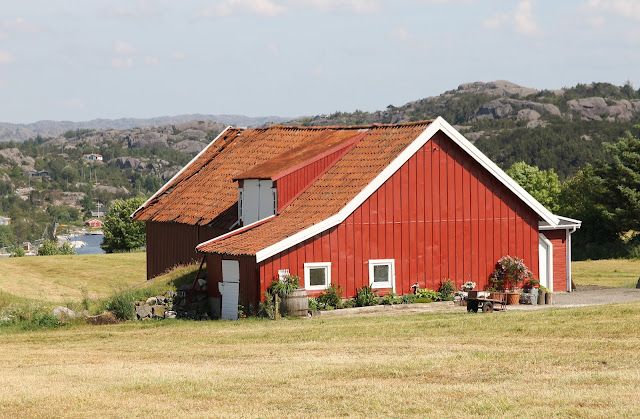
The colors of the buildings are sometimes quite compatible with nature and its surroundings, in tone all around the world. Sometimes, we see the buildings in different and contrasting colors, especially in Scandinavian countries such as Norway, where houses are in contrast to their environment. Red buildings in green nature usually remind us of home, which actually comes from imitating the brick used in past years. Brick is one of the building materials that evokes “home” in memory. For this reason, we see detached houses painted in warm architectural colors similar to bricks in many parts of the world, even when they are concrete structures.
Regional traditions play a significant role in shaping colored architecture across the globe. The white-washed villages of Santorini, the terracotta hues of Marrakech, and the pastel facades of Havana all demonstrate how colors architecture choices respond to local climate, materials, and cultural identity. Architects working on facade design must consider how a building’s color palette relates to its geographic and cultural context, ensuring that the structure feels rooted in its place while still expressing a distinct design vision.
Warm and Cool Colors in Interior Architecture
In addition, especially warm and cold colors are used to show the interiors differently. In order to use colors, they are sometimes painted in warm colors, which is the opposite of cold rooms facing north or east, to follow the warm atmosphere in the whole house. However, light has an important role in the perception of colors. Some interior designers and architects say that choosing cool colors with a reflective effect in low-light rooms and warm colors in rooms with plenty of light is more efficient in the use of color.

Understanding color theory in home design allows architects and designers to make strategic decisions about how warm and cool palettes influence spatial perception. A carefully chosen color scheme can make a small room feel larger, a high ceiling feel more intimate, or a dark corridor feel welcoming. The interplay between natural light and architecture and color is a dynamic relationship that shifts throughout the day, season, and even weather conditions.

Color as Identity in Contemporary Architecture
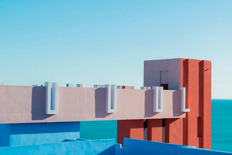
In contemporary practice, color in architecture has become a powerful tool for creating building identity and urban character. Architects like Luis Barragán and Ricardo Bofill have demonstrated how bold architectural colors can transform built spaces into iconic landmarks. Barragán’s vibrant pinks, yellows, and purples in Mexican modernism, and Bofill’s richly colored housing complexes in Spain, show that color can be as defining as form itself. These projects prove that architecture color is not merely decorative — it is conceptual and deeply tied to how buildings communicate with their users and surroundings.
Modern technologies, including color-changing LED systems and responsive facade materials, are expanding the possibilities of color and architecture even further. Buildings can now shift their appearance in real-time based on time of day, environmental conditions, or programmed events. Projects exploring color as concept show how contemporary architects are pushing the boundaries of what colored architecture can achieve. From the broader power of colors in architecture to individual building narratives, color remains one of the most accessible and impactful tools in an architect’s palette.
Practical Considerations for Choosing Architectural Colors
Selecting the right color of architecture involves balancing aesthetic vision with practical requirements. Climate plays a major role: lighter colors reflect solar radiation and help keep buildings cool in hot regions, while darker tones absorb heat and can be beneficial in colder climates. Material properties also matter — certain finishes and coatings respond differently to UV exposure, moisture, and aging, which affects how architectural colors maintain their appearance over time.
Sustainability is becoming increasingly important in color selection. Architects today consider low-VOC paints, natural pigments, and color preferences that align with eco-friendly principles. Whether designing a minimalist facade with a restrained palette or a vibrant public building that celebrates colored architecture, the choice of color must be durable, context-sensitive, and visually coherent. Working with color consultants and conducting on-site mockups under different lighting conditions are best practices that ensure the final result matches the design intent.


Sydney’s Buildings Are Ageing Faster Than Most Owners Realise
There is a wave of building deterioration moving through Sydney's property stock...

Famous Buildings in Asia: 6 Imperial Palaces That Shaped a Continent
A focused look at six iconic buildings in Asia, each an imperial...

10 Signs It’s Time to Upgrade Your Property Fence
Table of Contents Show Repairs Keep Piling UpPosts Are LeaningBoards Are Cracked...

Walt Disney Concert Hall: Frank Gehry’s Stainless Steel Symphony in Los Angeles
Frank Gehry's Walt Disney Concert Hall took 16 years from initial design...

Leave a comment