- Home
- Articles
- Architectural Portfolio
- Architectral Presentation
- Inspirational Stories
- Architecture News
- Visualization
- BIM Industry
- Facade Design
- Parametric Design
- Career
- Landscape Architecture
- Construction
- Artificial Intelligence
- Sketching
- Design Softwares
- Diagrams
- Writing
- Architectural Tips
- Sustainability
- Courses
- Concept
- Technology
- History & Heritage
- Future of Architecture
- Guides & How-To
- Art & Culture
- Projects
- Competitions
- Jobs
- Events
- Store
- Tools
- More
Famous Examples of Postmodern Architecture
A movement to the austerity, formality, and lack of diversity in modern architecture, particularly in the international style promoted by Philip Johnson and Henry-Russell Hitchcock, gave rise to the style or movement known as postmodern architecture in the 1960s.
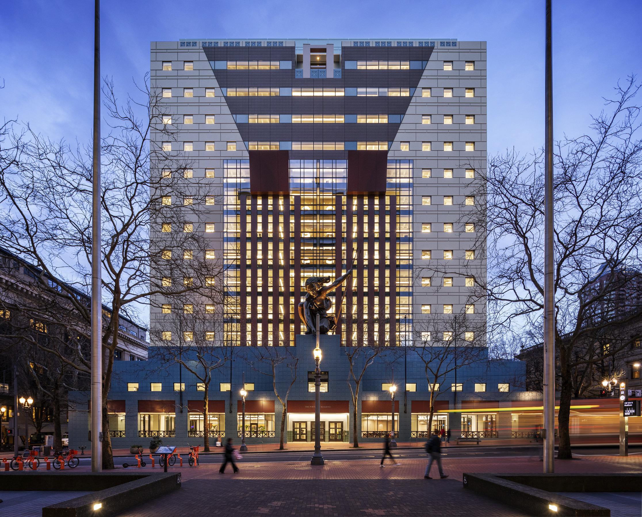
Table of Contents Show
- What Is Postmodern Architecture?
- Development of Postmodernism in Architecture
- Characteristics of the Postmodern Style in Architecture
- Famous Post Modern Architecture Examples
- Post Modernist Architects Who Shaped the Movement
- Postmodernism Interior Design: Bringing the Style Indoors
- Postmodern Housing and Residential Design
- Christo and Jeanne-Claude: Wrapping Landmarks in Fabric
- Post Modern Architecture Examples Around the World
- Legacy and Relevance of Postmodern Architecture Today
Postmodern architecture is one of the most influential and visually distinctive architectural movements of the late 20th century. As a reaction to the austerity, formality, and lack of diversity in modern architecture—particularly the International Style promoted by Philip Johnson and Henry-Russell Hitchcock—this bold post modern style emerged in the 1960s and reshaped the way architects approached design, culture, and context. Today, examples of postmodern architecture remain some of the most celebrated and debated postmodern buildings in the world.
The ideas behind postmodernism in architecture were first explored in the book Learning from Las Vegas by architectural theorist Robert Venturi and architect and urban planner Denise Scott Brown. From the 1980s to the 1990s, the style blossomed, with works by Scott Brown & Venturi, Philip Johnson, Charles Moore, and Michael Graves standing out in particular. It split into numerous different orientations in the late 1990s, such as high-tech architecture, neo-futurism, new classical architecture, and deconstructivism. Some structures constructed after this time, though, are still regarded as post-modern.

What Is Postmodern Architecture?
So what is postmodern architecture exactly? Postmodern architecture is an eclectic, colorful, and often playful architectural style that emerged as a direct challenge to the rigid doctrines of modernism. Where modernist architects prioritized function, minimalism, and uniformity, postmodernist architects embraced complexity, historical references, ornamentation, and cultural symbolism. The movement encouraged architects to celebrate context, local identity, and the existing built environment rather than imposing a singular utopian vision.
Postmodernism in architecture is not a single style but rather an amalgamation of approaches that borrow from history, react to urban context, and embrace decorative traditions. As historian Mary McLeod described it, postmodernism represented “a desire to make architecture a vehicle of cultural expression.” This philosophy gave rise to some of the most recognizable postmodern buildings and postmodern houses of the 20th century, many of which continue to influence contemporary architecture in 2025 and beyond.
Development of Postmodernism in Architecture
In spite of modernism’s functional tenets, Venturi advocated placing a focus on the building’s façade, including historical references, subtly utilizing uncommon materials and historical allusions, and using fragmentation and modulations to provide interest. This approach was revolutionary in the context of post modernism architecture, where every post modern architect sought to break free from the constraints of the International Style.
Successful architects and urban planners Denise Scott Brown and Venturi co-authored the book Learning from Las Vegas with Steven Izenour, which expanded on their mutual critique of modernism. Their work laid the intellectual foundation for what would become one of the most significant architectural movements of the century.
Instead of attempting to impose a futuristic utopia based on their own dreams, they pushed architects to celebrate and take into account the existing architecture of a location. This was consistent with Scott Brown’s viewpoint that structures had to be made for people and that designers ought to take their input into consideration.
The book’s motto, “Less is a bore,” was intended as a counterargument to Mies van der Rohe’s famed dictum, “Less is more.” Venturi used his own structures as illustrations of a new aesthetic that welcomed diversity and historical allusions without reverting to the academic revival of previous aesthetics.
Characteristics of the Postmodern Style in Architecture
The postmodern style is characterized by its opposition to authoritarianism and its refusal to acknowledge any single dominant style or idea in architecture. Another hallmark is the blurring of the lines between high culture and mass or popular culture, as well as between art and daily life. These qualities make postmodernist architecture instantly recognizable and endlessly debated among architects, critics, and enthusiasts.
The playful design of post modern architecture is frequently recognizable. Postmodern buildings often defy the modernist design principle of form following function, instead reinterpreting conventional features with humor, irony, and bold color. Some post modern buildings are designed purely for novelty—like a larger structure shaped as a stack of small cottages—while others embed deeper cultural narratives within their facades.
Key characteristics of postmodern style architecture include the use of classical motifs such as columns and arches combined with modern materials, vibrant color palettes, asymmetrical forms, sculptural elements, and references to local history and context. These elements come together to create structures that function as cultural statements as much as practical spaces.
Famous Post Modern Architecture Examples
From residential postmodern houses to monumental civic structures, the following examples of postmodernism demonstrate the breadth and creativity of the movement. Each post modern architecture example below showcases how postmodernist architects challenged conventions and created buildings that remain influential today.
Guild House by Venturi — The First Postmodern House

This postmodern house, created by two of the movement’s pioneers—Denise Scott Brown and Robert Venturi—is widely regarded as the first postmodern structure, laying the groundwork for the post modern style that would take off in the 1970s. The Guild House served as a test site for the architects’ concepts concerning complexity and contradiction by challenging the status quo and deviating from the norm.
The building is distinctive from the moment you approach it; the conspicuous gable roof almost resembles a classical pediment, and the heavy chimney sticking out from behind the facade slit makes it look like a pediment. Scale perception starts to contradict itself. Some things inside seem excessively large, while others are surprisingly little, much more so than they do on the outside. As one of the earliest examples of postmodern architecture, the Guild House remains a landmark in the history of the movement.
Vanna Venturi House — Iconic Post Modern House Design

The Vanna Venturi House, designed by Robert Venturi for his mother in the Chestnut Hill neighborhood of Philadelphia, is often cited as one of the first postmodern houses in history. Completed in 1964, this compact residence embodies the principles Venturi outlined in his influential book Complexity and Contradiction in Architecture. The post modern house design features a split gable, an oversized chimney, and a facade that plays with scale and classical references in a deliberately ironic way. The Vanna Venturi House stands as a masterclass in how postmodern housing can challenge expectations while remaining deeply functional.
Guggenheim Museum Bilbao by Frank Gehry

One of the most well-known architects of our time, Frank Gehry is recognized worldwide for designing the Guggenheim Museum in Bilbao. His creations show how postmodernism has evolved in the present era, splintering off to become the Deconstructivist movement. The strange manufactured shapes challenge modernism’s logic in a novel way, deforming the building’s exterior with irregular, seemingly unintended planes and forms. As an architect of postmodernism who pushed beyond its original boundaries, Gehry’s legacy demonstrates how postmodern ideas continue to evolve.
Portland Building by Michael Graves

While the Venturi house is regarded as the first postmodern structure, Michael Graves’ Portland Building is crucial in establishing postmodernism as a significant architectural movement. Completed in 1982, this was a relatively inexpensive design compared to its glassy modernist rivals, yet it won the competition bid and $4,000 in cash. The result was a series of vibrant facades with decorative symbols and historical allusions that made it one of the most discussed postmodern buildings of the era. The Portland Building has since been added to the National Register of Historic Places, confirming its significance in American architecture.
AT&T Building (550 Madison Avenue) by Philip Johnson
Philip Johnson’s AT&T Building in New York City, now known as 550 Madison Avenue, is one of the most iconic examples of postmodernism in architecture. Completed in 1984, the skyscraper’s most prominent feature is a purely decorative Chippendale-style pediment at its top—a bold departure from the flat-roofed glass towers that dominated Manhattan. As a post modernist architect who originally championed modernism, Johnson’s dramatic shift to the postmodern arch style demonstrated how deeply the movement had reshaped architectural thinking. The building became the best-known symbol of postmodern architecture and remains a touchstone for discussions of the movement.
Piazza d’Italia by Charles Moore
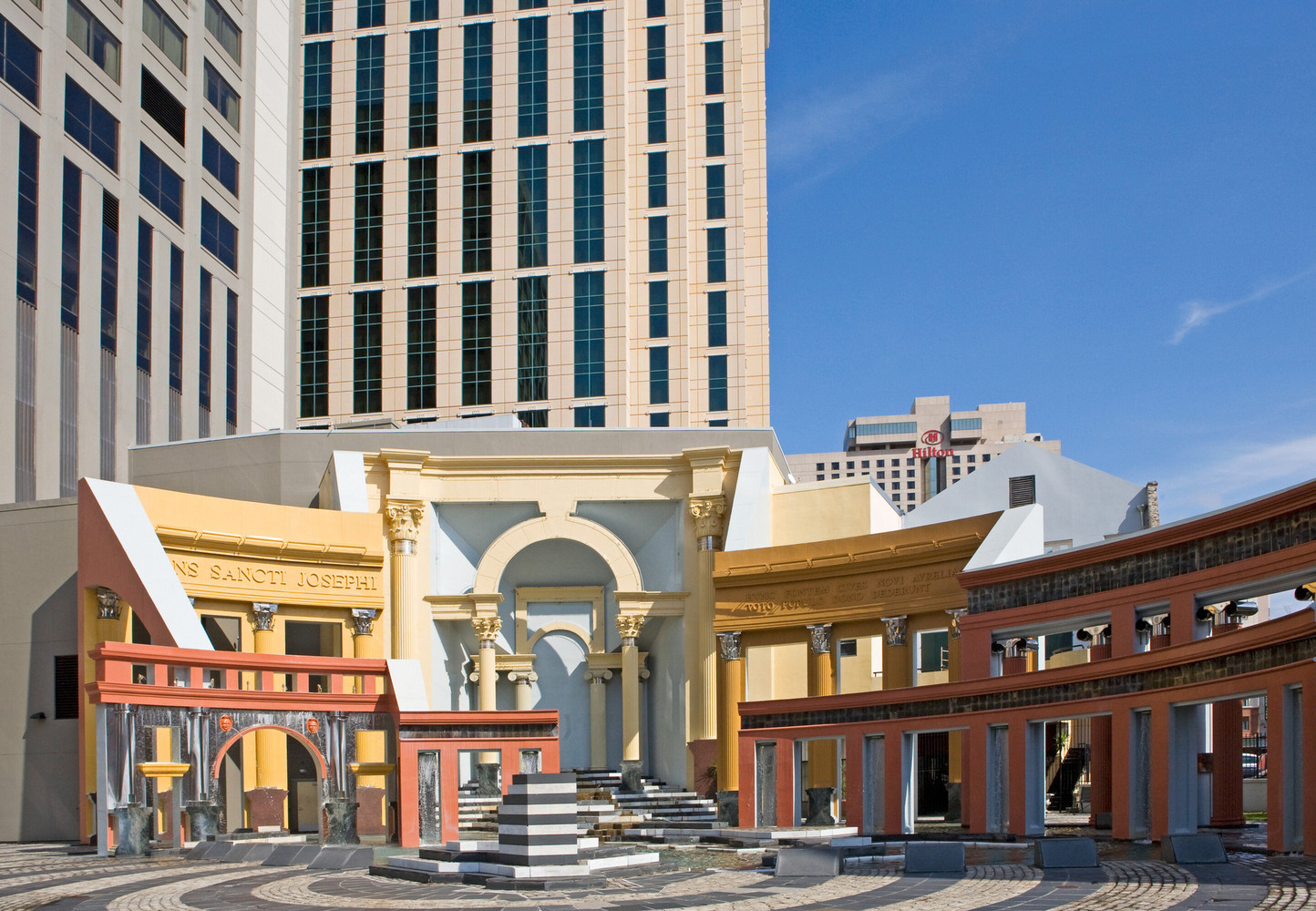
Completed in 1978, Charles Moore’s Piazza d’Italia in New Orleans is one of the most exuberant examples of postmodern architecture. This public square features a bold collection of Italian Renaissance architectural elements—columns, arches, and fountains—reinterpreted with neon lighting, stainless steel, and vivid colors. The design exemplifies the postmodernist approach of combining historical references with contemporary materials and irreverent humor. Though the piazza fell into disrepair, it was fully restored in 2004 and remains a key example of how postmodernist architects used public space to celebrate cultural identity.
Post Modernist Architects Who Shaped the Movement
The postmodern movement was driven by a group of visionary post modernist architects who challenged the status quo and redefined what buildings could communicate. Understanding these architects of postmodernism helps us appreciate the intellectual depth behind the playful facades.
Robert Venturi (1925–2018) is widely considered the father of postmodern architecture. His books Complexity and Contradiction in Architecture (1966) and Learning from Las Vegas (1972) provided the theoretical framework for the movement. His built works, including the Guild House and the Vanna Venturi House, served as tangible manifestations of his ideas.
Denise Scott Brown (born 1931) was Venturi’s partner in both life and practice. An architect and urban planner, she brought a sociological perspective to postmodernism, advocating for buildings that responded to the needs and preferences of real people rather than abstract ideals.
Michael Graves (1934–2015) was instrumental in bringing postmodernism into the mainstream with projects like the Portland Building. His colorful, referential designs became synonymous with the movement.
Philip Johnson (1906–2005) made a dramatic shift from modernism to postmodernism, most famously with the AT&T Building. His ability to bridge both movements made him one of the most influential figures in 20th-century architecture.
Charles Moore (1925–1993) is best known for the Piazza d’Italia and for designs that embraced regional identity, color, and historical allusion. His approach demonstrated that postmodern buildings could be deeply rooted in local culture.
Other notable post modernist architects include James Stirling, Terry Farrell, Aldo Rossi, Arata Isozaki, and Ricardo Bofill—each of whom contributed unique regional interpretations to the global movement.
Postmodernism Interior Design: Bringing the Style Indoors
While postmodernism is most often discussed in the context of buildings and facades, post modernism interior design has had an equally significant impact on how we experience spaces. Postmodern interiors reject the stark minimalism of modernist spaces in favor of bold colors, eclectic furnishings, playful patterns, and unexpected material combinations.
Key elements of postmodernism interior design include the mixing of historical styles—such as placing a classical column next to a pop-art print—the use of bold geometric patterns, terrazzo floors, Memphis Group-inspired furniture, and the integration of humor and irony into spatial design. Designers like Ettore Sottsass and the Memphis Group brought postmodern principles into furniture and product design, creating objects that were as much about cultural commentary as they were about function.
In recent years, there has been a notable resurgence of interest in post modernism interior design, with contemporary designers drawing on postmodern color palettes, geometric motifs, and playful forms to create spaces that feel both nostalgic and fresh.
Postmodern Housing and Residential Design
Beyond iconic public buildings, postmodern architecture also found expression in residential design. Postmodern houses and postmodern housing developments challenged the uniformity of modernist residential planning by embracing variety, color, and contextual sensitivity.
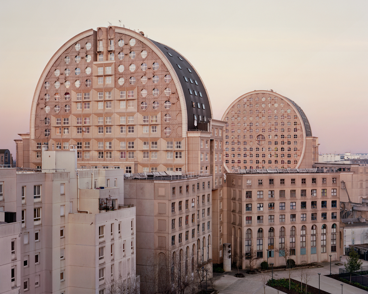
Notable examples of postmodern housing include the Piramides development in Amsterdam by Soeters van Eldonk Architecten, which features whimsical pyramid-shaped rooftops that play with scale and form. In France, the Espaces d’Abraxas complex in Noisy-le-Grand, designed by Ricardo Bofill, transforms social housing into a monumental neoclassical composition that blurs the line between everyday living and theatrical grandeur.
The postmodern house design philosophy extends beyond aesthetics—it also prioritizes the lived experience of residents. Unlike the austere modernist box, a post modern house might feature varied ceiling heights, unexpected window placements, playful facade treatments, and interior spaces that encourage exploration and delight. This approach to residential design continues to influence architects working on innovative housing projects today.
Christo and Jeanne-Claude: Wrapping Landmarks in Fabric
When discussing postmodernism’s broader cultural impact, the work of artists Christo and Jeanne-Claude deserves special mention. Known for wrapping large architectural landmarks in fabric, the Bulgarian-born Christo (1935–2020) and Moroccan-born Jeanne-Claude (1935–2009) created monumental, temporary installations that transformed how people perceived familiar public spaces. Their most celebrated projects include the Wrapped Reichstag in Berlin (1995), the Pont Neuf Wrapped in Paris (1985), and The Gates in New York City’s Central Park (2005).
Their practice embodied key postmodern principles: challenging established perceptions, blurring the boundaries between art and architecture, and engaging directly with public space and cultural memory. By wrapping entire buildings and landscapes in fabric, Christo and Jeanne-Claude invited millions of viewers to see architectural landmarks with fresh eyes—a fundamentally postmodern act of reinterpretation.
Post Modern Architecture Examples Around the World
The influence of postmodernism in architecture extends far beyond the United States. Here are additional post modern architecture examples that demonstrate the movement’s global reach:
SIS Building, London (1994) — Designed by Terry Farrell, the headquarters of the British Secret Intelligence Service (MI6) combines Mayan and Aztec references with contemporary materials. It is one of the most prominent examples of postmodernist architecture in Europe.
Neue Staatsgalerie, Stuttgart (1984) — James Stirling’s museum extension combines classical forms with bold, colorful accents and industrial materials, making it a textbook example of postmodern style architecture.
Humana Building, Louisville (1985) — Another masterwork by Michael Graves, this office tower layers classical and Art Deco references in a composition that is both monumental and playful.
Dancing House, Prague (1996) — Designed by Frank Gehry and Vlado Milunić, this deconstructivist building—nicknamed “Fred and Ginger”—pushes post modern buildings into expressive, sculptural territory.
Bonnefantenmuseum, Maastricht (1995) — Aldo Rossi’s fine art museum along the River Meuse, with its distinctive dome and industrial references, showcases the Italian architect’s rationalist approach to postmodernism.
Legacy and Relevance of Postmodern Architecture Today
As of 2026, postmodern architecture continues to spark debate and inspire new generations of designers. While the movement’s heyday may have been the 1980s and 1990s, its influence is clearly visible in contemporary architecture’s embrace of color, historical reference, and contextual sensitivity. The renewed interest in aesthetic diversity in architectural design owes much to the groundwork laid by postmodernist architects.
Many of the most significant postmodern buildings have been recognized with landmark status and preservation efforts. The Portland Building underwent a major renovation completed in 2020, and 550 Madison Avenue was redesigned by Snøhetta in 2022. These preservation projects confirm that postmodern architecture is no longer merely a historical curiosity but a valued part of architectural heritage.
For students, architects, and design enthusiasts exploring the movement, understanding these examples of postmodern architecture provides essential insight into how buildings can communicate culture, challenge norms, and celebrate the richness of human experience. The postmodern legacy reminds us that architecture is never just about structure—it is always, fundamentally, about meaning.
- architect of postmodernism
- definition of postmodern architecture
- example of postmodernism
- examples of postmodern architecture
- examples of postmodernism
- Guggenheim Museum Bilbao
- Guild House
- Le Pave Neuf
- Modern Architects
- Modern Architecture
- Modern Architecture Examples
- modern famous architecture
- Modern House Design
- Modern Houses
- Piazza d’Italia
- post modern architect
- post modern architects
- post modern architecture
- post modern architecture examples
- post modern buildings
- post modern house
- post modern house design
- post modern houses
- post modern style
- post modernism architecture
- post modernism interior design
- post modernist architects
- post modernist architecture
- post post modern architecture
- postmodern arch
- postmodern architects
- Postmodern Architecture
- postmodern architecture examples
- Postmodern Buildings
- postmodern house
- postmodern houses
- postmodern housing
- postmodern style architecture
- postmodernism architecture
- postmodernism architecture definition
- postmodernism buildings
- postmodernism house
- postmodernism in architecture
- postmodernism in architecture characteristics
- postmodernisme architecture
- postmodernist architecture
- what is postmodern architecture
- what is postmodernism in architecture
- who is known for wrapping large architectural landmarks in fabric
2 Comments
Submit your architectural projects
Follow these steps for submission your project. Submission FormLatest Posts
Strong Personal Brand Online: 9 Steps Every Architect Should Take
A focused guide for architects who want to build a strong personal...
Proportion in Architecture: Why Every Architect Should Master This Principle
Proportion in architecture governs the dimensional relationships between a building's elements and...
Al-Masjid an-Nabawi Architectural Styles: The Evolution of a Sacred Core
A detailed look at how Al-Masjid an-Nabawi evolved from a palm-trunk courtyard...
Why Removing Old Stumps Can Boost Your Property’s Value
Table of Contents Show Understanding the Impact of Stumps on Property ValueFirst...







This article talks about postmodern architecture and how it changed the way buildings are designed. I learned some new things, but I don’t know much about architecture, so it’s hard to have a strong opinion.
I really loved how the article explained the playful nature of postmodern architecture! It’s fascinating to see how it embraces historical references and colorful designs, like in the Piazza d’Italia. I appreciate that architects now focus more on local identity and cultural symbolism rather than just functionality. It makes buildings feel more connected to their surroundings!