- Home
- Articles
- Architectural Portfolio
- Architectral Presentation
- Inspirational Stories
- Architecture News
- Visualization
- BIM Industry
- Facade Design
- Parametric Design
- Career
- Landscape Architecture
- Construction
- Artificial Intelligence
- Sketching
- Design Softwares
- Diagrams
- Writing
- Architectural Tips
- Sustainability
- Courses
- Concept
- Technology
- History & Heritage
- Future of Architecture
- Guides & How-To
- Art & Culture
- Projects
- Competitions
- Jobs
- Events
- Store
- Tools
- More
Successful Architectural Presentation Boards #2
In this article series of “Successful Architectural Presentation Boards”, we will continue to talk about beautiful presentation sheets examples.

Table of Contents Show
Presentations are visual tools that you can use to represent your architectural projects and accomplishments. Presentations for architecture are created for both juries and submissions during the student years and for clients throughout the professional life. In this article series of “Successful Architectural Presentation Boards”, we will continue to talk about beautiful presentation sheets examples.
Using architectural presentation boards, architects showcase their various scaled projects. While discussing the value of architectural presentation sheets in this post, we’ll also provide you with some of the best presentation board examples. There are a few steps you must take if you want to improve both yourself and how you prepare your architectural presentation boards. First off, regardless of the scope of your project, from presentations of interior design projects to urban design, your reference usually stems from the concept. Every stage of the design process involves the architectural concept. The presentation board’s layouts, color schemes, font preferences, and design language are all influenced by your concept.

It is crucial to arrange the poster contents in architectural presentation sheets in accordance with their subjects. We don’t want the jurors evaluating your presentation to study analyses while also reviewing your concept project. You can select well-designed layouts and sheets divided by straightforward design language to present your project in the most effective way possible with all of its phases.
Different Types of Architectural Presentation Boards
Architectural presentation boards can be of different types to present your project. These types vary depending on the type of project, the identity of your brand or office, and the formats requested from you if you are a student. In this section, we will examine different types of architectural presentation sheets through examples.
Presentation Sheets with Unique Collages
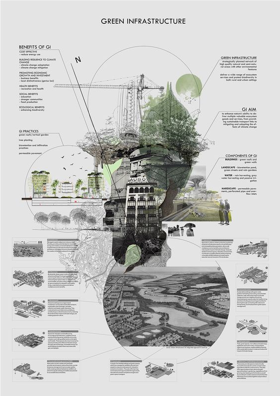
If you have unusual collages, use them in your presentations! Why?
Because architectural presentations are great opportunities to show our talents. If you can do abstraction and you are confident in your graphic design skills, you should prepare such presentation sheets. You don’t need to design any templates and think about layouts, if you can express your ideas in an abstract way with great collages, don’t hesitate.
As we have seen in two different presentations by the same architect, the technique may not change even if the topics and the purpose of the presentation board change.
Minimalist Design Presentation Sheets
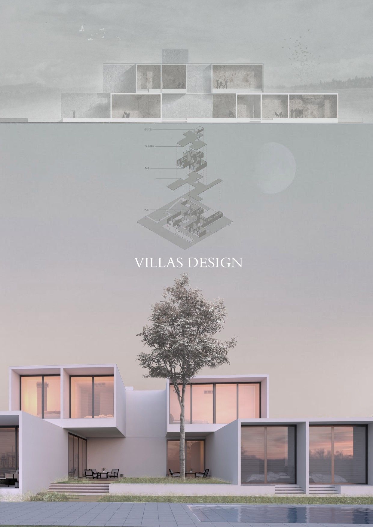
Do you know that it is possible to cover the negative aspects of your project in presentations? It is possible to make great presentations about them by highlighting only the right details and features. The common point we see in the presentation sheets with minimalist designs is that the projects look really professional no matter how they are prepared. If you want your design to look more professional and error-free, try to think simple!
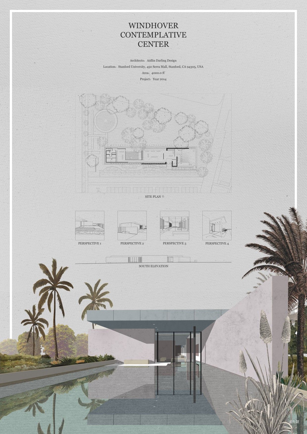
Sometimes simple and minimalist thinking can be harder than even complex designs, but if we look at the results, great presentations are made. Boards with minimalist designs are usually centered around a few quality renders in terms of color and style. Using the minimalist style on the presentation board provides great advantages in the presentation of architectural projects, especially in professional life. It may not be very suitable for competition projects or final submissions.
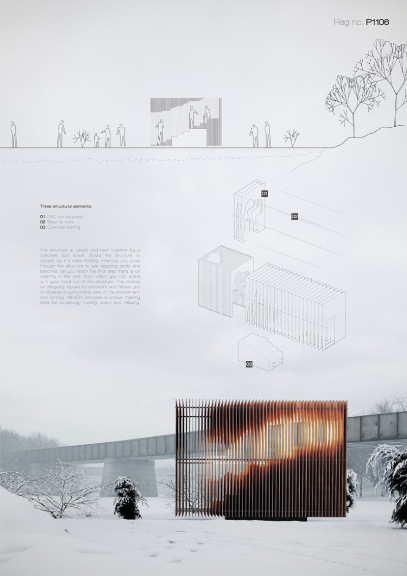
One-Colored Presentation Sheets
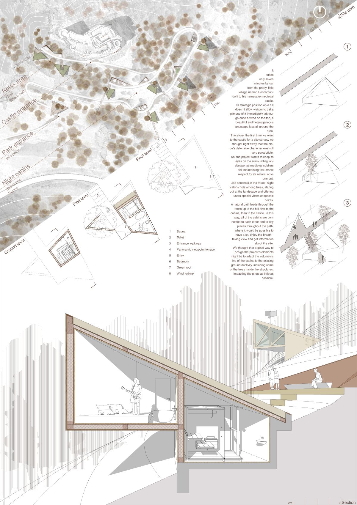
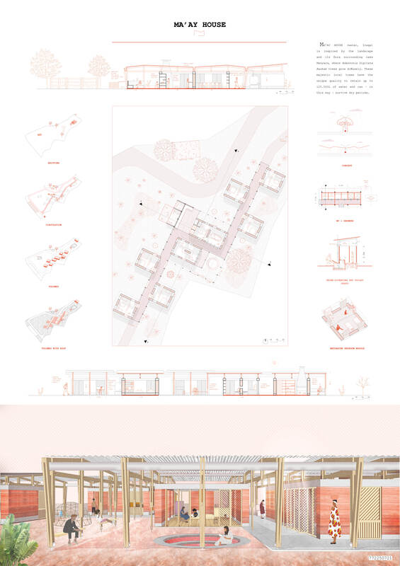
Monochrome presentations are a method preferred by some architects in their presentations. Although the first thing that comes to mind when we say monochrome is black and white, it is also possible to complete the drawings in the dominant color and achieve great results. As you can see in the examples, you might consider making such presentation boards to better understand the drawings and highlight your concept.

- arch projects presentation
- architectural presentation
- Architectural Presentation Boards
- architectural presentation boards guide
- architectural presentation sheets
- Architecture Student Presentation
- Fonts for Presentation
- How to create architectural presentation
- how to prepare jury presentation
- jury presentations
Submit your architectural projects
Follow these steps for submission your project. Submission FormLatest Posts
Successful Architectural Presentation Boards: Design & Layout
Architectural presentation boards are essential visual communication tools for architects and students...
Architecture Presentation Boards: Best Examples & Layout Tips
Discover successful architecture presentation boards featuring landscape layouts, construction detail boards, and...
10 Best Architecture Sheets by Students | Layout Examples 2026
Discover 10 outstanding architectural presentation sheets created by architecture students. From neighborhood...
How to Use Color and Layout in Your Architecture Presentation Board
An architecture presentation board becomes a powerful storytelling tool when color, layout,...




Leave a comment