- Home
- Articles
- Architectural Portfolio
- Architectral Presentation
- Inspirational Stories
- Architecture News
- Visualization
- BIM Industry
- Facade Design
- Parametric Design
- Career
- Landscape Architecture
- Construction
- Artificial Intelligence
- Sketching
- Design Softwares
- Diagrams
- Writing
- Architectural Tips
- Sustainability
- Courses
- Concept
- Technology
- History & Heritage
- Future of Architecture
- Guides & How-To
- Art & Culture
- Projects
- Interior Design
- Competitions
- Jobs
- Store
- Tools
- More
Successful Architectural Presentation Boards #3
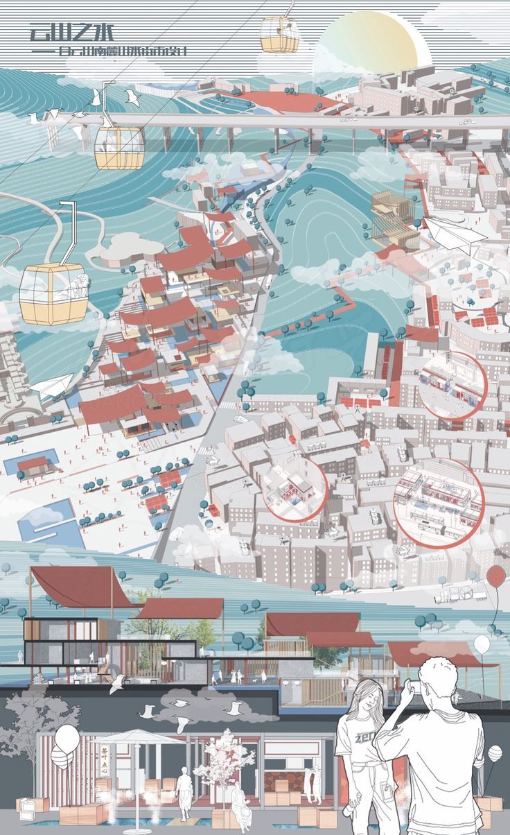
Presentation boards are a great way for an architect to present their building concept to the client. There are a few guidelines that need to be followed when designing one. In this article, we are together with 3 of the series in which we give examples of successful architectural panels.

Presentation boards are a great way for an architect to present their building concept to the client. There are a few guidelines that need to be followed when designing one. In this article, we are together with 3 of the series in which we give examples of successful architectural panels. In the continuation of the article, you will examine examples of successful architectural posters, as in the previous articles of the series. We wish to inspire all students and architects preparing for competitions.

An architectural presentation board is a large drawing board on which the architect displays drawings and other visuals (such as renders) to help communicate the design proposal. To begin with the presentation board, it should be two-sided and have a clean layout. The designer needs to ensure that they have enough content in order to keep the audience engaged. In addition, they should avoid using clip art or unnecessary images.
Being an important part of any architectural design development, presentation boards can be created using different software including for example, Adobe Photoshop or Revit. You can create your own presentation board by using following steps:
- Arrange the technical drawings consisting of architectural representations that you have prepared for your projects according to their colors and textures so that they are compatible on your presentation board.
- Bring together your drawings in harmonious colors and textures by creating a suitable template. Allocate more space to the content you want and trust to be at the forefront of the layout design.
- Write short and clear texts to explain your drawings, design process and diagrams. Share the texts in different areas on the presentation sheet so that it is easier to read.
Landscape Presentation Boards
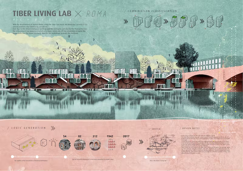
Among the presentation boards, vertical presentations presented as portraits are the most popular. However, using landscape, that is, vertically designed images, is also a good alternative. We recommend you to use horizontal posters and presentation boards, especially for non-printed digital presentations.
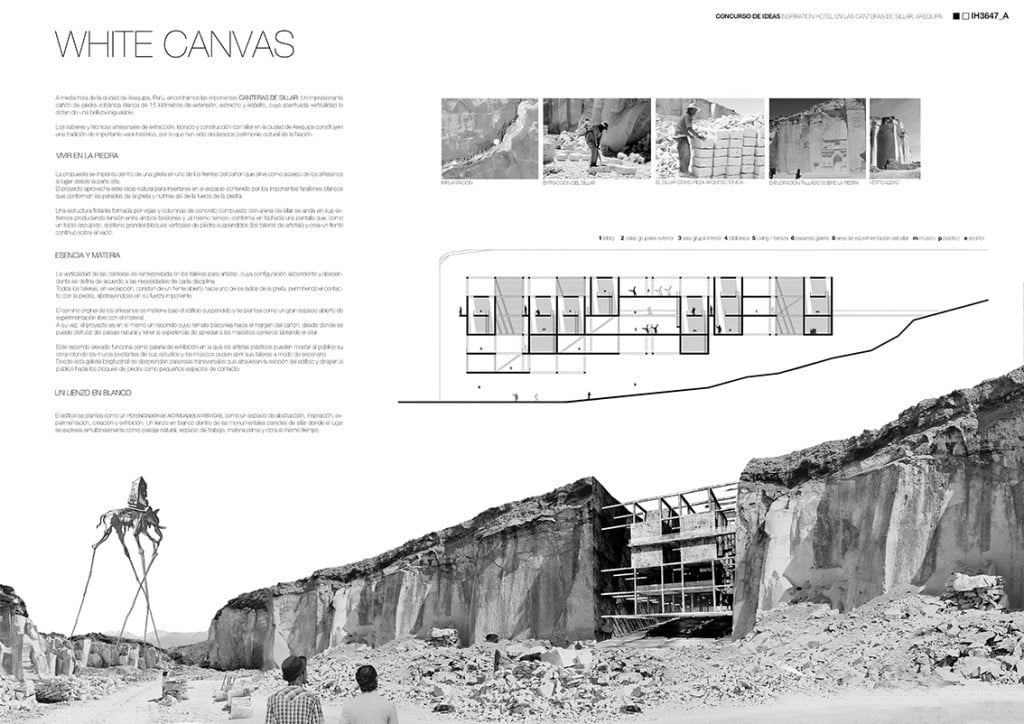
In landscape boards, architects often fit a lot of images and drawings into a small number of posters. Having a lot of content on the vertical ones compared to the vertical boards makes a positive impact. Because the human eye is more suitable for reading and examining something horizontally. While recommending simplification in vertical boards, you can prepare fuller posters for the boards you design as lanscape.
Presentation Boards with Construction Details

When designing a building, architects are responsible for everything from all the building and construction details to their conceptual design, but also to show them in the best possible way. That’s why we need to include presentation boards with construction details among the best examples when we tell you about architectural poster designs. This type of boards are mostly needed by architects for architectural competitions or for final submissions of architectural students’ project courses. As you can see in the examples, the most important thing in the technical drawing presentation boards where the construction details are shown is clean and clear drawings.
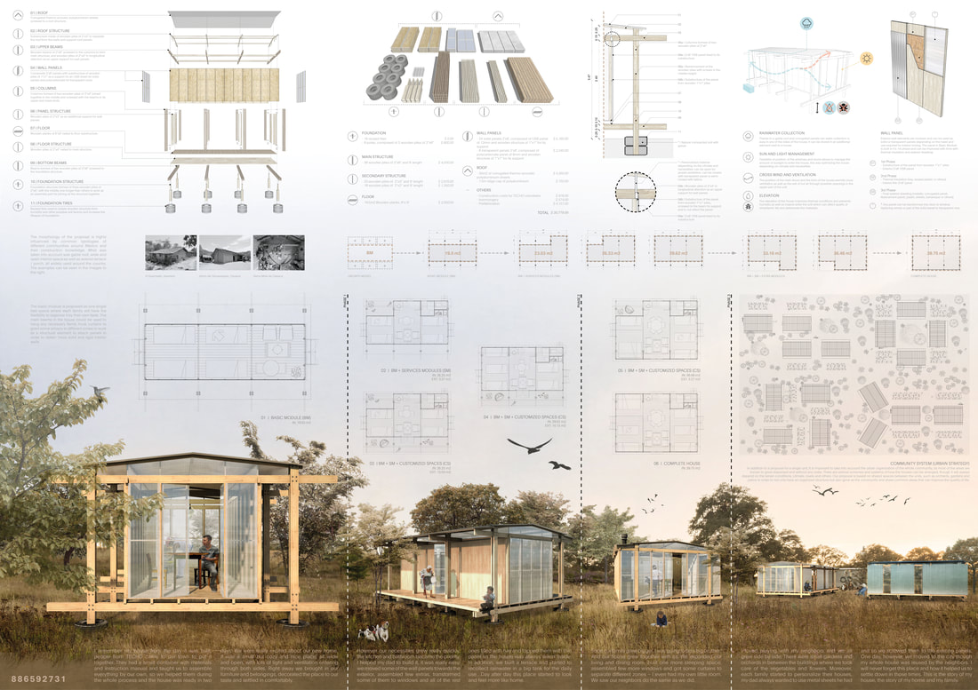
The best alternative for these drawings is always to add the clean drawings to the boards. We recommend that you pay close attention to technical rules and details, as the presentations where you show the construction details will be reviewed by professionals.
Collage Presentation Boards

Have you ever thought of showing your ideas in an abstract way by displaying your collage skills on presentation boards?
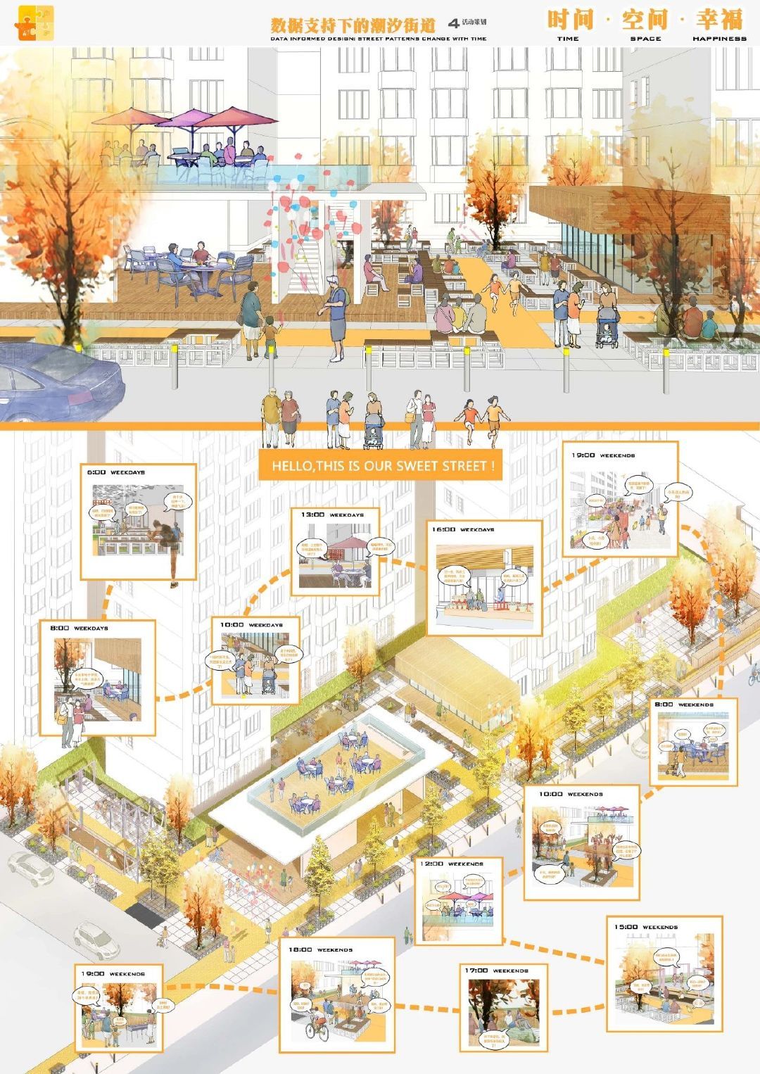
We advise all architects who rely on their graphic design and collage skills to prepare original presentation boards, as well as sample posters.

- arch projects presentation
- architectural presentation
- Architectural Presentation Boards
- architectural presentation boards guide
- architectural presentation sheets
- Architecture Student Presentation
- Fonts for Presentation
- How to create architectural presentation
- how to prepare jury presentation
- jury presentations
Submit your architectural projects
Follow these steps for submission your project. Submission FormLatest Posts
How to Create Better Architectural Presentations: Layout, Diagrams, and Storytelling Tips
Architectural presentations are about more than showing drawings—they’re about communicating ideas clearly,...
How to Use Color and Layout in Your Architecture Presentation Board
An architecture presentation board becomes a powerful storytelling tool when color, layout,...
Enhancing Architectural Presentations: Leveraging Visual Storytelling Tools
In architecture, a design’s brilliance is only as effective as its presentation....
Best Portable Projectors for Architectural Presentations
Architects are constantly presenting their ideas, whether it’s showing design concepts to...






Leave a comment