

Presenting Architectural Projects: 6 Portfolio Tips
A practical look at presenting architectural projects within a portfolio, covering project sheets, the balance of drawings and renders, sequencing for impact, and storytelling captions.
 Furkan Sen8 September 20246 Mins read638

Table of Contents Show
Presenting architectural projects well means turning each design into a clear, visual story rather than a stack of images. Strong project sheets pair a lead image with a short concept statement, ordered drawings, and honest captions, so reviewers grasp your intent in seconds and want to keep reading.
Most portfolios fail at the project level, not the cover. A reviewer spends roughly a minute on each spread, so how you present architectural projects decides whether your skills land or get skipped. This guide focuses on the individual project page: the sheet layout, the balance between drawings and renders, the order you place work in, and the narrative that ties a single project together. For advice on assembling the wider portfolio, see our guide on building an architectural portfolio that stands out.
What Makes Presenting Architectural Projects Effective?
Effective project presentation answers three questions fast: what is it, what problem did it solve, and what did you contribute. When a reviewer can read those answers from a single spread, the project works. Clarity beats volume here. A tightly edited set of six to eight architecture portfolio projects, each presented with intent, reads stronger than fifteen crammed pages.
Treat every project as a mini case study. Open with the result, then show the process that earned it. This order respects how people actually scan a page, top to bottom, image first, text second.
💡 Pro Tip
Build each project around one hero image and one core idea. When reviewing a draft sheet, cover the text and ask whether the design still reads. If it does not, your visuals are doing too little and your captions are doing too much.
Building a Strong Project Sheet
The project sheet is the unit of a portfolio. Give each project a consistent grid so the reader’s eye learns where to look: title and location top-left, hero image dominant, supporting drawings below, a short text column to the side. Repeating this structure across projects makes your work feel deliberate.
Cover Image and First Impression
Lead with your single best visual. This might be an exterior render at dusk, a section perspective, or a model photograph, whatever communicates the design idea most directly. Give it room to breathe rather than tiling four small images of equal weight. The first image sets the tone for everything that follows.

📐 Technical Note
Export images for print at 300 DPI and for screen at 72 to 150 DPI. A page set at A3 (297 by 420 mm) needs roughly 3500 by 4960 pixels at 300 DPI for sharp printing. Keep a high-resolution master of every drawing so you can repurpose sheets without quality loss.
Concept Statement and Narrative
Below the hero image, write two or three sentences that state the concept in plain language. Name the site condition, the design move, and the outcome. Skip the poetic preamble. A line such as “A folded roof channels rainwater to a central court while shading the south facade” tells a reviewer more than a paragraph of abstract language.
Drawings vs Renders: What to Include
Renders sell the atmosphere; drawings prove the thinking. A page heavy on glossy renders with no plans reads as styling, while a page of pure technical drawings reads as documentation. The strongest project sheets pair them. Show the render that captures the experience, then the plan, section, and a diagram that explains how the design works.
⚠️ Common Mistake to Avoid
Filling a project page with renders only and hiding the plans. Reviewers, especially at firms, want to confirm you can resolve a building, not just style a view. Always include at least one plan and one section per project, even on a visually driven spread.
Using Diagrams to Explain Intent
Concept diagrams carry a lot of weight on a single sheet. A three-step massing diagram or a simple circulation arrow can explain a design decision faster than any caption. Keep diagrams in a consistent line weight and color so they read as a set. Tools for producing clean diagrams and drawings are covered in our roundup of digital tools for independent architects.
Quick Reference: Project Page Elements
The table below maps the core elements of a project sheet to their purpose and a practical tip for each.
| Element | Purpose | Tip |
|---|---|---|
| Cover image | Sets tone, draws the eye in | One dominant visual, not four equal thumbnails |
| Concept statement | States the idea in plain words | Two to three sentences, no jargon |
| Drawings | Prove technical resolution | Include at least one plan and section |
| Renders | Convey atmosphere and material | Pick the view that explains the design |
| Captions | Guide reading, add context | Short, factual, placed near the image |

Sequencing Projects for Impact
Order matters as much as content. Open with your strongest project and close with your second strongest, since reviewers remember the first and last things they see. Place weaker or supporting work in the middle. Within a single project, sequence the spread from result to process: hero image, then plans and sections, then sketches and study models that reveal how you got there.
📌 Did You Know?
Eye-tracking studies on page layout consistently show readers follow an F-shaped or Z-shaped scan, concentrating on the top and left of a spread first. Placing your project title and hero image along that path means your key information lands where attention naturally goes.
Keep transitions between projects clean. A consistent divider, a repeated title position, or a thin section break signals “new project” without a hard page of text. The reader should always know where one project ends and the next begins.
Storytelling Within a Single Project
A project page is a short story with a setup, a tension, and a resolution. The setup is the site and brief, the tension is the constraint or problem, and the resolution is your design response. When you present architectural projects this way, even a small student scheme reads as considered work.
Anchor the story in specifics. Instead of writing that a design “responds to context,” show the awkward corner site and the move that solved it. Pair a problem photo or diagram with the solution drawing so the cause and effect sit side by side. Captions are your narrator here, so keep them factual and tied to what the reader is looking at.

Tailoring the Story to Your Audience
Adjust emphasis for who is reading. A firm focused on sustainable design will want to see environmental logic, so lead with the diagram that shows shading or airflow. An academic reviewer may care more about concept and research. The projects stay the same; the captions and the order you reveal them shift. For deeper context on environmental design thinking, our piece on sustainable architecture across cities is a useful reference.
How Do You Present Architecture Projects in an Interview?
In a live review, talk through three to five projects, not your entire portfolio. Open each with a one-sentence summary, walk the reviewer from concept to detail, and pause for questions. Let the drawings carry the technical points so you can speak to the decisions behind them. Platforms such as architecture projects on Behance are worth studying to see how working professionals stage a single project for a screen audience.
Frequently Asked Questions
How many projects should a portfolio include?
Six to ten projects is a reliable range for most architects and students. Quality and presentation matter more than count. A focused set where every architecture portfolio project is fully resolved reads stronger than a long list of half-finished pages.
Should I show renders or technical drawings?
Show both. Renders communicate atmosphere and material, while plans, sections, and diagrams prove you can resolve a building. A balanced spread with one strong render plus at least one plan and section gives reviewers confidence in both your design eye and your technical skill.
How much text should each project have?
Keep it short. A two to three sentence concept statement plus brief, factual captions is usually enough. The drawings and images should carry most of the message, with text guiding the reader rather than explaining what the visuals already show.
What is the best order to present projects?
Start with your strongest project and end with your second strongest, since first and last impressions stick. Place supporting work in the middle. Within each project, move from the finished result toward the process drawings that explain how you reached it.
How do I make a student project look professional?
Use a consistent grid, clean line weights, and a single concept per page. Treat the project as a case study with a clear problem and response. Strong layout and honest captions can make academic work read as professionally as built projects. The professional standards published by the RIBA knowledge resources and the American Institute of Architects are good benchmarks for how finished work is communicated, and design media such as ArchDaily show how single projects are framed for a wide audience.
Your Next Step
Pick your strongest project, rebuild its sheet around one hero image and a three-sentence concept statement, then add a plan, a section, and one diagram. Once that single page reads cleanly, use it as the template for every other project in your portfolio.






Concept Diagram Architecture: Hand-Rendered vs Digital Diagrams in a Portfolio
Hand-rendered and digital diagrams send different signals to portfolio reviewers. This piece...
Furkan Sen5 Mins read
Hand-Rendered vs Digital Diagrams: What Works Better in a Portfolio?
A practical breakdown of hand-rendered and digital diagrams in architecture portfolios, covering...
 Sinan Ozen6 Mins read
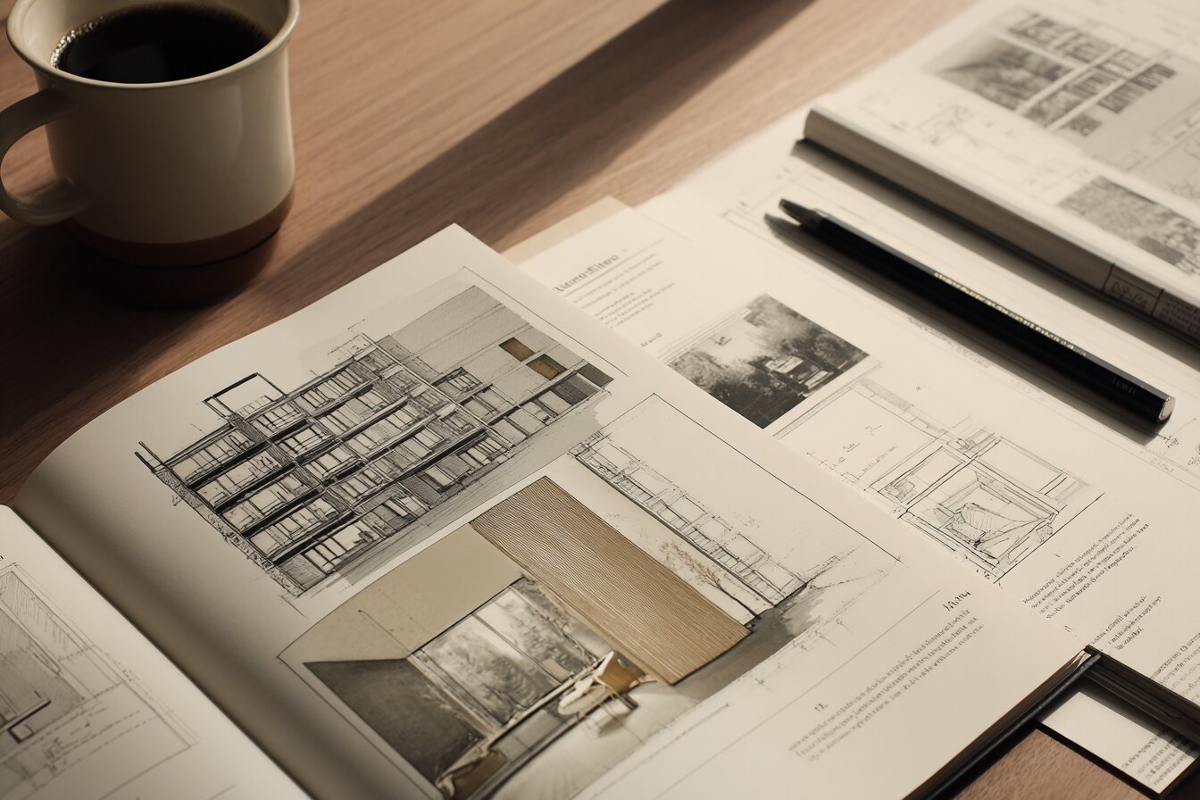
Architecture Portfolio Layout: Designing Pages with Grid and Typography
A focused look at architecture portfolio layout, from setting up a column...
 Elif Ayse Sen8 Mins read
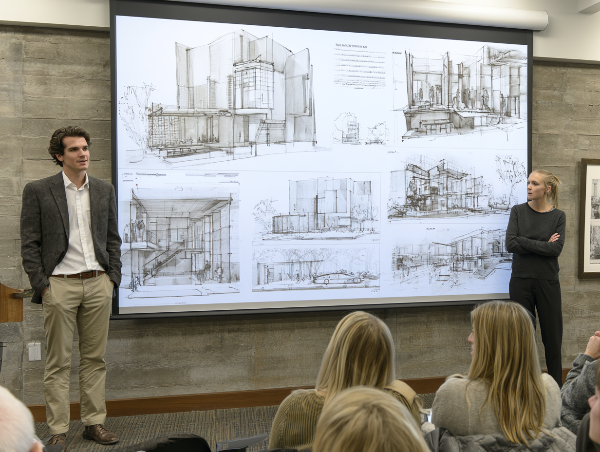
How to Present Your Work in an Architecture Portfolio Interview
Reaching the interview means your work earned a closer look, but presenting...
Furkan Sen7 Mins read


Leave a comment