- Home
- Articles
- Architectural Portfolio
- Architectral Presentation
- Inspirational Stories
- Architecture News
- Visualization
- BIM Industry
- Facade Design
- Parametric Design
- Career
- Landscape Architecture
- Construction
- Artificial Intelligence
- Sketching
- Design Softwares
- Diagrams
- Writing
- Architectural Tips
- Sustainability
- Courses
- Concept
- Technology
- History & Heritage
- Future of Architecture
- Guides & How-To
- Art & Culture
- Projects
- Competitions
- Jobs
- Events
- Store
- Tools
- More
Exploring Minimalist Facade Design: The Lasting Trend in Architecture
Discover the lasting trend of minimalist facade design in architecture. This insightful article explores how the use of simple geometries, raw materials like concrete and glass, and natural light can redefine architectural spaces. Dive deeper into the core principles of minimalist design and learn how it allows each project to tell its own unique story.

Table of Contents Show
In the bustling world of architecture, we’re witnessing a dynamic shift towards minimalist facade design. It’s a trend that’s not only transforming skylines around the globe, but also redefining our understanding of aesthetics in built environments.
Minimalist facade design strips architecture to its bare essentials, focusing on simplicity and functionality. It’s a design ethos that values less over more, and silence over noise. This approach, while seemingly stark, can result in strikingly beautiful and profoundly meaningful spaces.
As we delve into the world of minimalist facade design, we’ll explore its principles, its impact, and why it’s capturing the imaginations of architects and designers worldwide. So, let’s embark on this architectural journey together, exploring the beauty in simplicity and the power of understated elegance.

Importance of Minimalist Facade Design in Architecture
When it comes to crafting structures that leave significant impression, architects and designers are turning to minimalist facade design. Let’s dive in deep into the importance of this transformative approach in contemporary architecture.
Enhancing Visual Appeal
The minimalist approach remains integral in structuring more refined, simple, and visually appealing facades. Less is indeed more in this scenario. The subtraction of excess elements provides a heightened sense of clarity and comprehension. As a result, complex impressions are decoded into simpler forms that immediately grab attention and evoke emotions.
By reducing noise and clutter, minimalist facade design unveils the authentic beauty of raw materials. Think of unadorned concrete, timber, or glass. The charm of beautiful spaces lies in their capacity to connect with people at a deeper level. Minimalist designs achieve this connection due to the authenticity and clarity they exude.
Creating a Timeless Look
Another pivotal role of minimalist facade design lies in its ability to contribute a timeless look to architectural creations. Traditional design concepts can often find themselves outdated as styles change and evolve over time. However, minimalism transcends such fleeting trends. It’s an approach that remains consistently modern, appealing, and relevant.
Minimalist designs are not burdened by the trappings of ornate and opulent fixtures. They emphasize the essential, the bare, the pure. They linger in the minds of the viewers long after being seen, a testimony to their timeless allure.
Minimalist aesthetics steer clear from loud statements. They refrain from using ostentatious ornaments or flashy colors. Instead, they rely on subtle refinements, functional spaces, and judicious use of materials. This leads to a timeless architecture that continues to thrive with equally impressive vitality and significance.

Principles of Minimalist Facade Design
When we dive into the principles of minimalist facade design, we explore the foundations that lead to visually pleasing, emotionally resonant, and timeless architectural creations. This look is achieved through a careful application of two primary principles: Simplicity and Functionality.
Simplicity
In minimalist design, we often hear the saying, “Less is more”. This principle reflects in the facades of minimalist buildings. Clean lines, limited colors, and uncomplicated finishes are all indicative of minimalist design. It’s not about stripping down to the bare essentials but it’s about achieving a simplistic elegance that speaks for itself.
Creating a minimalist facade requires a meticulous design process that balances the use of raw materials and colors. Every element serves a purpose and nothing more. The use of raw materials, straight lines, and stark contrasts brings out an authentic aesthetic without unnecessary frills. This preserves the integrity of materials used and eliminates elements that do not carry weight. It’s all about bringing in the essentials and doing away with the superfluous – all while maintaining a harmonious balance that leads to a striking first impression.
Functionality
While beauty defines minimalist design, functionality is at its core. Minimalist facade design ensures that every piece serves a tangible need. This is where the facade’s design interacts and intertwines with the building’s structure.
In the minimalist design philosophy, form follows function. This means that the design does not compromise on the building’s functionality for aesthetic’s sake. Eliminating visual noise allows people to focus on the building’s actual functionality and purpose. This approach lets the architectural form be guided by practical considerations, which in turn influences how the facade looks. If an element doesn’t enhance usability or contribute to the building’s efficiency, it’s typically left out.
The functionality principle of minimalist facades can lead to layouts that are receptive and fluid, catering to the inhabitant’s needs. By optimizing space through clever design, we ensure that not a single corner of the building is superfluous or ornamental. Instead, the layouts and design choices promise utility and ensure that every corner is intrinsically functional.

Examples of Minimalist Facade Designs
Let’s explore the elegant authenticity of minimalist design through real-life examples. We’ve prepared a selection of minimalist facade designs spanning three crucial categories: residential buildings, commercial structures, and public spaces.
Residential Buildings
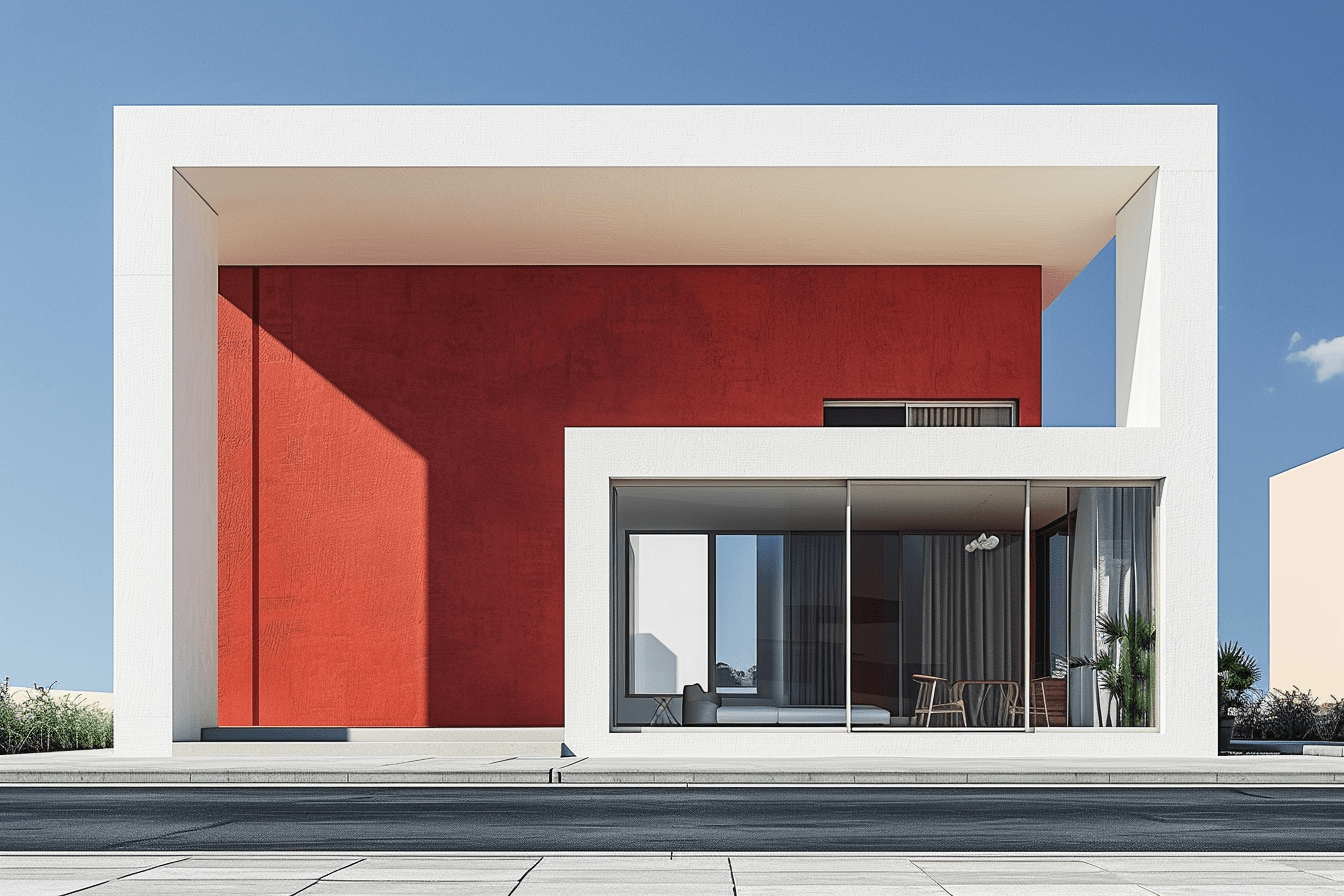
Take a tour through minimalist residential designs; they’re masterpieces that seamlessly blend functionality with aesthetics. Notable examples include the House in Paderborn by Matthias R. Schmalohr, where the architect encapsulated minimalist design principles with a stark white facade interspersed with expansive, clear glass sections. Bin House by Suppose Design Office in Japan bears testament to the marriage of raw concrete with glass and minimal ornamentation. The design’s striking structure creates an intimate connection between indoor and outdoor spaces.
Commercial Structures
Taking the leap into Commercial Structures, it’s easy to appreciate the optimization of space and functionality with minimalist design principles. Iconic examples include Tadao Ando’s Row House, which replaces the traditional aesthetic with a robust concrete facade. There’s also Savile Row by EPR Architects in London, boasting a sleek, glass-dominated facade that subtly mirrors its 18th-century counterparts.
Public Spaces
Finally, we move into Public Spaces, where minimalist design has redefined the communal experience. Examples here include The New Museum in New York, designed by SANAA, which celebrates concrete and glass in its distinct stacked-box design. Portugal’s Tavira Library, designed by AGi Architects, paradoxically adds character with its uncomplicated facade, suggestive of the beauty of simplicity.
Explore, rejoice, and immerse yourselves in these structures that redefine our perception of minimalist facade designs. In our next section, we’ll delve deep into the science behind this timeless design philosophy. Stay connected with us on this journey through simplicity and elegance.

Incorporating Minimalist Facade Design in Your Project
Each minimal design showcases a way of life, a way of thinking, and an architectural philosophy that predates the modern world. Minimalist facade design is more than aesthetics; it’s the architectural embodiment of less is more. The next phase takes us into the practical aspects of making this design philosophy a reality.
Choosing Materials
While materials like glass, raw concrete, and metal often dominate the minimalist scene, it’s important to recognize that the power lies not in the materials themselves but in the way they’re utilized. The minimalist design philosophy emphasizes the functional use of materials, making it necessary to understand the performance and application of chosen materials.
Raw concrete, for instance, is highly appreciated for its durability and versatility. It exudes a sense of strength and stability while maintaining a simplistic appeal. The House in Paderborn showcases these features excellently. On the other hand, glass forms a significant component of minimalist designs as it enhances openness, reflects light, and promotes a seamless transition between the interior and exterior environments. Tadao Ando’s Row House effectively demonstrates the captivating use of glass in minimalist design.

Utilizing Natural Light
Using natural light in minimalist design is not merely to brighten up spaces. It’s about enhancing the feeling of space, connecting with nature, and significantly reducing energy use. The design of the Bin House and Tavira Library exhibits a well-thought-out use of natural light. The use of large windows, glass walls, and open floor plans ensures that natural light reaches every corner of these buildings.
Remember that when you properly harness natural light through strategic placement of windows and building orientation, it adds character to your structure. Natural light breathes life into your design and gives an illusion of space in compact settings.
Embracing Clean Lines
Minimalist facade design thrives on simple geometries and unadorned surfaces. The clean lines create the visual calmness inherent in minimalist design while emphasizing the function. Savile Row by EPR Architects serves as an ideal example of a commercial structure presenting the power of clean vertical and horizontal lines in their facade design.
The boldness of straight lines and plain surfaces, the play of light and shadow, and the expressiveness of minimalist elements directly tie back to our earlier observation about the fusion of functionality and aesthetics. Hence, the clean lines are not stark features but an element that subtly communicates the building’s function.
In the journey of infusing minimalist principles into your project, remember that the minimalist architecture is not about stripping down to bare essentials instead it’s a thoughtful reduction to distil the essence of a design concept.

Conclusion
In exploring the vast realm of minimalist facade design, it’s worth remembering that the entire architectural industry is constantly evolving. Trends come and go, but certain fundamentals persist amid these fluctuating dynamics. Minimalism, with its focus on form, functionality, and a respect for materials, isn’t an overnight fad and doesn’t seem to be one either. Our exploration suggests that minimalist facade design is here to stay, fundamentally reshaping the way we visualize and utilize architectural spaces.
The choice of materials such as raw concrete and glass, as we’ve seen, defines the minimalist aesthetic. These elements are not randomly chosen, they’re carefully curated to serve a purpose in the design process. The careful use of these materials doesn’t just elevate the aesthetic element of the architecture, but also plays a pivotal role in enhancing the practical aspects.
Natural light, another hallmark of minimalist design, has been proven to not only create a sense of space but also foster a connection with nature. The dynamic interplay between interior spaces and the natural world is a trade-mark of minimalist architecture. The use of natural light and expansive glass facades opens up the physical spaces, intertwining them with the outside world. This ongoing conversation between the interior and exterior becomes a fundamental part of the architecture, going beyond the aesthetics to touch human lives in subtle yet significant ways.

When we talk about clean lines, one immediately thinks about designs such as Savile Row. Simple geometries, unornamented surfaces, and a frivolity-free stance are trademarks of minimalist architecture and are quintessential in achieving the iconic minimalist look. These clean lines and geometric forms aren’t just visually appealing, they also speak to the core principle of minimalism – simplicity.
As we delve further into the principles and practices of minimalist facade design, let’s always keep in mind one essential fact: Minimalist architecture is not about stripping down to bare essentials, but instead about distilling the essence of a design concept. Minimalist design lets each project tell its own story, shaping its narrative through the careful selection of materials, light, and geometry. Minimalism in facade design is about creating spaces that speak volumes through their silence, and making every choice count. There’s much more to explore as we continue our journey through minimalist design.
Submit your architectural projects
Follow these steps for submission your project. Submission FormLatest Posts
How Facades Tell Cultural Stories
How facades tell cultural stories—decode symbols, materials, and climate cues with regional...
Top 10 Examples of Dynamic Facade Designs Around the World
Dynamic facades are transforming contemporary architecture with systems that move, react, and...
Modern Facade Building Design: Parametric, Futuristic & Green
Explore modern facade building design trends including parametric algorithms, green living walls,...
8 Trends in Dynamic Facade Design You Need to Know
Dynamic façades are reshaping contemporary architecture by responding to climate, light, and...


Leave a comment