

10 Interior Design Rendering Tips for Photorealistic Results
A practical set of interior design rendering tips covering references, composition, lighting, textures, color, and post-processing, with a quick-reference table and answers to the questions render artists ask most.
 Elif Ayse Sen7 July 20246 Mins read446

Table of Contents Show
These interior design rendering tips help you turn flat 3D scenes into images that feel real. Success comes down to a few controllable factors: balanced lighting, accurate textures, thoughtful composition, and the right camera angle. Get these right and your renders read as photographs rather than computer models.
A convincing interior render sells the space before a single wall is built. Clients judge a room by how it looks on screen, so the quality of your visualization work shapes their trust in the whole design. The ten tips below come from working render artists and follow the full pipeline, from reference gathering to final post-processing.
10 Interior Design Rendering Tips at a Glance
The table below summarizes each tip, why it matters, and how to apply it in practice.
| Tip | Why it matters | How to apply |
|---|---|---|
| 1. Gather references | Grounds the scene in reality | Build a folder of photos and mood boards first |
| 2. Define mood and goals | Keeps every choice consistent | Write the purpose and feeling before you model |
| 3. Master composition | Guides the viewer’s eye | Use the rule of thirds and clear focal points |
| 4. Pick the right camera | Controls scale and realism | Shoot at eye level with a 24 to 35mm lens |
| 5. Balance lighting | Sets the mood and depth | Mix natural light with a few directional fixtures |
| 6. Control shadows | Adds three-dimensional weight | Keep soft contact shadows under furniture |
| 7. Use quality textures | Reads as real material | Apply high-resolution maps with correct scale |
| 8. Add imperfections | Breaks the CG look | Add wear, folds, and slight surface variation |
| 9. Build a color scheme | Ties the room together | Work from one palette with limited accents |
| 10. Refine in post | Lifts the final image | Adjust exposure, contrast, and color grading |
Set the Foundation Before You Render
1. Gather Strong Reference Images
Good renders start away from the software. Because you are trying to copy how real rooms look, real photos give you the best target. Collect images that match the style, materials, and lighting you want, then keep them open on a second screen while you work. Notice how light falls across a wood floor at different times of day, or how fabric bunches on a sofa. This habit is one of the interior design rendering tips that separates believable work from generic output.
Photograph your own surroundings too. A pattern on a facade or a color pairing in a cafe can feed directly into a future project and grow your personal material library.
2. Define the Mood and Goals First
Every render needs a clear brief. Start with the client’s vision, the room’s function, and the feeling you want to convey. Write it down. If the goal is a calm bedroom bathed in morning light, that decision drives your window placement, palette, and camera timing. Clear goals stop you from second-guessing choices halfway through and keep furniture, lighting, and color pulling in the same direction.
Get Composition and Camera Right
3. Master the Basics of Composition
A strong render borrows from photography. The rule of thirds splits the frame into nine parts, and placing key elements along those lines creates natural balance. Depth of field pulls attention toward what matters, while a defined focal point tells the viewer where to look first. Think about foreground, middle ground, and background so the image reads with layers instead of feeling flat.
📌 Did You Know?
The rule of thirds was first described by English artist and engraver John Thomas Smith in his 1797 book Remarks on Rural Scenery. Painters used it for landscapes long before it became a standard guide for photographers and 3D artists.
4. Choose the Right Camera Angle and Lens
Camera choice changes how a room feels. Eye-level angles give a natural, relatable view, while a slightly higher angle can make a compact space read as larger. Avoid extreme wide lenses that stretch walls and warp furniture. A focal length in the 24 to 35mm range keeps proportions honest. Set the camera up early and test a few positions before committing to a full-quality render, since angle problems are hard to fix later.

Light the Scene Like a Photographer
Lighting is the single biggest factor in a believable interior rendering. It reveals texture, defines space, and sets the emotional tone. The next two tips cover the balance between light sources and the shadows they create.
5. Balance Natural and Artificial Lighting
Natural light brings out the true color and grain of materials, so start there. Rotate the sun to match the time of day in your brief, whether that is bright midday or a low evening glow. Real-time tools such as Enscape and Lumion let you preview these shifts instantly. Then add artificial fixtures with restraint. Functional lights used everywhere flatten a room, while a few directional spots, a floor lamp, or a pendant build mood and highlight the features you care about.
📐 Technical Note
Color temperature is measured in Kelvin (K). Daylight sits around 5000 to 6500K and reads as cool and neutral, while warm interior bulbs fall near 2700 to 3000K. Matching your light temperatures to the scene keeps whites clean and prevents an unnatural color cast.
6. Control Shadows and Highlights
Shadows give a room its sense of weight and space. Soft contact shadows under furniture anchor objects to the floor, and gentle gradients across walls hint at contours the geometry alone cannot show. Highlights do the opposite job, drawing the eye to glossy or textured surfaces and adding sparkle to metal, glass, and polished stone. Rendering engines like V-Ray by Chaos handle global illumination and accurate shadow falloff automatically, but you still guide the result by placing lights with intent.
💡 Pro Tip
When a render looks flat, dim your fill lighting before adding more lamps. Most beginners over-light a scene, which erases the shadow contrast that makes a room feel three-dimensional. Start dark and add light only where the image needs it.
Make Materials and Color Believable
7. Use High-Quality Textures and Materials
Textures carry most of the realism in a render. Use high-resolution maps that genuinely represent wood, stone, metal, and fabric, and set their scale correctly so a floor plank or a brick reads at true size. Pay attention to roughness and reflectivity, since these control how a surface catches light. A material that is too glossy looks like plastic, while one with no reflection at all looks dead. Adjust these values against your reference photos rather than trusting the default settings.

8. Add Realism Through Imperfections
Perfect surfaces are the fastest way to reveal a render as computer-made. Real rooms have wear. Add slight scuffs on a wooden floor, soft folds in upholstery, a wrinkle in a rug, or a smudge on a glass table. Vary the placement of books, cushions, and plants so nothing looks cloned. These small touches, along with faint surface variation on paint and plaster, push an image from clean to convincing.
9. Build a Harmonious Color Scheme
Color sets the tone before a viewer notices anything else. Blues and greens calm a room, while warm reds and yellows raise its energy. Work from one main palette and treat bright accents as seasoning, not the main course. Analogous schemes, which use neighboring colors on the wheel, feel restful, while complementary pairs add contrast and life. Keep a consistent finish, matte or gloss, so mixed styles still feel like one coherent space. For direction on current palettes, our guide to interior design trends is a useful starting point.
⚠️ Common Mistake to Avoid
Avoid pure black and pure white in materials, and steer clear of fully saturated colors across large surfaces. Real materials almost never hit those extremes, so they read as fake. Pull whites slightly warm or cool and knock back saturation for a natural result.
Push Realism with Models and Post-Processing
10. Invest in Quality Models, Then Refine in Post
Detailed 3D models of furniture, fixtures, and decor give a render the fine detail that sells photorealism, from the stitching on a chair to the sheen of a polished counter. Optimized models also render faster, which matters when you are iterating for a client. Build a library you can reuse across projects and pick tools that fit your workflow, a choice covered in our roundup of 3D rendering software for architects and our list of Enscape alternatives.
Finish in post-processing. A short pass to adjust exposure, contrast, white balance, and subtle color grading can lift a good render into a striking one. Add a touch of chromatic aberration or a soft vignette if it suits the mood, but keep edits restrained so the image still feels like a photograph. Studios featured on ArchDaily rely on this final polish to make interiors read as real spaces.

Frequently Asked Questions
What are the most important interior design rendering tips for beginners?
Start with lighting, composition, and materials. Balanced light gives a scene depth, a considered camera angle makes it readable, and accurate textures make surfaces believable. Master these three before worrying about advanced effects, since they carry most of the realism in any interior render.
How do you make interior renders look realistic?
Realism comes from imperfection and accurate light. Use high-resolution textures at the correct scale, add soft contact shadows, and include small signs of wear like folds and scuffs. Match your color temperatures and finish with a light post-processing pass for exposure and contrast.
Which software is best for interior design rendering?
Popular choices include V-Ray, Enscape, and Lumion, each with different strengths in speed, realism, and ease of use. The right pick depends on the modeling program you already use and how fast you need previews. Real-time engines suit quick client reviews, while offline engines offer the highest final quality.
Why do my interior renders look flat?
Flat renders usually come from too much even lighting and not enough shadow contrast. Reduce your fill light, add a clear main light source, and let shadows build depth. Weak material variation and a missing focal point also make images feel lifeless.
What This Means for Your Next Project
Your Next Step: Pick one current render and audit it against this list, starting with lighting balance and shadow contrast, since those changes give the fastest visible improvement before you touch textures or post-processing.




From SketchUp View to Client-Ready Render: A Hands-On Look at Vizbase
Vizbase co-founder Mikus Zarāns shows how the browser-based AI renderer turns SketchUp...
 illustrarch Editoral Team4 Mins read
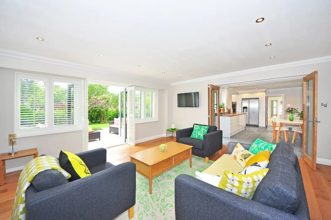
How Integrated Furniture Can Shape the Architecture of Urban Interiors
Most people treat furniture as the last decision in interior architecture, yet...
illustrarch Editoral Team2 Mins read
Architecture and Interior Design: Can Architects Specialize in Both?
Architects hold most of the skills interior design needs, from space planning...
 Furkan Sen5 Mins read

Best 3D Rendering Companies for Quick Turnaround Time
Discover the top 3D rendering companies that excel in delivering fast, quality...
illustrarch Editoral Team5 Mins read


Leave a comment