

Photorealistic 3D Rendering: A Practical How-To Guide
Master photorealistic 3D rendering by getting lighting, materials, and post-production right, the three factors that make architectural renders look like real photographs.
 Elif Ayse Sen16 May 20246 Mins read655

Table of Contents Show
Photorealistic 3D rendering is the process of producing architectural images so convincing they pass for photographs, achieved by controlling three things above all else: light, materials, and post-production. Get the physics of light right, build materials that respond to it correctly, and finish the image with careful color and depth, and a render stops looking computer-generated.
Most renders fail the photorealism test for predictable reasons. The lighting is flat, the surfaces look like plastic, or the final image skips any grading. This guide breaks down how to fix each of those, in the order that matters, so you can move from a clean but obviously digital image to one a client mistakes for a site photo. The same principles apply whether you work in V-Ray, Lumion, or any modern engine.

What Makes a 3D Render Look Photorealistic?
Photorealism comes down to how accurately your scene imitates the behavior of real light bouncing off real surfaces. A camera captures photons, not geometry, so the goal is to recreate the conditions a camera would actually see. Three factors carry most of the weight: the lighting setup, the physical accuracy of your materials, and the post-production pass that ties them together. Geometry and modeling detail matter too, but a perfectly modeled scene with bad lighting still reads as fake.
The trap many architects fall into is chasing detail in the model while ignoring the render conditions. A simple box can look photographic with the right light, and a highly detailed interior can look like a video game without it. If you are weighing whether to render manually or use a machine-assisted workflow, our guide to AI rendering in architecture covers where automated tools fit alongside traditional engines.
Lighting: The Foundation of Photorealism
Light is the single largest contributor to a believable image. Real environments are lit by a primary source, such as the sun or a window, and countless secondary bounces that fill shadows with soft, indirect color. Engines reproduce this through global illumination. When you skip or underuse it, shadows turn black and surfaces look pasted on.
For exteriors, a physical sun-and-sky system tied to a real location and time of day gives you accurate shadow angles and color temperature. For interiors, an HDRI environment map loaded into the dome light supplies realistic ambient light and reflections in one step. Aim for a clear hierarchy: one dominant source, a few supporting fills, and let bounced light do the rest.
💡 Pro Tip
When an interior render feels dull, the problem is usually exposure, not light count. Set your camera with physical values first, an aperture, shutter speed, and ISO, then balance the scene to that exposure instead of stacking extra lights. A single well-exposed window often beats six artificial fills and renders far faster.
Golden hour, with its low warm sun, flatters almost any building and hides weak modeling in soft shadow. Overcast skies are forgiving for product-style shots where you want even, neutral light. Match the mood to the design rather than defaulting to a bright noon sun, which produces harsh contrast that is hard to control.
Materials and Textures That Read as Real
A material in a render engine describes how a surface reacts to light: how much it reflects, how rough that reflection is, and whether light passes through it. Modern engines use physically based rendering, which keeps these values within real-world limits so a surface behaves consistently under any lighting. This is why a properly built material looks correct at sunrise and at night without manual tweaks.
The detail that separates amateur from professional work is surface imperfection. No real surface is perfectly smooth or perfectly clean. Add subtle roughness variation, fingerprints on glass, dust in corners, and slight unevenness to flooring. These small flaws give the eye something to read as real. High-resolution texture maps with proper scale matter as well, since a brick that is the wrong size instantly signals a fake.
📐 Technical Note
Most physically based materials rely on a roughness or glossiness map rather than a single value. Authoring textures in linear color space for data maps (roughness, metalness, normal) and sRGB for color maps prevents the washed-out or overly dark results that come from feeding the wrong color profile into the shader.

The Three Pillars of Photorealism at a Glance
The table below summarizes where to focus your effort and what each factor contributes to a believable result.
| Photorealism Factor | Why It Matters | Practical Tip |
|---|---|---|
| Lighting | Defines mood, shadow accuracy, and how surfaces are read by the eye. | Use global illumination with one dominant source and physical camera exposure. |
| Materials | Controls reflection, roughness, and how believable each surface looks. | Build physically based shaders and add subtle imperfection maps. |
| Post-production | Ties the image together with photographic color, contrast, and depth. | Grade in 32-bit, add subtle bloom, grain, and lens effects sparingly. |
Post-Production: Where Renders Become Photographs
A raw render is rarely the finished image. Post-production is the stage where you apply the color grading, contrast, and atmospheric touches a photographer would add in editing. Rendering to a 32-bit format such as OpenEXR keeps the full range of light data, so you can recover blown highlights and lift shadows without banding. Adjust white balance, add a gentle contrast curve, and introduce subtle effects like bloom around bright sources and a faint film grain to break up the clinical perfection of a digital image.
Depth of field and chromatic aberration, applied lightly, mimic how a real lens behaves. The keyword is restraint. These effects sell realism in small doses and destroy it when overdone. For a wider look at current finishing styles and how visualization studios approach mood, our overview of trending architectural rendering techniques is worth a read.
⚠️ Common Mistake to Avoid
Oversaturating the final image is the fastest way to break realism. Designers often push vibrance to make a render pop, but real photographs hold a surprising amount of muted, neutral tone. Pull saturation back, keep shadows slightly cool and highlights slightly warm, and the scene reads as captured rather than created.
Choosing a Render Engine for Photorealistic Output
The engine you pick shapes your workflow more than your final quality, since any modern renderer can produce photographic results in capable hands. V-Ray by Chaos is the long-standing studio standard, prized for accurate light simulation and fine control over materials. Lumion trades some of that control for speed, rendering interactive scenes in near real time, which suits fast client previews and animation. For modeling and rendering inside one package, Autodesk 3ds Max pairs naturally with V-Ray or Corona.
📌 Did You Know?
The principles behind realistic materials in architecture come from physically based rendering, a model adopted across film and gaming so that a single material behaves correctly under any lighting condition. It is the reason a well-built shader needs no manual tuning when you move it from a daytime to a nighttime scene.
Hardware also factors in. CPU engines like Corona reward high core counts, while GPU-accelerated paths in V-Ray and others cut render times dramatically if you have a strong graphics card. Match the tool to your project type and your machine rather than chasing whichever engine produced the last image you admired. For reference imagery and finished projects to study, ArchDaily publishes thousands of professional visualizations worth analyzing for lighting and composition.
Frequently Asked Questions
What is photorealistic 3D rendering in architecture?
It is the practice of generating architectural images that closely resemble real photographs by accurately simulating light, materials, and camera behavior. The aim is an image where a viewer cannot easily tell the difference between the render and a photo of a finished building.
How do you make a 3D render look realistic?
Start with accurate global illumination and a clear lighting hierarchy, build physically based materials with subtle surface imperfections, then finish with restrained post-production. Correct exposure and natural color grading often improve a render more than adding extra geometry or lights.
Which software is best for photorealistic rendering?
V-Ray and Corona lead for maximum control and accuracy, while Lumion and Enscape win on speed and ease of use. The best choice depends on whether you prioritize fine adjustment or fast turnaround, and on whether your hardware favors CPU or GPU rendering.
How long does a photorealistic render take?
A single high-resolution still can take from a few minutes to several hours depending on scene complexity, lighting, and hardware. GPU rendering and denoising tools have cut these times sharply, letting many architects produce final-quality images overnight rather than over days.
Putting It All Together
Photorealism is less about expensive software and more about understanding what a camera sees. Fix your lighting first, build materials that obey real physics, and finish with a photographer’s eye in post. Master those three layers in order and your renders will hold up next to real photographs, whatever engine you run them through.





From SketchUp View to Client-Ready Render: A Hands-On Look at Vizbase
Vizbase co-founder Mikus Zarāns shows how the browser-based AI renderer turns SketchUp...
 illustrarch Editoral Team4 Mins read
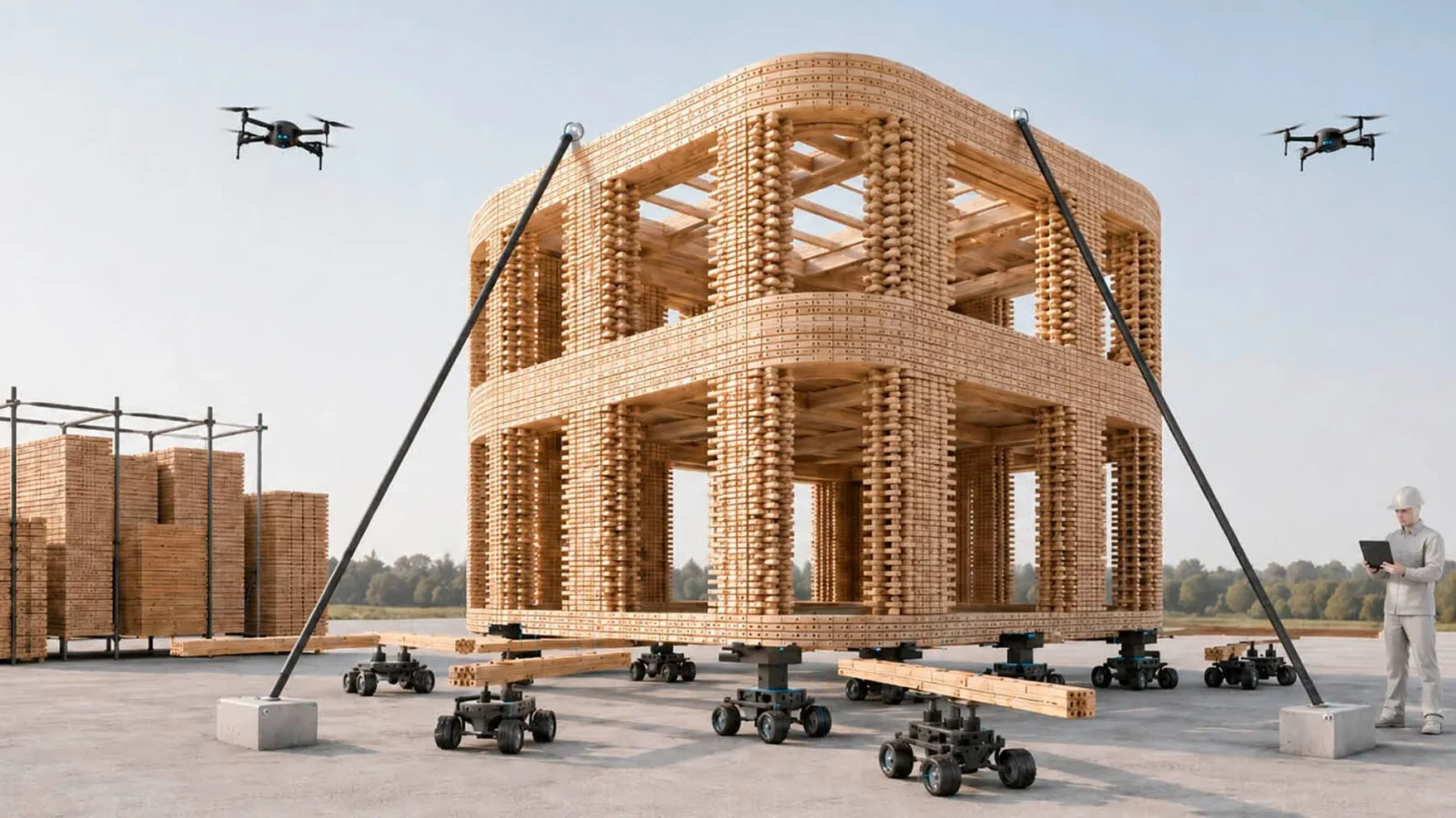
Foster + Partners to Test Robot Swarms Building Timber from the Top Down
Foster + Partners wins €4m EU grant to build robot and drone...
illustrarch Editoral Team2 Mins read

Python or Grasshopper: Which Should Architecture Students Learn First?
Grasshopper teaches parametric logic through visual feedback, while Python handles data, repetition,...
 Sinan Ozen6 Mins read

Notion Alternatives for Architects: 7 Tools That Fit Studio Work
Notion works until a studio needs fee tracking, phase budgets and timesheets....
 Furkan Sen7 Mins read


Leave a comment