

The Language of Interior Design: Elements and Principles Explained
A room speaks through color, texture, light, layout, and decor. This guide breaks down the language of interior design element by element, then shows how balance, rhythm, and cohesion turn those parts into a space that feels resolved.
 Elif Ayse Sen3 November 20236 Mins read768

Table of Contents Show
The language of interior design is the visual grammar that turns color, texture, light, and space into meaning. Every element sends a message, shaping how a room feels and how it works. Learning to read and combine these interior design elements and principles lets you create spaces that communicate mood, purpose, and personality.
Interior design is more than a visual feast for the eyes. It is a way of speaking without words. By blending textures, colors, spatial arrangements, and decor, a room can express aesthetic sensibilities, set an atmosphere, and shift how people feel the moment they walk in. This visual vocabulary can seem hard to read at first, yet it is open to anyone willing to learn how it works. What follows breaks down the language of interior design element by element, and shows how those parts combine into rooms that actually say something.
The Building Blocks: Interior Design Elements and Principles
Every design decision draws on a small set of core parts. The elements are the raw material, such as line, form, color, and texture. The principles are the rules that arrange them, including balance, rhythm, and cohesion. Think of the elements as words and the principles as sentence structure. The table below summarizes how the main interior design elements and principles work and where to apply them.
| Element / Principle | What It Communicates | How to Use It |
|---|---|---|
| Line | Direction, movement, and structure | Horizontal lines calm a room, vertical lines add height, curves soften it |
| Form | Shape and physical mass of objects | Mix geometric and organic forms to guide the eye and avoid monotony |
| Color | Mood and emotional temperature | Pick one dominant hue, then supporting tones that set the atmosphere |
| Texture | Depth, warmth, and tactile interest | Layer smooth and rough surfaces so a space reads as rich, not flat |
| Balance | Stability and visual weight | Arrange objects symmetrically or asymmetrically to hold equilibrium |
| Rhythm | Flow and repetition | Repeat colors, shapes, or patterns to carry the eye through the room |
Color
The use of color is perhaps the most direct way to speak in a room. Every color carries psychological weight. Blues tend to read as calm and steady, yellows spark energy and optimism, while grays and off-whites act as a quiet backdrop that adds a sense of order. Color sets the emotional temperature of a space before anyone notices a single piece of furniture.
Texture
Texture works like the adjectives of the language, adding depth and character to the overall picture. A shaggy rug, a slab of polished marble, or a rough sawn timber table each shifts how a space reads. Texture also engages the sense of touch, inviting people to reach out and interact rather than simply look.
Line and Form
Line and form give a room its structure and silhouette. Strong horizontal lines, like a low console or a wide window, settle a space and make it feel grounded. Vertical lines pull the eye upward and suggest height. Form describes the mass and shape of the objects themselves, and pairing crisp geometric pieces with softer organic ones keeps the composition from feeling rigid.
Space and Layout
In a well-planned room, every piece of furniture has a job and adds to the spatial arrangement. Space acts as the grammar, ordering the elements into patterns that make sense and flow. Handled well, it maximizes function while keeping visual harmony. Handled poorly, even beautiful objects feel scattered and awkward.
Lighting
Lighting is the punctuation in a design sentence. It highlights, emphasizes, and sets the mood, and it changes everything else in the room. The gap between a well-lit space and a flat, over-lit one is as clear as the difference between a readable paragraph and a jumble of words. Layering ambient, task, and accent light gives a room the range to shift with the time of day.
💡 Pro Tip
Before committing to a wall color, paint a large sample and watch it across a full day. A hue that looks warm at noon can turn cold and gray under evening light. Testing paint against your actual lighting saves the costly repaint that trips up so many first-time projects.
Decor and Accents
Decor and accents are the idioms and turns of phrase that give a space character. A piece of vintage art, a handmade ceramic, or a rug picked up while traveling can become a focal point that says something about your taste, history, and personality. These finishing touches carry a lot of meaning for their size.

The Grammar: Principles That Hold a Room Together
Knowing the elements is only half the work. The principles decide how those elements sit together, and they separate a collection of nice objects from a room that feels resolved. Balance controls visual weight so no corner feels heavy or empty. Rhythm repeats colors, shapes, or materials so the eye moves through the space instead of stalling. Scale and proportion keep furniture in sensible relationship to the room and to each other.
🏗️ Real-World Example
Barcelona Pavilion (Barcelona, 1929): Mies van der Rohe used almost no decoration, so the whole message came from material and space. Polished travertine, green Alpine marble, and golden onyx walls speak through texture and color alone, while open, flowing planes replace conventional rooms. It remains a clear lesson in how the language of interior design can be spoken through surface and layout rather than ornament.
Syntax: The Importance of Cohesion
Like a well-formed sentence, a well-designed space needs cohesion. The elements have to be chosen so they work in agreement rather than compete. Cohesion means individual pieces do not sit in isolation but combine to tell one clear story. A shared palette, a repeated material, or a consistent level of formality can be enough to tie a room together.
Context and Cultural Meaning
Every space carries a context, whether cultural, architectural, or functional, and that context shapes its design language. A mid-century modern scheme may read as nostalgia in an American home yet signal something different in a European apartment. Reading that context matters, especially when you borrow styles from other eras or cultures, because the same object can say opposite things in different settings.

Subtext: How Interior Design Speaks to Emotion
Beyond what you can see and touch, there is an emotional layer to every room. The way space is organized reaches human psychology directly. Cozy rooms with soft textures and warm colors invite feelings of safety and comfort, while open, minimal spaces can suggest freedom and clear thinking. This subtext is often the part clients feel first and describe last, since it works below conscious attention.
📌 Did You Know?
Blue is the most popular color in the world. A 2015 YouGov survey across ten countries on four continents found blue was the top choice in every one of them. That consistency is part of why designers reach for blue when they want a room to feel steady, trustworthy, and calm.
Because the emotional response is so strong, the same principles read differently depending on who lives in the space. A family home and a boutique hotel might share a palette yet aim for very different feelings, one grounded and familiar, the other memorable and slightly theatrical.
🎓 Expert Insight
“The essence of interior design will always be about people and how they live.”, Albert Hadley, American interior designer
Hadley, often called the dean of American decorators, points to the real test of the language of interior design. Every element and principle only matters in how it serves the people who use the room.
Why Communication Matters in Interior Design
The role of communication in interior design is a wide one, acting as the bridge between designers, clients, contractors, and the spaces themselves. Design skill and technical know-how are needed for any successful interior design project, but they only go so far without clear communication. A few reasons make it central to good work.
Clear communication lets a designer turn abstract ideas into concrete visuals. Most clients have a picture in mind, sometimes vague, of how they want a space to look and feel. The designer’s job is to interpret those ideas and shape them into workable plans. That means speaking the client’s language and then translating it into the language of design, through color, texture, and layout.
It also keeps a project on track once building starts. Contractors, suppliers, and trades all need the same information, and small gaps in a drawing or a spec can grow into expensive mistakes on site. Designers who write clear briefs, mark up plans carefully, and confirm decisions in writing spend far less time fixing avoidable problems later.

Putting It All Together
Reading the language of interior design is a lot like becoming fluent in a new tongue. Once the elements and principles click into place, you gain the tools to shape spaces that look good and also feel right and fit their setting. For deeper study, resources such as ArchDaily and Architectural Digest show these ideas at work in built projects, while reference sources like Britannica and design programs such as the New York School of Interior Design lay out the formal grammar behind them.
Bottom Line: Treat color, texture, light, and layout as words, and balance, rhythm, and cohesion as the way you order them. Whether you are a working designer or shaping your own home, learning to speak the language of interior design lets you build rooms that are functional, expressive, and genuinely fluent.


1 Comment



Interior Design for Commercial Spaces: Enhancing Functionality and Brand Identity
Commercial interior design has to serve brand, function and regulation at once....
 Begum Gumusel4 Mins read
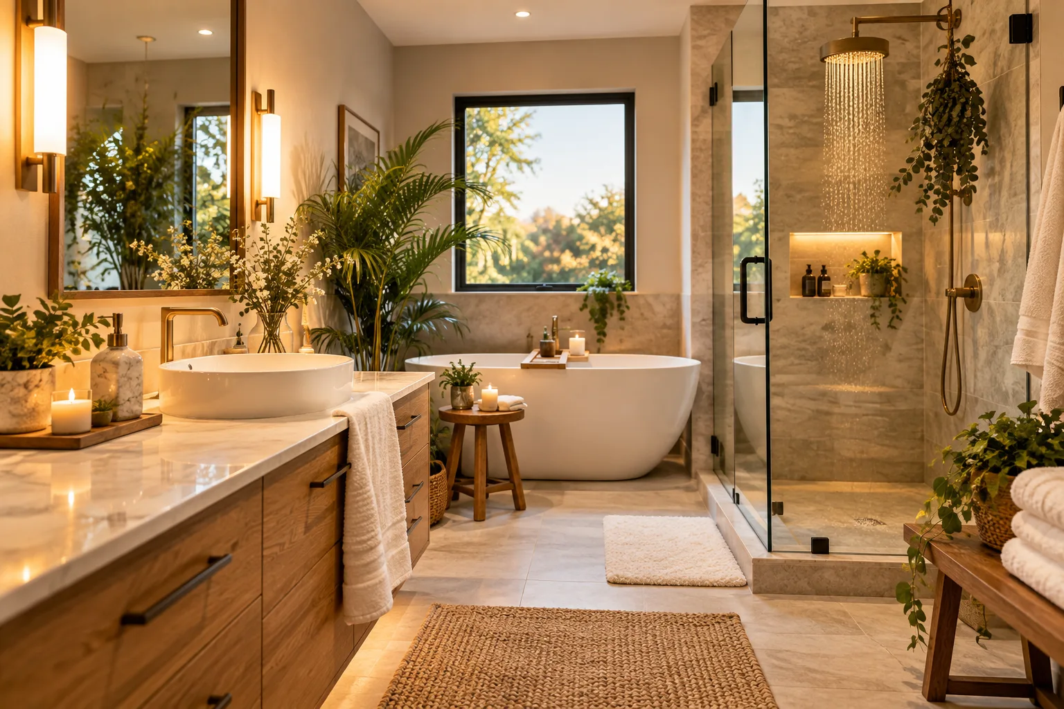
Spa-Like Serenity: 5 Accessible Luxury Upgrades to Transform Your Master Bathroom
Five accessible upgrades, from decluttering and layered lighting to plush textiles, natural...
 illustrarch Editoral Team3 Mins read
Futuro House Production Revived in Finland After Decades-Long Hiatus
A Facebook listing for abandoned moulds led to the first new Futuro...
illustrarch Editoral Team3 Mins read
How to Fill a Large TV Wall?
A broad living room wall poses an immediate spatial challenge the moment...
illustrarch Editoral Team4 Mins read


Interior design is such a complex topic. I think this is a perfect summary of the important factors in creating stunning spaces.