

How To Organise Your Presentation Board

Presentation board styles, techniques and layouts may differ according to the prevailing trends, to the university, culture, country..etc. In this article series we will deal generally with basic so that you become aware of them before starting your own style!
Before starting creating your layout you have to think about:
* What do you want to communicate?
* Which visuals will you use?
*What are the main elements of the project? How can you highlight them?
* -Let’s collect all the plans and viusals etc and what you want to write in one place and start planning!
We have some factors to consider when we create our board:
Orientation
-Will your board be shown as a single piece? – for instance: 4 A1 but continously connected.
If the number of the boards is limited, do your drawings fit in well?
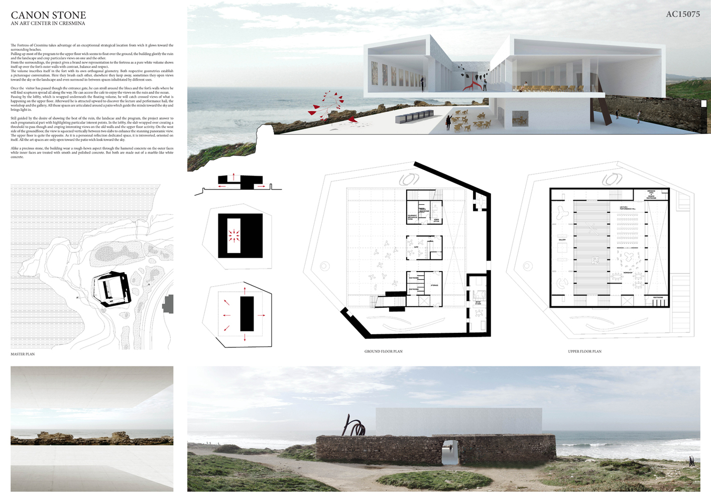
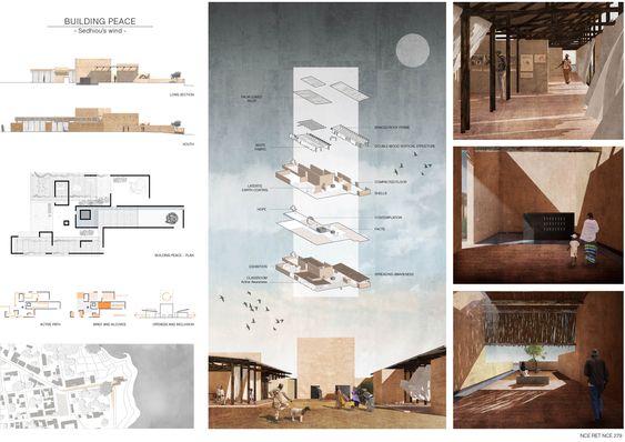
https://urbanomnibus.net/wp-content/uploads/sites/2/2011/08/Made-board1.jpg
Layout
It is your preferred way to use in your presentation board, to organize the visual elements on the layout. There are many kinds of them such as:
-a grid (never gets old)
– Full image ( good if you can use it!)
– A mix (don’t approach if you are a beginner!)
Fonts
First thing, I am not a fan of a lot of texts in the boards, but for the texts that you are going to use, you have to choose good fonts so that they become easy to read, and also look good!
Use one font in the whole board, it is safer! you may use bold, italic styles, but still it is safer to use one font only if you’re beginner.

Colors
In order not to distract your viewers by using too much colors – sometimes not in harmony- you may like to check some precedent color pallets to know which colors go with which.
Some people use the whole boards in greyscale to be safer, but if you can use color – even if 1 color beside the greyscale, it would add a good touch to the whole image-.
Text
No one is going to read – generaly- your long passages! so kep them precise and short, and explain your ideas with visuals and diagrams.
My teacher once said, use a long text in your board if you’re a lawyer, but you are an architect, so use drawings!
Structure
As we mentioned, your boards can be created as: side-by-side, as separate boards presented in a sequence, or as one big poster.
Big posters can work in case you have big visuals that need more than one board to fit in, but if not, I would recommend separate boards because they are easier to read. But shortly, your layout will tell your story, so choose the best for you!
Hierarchy
Thinking about the board’s hierarchy is important because some of your visuals must have more attention than theothers, in order to convey your idea. You can do this by making some visuals bigger or more colorful or saturated than the others.
Also Consider if the delievery is online or in the real life, small texts won’t be read if you present this in front of teachers who are far away from the board!
And more that we have checked in my Presentation board E-book, get it for free for more tips and tricks about creating your presentation board.


The Shard London: How Renzo Piano’s Glass Tower Redefined the City Skyline
Standing at 309.6 metres in Southwark, the Shard is the United Kingdom's...
")
10 Best Pavers for Driveway (2026)
Table of Contents Show 1. Techo-Bloc: Blu 80mmWhy Choose Techo-Bloc Blu 80mm...

Architecture Inside Out: How High-Tech Buildings Turned Structure Into Spectacle
From the Centre Pompidou in Paris to Norman Foster's HSBC tower in...

Best Examples of Modern Architecture: Steel and Glass Buildings That Shaped a Movement
Six buildings changed architecture forever by proving that steel and glass could...

Leave a comment