

Understanding Section Drawings in Architecture: A Practical Guide
Learn section drawings in architecture: what they are, types, symbols, lineweights, and scales—plus expert tips to read, design, and coordinate them effectively.

Table of Contents Show
Section drawings are where buildings start to make spatial sense. If plans tell us “what” and elevations show us “how it looks,” sections reveal “how it actually works.” In this guide to Understanding Section Drawings in Architecture, we unpack what sections are, how to read them, and how we use them to design and communicate buildings clearly, from concept to construction.
What Is An Architectural Section?
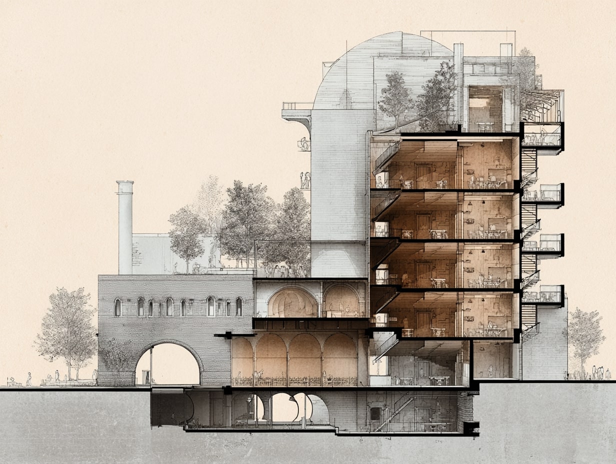
An architectural section is a vertical slice through a building that shows the relationship between spaces, structure, and systems at a specific cut location. Think of it as cutting a cake and looking at the layers, floors, walls, stairs, ducts, and daylight all in one view.
We use sections to:
- Clarify spatial proportions, heights, and adjacencies
- Coordinate structure, MEP services, and envelope layers
- Validate code items like egress and headroom
- Communicate material assemblies and buildability
Unlike elevations (which are exterior-oriented) and plans (which are horizontal cuts), sections combine both interior experience and technical composition. They’re essential for design reviews, client presentations, and construction documentation.
Types Of Section Drawings
Longitudinal And Cross Sections
- Longitudinal sections run along the long axis of a building, capturing sequences of spaces, great for public buildings, schools, or transit hubs where procession matters.
- Cross sections cut across the short axis, ideal for showing structural spans, floor-to-floor heights, and façade-depth strategies.
Wall And Detail Sections
- Wall sections zoom in to show full envelope build-ups, cladding, air/water barriers, insulation, structure, and interior finishes, often from foundation to parapet.
- Detail sections focus tightly on junctions (window heads, sill/thresholds, roof-wall intersections) where performance and constructability are most at risk.
Broken, Removed, And Partial Sections
- Broken sections “skip” less relevant areas to focus on critical zones without producing extra sheets.
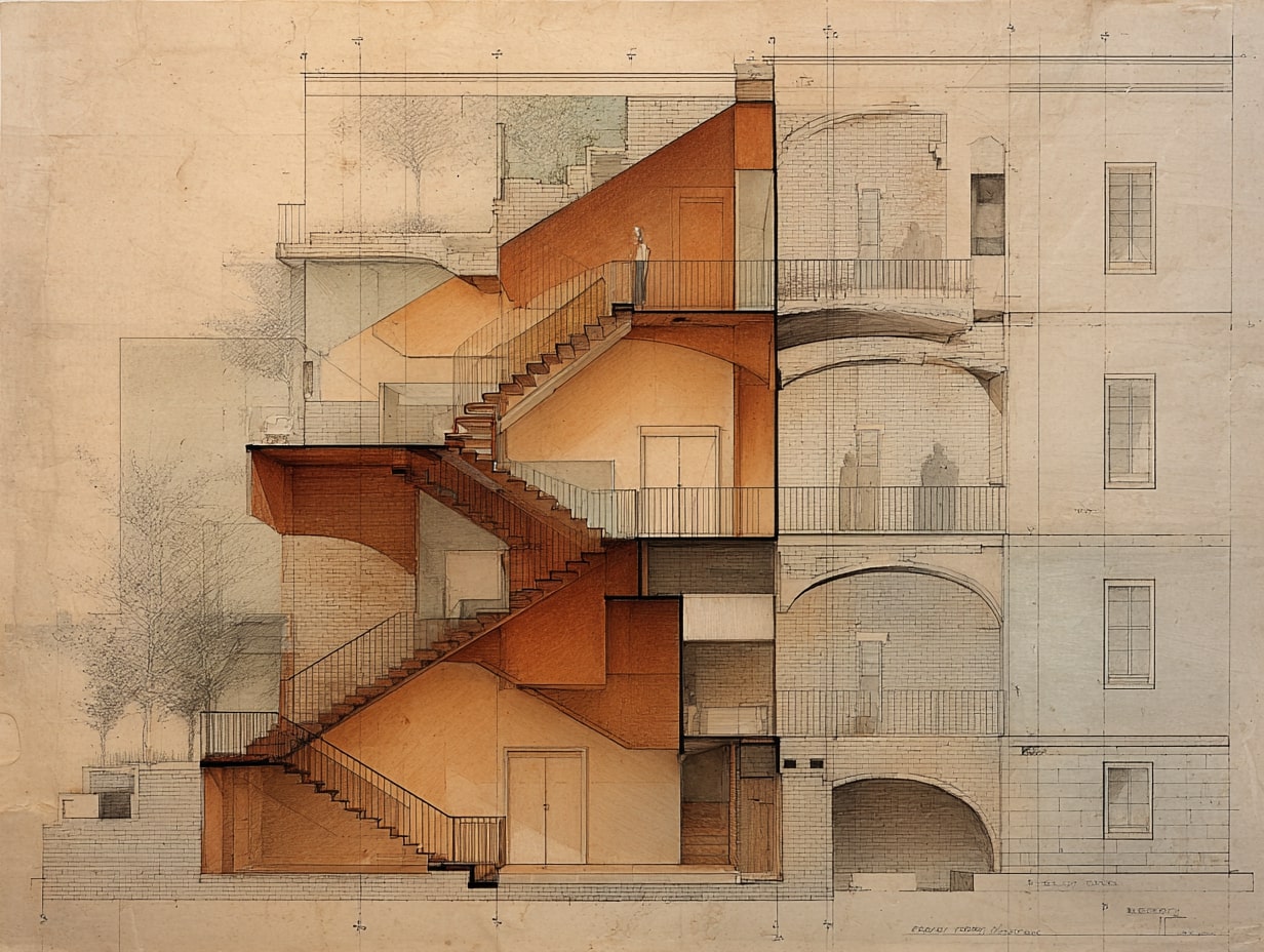
- Removed sections pull a complex component (like a stair) off to the side at larger scale for clarity.
- Partial sections isolate a specific bay or room when a full-cut is overkill.
| Section Type | Cut Direction / Scope | Typical Scale | Best Used For | Common Use Cases |
|---|---|---|---|---|
| Longitudinal Section | Along the long axis | 1/8″ = 1′-0″ or 1/16″ = 1′-0″ | Showing spatial sequences and procession | Museums, schools, transit stations, churches |
| Cross Section | Across the short axis | 1/8″ = 1′-0″ or 1/4″ = 1′-0″ | Structural spans, floor-to-floor heights | Residential buildings, office towers, warehouses |
| Wall Section | Vertical cut through envelope | 3/4″ = 1′-0″ or 1-1/2″ = 1′-0″ | Full envelope build-up from foundation to parapet | Construction documents, building permit sets |
| Detail Section | Focused junction cut | 1-1/2″ = 1′-0″ or 3″ = 1′-0″ | Critical junctions and transitions | Window heads/sills, roof-wall intersections, flashings |
| Broken Section | Interrupted cut skipping areas | Varies | Focusing on critical zones without extra sheets | Long buildings with repetitive bays |
| Removed Section | Component pulled to side | Larger than parent drawing | Isolating complex elements for clarity | Stairs, elevator shafts, curtain wall modules |
| Partial Section | Limited to specific bay or room | Varies | Showing a portion when full-cut is unnecessary | Single room conditions, localized ceiling changes |
💡 Pro Tip
When deciding between a longitudinal and cross section, ask yourself: “Am I trying to show the journey through the building, or the structural logic of a single bay?” Longitudinal sections excel at spatial narrative; cross sections reveal structural and envelope depth. On complex projects, you’ll need both — start with the cross section to lock down floor-to-floor heights and structural zones, then use the longitudinal to verify spatial flow and procession.
How To Read A Section: Symbols, Notation, And Conventions
Section Line, Arrows, And Callouts
On the plan, a bold section line shows the cut path. Arrows indicate the viewing direction, and a callout or reference bubble points to the sheet and detail number where the section lives.
Cut Plane, Lineweights, And Depth Cues
Cut elements (what the plane slices through) get the heaviest lineweight: beyond-cut elements lighten progressively. We often use poche (filled cut) for structure and walls, and lighter lines or gray poché for background. Some teams add atmospheric depth (halftones or lighter lineweights) to improve legibility.
| Element Category | Lineweight (mm) | Pen / Color Convention | Purpose |
|---|---|---|---|
| Cut elements (walls, slabs, columns) | 0.50 – 0.70 mm | Black, heaviest pen | Define the cut plane clearly |
| Foreground elements (furniture, fixtures) | 0.25 – 0.35 mm | Black or dark gray | Show objects in front of the cut |
| Background elements (walls, windows beyond) | 0.13 – 0.18 mm | Gray or screened | Provide depth without visual competition |
| Hidden / below-cut elements | 0.09 – 0.13 mm (dashed) | Light gray, dashed line | Indicate concealed structure or services |
| Annotation (dimensions, text, leaders) | 0.18 – 0.25 mm | Black, consistent weight | Keep notes readable but secondary to drawing |
🎓 Expert Insight
One of the most common mistakes in student and early-career work is treating all lineweights the same. In professional practice, the lineweight hierarchy is non-negotiable — it’s the primary tool that separates readable construction documents from confusing ones. A good rule of thumb: if you print your section and can’t immediately distinguish cut from background at arm’s length, your lineweights need work. Many senior architects recommend starting with just three pen weights (heavy, medium, light) and only adding more when genuinely needed.
Hatching, Materials, And Components
Material hatches distinguish concrete, masonry, insulation, and wood. Consistent patterns and a material legend reduce confusion, especially when details are dense. Components like stairs, ducts, and beams should be drawn consistent with plan conventions.
| Material | Standard Hatch Pattern | Description |
|---|---|---|
| Concrete (cast-in-place) | Dots / stipple pattern | Random dot pattern representing aggregate |
| Concrete (precast) | Dots with diagonal lines | Stipple with light diagonal hatching |
| Steel / Metal | Solid black fill or diagonal lines | Dense, heavy fill for structural steel sections |
| Masonry (brick) | Diagonal lines at 45° | Evenly spaced diagonal hatching |
| Masonry (CMU / block) | Diagonal cross-hatch | Two sets of diagonal lines crossing |
| Wood (dimensional lumber) | Wood grain lines (end grain: circular rings) | Parallel lines or concentric arcs |
| Plywood / engineered wood | Alternating parallel lines | Lines alternate direction per layer |
| Rigid insulation | Evenly spaced “X” marks | Repeated X pattern across the fill |
| Batt insulation | Wavy or scalloped lines | Loose, wavy pattern indicating flexible fill |
| Earth / gravel | Dots with small triangles | Random pattern with varied dot sizes |
| Gypsum board / drywall | Solid thin fill or light gray | Thin solid fill, sometimes with a single line |
| Glass | Solid thin line | Single or double line with no fill |
Levels, Grids, And Datums
Levels provide vertical control, top of slab, finish floor, parapet, ridge. Grids help align with plans and structure. A shared datum (often 0′-0″ at ground floor) keeps consultants synchronized, especially in BIM.
⚠️ Common Mistake to Avoid
Setting your datum at an arbitrary point or failing to agree on a shared 0′-0″ with structural and MEP consultants early in the project is one of the most costly coordination errors in practice. In BIM workflows, misaligned datums can cascade into hundreds of misplaced elements that only surface during clash detection — or worse, during construction. Always establish and document the shared datum in your project execution plan before any modeling begins.
Scale, Dimensions, And Notes
Choose the scale that serves the purpose: 1/8″=1′-0″ for overall building sections, 1/4″ or 1/2″ for key areas, and 1-1/2″ or larger for details. Dimension critical heights (clearances, headroom, sill heights), and use concise notes, avoid duplicating specs.
| Scale | Metric Equivalent | Drawing Type | Level Of Detail | When To Use |
|---|---|---|---|---|
| 1/16″ = 1′-0″ | 1:200 | Site section / massing | Minimal – overall form only | Master planning, urban context studies |
| 1/8″ = 1′-0″ | 1:100 | Building section | Low – major spaces and structure | Design development, CD overall sections |
| 1/4″ = 1′-0″ | 1:50 | Enlarged building section | Medium – assemblies and key dimensions | Key areas, stair sections, atrium cuts |
| 1/2″ = 1′-0″ | 1:25 | Wall section | High – full envelope layers visible | Envelope assemblies, foundation to roof |
| 3/4″ = 1′-0″ | 1:20 | Enlarged wall section | High – individual layers and fasteners | Complex façade conditions, curtain walls |
| 1-1/2″ = 1′-0″ | 1:10 | Detail section | Very high – every component shown | Window heads/sills, flashing, thresholds |
| 3″ = 1′-0″ | 1:5 | Large-scale detail | Maximum – fasteners, sealants, tolerances | Critical waterproofing joints, custom profiles |
Free Online Staircase Calculator
Free online staircase calculator for architects, builders and DIY enthusiasts. Calculate riser height, tread depth, stair angle, stringer length and verify compliance with international building codes including IRC, IBC, UK Building Regulations, Eurocode and Australian BCA.
Dimensions
Optional Settings
Building Code
Comfort Rating (Blondel's Formula)
Formula: 2R + T = - mm
Ideal range: 600-650mm
Building Code Compliance
Enter dimensions and click Calculate
Stringer Details
Quick Reference: Building Code Requirements
| Code | Max Riser | Min Tread | Max Angle | Min Headroom | Min Width |
|---|---|---|---|---|---|
| IRC (USA Residential) | 196mm (7.75") | 254mm (10") | ~37° | 2032mm (6'8") | 914mm (36") |
| IBC (USA Commercial) | 178mm (7") | 279mm (11") | ~33° | 2032mm (6'8") | 1118mm (44") |
| UK Building Regs | 220mm | 220mm | 42° | 2000mm | 800mm |
| Eurocode | 190mm | 260mm | 38° | 2100mm | 900mm |
| Australian BCA | 190mm | 240mm | 38.5° | 2000mm | 600mm |
Designing With Sections: What To Analyze
Spatial Organization And Proportion
We test floor-to-floor heights, mezzanines, double-height moments, and how natural light penetrates deep into plans. Proportion checks, like 1:2 or 2:3 room ratios, help spaces feel balanced.
🎓 Expert Insight
The classical proportioning rules — 1:2, 2:3, and the golden section — aren’t just academic exercises. In practice, rooms that feel “off” almost always have proportional issues visible only in section. A conference room with a 9-foot ceiling and a 30-foot depth, for example, will feel like a tunnel. The section is where you catch this before it gets built. Experienced designers sketch quick proportional overlays on their sections as a sanity check, even in BIM-heavy workflows.
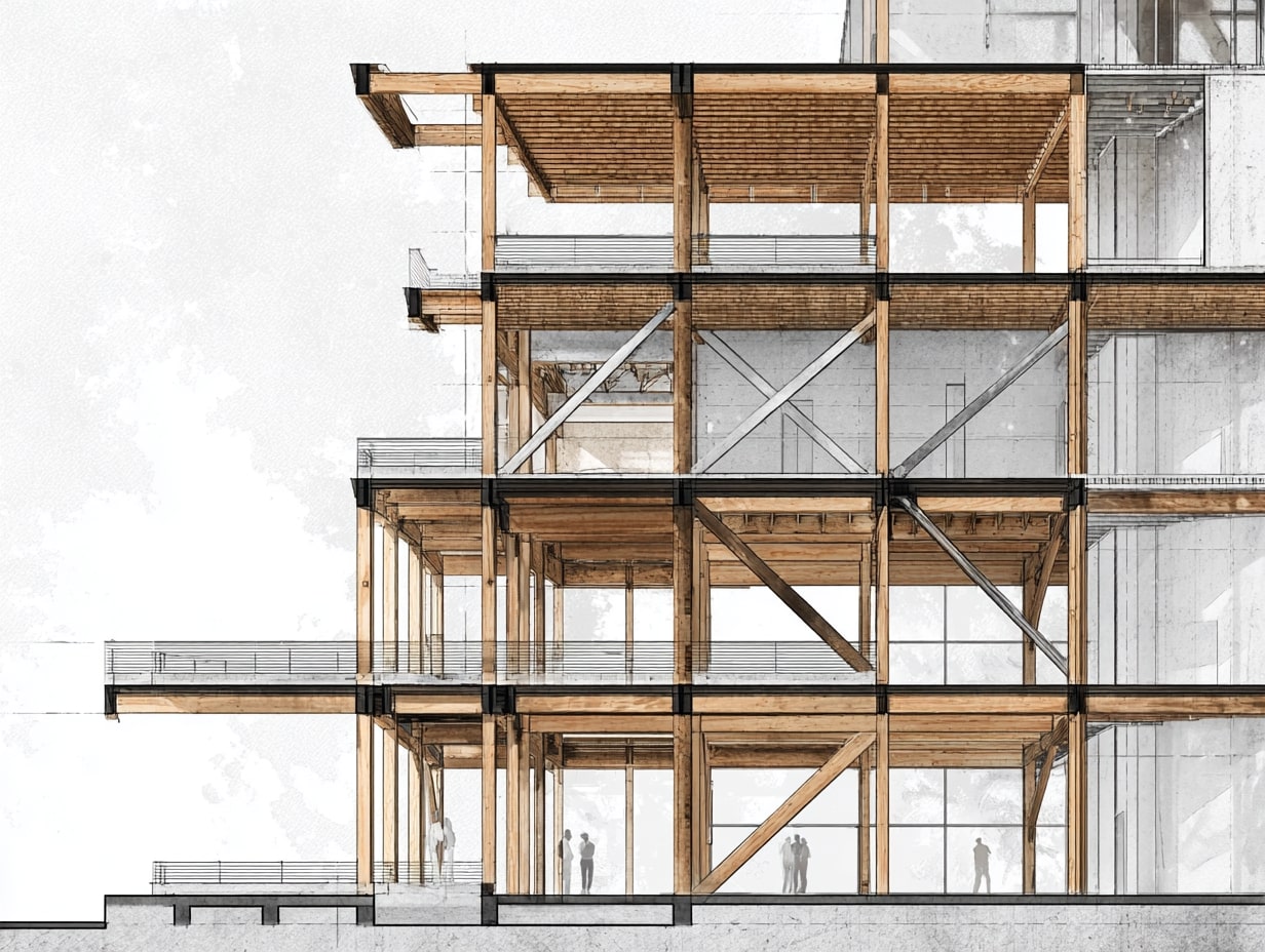
Structure, Services, And Buildability
Sections reveal how beams, joists, and slabs align with ducts, pipes, and sprinklers. We look for clashes early: a duct hitting a beam, a stair landing into a transfer girder. If it doesn’t work in section, it won’t work on site.
💡 Pro Tip
Always draw your MEP plenum zone as a shaded band in early design sections — even before the MEP engineer has sized ducts. A minimum 12–14 inches for commercial HVAC distribution is a safe starting assumption. This simple habit prevents one of the most frequent coordination failures in construction: discovering at the steel-erection stage that there’s no room for ductwork above the ceiling grid. As a general rule, if your floor-to-floor height minus structural depth minus ceiling finish is less than 12 inches, flag it immediately.
Daylight, Views, And Natural Ventilation
We trace sun angles, light shelves, clerestories, and stack-effect paths. Simple section studies can increase daylight autonomy and reduce glare by adjusting reveals, soffits, and window heights.
Envelope Performance And Thermal Layers
Thermal continuity, air barriers, and drainage planes must be unbroken. In section we confirm insulation wraps corners, parapets, and slab edges without “thermal shortcuts.” We also check condensation risk at dew-point transitions.
⚠️ Industry Note
Thermal bridging at slab edges and parapets is one of the leading causes of energy performance gaps between designed and as-built buildings. Research from organizations like the Building Science Corporation and Passive House Institute consistently shows that unaddressed thermal bridges can increase heat loss through a wall assembly by 20–30%, even when the field-of-wall insulation meets code. In section drawings, trace a continuous red line along your insulation path — if it breaks at any point, you have a thermal bridge that needs a design solution such as thermal break clips, insulation extensions, or proprietary structural thermal break products.
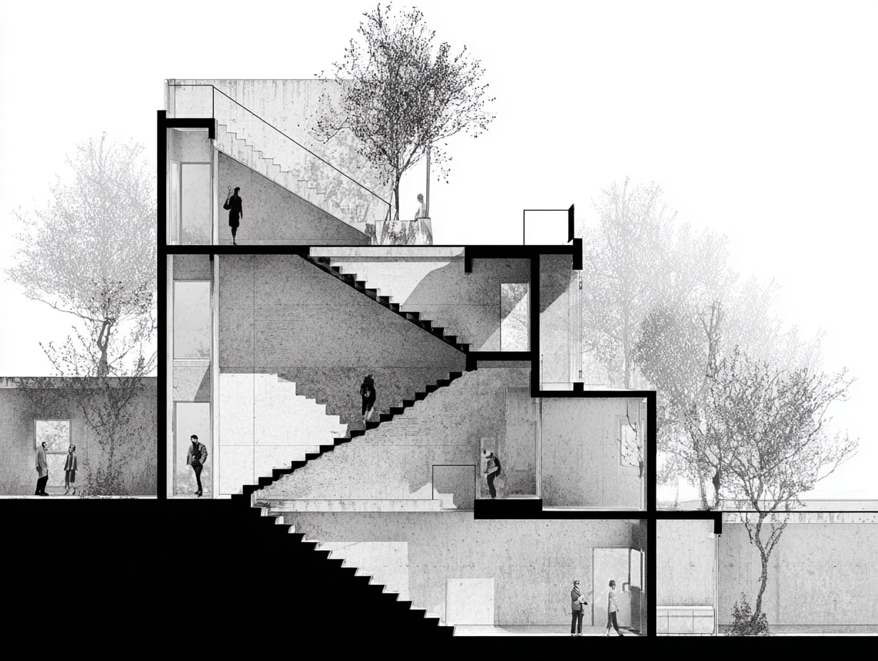
Circulation And Life Safety
Stair geometry, headroom, handrail heights, refuge areas, and smoke control are best validated in section. We verify riser/tread totals, landing lengths, and that exits connect clearly to grade.
| Section Analysis Area | What To Check | Key Metrics / Standards | Common Issues Found |
|---|---|---|---|
| Spatial proportion | Floor-to-floor heights, room ratios, double-height spaces | 1:2 or 2:3 room proportions; typical 9′-10′ floor-to-ceiling (residential), 12′-14′ (commercial) | Compressed ceiling heights, awkward mezzanine proportions |
| Structural coordination | Beam/slab alignment with MEP services | Minimum 10″–12″ plenum depth for HVAC; structural depth per span tables | Duct-to-beam clashes, insufficient plenum space |
| Daylight & ventilation | Sun angles, clerestory placement, stack ventilation paths | Daylight factor ≥ 2% for habitable rooms; 2.5× room height max depth for sidelighting | Deep plan areas with no light, glare from unshaded glazing |
| Envelope performance | Thermal continuity, air barrier integrity, drainage planes | Continuous insulation at slab edges; R-values per climate zone (ASHRAE 90.1 / local codes) | Thermal bridges at parapets, broken air barriers at floor lines |
| Circulation & life safety | Stair geometry, headroom, smoke control | Min. 6′-8″ (2032 mm) headroom (IBC); max 7″ riser / min 11″ tread | Insufficient headroom at landings, non-compliant riser/tread ratios |
Creating Effective Sections: Workflow And Best Practices
Choosing Strategic Cut Locations
Cut where the story is richest: through stairs, double-height spaces, major structural spans, and envelope transitions. Avoid cutting through visual noise (like dense furniture) unless it’s the focus.
💡 Pro Tip
Before you place a single section line, sketch a quick “section strategy diagram” on your plan — mark every stair, level change, atrium, and major structural transfer with a dot, then draw your section lines so each cut captures at least two or three of these critical moments. This prevents the common problem of producing six sections that all show the same repetitive bay while missing the one area where the building actually gets complicated. In competition and client presentations, the section cut that reveals the most spatial drama is almost always the one that wins the project.
Setting Up Datums, Levels, And Grids
Establish shared coordinates early with consultants. Lock levels before heavy detailing, moving them late creates ripple effects across sheets and schedules.
CAD/BIM Modeling And Detailing Workflow
Model primary structure and envelope with sufficient fidelity so sections generate cleanly. Then embellish: add 2D detail components, poche, and tags. Use view templates, filters, and worksets to keep graphics consistent.
🎓 Expert Insight
In Revit-based workflows, one of the most impactful time-savers is building a robust section view template early in the project. Define your lineweight overrides, poche fills, and annotation crop settings once, then apply that template to every new section. Teams that skip this step typically spend 30–40% more time on graphic cleanup at the CD phase. Also, avoid the temptation to over-model — elements like flashing, sealant beads, and shims are almost always faster and cleaner as 2D detail components overlaid on the section, rather than modeled in 3D.
Lineweight Hierarchy And Graphic Clarity
Prioritize cut > foreground > background. Reserve poche for cut elements: keep beyond elements lighter or screened. Limit textures: legibility beats decoration.
Annotation Standards And Material Legends
Adopt a consistent keynoting system and material legends. Tag less, but smarter, call out assemblies once and reference them. Keep abbreviations standard to avoid misreads in the field.
Common Pitfalls And How To Avoid Them
- Floating levels that don’t match plans
- Broken thermal or air barriers at transitions
- Overly complex hatches that obscure intent
- Missing dimensions for critical clearances
- Inconsistent section callouts between sheets
Mitigation is simple: coordinated templates, periodic QA reviews, and redline passes focused on constructability.
| Workflow Stage | Key Actions | Tools / Methods | Deliverable |
|---|---|---|---|
| 1. Cut location selection | Identify critical spatial, structural, and envelope moments | Markup on plan, design review discussion | Annotated plan with proposed section lines |
| 2. Datum & grid setup | Establish shared levels, grids, and 0′-0″ datum with consultants | Revit shared coordinates, CAD xrefs | Coordinated level/grid template |
| 3. BIM/CAD modeling | Model primary structure and envelope to LOD 300+ | Revit, ArchiCAD, Vectorworks | Clean auto-generated sections |
| 4. 2D embellishment | Add poche, detail components, hatching, and tags | View templates, detail component families | Presentation-ready section drawings |
| 5. Annotation & keynoting | Apply dimensions, keynotes, material legends, and references | Keynote schedules, standard abbreviation lists | Fully annotated CD-quality sections |
| 6. QA & coordination | Cross-check against plans, elevations, and consultant drawings | Redline reviews, clash detection, overlay checks | Coordinated, issue-free drawing set |
📌 Lessons From The Field
In real-world project delivery, the QA redline pass is where most section-related RFIs (Requests for Information) get prevented. Experienced project architects recommend a dedicated “section coordination overlay” session — print key sections at half-size, overlay them on corresponding plan prints at the same scale, and physically check that every wall, column, and opening aligns. This 30-minute exercise routinely catches 5–10 discrepancies per project that digital clash detection misses because they involve 2D annotation and detail component errors, not 3D model conflicts.
Coordinating And Presenting Sections
Aligning With Plans And Elevations
We align section cuts with plan grids and key façade moments so drawings “talk to each other.” What you see in section should match elevations, sill lines, parapets, and control joints.
Cross-Referencing Callouts And Sheet Organization
Clear references (A-301/1, etc.) reduce hunting. Group related sections near their plans and details. If a section changes, update the cloud and revision index consistently.
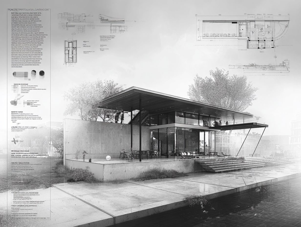
Rendering Styles: Black-Line, Shaded, And Hybrid
- Black-line: crisp and construction-focused.
- Shaded: adds massing and material legibility for clients.
- Hybrid: poche + light shading + subtle entourage to convey depth without sacrificing precision.
Choose per audience, contractor, client, or planning review.
| Rendering Style | Visual Character | Best Audience | Pros | Cons |
|---|---|---|---|---|
| Black-line | Crisp, high-contrast line work only | Contractors, engineers, code reviewers | Maximum precision, fast to produce, prints cleanly | Can feel flat; harder for non-technical audiences to read |
| Shaded | Tonal fills, shadows, material textures | Clients, design juries, planning boards | Communicates massing and materiality intuitively | Can obscure technical detail; slower to produce |
| Hybrid | Poche + light shading + subtle entourage | Design reviews, publications, mixed audiences | Balances depth and precision; visually engaging | Requires careful calibration to avoid clutter |
💡 Pro Tip
For client presentations and design competitions, the hybrid rendering style consistently outperforms pure black-line or fully shaded approaches. The key is restraint: apply solid poche only to cut elements, add a single light-gray tone for depth on beyond-elements, and use one or two carefully placed human figures for scale. Avoid the temptation to add trees, clouds, and heavy textures — they distract from the spatial story. The most awarded section drawings in architectural publications almost always follow this “poche + one tone + figures” formula.
Print Settings, Scale Choices, And Accessibility
Test prints at final scale. Maintain minimum text heights for readability. Provide digital PDFs with layers/bookmarks when possible so stakeholders can navigate quickly.
Conclusion
Sections are where architecture’s logic is laid bare. When we cut with intent, read symbols precisely, and coordinate diligently, section drawings become powerful design tools, not just documentation. If we use them to probe space, verify performance, and communicate clearly, they’ll save time in coordination meetings and headaches on site. That’s the real value of Understanding Section Drawings in Architecture: sharper decisions, fewer surprises, better buildings.


How to Study Ancient Architecture: Tips and Resource
A practical guide to studying ancient architecture across Egyptian, Greek, and Roman...

10 Common HVAC Mistakes in Architecture to Avoid
Learn the most common HVAC mistakes in architectural design and how to...

8 Tips for Designing a Productive Garden Studio
Transform your outdoor space into a productive sanctuary. Learn essential design principles...

7 Tips for Designing a Kid-Friendly Creative Corner
Learn how to design the perfect kid-friendly creative corner with these 7...

Leave a comment