

How to Use Color in Interior Design: Tips and Trends for 2023
Effective use of color in interior design involves understanding color theory, harmonies, and emotional impacts to create balanced and visually appealing spaces.
 Bahattin Duran11 August 20247 Mins read369
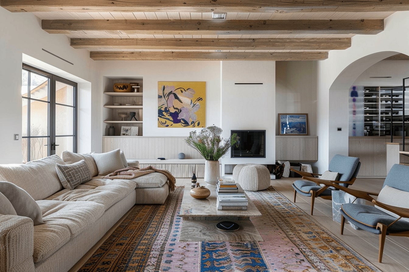
Table of Contents Show
Color is one of the most powerful tools in interior design. It sets the mood, influences perceptions, and can even affect our emotions. Whether we’re revamping a single room or designing an entire home, understanding how to use color effectively can transform our spaces from ordinary to extraordinary.
But where do we start? With so many hues, shades, and tones to choose from, it can feel overwhelming. We’ll break down the basics of color theory, explore different color schemes, and share tips on how to balance colors to create harmonious and visually appealing interiors. Let’s dive into the vibrant world of color and discover how we can use it to elevate our living spaces.

Understanding Color Theory
Grasping color theory is crucial for successful interior design. It aids in creating balanced spaces that evoke the desired emotions and aesthetics.
The Color Wheel Explained
The color wheel arranges colors systematically to show their relationships. It includes primary colors (red, blue, yellow), secondary colors (green, orange, purple), and tertiary colors (combinations like red-orange or blue-green). This visual guide aids in selecting harmonious color combinations. For example, choosing adjacent colors creates an analogous scheme, while selecting opposite colors forms a complementary scheme. The wheel simplifies the process of experimenting with different hues and shades to determine what works best for any given space.
Color Harmonies and Contrast
Color harmonies use relationships on the color wheel to create pleasing combinations. Common schemes include:
- Monochromatic: Uses variations in lightness and saturation of a single color, ensuring cohesion.
- Analogous: Combines colors next to each other on the wheel, offering serene and comfortable designs.
- Complementary: Pairs opposite colors on the wheel, ensuring visual interest and high contrast.
Balancing contrast elevates a design by highlighting features. For example, pairing dark and light shades creates depth, while contrasting warm and cool tones introduces dynamic energy. Understanding these principles makes it easier to design spaces that are both visually engaging and harmonious.

The Role of Color in Interior Design
Colors play a crucial role in how we experience and feel about our living spaces. They affect our emotions and perceptions, making it essential to choose the right colors for each room.
Emotional Impact of Colors
Colors directly influence our moods and emotions. Warm colors like red, orange, and yellow, for example, evoke feelings of warmth and comfort, while cool colors like blue, green, and purple promote calmness and relaxation. Bright colors can energize and uplift a space, making it ideal for social areas like living rooms or kitchens. In contrast, muted tones create a tranquil atmosphere, perfect for bedrooms or reading nooks. Understanding these effects helps in choosing colors that align with the desired emotional response for each room.
Influence of Color on Perceived Space
Colors also impact the perceived size and shape of spaces. Light colors such as white, cream, and pastel shades create an illusion of a larger, more open space, ideal for small rooms. Dark colors like navy, charcoal, and deep green add depth and make large rooms feel cozier. Vertical stripes make ceilings appear higher, while horizontal stripes can widen a room. Using accent walls or varying shades can alter how we perceive dimensions and proportions, optimizing rooms for their intended use.

Color Psychology in Interior Design: How Colors Affect Mood
Color psychology in interior design is often reduced to simple rules: blue calms, red excites, yellow cheers. The research behind those rules is more nuanced, and knowing what it actually says helps you choose colors with more confidence and fewer clichés.
The first lesson is that hue is only part of the story. In a 1994 study published in the Journal of Experimental Psychology: General, Patricia Valdez and Albert Mehrabian found that brightness and saturation had strong and consistent effects on emotion. Brighter colors were rated as more pleasant, and more saturated colors as more arousing. In a room, that means a pale, greyed blue and an intense electric blue will feel very different, even though both are “blue”.
- Lightness shapes comfort: lighter, softer tones tend to feel pleasant and restful, which is why they suit bedrooms and small rooms.
- Saturation shapes energy: strong, saturated color raises arousal, so use it where activity is welcome, such as a kitchen, a playroom or a single accent wall, rather than across every surface of a bedroom.
- Hue carries associations: warm hues read as cosy or lively and cool hues as calm and open, but these meanings vary between cultures and between individuals.
Context matters as much as the color itself. A review by Andrew Elliot and Markus Maier in the Annual Review of Psychology (2014) concluded that color can affect people’s feelings, thinking and behavior, but that the field is still at an early stage and that much more work on context and real-world settings is needed before strong recommendations can be made. A widely cited 2009 study in Science by Ravi Mehta and Rui Zhu found that red improved performance on detail-oriented tasks and blue on creative ones, yet at least one later replication attempt did not find the same effect.
For designers, the practical approach is to treat color psychology as a starting point and test it in the actual room. Look at samples in morning and evening light, check how the color works with materials such as wood, stone and textiles, and ask the people who will use the space how it makes them feel. The same terracotta that feels warm and grounding to one client may feel heavy to another. For how color shapes buildings beyond the interior, see our guide to color in architecture.
Choosing Colors for Different Rooms
Selecting appropriate colors for specific rooms can elevate the aesthetic and functionality of your space. Different rooms invoke different purposes and moods, making the color choice critical for each area.
Bedroom Color Schemes
Bedrooms are sanctuaries for rest and relaxation. Soft, muted tones like light blues, soft greens, and warm neutrals create a calming environment conducive to sleep. Pastel colors can work wonders, enhancing the serene atmosphere. Conversely, deeper hues like navy or charcoal can provide a cozier feel, ideal for a warm and intimate bedroom setting.
Living Room Color Palette Ideas
Living rooms serve as the heart of the home, where entertainment and relaxation blend. Neutral bases like beige, gray, or white offer flexibility, allowing vibrant accents like teal, burnt orange, or mustard to shine. Embracing accent walls can introduce a focal point without overwhelming the space. Earth tones can imbue warmth, making the living room inviting and comfortable.
Kitchen and Bathroom Colors
Kitchens benefit from lively, stimulating colors. Yellows and reds can enhance appetite and energy. Light shades like whites, creams, and pale grays can make the kitchen appear larger and more hygienic. Bathrooms, on the other hand, favor clean, crisp colors. Shades of blue and green can evoke a spa-like ambiance, while white or cream offers simplicity and a fresh feel.
Trending Color Schemes in Modern Interior Design
Emerging color schemes in modern interior design balance aesthetics and emotions. Let’s explore which colors are making waves this year and what future trends might look like.
Popular Colors This Year
Several colors dominate interior design in 2023:
- Terracotta: This earthy hue adds warmth and lends a rustic charm to spaces.
- Sage Green: Reflecting nature, it creates a calming ambiance.
- Deep Navy: Use this sophisticated shade to add depth and make a bold statement.
- Muted Pastels: Soft tones like blush pink and powder blue offer a subtle, soothing look.
- Warm Neutrals: Shades like beige and taupe provide a versatile, timeless foundation.
These colors gain popularity due to their ability to evoke nature, serenity, and timelessness.
Future Trends in Color Design
Upcoming trends hint at innovation and adaptability:
- Digital Lavender: As tech influences lifestyle, this color merges futuristic vibes with tranquility.
- Rich Jewel Tones: Emerald green and sapphire blue create luxurious, opulent environments.
- Eco-Conscious Hues: Expect to see more greens and browns reflecting sustainability and environmental awareness.
- Bold Black Accents: Incorporating black in furnishings and decor items adds modern elegance and contrast.
- Playful Yellows: Bright and energetic, yellows inject a sense of fun and positivity into spaces.
Future trends in color design lean towards expressive, bold choices that invite innovation while staying rooted in comfort and sustainability.
Dark and Moody Palettes: How to Design a Dark Interior
Dark interiors use deep colors such as charcoal, inky navy, forest green, oxblood and near-black brown across walls, ceilings and joinery to create rooms that feel enclosed, calm and intimate. Done well, a dark palette makes a room feel richer and more considered rather than smaller. The secret is to treat darkness as a decision about light, texture and contrast, not only as a paint choice.
Start With the Light
Dark colors absorb most of the light that reaches them. Paint makers publish a Light Reflectance Value (LRV) for each shade, which tells you how much light the surface reflects; the lower the number, the more light the color absorbs. Check the LRV before you commit, and plan lighting in layers: wall lights, table lamps and picture lights with warm white lamps, so the room glows from several low points instead of one ceiling fixture. North-facing rooms and rooms used mostly in the evening are natural candidates, because they never feel bright anyway.
Techniques That Make Dark Rooms Work
- Color drenching: paint walls, trim, doors and sometimes the ceiling in the same deep shade. Removing contrast lines blurs the edges of the room and makes it feel cocooning rather than cramped.
- Varied sheen: combine matte walls with eggshell or satin trim in the same color, so light catches the woodwork and adds depth.
- Texture: velvet, bouclé, linen, oiled timber, stone and brass read clearly against dark backgrounds and keep the room from looking flat.
- Measured contrast: one light element, such as a pale rug, a large artwork or a marble surface, gives the eye a place to rest.
- Reflective accents: mirrors, metallic finishes and glass bounce lamp light back into the room.
Where Dark Palettes Work Best
Dining rooms, studies, media rooms, powder rooms and bedrooms suit dark schemes because they are used for focus, conversation or rest. Kitchens can work too, with dark cabinetry balanced by lighter worktops; our guide to dark kitchen ideas covers that in detail. In small rooms, going fully dark is often more successful than a single dark accent wall, which can make one surface feel heavy and draw attention to the size of the room.
Conclusion
Color plays a pivotal role in defining the aesthetics and functionality of interior spaces. By understanding color theory and harmonies, we can create environments that evoke specific emotions and moods. Timeless hues like terracotta and sage green bring a natural, serene feel, while modern trends like digital lavender and rich jewel tones add innovation and luxury.
Considering the purpose of each room is essential when selecting colors. For example, blues and greens work well in bedrooms for relaxation, while warmer tones like yellows and oranges stimulate conversation in living areas. Trends may come and go, but the principles of good color usage remain constant, combining personal preference with informed choices.
Paying attention to the latest trends allows us to keep spaces fresh and contemporary. Despite changing fashions, integrating sustainable and eco-conscious colors reflects a growing commitment to the environment, showing that good design goes hand-in-hand with responsible choices.
Designing with color requires balance and intentionality, ensuring that every shade serves a purpose and complements the overall aesthetic. Using accents, considering lighting, and maintaining a cohesive palette contribute to the successful application of color in interior design.





Interior Design for Commercial Spaces: Enhancing Functionality and Brand Identity
Commercial interior design has to serve brand, function and regulation at once....
 Begum Gumusel4 Mins read
Futuro House Production Revived in Finland After Decades-Long Hiatus
A Facebook listing for abandoned moulds led to the first new Futuro...
 illustrarch Editoral Team3 Mins read
Building Your Dream Home in NSW: What You Should Know About Montgomery Homes
Montgomery Homes has been building across Sydney, Newcastle, the Hunter, Wollongong and...
illustrarch Editoral Team4 Mins read
Designing a Home Theater: Where Drapery Fits Into the Plan
In a media room the curtains are a performance layer, not decoration....
illustrarch Editoral Team3 Mins read


Leave a comment