- Home
- Articles
- Architectural Portfolio
- Architectral Presentation
- Inspirational Stories
- Architecture News
- Visualization
- BIM Industry
- Facade Design
- Parametric Design
- Career
- Landscape Architecture
- Construction
- Artificial Intelligence
- Sketching
- Design Softwares
- Diagrams
- Writing
- Architectural Tips
- Sustainability
- Courses
- Concept
- Technology
- History & Heritage
- Future of Architecture
- Guides & How-To
- Art & Culture
- Projects
- Competitions
- Jobs
- Events
- Store
- Tools
- More
Font Importance for Portfolio
Portfolio is the identity of architects presenting their work in the best way. When designing a portfolio, the design should show your work and represent you in the best way. This form of expression often affects the legibility of the design from the cover of the portfolio to the content. The balance, which is one of the basic principles of design, should be created between the visuals and texts in the portfolio. It is necessary to provide balance in portfolio design and to pay attention to the principle of unity, which is also one of the design principles.

Table of Contents Show
Portfolio is the identity of architects presenting their work in the best way. When designing a portfolio, the design should show your work and represent you in the best way. This form of expression often affects the legibility of the design from the cover of the portfolio to the content. The balance, which is one of the basic principles of design, should be created between the visuals and texts in the portfolio. It is necessary to provide balance in portfolio design and to pay attention to the principle of unity, which is also one of the design principles.
Key Characteristics Of Effective Architectural Portfolio Fonts
Effective architectural portfolio fonts balance aesthetic appeal and functional clarity. They enhance the professionalism of the design while ensuring seamless communication of the portfolio’s content.
Readability And Legibility
Readable fonts ensure information is quickly and easily understood. Legible typefaces like Helvetica, Calibri, or Garamond work well by maintaining clear distinctions between letters and consistent spacing. Sans-serif fonts often suit modern layouts, while serif fonts provide refinement for traditionally styled portfolios. Avoid decorative fonts in body text, as they reduce clarity, especially in smaller sizes.

Professional Aesthetic
Fonts establish a polished and cohesive visual identity. Clean and minimalist fonts such as Futura and Arial communicate sophistication and align with architectural standards. Avoid overly whimsical or casual fonts, as these undermine credibility. Pairing one primary and one secondary font with complementary weights ensures visual variety while maintaining professionalism.
Versatility Across Mediums
Fonts should perform well across both print and digital formats. Scalable typefaces like Roboto and Open Sans retain clarity in presentations, portfolio books, and web-based layouts. Adaptive fonts support responsive designs, ensuring alignment and readability across devices. For consistency, test chosen fonts on different mediums before finalizing the portfolio design.

The visual balance in your design is related to the writing of the titles and the texts containing the project descriptions as well as the renderings and drawings. The fonts you choose in your articles are of great interest to this visuality.
You can check the fonts that we have given examples in previous articles from the link below. The common feature of all these fonts is that they do not get in the way of the content in your portfolio. If you design your portfolio with complex and bold, eye-catching fonts, it will not attract the attention of the browsing people.
How To Combine And Pair Fonts For A Cohesive Design
Combining fonts enhances visual hierarchy and ensures a unified portfolio design. Selecting complementary fonts from the same type family, such as pairing Open Sans Regular with Open Sans Bold, creates consistency. Differentiating headers and body text while maintaining stylistic coherence strengthens readability.
Balancing serif and sans-serif fonts introduces contrast without overwhelming the layout. For instance, pairing Garamond (serif) for titles with Helvetica (sans-serif) for content provides a blend of tradition and modernity. Strong contrasts work best when the fonts maintain proportional harmony.

Limiting combinations to two or three fonts prevents clutter. Using a primary font for titles, a secondary font for body text, and an optional accent font for highlights ensures focus remains on the showcased work. Overuse of fonts shifts attention away from the primary elements.
Matching font attributes, such as weight and size, ensures alignment across the design. Pairing fonts with cohesive proportions, like Montserrat Light for headings and Montserrat Regular for paragraphs, maintains visual balance and avoids disparity between sections.
Testing combinations on multiple mediums, including print and digital formats, confirms legibility and design consistency. Scalable fonts like Roboto or Futura maintain clarity and visual impact across various output resolutions, achieving a polished portfolio presentation.
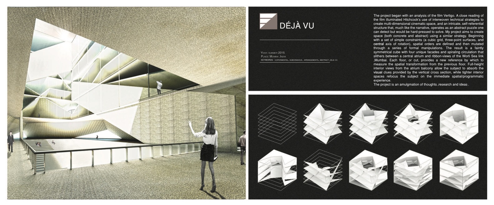
One of the most important things in a good portfolio design is that the way the projects in the content are represented is similar to each other. Although your projects are different from each other, it is your duty to represent them in the same style. It is imperative that you present your best projects with your best presentation technique and design your portfolio in a certain flow. In this design, it is important to draw attention to the projects and that all titles and texts are complementary. Keep all this in mind when deciding on fonts. We recommend using aspects of fonts that strengthen portfolio design.
- Academic Portfolio
- Architectural Portfolio
- architectural portfolio design
- architectural portfolio examples
- Architectural Portfolio Fonts
- architectural portfolio layout
- architecture portfolio application
- architecture portfolio cover
- architecture portfolio examples
- architecture portfolio issuu
- architecture portfolio pdf
- architecture portfolio template
- designing portfolio
- Fonts for Portfolios
- how to design portfolio
- issue
- portfolio design
2 Comments
Submit your architectural projects
Follow these steps for submission your project. Submission FormLatest Posts
Architectural Portfolio Visibility on Pinterest: A Practical Guide for Architects
Pinterest operates less like a social network and more like a visual...
10 Things You Need To Do To Create a Successful Architectural Portfolio
Discover 10 essential steps to create a successful architecture portfolio. From cover...
A Guide To Creating an Instagram Profile as an Architecture Portfolio
Discover how to transform your Instagram profile into a professional architecture portfolio....
Architecture Portfolio Tips: A Guide to Creating Yours
Creating an architectural portfolio that stands out requires more than showcasing your...








I really liked this article! It gives great tips on how to make a portfolio look professional. I learned about choosing the right fonts and how important balance is. Now I feel more confident in designing my own portfolio!
This article really explains how important it is to choose the right fonts for an architectural portfolio. I learned that readable fonts like Helvetica and Garamond can make a big difference in how well people understand your work. It’s also helpful to know that you should keep the design clean and not use too many different fonts, as this can confuse the viewer. The tips about pairing fonts were also useful!