

20 Photoshop Tips for Architects to Improve Renderings
A practical set of 20 Photoshop tips for architects, grouped by workflow stage, covering non-destructive editing, entourage, lighting, atmosphere, and export settings.
 Muhammad Abdullatef - Tifa Studio9 January 20256 Mins read558
Table of Contents Show
These Photoshop tips for architects focus on faster post-production, believable renderings, and cleaner presentation boards. From non-destructive layers and adjustment layers to entourage, lighting, and export settings, the techniques below help you turn raw model views into polished visuals that read clearly for clients and juries.
Photoshop sits at the end of most visualization pipelines, where a flat render from your modeling software becomes a finished image. Learning to work quickly and without damaging your source files is what separates a rushed board from a professional one. The 20 tips below are grouped into five stages of an architectural workflow, so you can jump straight to the part of the process you want to sharpen. Each one is short, practical, and built around real project tasks like adding people, fixing lighting, or preparing files for a print jury.
Why These Photoshop Tips for Architects Matter
Most architecture students learn Photoshop by trial and error, picking up scattered habits that slow them down later. A structured set of Photoshop tips for architects saves hours on every board and keeps your files editable when a client asks for a last-minute change. Good post-production also protects the design itself, since a weak image can undersell strong work. If you are still building your foundation, our guide to learning Photoshop as an architecture student pairs well with the techniques here.

📌 Did You Know?
Photoshop first shipped in 1990, but non-destructive editing only became central to architectural work after Smart Objects arrived in Photoshop CS2 (2005). That single feature changed how architects layer textures and entourage, because scaled or filtered content could finally be re-edited without quality loss.
Post-Production and Non-Destructive Setup
The first four Photoshop tips for architects protect your source render and keep every edit reversible. Set these habits before you touch color or lighting.
1. Build a Clean Layer Structure
Separate your render, background, entourage, and text onto distinct layers, then group them into folders. This lets you edit furniture or landscaping without affecting the model. Adobe’s own layer basics documentation is a fast reference if you are new to grouping and layer order.
2. Edit With Adjustment Layers
Instead of applying Levels or Hue/Saturation directly to a pixel layer, add an adjustment layer above it. You can retune contrast or shift material tones at any point, and you can clip the adjustment to a single layer so it affects only that element.
3. Convert Repeated Elements to Smart Objects
Turn textures, trees, and logos into Smart Objects before scaling or filtering them. Photoshop stores the original data, so resizing a tree five times will not soften it. Linked Smart Objects also update across several boards at once.
4. Mask Instead of Erasing
Use layer masks to hide parts of a layer rather than deleting pixels. Paint black to conceal and white to reveal. If you cut a building against the sky and the edge looks rough, refine the mask rather than starting over.
💡 Pro Tip
Before you export any board, duplicate your entire layer stack and flatten only the copy. Keep the layered original as your working master. On real projects, tutors and clients almost always ask for one more change after you think a board is finished, and a flattened file forces you to redo hours of work.
Entourage and Context
People, plants, and cars make a render feel lived-in. The next four tips cover how to add them without breaking believability.
5. Cut Entourage With Clean Selections
Use the Object Selection and Quick Selection tools for figures and trees, then check edges against a contrasting background. Adobe’s overview of making selections covers the tools worth practicing first.
6. Match Scale and Perspective
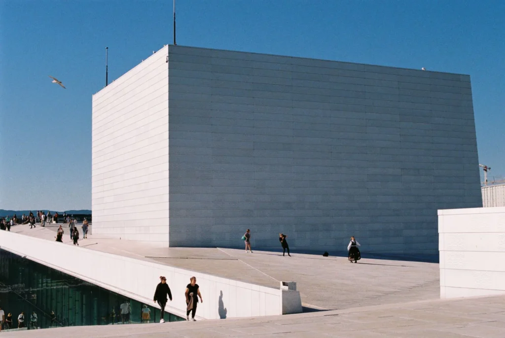
Place a standing figure so eye level aligns with the horizon line of your render. Wrong scale is the fastest way to make a professional image look amateur, so drag in a known reference like a 1.7 meter person early.
7. Ground Objects With Contact Shadows
Every added element needs a soft shadow where it meets the floor. Paint a low-opacity shadow on a separate layer under the entourage. Without it, people and trees appear to float above the pavement.
8. Build a Reusable Entourage Library
Save cut-out people, plants, and skies into an organized folder so you are not searching every submission week. Custom brushes help too, and our roundup of the best Photoshop brushes for architects is a good starting kit for foliage and texture work.
Lighting and Shadows
Lighting is where a render gains depth. These tips push contrast and light direction in a controlled, reversible way.
9. Balance Exposure With Curves
A Curves adjustment layer gives you finer control than Brightness/Contrast. Pull the shadows down slightly and lift the midtones to add punch, watching the histogram so you do not clip highlights on white facades.
10. Dodge and Burn for Emphasis
Create a 50% gray layer set to Overlay, then paint with soft white to brighten and soft black to darken. This non-destructive dodge and burn method lets you guide the eye toward an entrance or a key material.
11. Reinforce a Single Light Direction
Decide where your sun sits and keep every added shadow consistent with it. Mixed shadow directions read as fake instantly, even to viewers who cannot say why an image feels wrong.
12. Add Sunlight and Bounce Passes
Paint warm light on surfaces facing the sun and cooler tones in shade using low-opacity brushes on Overlay layers. Blending modes drive most of this work, and Adobe’s blending mode reference explains how Overlay, Multiply, and Screen behave.
Atmosphere and Realism
Atmosphere separates a technical render from an image people remember. Tips 13 to 16 add mood and material richness.
13. Add Depth With Atmospheric Haze
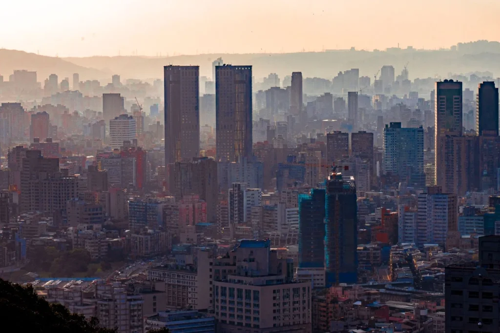
Place a soft, light gradient over distant buildings to fade them slightly. This mimics how the atmosphere reduces contrast with distance and pushes your main volume forward in the frame.
14. Overlay Real Textures
Drop photographic concrete, timber, or fabric textures onto surfaces and set them to Overlay or Multiply so the underlying shading shows through. Lower the opacity until the texture reads as material, not as a sticker.
15. Darken Corners and Recesses
Add subtle occlusion by painting shadow into corners, reveals, and under overhangs. Real surfaces catch less light where planes meet, and this quick pass makes a flat model feel solid.
16. Color Grade for Mood
Use Color Balance or a Photo Filter adjustment layer to set an overall tone, such as a warm dusk or a crisp morning. A consistent grade ties a set of boards together visually.
⚖️ Pros & Cons at a Glance
✔️ Pros: Fast turnaround on renders, full control over light and mood, reusable assets, no need for long re-renders.
✖️ Cons: Easy to overdo effects, results depend on source render quality, heavy files can slow older machines.
Presentation and Export
The last four tips prepare your work for boards, portfolios, and print. Weak export settings can undo everything you built.
17. Compose With the Rule of Thirds
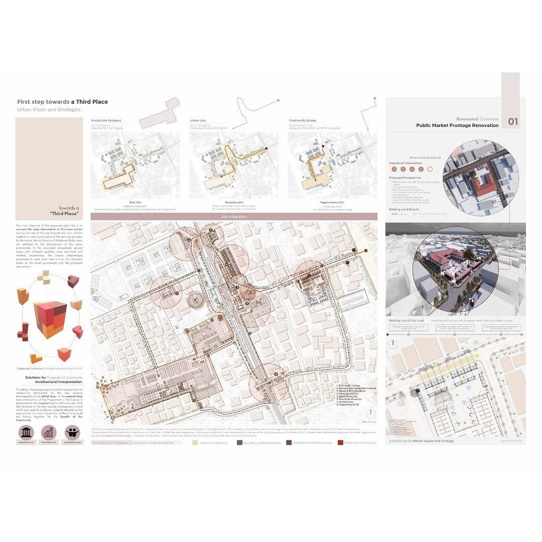
Turn on Photoshop’s grid and place the horizon and key elements along the thirds. A strong composition guides the viewer before they read a single label.
18. Handle Typography and Annotation
Keep fonts limited to one or two families and align text to a clear margin. Photoshop is capable for board layout, though many architects also compare it against dedicated layout tools when choosing architectural presentation software for final documents.
19. Set the Right Color Mode
Work in RGB for screen and portfolios, then convert to CMYK only when preparing files for a commercial printer. Checking this early prevents muddy colors on printed boards.
20. Export With Print in Mind
For print, add a small bleed margin and save as PDF or TIFF at 300 DPI. For web and portfolios, export sharp PNG or high-quality JPEG at screen resolution. If you are weighing manual post-production against automated pipelines, our look at Photoshop versus AI rendering is worth a read.
Photoshop Techniques for Architects at a Glance
The table below sums up the core techniques from this list, what each one does, and a quick tip for applying it.
| Technique | What it does | Tip |
|---|---|---|
| Layer groups | Separate render, entourage, and text | Name folders so revisions stay fast |
| Adjustment layers | Retune color and contrast reversibly | Clip to one layer for targeted edits |
| Smart Objects | Scale and filter without quality loss | Use for textures and repeated trees |
| Dodge and burn | Guide the eye with light and shade | Paint on a 50% gray Overlay layer |
| Texture overlays | Add material realism to surfaces | Lower opacity so shading shows through |
| Export presets | Match output to print or screen | 300 DPI for print, RGB for portfolios |
For more inspiration on how studios treat post-production, the ArchDaily Photoshop archive collects real project workflows and image breakdowns worth studying.
Frequently Asked Questions
Which Photoshop tools do architects use most?
Architects rely most on layers, layer masks, adjustment layers, selection tools, and blending modes. These handle the core tasks of cutting entourage, correcting color, and building light without damaging the source render.
Is Photoshop enough for architectural rendering?
Photoshop is a post-production tool, not a renderer. You still model and render in software like Enscape, V-Ray, or Lumion, then bring the output into Photoshop to refine lighting, add entourage, and prepare boards.
What resolution should architectural boards be?
Use 300 DPI for printed boards and PDFs sent to a plotter. For screen use, portfolios, and websites, export at screen resolution in RGB, which keeps files light while staying sharp on displays.
How can architecture students improve their Photoshop skills fast?
Rebuild one professional image from scratch and match it as closely as you can. Copying a strong reference teaches layer order, lighting, and entourage placement faster than watching tutorials alone.
Putting It All Together
Your Next Step: Pick one recent render, rebuild it using the non-destructive setup from tips 1 to 4, then add a single dodge and burn pass. That one exercise will show you how much control you gain before you tackle the full list on your next board.



Notion Alternatives for Architects: 7 Tools That Fit Studio Work
Notion works until a studio needs fee tracking, phase budgets and timesheets....
 Furkan Sen7 Mins read

Why Every Practice Ends Up With Five Versions of the Same Revit Family
Let’s learn why Revit family libraries accumulate duplicates, break schedules and slow...
 illustrarch Editoral Team5 Mins read
Visualizing Renovation Projects From Photographs: A Workflow for Existing-Building Work
Photo-based visualization turns a photograph of a building that already exists into...
illustrarch Editoral Team7 Mins read

Best Free CAD Blocks and Resources for Architects
A working guide to free CAD blocks for architects, covering ARCAT, CAD-Blocks.net,...
Furkan Sen7 Mins read


Leave a comment