

Architecture Sketch: Essential Techniques and Modern Practices

Table of Contents Show
You need sketching to think through space, communicate ideas fast, and test forms before committing to detailed plans. A strong architecture sketch captures proportion, perspective, and intent quickly, so you can develop concepts, troubleshoot design problems, and show convincing ideas to others.
This post walks you through the core principles that make sketches effective, the tools that help you work faster and cleaner, and the essential techniques that sharpen your eye and hand. Expect practical tips for different drawing types, modern digital options, and resources to keep improving your craft.
Core Principles of Architectural Sketching
Architectural sketching requires controlled line work, clear scale relationships, and composition that directs the viewer’s eye. Apply deliberate choices about line weight, basic shapes, and spatial hierarchy to convey function, material, and proportion quickly.
What Is an Architectural Sketch
An architectural sketch is a rapid, visual instrument you use to record and test building ideas. It prioritizes clarity over polish, using freehand lines to show massing, circulation, and key details rather than construction-level information. You’ll commonly produce plan thumbnails, elevation studies, and perspective sketches to explore form and light. Each sketch functions as a decision-making tool: you check proportions, resolve a roof junction, or test window rhythms without creating a finished drawing. Keep sketches small and iterative. Quick iterations let you compare options, and adding simple human figures or furniture gives immediate scale and functionality cues.
Purpose of Sketching in Architecture
You sketch to communicate, develop, and critique design ideas before committing to technical drawings or models. Sketches translate thoughts into visible form so you can evaluate spatial relationships, material intent, and program organization on the spot. Use sketches to align your team and clients: a few strong sketches can replace lengthy verbal descriptions and reveal misunderstandings early. They also serve as a creative workspace where you explore alternatives cheaply—different façades, roof forms, or site orientations—then refine the most promising solutions.
In practice, architectural sketches bridge concept and construction; they influence diagrams, drawings, and physical models that follow.
Fundamental Concepts: Line, Shape, and Composition
Line controls legibility. Vary line weight to separate primary forms from secondary details: thick outlines for volumes, medium lines for openings, thin lines for texture or construction hints. Confident strokes communicate material edges and structural intent.
Basic shapes—rectangles, cylinders, and triangles—form the vocabulary of massing. Break complex forms into these primitives to maintain proportion and simplify perspective. Combine and subtract shapes to indicate courtyards, overhangs, and circulation paths.
Composition organizes information. Place a clear focal point, balance positive and negative space, and use alignment or rhythm to guide the viewer. You can annotate selectively—material notes or brief dimensions—so your architectural sketches remain readable and purposeful.
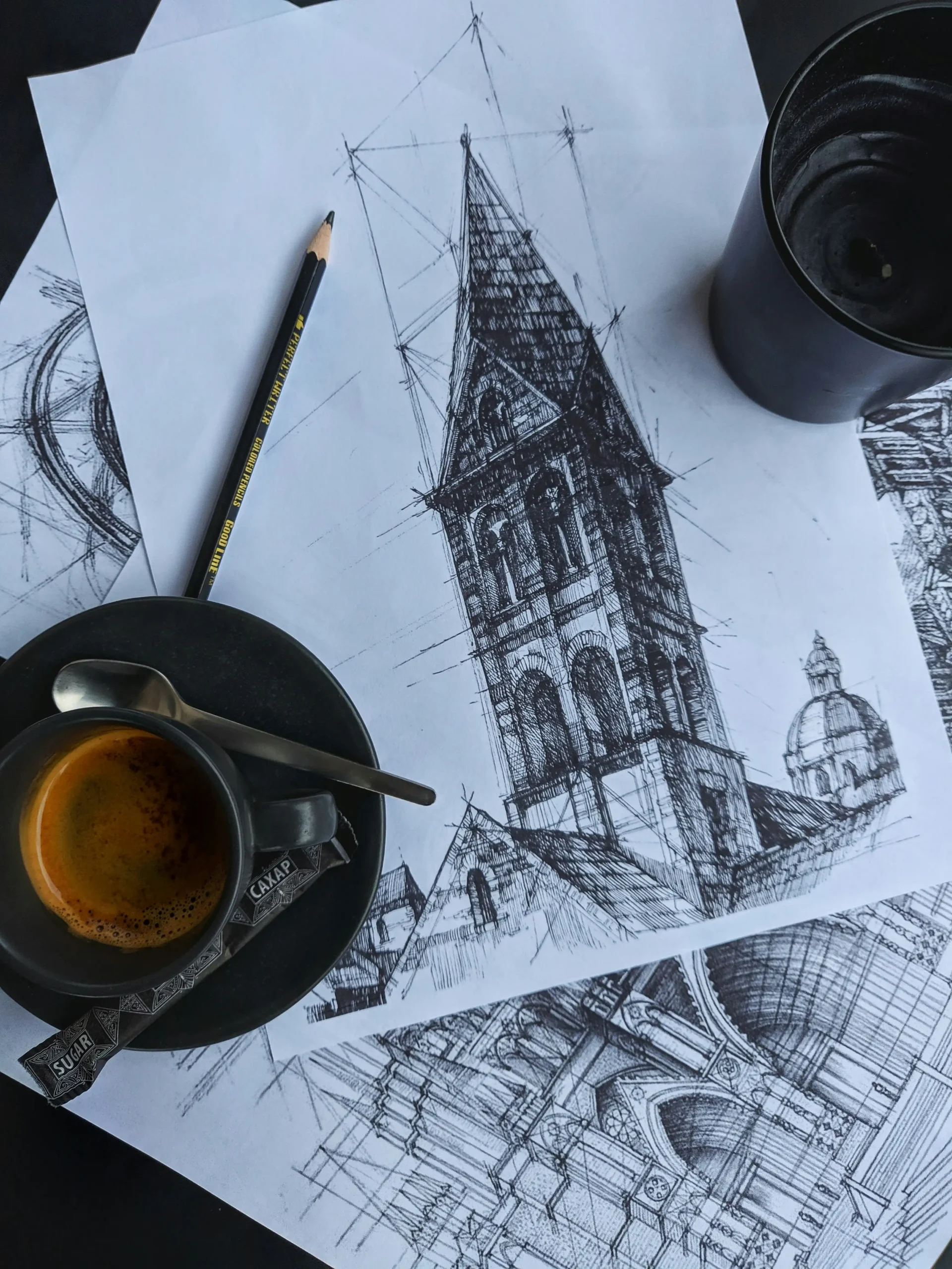
Key Tools and Materials
Select papers and tools that suit the stage of design and the scale of your work. Prioritize surface tooth, weight, and portability for sketchbooks; choose pencils and pens for control and reproducibility; add rulers and erasers that preserve line quality.
Choosing the Right Sketchbooks and Papers
Pick sketchbooks sized for how you work: A4 or A3 spiral-bound books suit studio development, while A5 or Moleskine-style pads fit quick site sketches. Use 80–120 gsm paper for pencil drawings and 150–200 gsm for marker or wet media.
Look for paper with slight tooth for graphite and charcoal; smooth Bristol handles fine-line pens and technical ink. If you scan or photograph hand-drawn sketches, choose bright white paper with low texture to reduce shadow and improve digital cleanup.
For final presentation studies, use heavyweight cartridge or layout paper that accepts multiple passes of ink without feathering. If you use an Apple Pencil on an iPad, buy a textured film to mimic tooth and reduce glare.
Pencils, Pens, and Digital Tools
Keep a small range of mechanical pencils (0.5mm and 0.7mm) and graphite grades (HB, 2B, 4B) for consistent line weight and rapid shading. Mechanical pencils deliver precise, repeatable lines ideal for dimensioned sketching and annotations.
Carry at least one waterproof fine-liner (0.1–0.5mm) for inking and reproducible linework. Use markers like alcohol-based greys for quick tonal studies, and reserve technical pens for measured drawings.
Adopt digital tools when you need editable layers or fast iterations. The Apple Pencil provides pressure sensitivity and tilt control for natural pencil drawings on iPad apps. Use a calibrated stylus-to-app workflow so your hand-drawn sketches translate cleanly to CAD or render software.
Supporting Tools: Rulers, Erasers, and Enhancements
Use a 30cm stainless steel ruler and a 15/30 cm architect’s scale to maintain straight edges and accurate proportions. A small clear plastic triangle (30°/60°) speeds up perspective and parallel line work.
Carry a kneaded eraser for soft corrections and lifting graphite without damaging paper. Add a precision eraser (mono zero) for cleaning tight details in hand-drawn sketches.
Enhance your workflow with a clipboard or portable drawing board for site work, and a spray fixative for charcoal or soft graphite studies to prevent smudging. Keep spare leads, ink cartridges, and an Apple Pencil charger to avoid interruptions during critical sketching sessions.
Essential Sketching Techniques
These techniques focus on building reliable hand skills, constructing accurate spatial frameworks, and rendering light and material convincingly. You’ll practice specific exercises, learn clear rules for vanishing points and horizons, and apply controlled mark-making to suggest form and texture.
Developing Sketching Skills
Start with short timed sketches (1–5 minutes) to train observation and economy of line. Focus each session: proportion one day, edge control the next, and quick value studies another. Use a range of pencils (HB to 4B) to practice line weight; press harder for primary outlines and lighten for secondary elements.
Practice drawing from life: facades, cornices, and window groups. Break complex forms into simple volumes—boxes, cylinders, and planes—before adding detail. Keep a sketchbook and catalog recurring mistakes so you can target them in focused drills. Repeat the same subject at different times of day to refine how you record shadow and texture.
Tools help mastery: a straightedge for construction lines, fine-liners for crisp details, and blending stumps for controlled softening. Gradually reduce reliance on rulers to improve freehand accuracy.
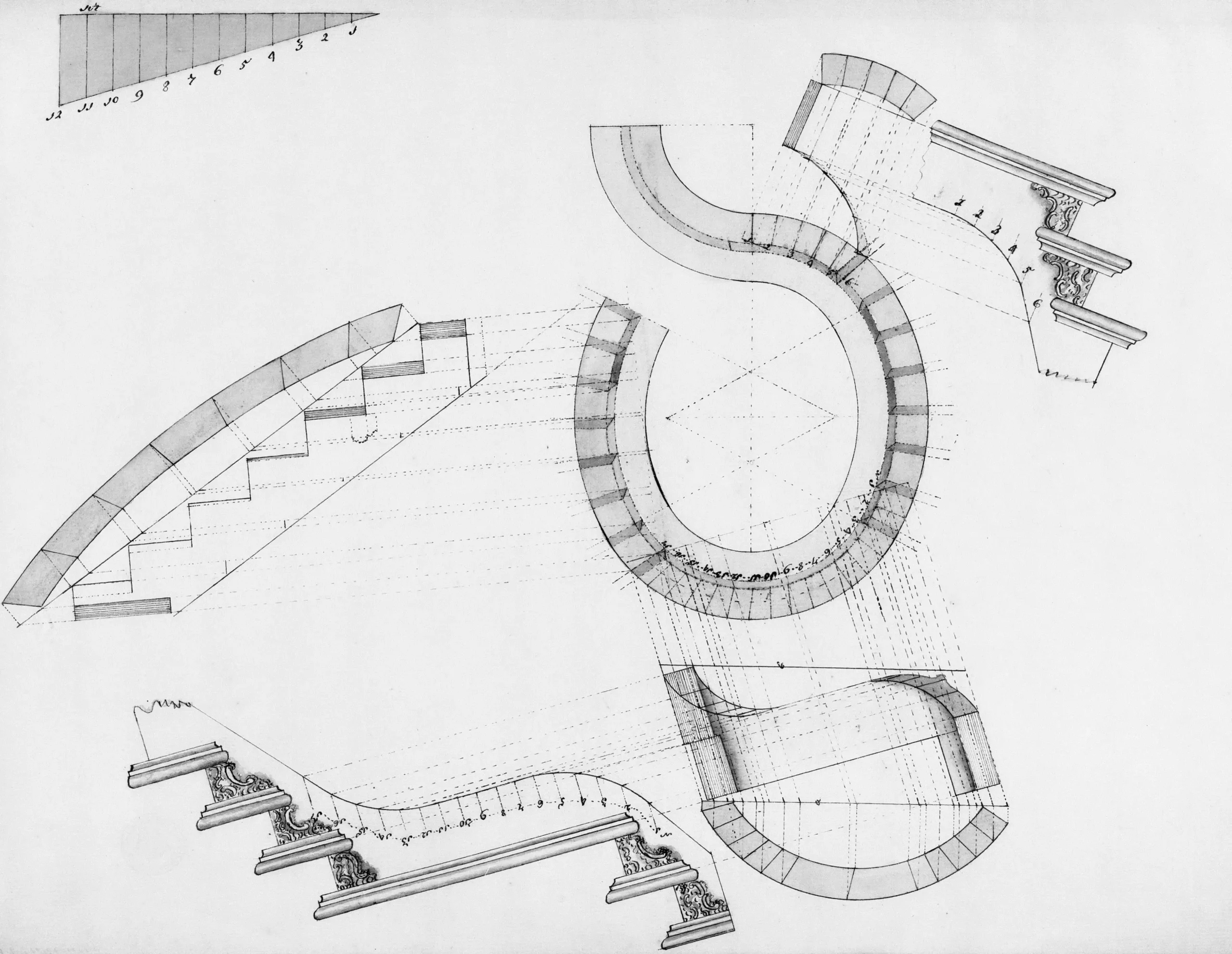
Perspective Drawing Fundamentals
Begin with horizon line and vanishing points. For interiors or head-on façades use one-point perspective—place the single vanishing point on the horizon and align orthogonals toward it. For corner views employ two-point perspective: set two vanishing points off the page if needed to avoid distortion.
Use three-point perspective for tall buildings or dramatic angles; add a vertical vanishing point above or below the horizon to capture height compression. Keep a light construction layer of guidelines and erase selectively to retain clarity.
Check scale with a simple human figure or door height to maintain believable proportions. When drawing streetscapes, align repetitive elements (lamp posts, windows) to the same vanishing points for rhythm and depth. Use measured perspective—plot key distances along a receding line—to avoid cumulative distortion in long views.
Shading, Hatching, and Highlights
Identify a single light source before you mark any shadows. Map primary planes that face toward, away from, and perpendicular to the light. Apply broad shaded areas first to establish the darkest and mid-tone values.
Use hatching and cross-hatching to build tone and texture. Vary line density and direction: sparse parallel hatching suggests smooth surfaces; tight cross-hatching conveys rough or cast shadow. Combine strokes with different pressures to create graduated transitions.
Reserve highlights by leaving paper white or lifting graphite with a kneaded eraser. Add crisp highlights on reflective materials (glass, metal) and softer highlights on matte surfaces. For clarity, annotate or lightly indicate material types (e.g., “brick — dense hatching”) when textures require different mark languages.


Sydney’s Buildings Are Ageing Faster Than Most Owners Realise
There is a wave of building deterioration moving through Sydney's property stock...

Famous Buildings in Asia: 6 Imperial Palaces That Shaped a Continent
A focused look at six iconic buildings in Asia, each an imperial...

10 Signs It’s Time to Upgrade Your Property Fence
Table of Contents Show Repairs Keep Piling UpPosts Are LeaningBoards Are Cracked...

Walt Disney Concert Hall: Frank Gehry’s Stainless Steel Symphony in Los Angeles
Frank Gehry's Walt Disney Concert Hall took 16 years from initial design...

Leave a comment