

The Impact of Door Color and Finish on Home Décor

Table of Contents Show
Walk into any beautifully designed home, and you might not immediately notice the doors, but their absence of visual disruption is precisely the point. Door color and finish are often treated as afterthoughts, relegated to standard builder-grade white or whatever matches the trim.
Yet they play a powerful role in shaping a home’s visual identity, quietly influencing how we perceive space, flow, and atmosphere. Beyond their obvious functionality, doors contribute to mood, balance, and cohesion across spaces in ways that go far beyond simply opening and closing.
Think of doors as the punctuation marks in your home’s design story. They frame transitions, define boundaries, and create rhythm as you move from room to room. A well-chosen door color can transform a hallway from bland to breathtaking, while the right finish can elevate an entire floor’s aesthetic from builder-basic to custom-crafted.
How Door Color Shapes Visual Harmony
Color is one of the most immediate elements people notice when entering a space, and doors act as visual anchors within that environment. Unlike furniture that can be easily moved or accessories that can be swapped seasonally, doors are semi-permanent fixtures that establish a foundational color palette for your interior architecture.
Creating Contrast or Continuity
The strategic use of door color allows you to either highlight architectural features or create seamless visual flow, depending on your design goals.
Bold contrast offers an opportunity to inject personality and drama into otherwise neutral interiors. Dark or vibrant doors can break monotony and add character to spaces dominated by white walls or beige tones. A charcoal gray door in a cream-walled room immediately becomes a focal point, drawing the eye and creating visual interest.
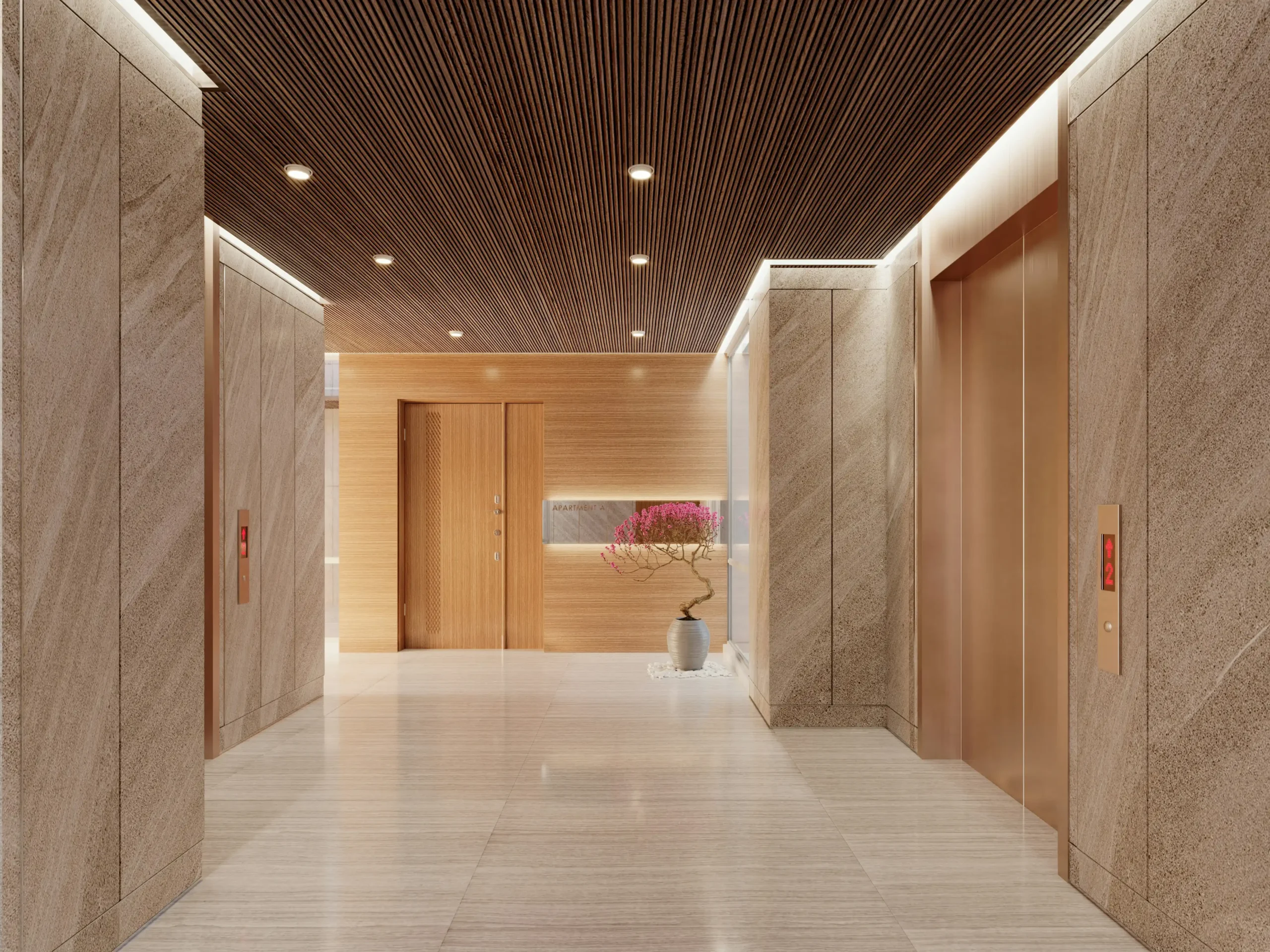
Navy blue doors against soft gray walls introduce sophistication without overwhelming the senses. These contrasting choices work particularly well in contemporary homes where clean lines benefit from strategic pops of color.
Seamless blending takes the opposite approach, matching door colors with walls to create a clean, minimal look that’s especially effective in modern layouts. When doors disappear into their surroundings, rooms feel more expansive and cohesive.
This technique proves invaluable in smaller homes or apartments where you want to maximize the sense of space rather than fragment it with contrasting elements.
Zoning spaces through color provides a subtle way to define functional areas without physical partitions. Different door colors can signal transitions between public and private zones, perhaps lighter doors for communal areas and deeper tones for bedrooms. This approach maintains open-plan benefits while providing psychological boundaries that help organize a home’s flow.
Psychological Influence of Color
The emotional impact of door colors shouldn’t be underestimated, as these transition points set the mood for the spaces they introduce.
Light shades convey openness and calm, making them ideal for smaller rooms or spaces where you want to promote relaxation. Soft whites, pale grays, and gentle pastels reflect more light, creating an airy atmosphere that makes rooms feel larger and more welcoming. These colors work beautifully in bedrooms, bathrooms, and home offices where tranquility supports the room’s purpose.
Dark tones suggest elegance, depth, and formality, lending gravitas to spaces that benefit from a more sophisticated presence. Charcoal, deep green, rich brown, and classic black doors anchor a room visually and create a sense of intentional design. They’re particularly effective in dining rooms, libraries, or master suites where you want to evoke a more refined, adult atmosphere.
Natural hues in earthy colors promote warmth and balance, aligning beautifully with biophilic design trends that connect interiors with nature. Terracotta, sage green, warm taupe, and honey-toned neutrals bring organic comfort to spaces while maintaining versatility across different design styles.
In interior design, doors act as transition points, and their color directly affects how spaces connect visually. When planning renovations, considering the door rough opening dimensions alongside color choices ensures both structural soundness and aesthetic cohesion from the start.
The Role of Door Finishes in Style Definition
While color sets the emotional tone and establishes visual relationships, finish determines texture, reflection, and perceived quality. The surface treatment of your doors affects how light interacts with them, how they feel to the touch, and how they stand up to daily wear.
Popular Door Finishes and Their Effects
Understanding how different finishes behave helps you make choices that support both aesthetics and practicality.
Matte finish delivers a soft, contemporary appearance that’s increasingly popular in modern interiors. This non-reflective surface is forgiving of fingerprints and minor imperfections, making it practical for families with children. Matte finishes create a sophisticated, understated look that never feels flashy or dated, working equally well in minimalist lofts and cozy cottages.
Gloss finish takes the opposite approach, offering a reflective and bold surface that enhances light distribution throughout a space. High-gloss doors can make dark colors feel less heavy by bouncing light around, and they photograph beautifully for that magazine-worthy look. However, this shine comes with a tradeoff, gloss finishes highlight imperfections, fingerprints, and wear more readily than their matte counterparts.
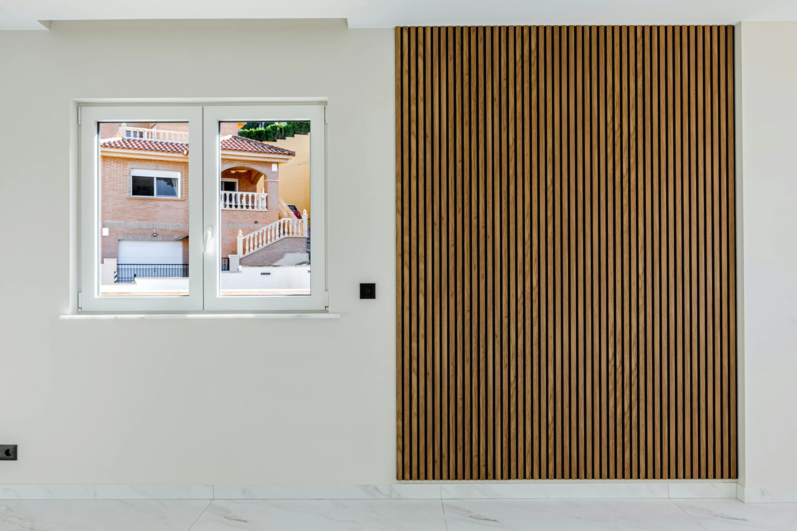
Wood grain or veneer adds natural richness and textural depth that suits both classic and modern homes. The visible grain patterns create visual interest without busy detailing, and they age gracefully as slight wear adds character rather than looking shabby. Wood finishes bring warmth that painted surfaces can’t quite replicate, making them ideal for homes seeking organic, lived-in appeal.
Metallic or lacquered finishes function as statement elements in luxury settings, introducing glamour through reflective surfaces in gold, bronze, or high-shine lacquer. These specialty finishes work best as accents rather than throughout an entire home, perhaps on a powder room door or a dramatic entry to a primary suite.
Finish and Maintenance Considerations
Practicality matters just as much as aesthetics when selecting door finishes for real-world living.
High-gloss finishes may require frequent cleaning to maintain their mirror-like appearance, as every smudge and fingerprint shows prominently. They’re best reserved for low-traffic areas or homes without young children and pets.
Matte and textured finishes prove more durable for high-traffic areas like hallways, mudrooms, and children’s bedrooms. Their surface camouflages minor scratches and daily wear while maintaining a fresh appearance with minimal maintenance.
Natural wood finishes benefit from periodic polishing to maintain their appearance and protective coating. While they require slightly more care than painted surfaces, many homeowners find the warmth and character worth the occasional attention.
Choosing the right finish ensures doors complement furniture, flooring, and overall décor rather than competing with them. When measuring your door rough opening for installation or replacement, consider how the finish will interact with adjacent materials and lighting conditions in that specific location.
Matching Door Choices with Interior Themes
A cohesive look depends on alignment between doors and the broader design language throughout your home. Doors should feel like natural extensions of your chosen aesthetic rather than random elements that happened to be installed.
Theme-Based Door Selection
Different design styles call for specific door treatments that reinforce their distinctive characteristics.
Minimalist interiors thrive with neutral colors, flush doors, and matte finishes that maintain clean lines and uncluttered visual fields. White, light gray, or soft beige doors in smooth surfaces disappear into walls, allowing architectural form and carefully curated furnishings to take center stage. Hardware should be equally minimal, simple lever handles in brushed metal rather than ornate knobs.
Traditional spaces call for rich wood tones, detailed panels, and satin finishes that honor craftsmanship and timeless elegance. Classic six-panel doors in cherry, mahogany, or walnut with subtle sheen create the refined atmosphere traditional design celebrates. These doors work beautifully with crown molding, wainscoting, and other architectural details that define conventional elegance.
Industrial styles embrace dark colors, raw textures, and metal accents that reference warehouse and loft aesthetics. Black or deep charcoal doors with visible hardware, perhaps even barn-style sliding mechanisms, reinforce the urban, repurposed feel. Matte finishes or slightly distressed surfaces enhance authenticity rather than appearing too precious or polished.
Scandinavian design favors light colors, natural wood, and understated finishes that embody the Nordic principles of simplicity and functionality. Pale ash, birch, or painted white doors with visible wood grain maintain the connection to nature while supporting the bright, airy spaces characteristic of Scandi style. Finishes should be natural or semi-gloss, never high-shine.
In well-planned interior design, doors support the theme quietly while enhancing the overall atmosphere. They shouldn’t announce themselves but rather harmonize with floors, trim, cabinetry, and furnishings to create a unified whole.
Conclusion
Door color and finish have a lasting impact on how a home feels and functions, influencing everything from spatial perception to emotional response. When chosen thoughtfully, they enhance visual flow, reinforce design themes, and elevate everyday spaces from ordinary to exceptional. The difference between a house that feels disjointed and one that feels cohesively designed often comes down to these seemingly small details, the consistency of finish across rooms, the strategic use of color to guide movement, the quality of surface that catches afternoon light.


7 Creative Ideas for Designing Flexible Living Spaces
Transform your home with these 7 creative flexible living space ideas. Learn...

9 Space-Saving Design Ideas for Modern Multi-Use Rooms
Transform your home with these 9 innovative space-saving design ideas for multi-use...

Beyond Openings: When Doors and Glazing Become Architectural Features
For much of architectural history, doors and glazing were treated as necessary...

Window Solutions That Work for Basements, Lofts, and Garage Spaces
As a homeowner, you know every bit of space matters. Basements, attics,...

Leave a comment