- Home
- Articles
- Architectural Portfolio
- Architectral Presentation
- Inspirational Stories
- Architecture News
- Visualization
- BIM Industry
- Facade Design
- Parametric Design
- Career
- Landscape Architecture
- Construction
- Artificial Intelligence
- Sketching
- Design Softwares
- Diagrams
- Writing
- Architectural Tips
- Sustainability
- Courses
- Concept
- Technology
- History & Heritage
- Future of Architecture
- Guides & How-To
- Art & Culture
- Projects
- Competitions
- Jobs
- Events
- Store
- Tools
- More

Not far from Lake Mývatn, surrounded by volcanoes, Grjótagjá lies embedded in the barren landscape of Iceland. Formed by a geological fault zone, the balance of power between the European and American continental plates can be seen here through a rock fissure that runs for several kilometres.

The aesthetics of the articulated architecture should do adequate sense to the entirety of the site. The unique impression of the continental plates drifting apart, the resulting landscape – the design should abstract this play of forces and make it spatially perceptible in a different way. Strong elements create a mass that can reflect the existing forces and still appear delicate and light.
With the focus on place, the changing impression of Icelandic nature is also adapted. Due to the vastness of the landscape, the forms in the distance dissolve into their strongest parts. But the closer you get, the more facets of the architecture you perceive through the reduced presence of other elements.

The unconventional use of materials creates an alternating transition between a natural and an artificial world. An architectural anomaly. Clearly man-made, the result is an architecture that adapts the properties of nature, uses the materials at hand and adds spatial qualities to the site that are seemingly reserved for nature. In its artificial presence, the architecture can refer to nature within itself and make it spatially and atmospherically tangible. The native stone becomes a massive object – the vastness of the landscape becomes fragilely tangible. The boundaries between natural space and architecture begin to fray. In this way, the architecture can do justice to the place, give something back to it and yet authentically develop its own aesthetic.

Conceived as a loose ensemble of two spatially and aesthetically complementary elements, but independent in their contrasts. Through their self-confident formal language, they create their own presence without, however, competing with the landscape. In its spatial orientation, the design attempts to strengthen the spatial qualities of the site and sharpen the perception of the landscape.
Despite its aesthetic articulation, the guest house clearly holds itself back, spans a space in dialogue with the fissure and frames a horizontal axis of view into the vastness of the landscape. The abstraction of Grjótagjá is intended to create an architecture that can serve as a shelter for visitors and hikers, but also sharpen the view of the surrounding nature.
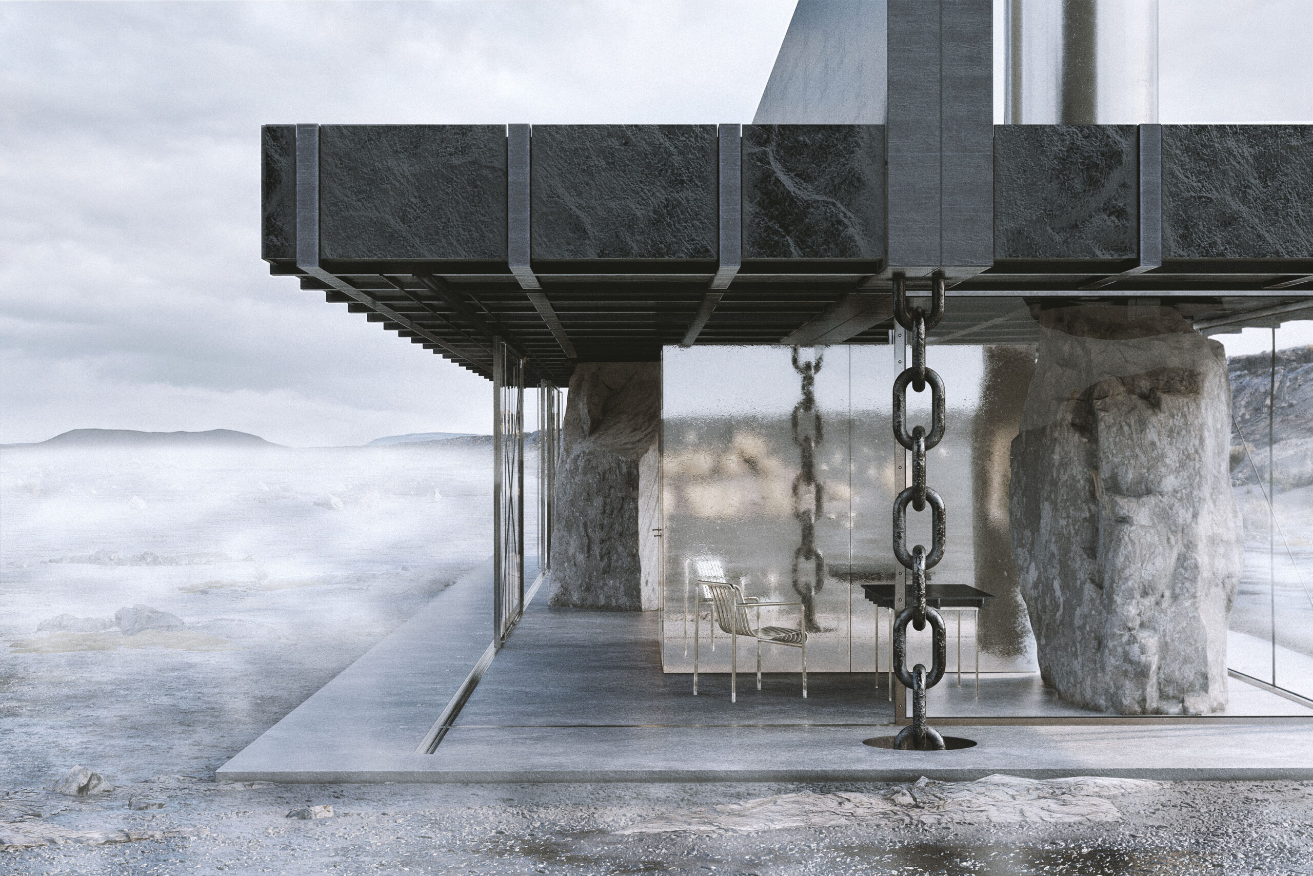
The massive roof in its unconventional form rests on three stones that were quarried on site. Two seemingly oversized chains hold it to the ground. The forces of nature are brought into balance by the power of architecture. In this way, a freely accessible space is spanned that accommodates all the necessary functions. This fusion of the natural and the man-made leads to an artificially altered perception of nature. The stones suddenly become the central component of the design, thus an object and a reflection of themselves.

The relationships in the floor plan are also determined by the context. In the west, the house spans a space with the opposite crevice. This is extended under the roof and framed by the stones.
In the east, one steps through the axis of the stones and has them at one’s back. In combination with the cantilevered roof, this captures the view into the vastness of the landscape.
This creates three surprisingly versatile areas: The actual lounge area with the large table in the centre, facing west towards the fissure. The fireplace with the central chimney to the southeast and the semi-public area to the north, separated by the set functional core. The kitchen, which is open to the space, gives visitors the option of self-catering and serving themselves. The fireplace is also accessible to hikers at all times and can thus serve as a retreat in bad weather.
The climate layer is realised by lightweight frame elements with polycarbonate sheets that can be freely positioned in their opening behaviour depending on the weather and functional needs. The spatial boundaries are thus not defined by the thermal layer, but result from the positioning of the elements in the floor plan and their orientation to the plot.

The tower strives upwards in its entire form and appears almost weightless. In its unique way, it creates its own aesthetics, which still fits into the expanse as a point of orientation. Similar to the human perception of the landscape, the presence of the tower changes depending on the distance of the viewer. From a distance, the monolithic staircase catches the eye; up close, various details and references become perceptible and the tower dissolves into a filigree volume. Similar to the observation of nature, sculptural and filigree at the same time.

The base of the tower forms a closed space that has no clearly defined opening. The visitor consciously steps through the taut chains and thus finds himself inside the tower and at the beginning of the spatial continuum upwards. A path that is meant to make the differences in height physically tangible.
Via one of the two external staircases, visitors climb out of the defined space onto the first, still protected platform. The height corresponds to the opposite side of the fissure. In this way, the difference in height of the two continental plates becomes tangible through the absolute references.
 From here, visitors enter the inner staircase, which strives upwards as a staircase running in opposite directions. The chains that now surround the staircase at a distance create a shell around it that lets the view through, but still creates a sense of enclosure.
When stepping onto the upper exit, visitors leave this protection and are left unprotected against the elements. This second platform shifts the focus to the unconditional expanse of the Icelandic landscape, allowing the visitor to experience it in a way never before possible.

The spatial path of the staircase thus abstracts the narrative qualities of the site without imitating them, and yet manages to make additional qualities tangible for the visitor. Structurally, the tower is a closed system that attempts to meet its aesthetic demands reduced to the minimum. The external staircase in the lower section creates a structural base that supports the free-standing staircase above. The ascending stairs serve here as diagonal bracing. Vertical loads are transferred downwards via the staircase as one volume into the base.
The chains are not only spatial envelopes, but also have their constructive necessity. The primary horizontal loads, such as wind loads, are balanced via the chains, which are braced on all sides, as a kind of inverted support. As elements reacting to tension, they thus keep the tower in loose balance.
 The parallel staircases allow for a functional separation of ascent and descent. This makes a very narrow construction possible, as there is only one direction of walking per staircase. In this way, the whole tower only has a diameter of 4.2 m. Thus, only point foundations are necessary for the tower, which means a minimal intervention in the natural conditions.
illustrarch is your daily dose of architecture. Leading community designed for all lovers of illustration and drawing.
Submit your architectural projects
Follow these steps for submission your project. Submission FormLatest Posts
Renaatus Irumathi
Nestled on the eastern shores of Hulhumale’, Renaatus Irumathi Residence greets each...
White Khamovniki
The project is based on the idea of a building as a...
Millennium Horizon
The future cityscape Millennium Horizon is a groundbreaking architectural project envisioned for...
Wuto Space
Table of Contents Show DisobeyFearSide A and BThe Ideal Life A two-bedroom,...


Leave a comment