- Home
- Articles
- Architectural Portfolio
- Architectral Presentation
- Inspirational Stories
- Architecture News
- Visualization
- BIM Industry
- Facade Design
- Parametric Design
- Career
- Landscape Architecture
- Construction
- Artificial Intelligence
- Sketching
- Design Softwares
- Diagrams
- Writing
- Architectural Tips
- Sustainability
- Courses
- Concept
- Technology
- History & Heritage
- Future of Architecture
- Guides & How-To
- Art & Culture
- Projects
- Competitions
- Jobs
- Events
- Store
- Tools
- More
Designing the Architecture of Waiting Stations and Transitional Space
Explore the architecture of waiting stations and transitional spaces: how design shapes comfort, flow, and inclusion. Learn principles for crowd dynamics, safety, clear wayfinding, environmental quality, amenities, and technology that turn lobbies and platforms into vital civic infrastructure and waiting into a productive experience.

Table of Contents Show
We spend more time in in‑between places than we admit, platforms, lobbies, vestibules, concourses, curbside zones. The architecture of waiting stations and transitional space is where cities reveal their temperament: generous or stingy, legible or confusing, calm or chaotic. When we design these thresholds well, dwell time becomes productive, stress drops, and the system performs better. When we don’t, everything backs up. In this piece, we lay out how we think about these environments, from human comfort to crowd dynamics, so they work at rush hour and in the quiet minutes, too.
The Stakes of Transitional Space

Liminality and the Social Life of Waiting
Waiting isn’t dead time: it’s social time under pressure. In stations and transfer halls, we see reunions, negotiations, quick meals, and quiet pauses. That liminality heightens emotion, so small design moves carry outsized weight. Give people agency, clear information, a choice of seating postures, a spot to step aside, and we reduce cortisol and conflict. We’ve seen a single, well-placed leaning rail near a busy platform diffuse crowding because it creates dignified “micro-rest” options without blocking flow.
Typologies and Scales
Transitional space spans scales: bus stops and school entries, ferry terminals, airport security lanes, hospital intake, courthouse screening, even elevator lobbies in supertalls. Each has a signature rhythm, peaks, troughs, and edge conditions. We map these temporal patterns first. A small town depot leans on passive comfort and civic identity: an urban intermodal hub demands layered queues, rapid wayfinding, and robust finishes. The constant: design the handoffs, door to hall, hall to queue, queue to service, so the next move is obvious.
Human-Centered Principles
People don’t just sit: they perch, lean, and hover. We mix options: 17–19 in seat heights with armrests (for stand assists), 10–15° leaning rails along edges, and 28–30 in work counters for short laptop sessions. Varied back heights help stroller-pushers and backpackers. We target short-wait comfort over lounge sprawl: breathable upholstery in quieter bays, durable hardwood or molded seats in high-turnover zones. Small details count, hooks for bags, rounded edges, and a few seats facing away from the crowd for social relief.

Inclusion and Universal Design
If a space works for the most vulnerable user, it works for all of us. We plan clear 5 ft turning circles, tactile paving at decision points, ramps at 1:12, and high-contrast, multilingual signage with pictograms. Audio announcements pair with visual boards: induction loops serve hearing aid users. Parents need stroller paths that don’t fight stairs. Nursing and prayer rooms near, not beyond, security. Gender-inclusive restrooms, low-height drinking fountains, and seating with both firm and soft options round out equitable access.
Safety, Visibility, and Trust
Safety starts with sightlines. We avoid blind corners, light faces (vertical illumination) so we can read intent, and keep glazing transparent at eye level. Active edges, retail, staffed kiosks, provide natural guardianship. Cameras and call points are obvious but not ominous. At night, 100–300 lux in circulation with warmer tones reduces glare: brighter pools mark help points and exits. Materials cue behavior: a subtly different floor at platform edges, tactile strips at thresholds. When we telegraph movement, people trust the space and one another.
Flow and Legibility
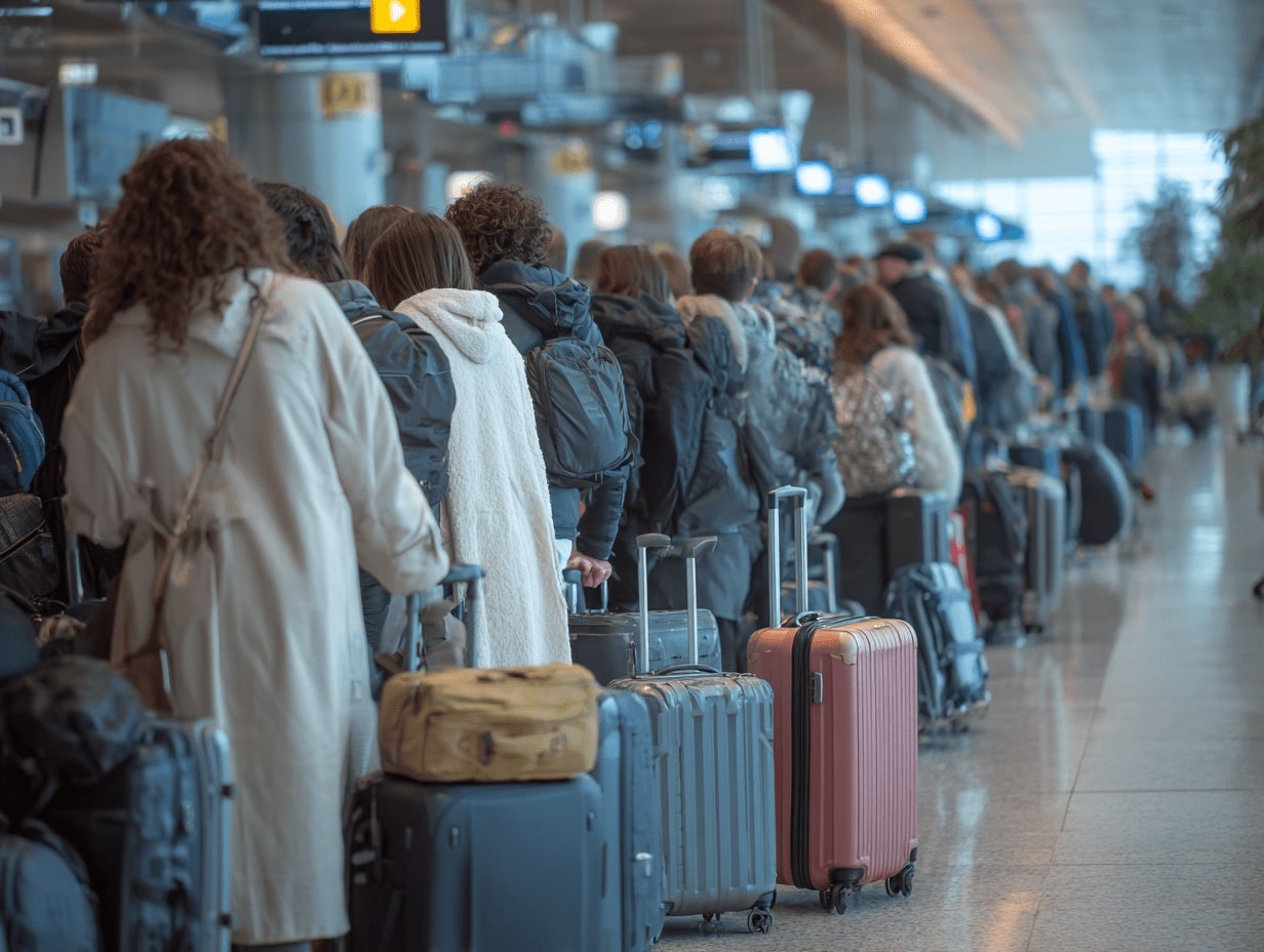
Good queues feel fair and move fast. Single serpentine lines reduce jockeying: parallel lanes suit pre-screened or assisted users. We design for throughput, not just area. A quick rule we use: if arrivals spike to 20 people/minute and service averages 10 seconds per person, you’ll hold roughly 33 people in the system, so give that line 250–300 sq ft and visual reassurance about progress. Pre-staging (trays out before security, tickets checked before turnstiles) collapses dwell at bottlenecks.

We aim for a “one-glance” environment: at any decision point, the next two moves should be evident. Big moves (gates, platforms, exits) get large signs aligned with travel vectors: confirmation signs sit past the turn. Landmarks, color-washed cores, a distinct art piece, a light well, anchor memory. We keep mounting heights consistent, pair text with universal icons, and use floor and ceiling cues as guidance: linear lights and floor textures quietly pull us in the right direction.
Environmental Quality
Daylight calms crowds, but glare derails them. We favor high clerestories, fritted glazing, and shades that cut contrast, not just brightness. For acoustics, absorbing ceilings and baffles target an NRC around 0.70 in busy halls: short reverberation times keep announcements intelligible. Thermal comfort matters even in short stays, draft-free entries, vestibules that actually seal, and radiant floors at cold platforms make winter waits bearable. Clean, frequent air changes with good filtration boost perceived safety.

Transitional space is tough on finishes. Terrazzo floors, phenolic partitions, solid-surface counters, and stainless where carts strike pay off. We specify textures that hide scuffs yet clean easily, rounded corners on millwork, and removable seat pads in quiet zones. Warmth doesn’t have to vanish: wood accents in protected areas, colored mineral paints, and woven panels bring civility without fragility. Clear maintenance zones and floor drains near vending and bottle fillers keep grime from migrating.
Amenities, Technology, and Business Model
Amenities shape dwell time and revenue, but also dignity. We balance grab-and-go food with bottle fillers, small local vendors with anchor tenants, and add civic programs: library holds lockers, repair cafes on weekends, pop-up health screenings. Seating should never be contingent on purchase: retail edges can lend light and staff presence to the concourse while leaving sightlines open.

Digital Layers, Power, and Work Surfaces
Information should be calm, current, and everywhere you need it, once. E-ink boards for schedules, push notifications for gate changes, QR codes for detailed maps. Reliable Wi‑Fi, USB‑C and outlets at a safe density, and a few counter-height bars let us answer email without camping. We plan conduit and access panels for inevitable upgrades so tech doesn’t age the space in three years.
Performance, Resilience, and Sustainability
Peaks and exceptions are where designs prove themselves. Reconfigurable stanchions, wider pinch points, and outdoor spill zones handle holiday surges. Touchless doors and fixtures, easy-to-clean surfaces, and good ventilation came out of the pandemic playbook and remain useful. Redundant power for critical signage, flood-resilient ground floors where needed, and secure back-of-house routes keep operations steady when things go sideways.

We don’t guess: we measure. People counters and privacy-safe heat maps reveal bottlenecks. We track dwell times, missed connections, queue lengths, energy use, and even acoustic comfort. Short intercept surveys and staff debriefs round out the picture. Then we iterate, A/B test sign placement, tweak seating mixes, re-time doors. A living dashboard aligns operations, design, and business goals so the space keeps getting better.
Conclusion
If we treat the architecture of waiting stations and transitional space as civic infrastructure, not leftover area, we gain calmer journeys, safer crowds, and stronger neighborhoods. The work is part choreography, part hospitality, part systems thinking. When we design for the body, clarify the next move, and instrument the environment to learn, waiting stops feeling like a penalty and starts working as time well spent.
- airport waiting lounge design
- architectural design for waiting spaces
- bus stop architectural design
- communal space architecture
- designing commuter hubs
- efficient space utilization in stations
- innovative waiting area design
- modern waiting room design
- public transit architecture
- public transport station architecture
- public waiting facilities design
- train station planning
- transit hub architecture
- transitional space architecture
- transitional space design
- transitional space planning
- urban transit station design
- waiting area design concepts
- waiting area interior design
- waiting station design
Submit your architectural projects
Follow these steps for submission your project. Submission FormLatest Posts
The Art of AI Urban Planning: Designing Livable and Sustainable Cities
I urban planning is moving from research labs into city halls, helping...
Snøhetta, MVRDV and BIG Design Istanbul’s Ion Riva Master Plan
The Ion Riva Master Plan is one of Istanbul's most significant recent...
Sustainability Landmark in Rotterdam: 5 Shortlisted Teams
Five leading architecture firms — MVRDV, Heatherwick Studio, Mecanoo, Office for Political...
Rojkind Arquitectos Is Bringing Mexico City’s Design Vision to Tirana
Rojkind Arquitectos wins the Zyber Hallulli mixed-use competition in Tirana, Albania, proposing...


Leave a comment