

The Philosophy of Less Is More in Interior Design
An accessible look at the philosophy of less is more in interior spaces: where Mies van der Rohe's idea came from, what negative space and quality over quantity really mean, and how to apply minimalist restraint at home.
 Elif Ayse Sen27 October 20235 Mins read793
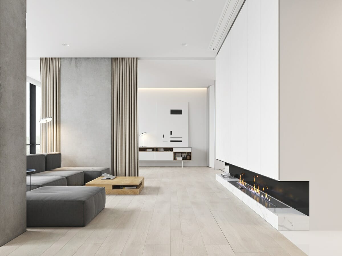
Table of Contents Show
The idea of less is more in interior design means stripping a room back to what genuinely serves it, so the pieces that stay have space to breathe. Rooted in the work of architect Ludwig Mies van der Rohe, this minimalist interior philosophy treats empty floor, natural light, and honest materials as design elements in their own right, not gaps waiting to be filled.
For anyone tired of rooms that feel busy and heavy, the promise of a calm, edited home is a strong pull. That promise sits at the center of less is more in interior design, an approach that asks you to subtract before you add. It shares a lineage with the wider move toward minimalist house design, yet inside a single room the choices feel more personal. This is where you sleep, cook, and switch off. What follows is a practical look at where the idea started, what it actually asks of a space, and how to apply it without turning your home into a cold gallery.
Where the Phrase “Less Is More” Began
Simple, uncluttered living has appeared in many cultures for centuries, from traditional Japanese interiors to Shaker furniture. As a design slogan, though, “less is more” belongs to the modernist movement of the early twentieth century. Architects and designers wanted to break from the heavy ornament of Victorian and Beaux-Arts interiors, and they turned instead to clean form, exposed structure, and function you could read at a glance.
Mies van der Rohe carried that thinking into some of the most studied buildings of the century. His interiors relied on open plans, a small set of rich materials, and a near-total absence of decoration. The point was never emptiness for its own sake. It was about giving each chosen element enough room to register fully.

🎓 Expert Insight
“Less is more.” Attributed to Ludwig Mies van der Rohe, architect
Mies used the phrase to argue that careful restraint produces stronger spaces than addition. In an interior, that means one well-made chair in an open corner often reads better than three ordinary ones crowded together.
What the Minimalist Interior Philosophy Actually Means
At its core, this way of designing rests on a simple test: does an object earn its place? Every piece of furniture, every surface, and every decorative item should serve a clear function or add real visual value. Anything that fails that test reads as clutter, no matter how nice it looked in the store.
Three ideas do most of the work. The first is function, where each element has a job to do. The second is a restrained aesthetic, since reducing distraction lets you actually see the grain of a timber table or the line of a well-designed lamp. The third is calm, because a room with fewer competing objects tends to feel quieter and easier to relax in. Together these turn less is more in interior design from a look into a set of decisions you can repeat in any room.
There is also a wellbeing angle that often gets overlooked. A space with fewer objects competing for attention is easier to clean, easier to move through, and easier to think in. Many people report that an edited bedroom or workspace helps them wind down faster, because there is less visual noise to process at the end of the day. That link between an ordered room and a settled mind is a large part of why the minimalist interior philosophy keeps returning to fashion rather than fading as a passing trend.
📌 Did You Know?
The phrase “less is more” did not start in architecture at all. It appears in Robert Browning’s 1855 poem “Andrea del Sarto,” decades before Mies van der Rohe adopted it as his design creed and made it a byword for modernist restraint.
Negative Space, Decluttering, and Why Emptiness Works
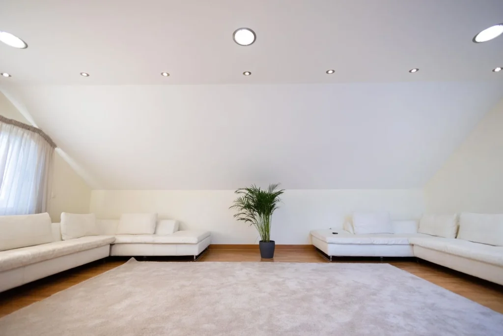
The hardest part of a minimalist interior philosophy is learning to value what is not there. Negative space, the deliberate emptiness around and between objects, is an active part of the design rather than a shortage of furniture. A bare stretch of wall or a clear expanse of floor gives the eye somewhere to rest and makes the pieces you keep feel intentional.
Decluttering is the daily engine behind this. When every item has a home and surfaces stay mostly clear, a room reads as calm almost automatically. This is also why storage matters so much in edited rooms. Built-in cabinets, closed shelving, and hidden compartments let you own what you need while keeping it out of sight. Good use of daylight supports the same goal, and there are practical ways to bring more natural light into a home so open space feels airy rather than stark.
💡 Pro Tip
Before you buy more storage to hide clutter, run the reverse test first. Take everything off one surface, then return only the items you reached for in the past month. Most people find a third of the objects never make it back, which frees space without a single purchase.
The Core Principles at a Glance
These principles turn the philosophy into choices you can make room by room. The table below pairs each one with how it tends to look in a real interior and a quick way to apply it.
Core Minimalist Principles for Interior Spaces
| Principle | How It Looks in Interiors | Tip |
|---|---|---|
| Function first | Each piece has a clear job, with dual-purpose furniture common | Question any object that only decorates |
| Neutral palette | Whites, greys, beiges, and soft blacks as a quiet backdrop | Let one material or artwork be the accent |
| Quality over quantity | Fewer, better-made pieces instead of many cheap ones | Buy slowly and choose lasting materials |
| Negative space | Clear floor and empty wall treated as part of the design | Leave gaps rather than filling every corner |
| Texture over pattern | Wool, linen, leather, and stone add depth within a plain palette | Mix three textures before adding any print |
Quality Over Quantity, in Real Rooms
The phrase “quality over quantity” gets repeated so often it can lose meaning, but in an edited interior it has a clear payoff. When you own fewer things, each one has to work harder, which justifies spending more on the pieces you do keep. A solid oak table, a well-built sofa, or a single considered light fixture will outlast a room full of disposable items and hold its look for years. The cost math tends to favor this approach over time, since one durable piece rarely needs replacing while cheaper furniture cycles through the house every few seasons.
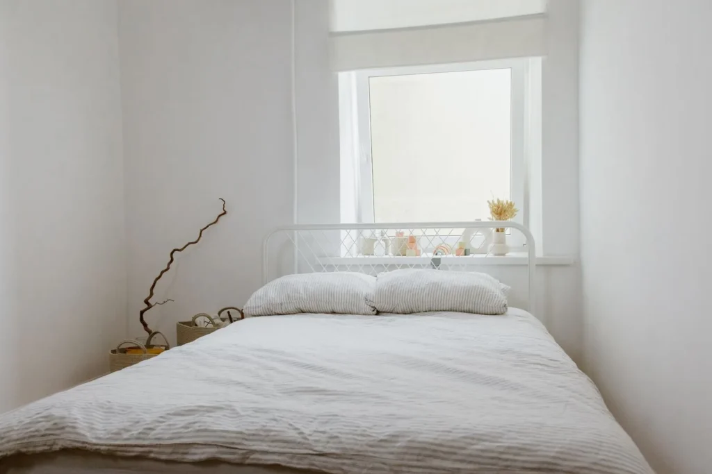
A common worry is that fewer pieces will make a home feel empty or unwelcoming. In practice the opposite usually happens, provided you get the balance right. Warmth comes from material and light rather than sheer volume, so a wool throw, a timber floor, and a low pool of lamplight can make a spare room feel far cozier than one packed with cushions and trinkets. The goal is a space that feels intentional, not bare.
This restraint also carries through to color and detail. Streamlined furniture with clean lines, sheer curtains that let daylight through, and a tight material list all keep attention on form rather than fuss. If you want to see how these choices read across full rooms, this walkthrough of minimalist interiors beyond plain white walls shows the range that restraint still allows.
🏗️ Real-World Example
Farnsworth House (Plano, Illinois, 1951): Mies van der Rohe reduced this glass and steel retreat to a floating floor plane, a roof, and a single service core. With almost no interior walls or added ornament, the surrounding landscape and a handful of chosen furnishings become the entire decorative scheme, a built argument for less is more.
The Bigger Picture
It is easy to read minimalism as a style of white rooms and bare shelves, but the deeper idea is about attention. A room built on less is more in interior design is really a set of decisions about what deserves your daily focus. Seen that way, the emptiest wall in the house can be the most generous part of the design, because it hands the space, and your mind, a little room to rest. For more on the underlying rules that hold these rooms together, the fundamentals in this guide to minimalist design basics are a useful next stop.
External references: Ludwig Mies van der Rohe (Wikipedia), Mies van der Rohe at MoMA, Mies van der Rohe (Britannica), Minimalism coverage on ArchDaily, and Minimalism (Wikipedia).




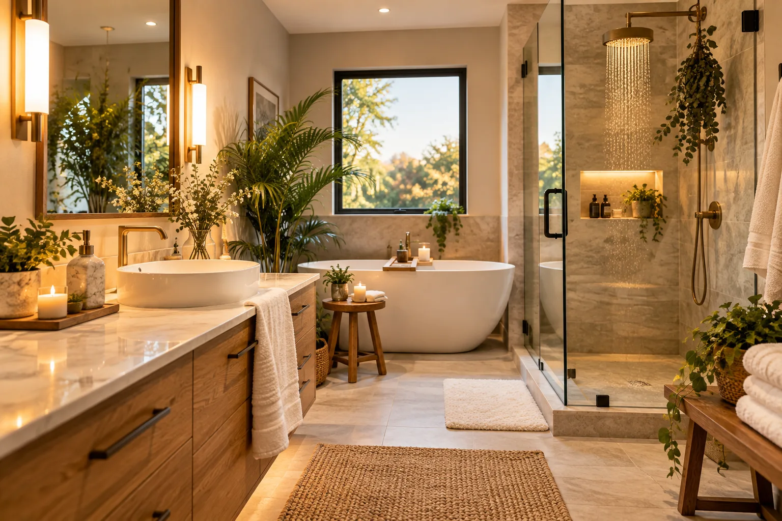
Spa-Like Serenity: 5 Accessible Luxury Upgrades to Transform Your Master Bathroom
Five accessible upgrades, from decluttering and layered lighting to plush textiles, natural...
 illustrarch Editoral Team3 Mins read
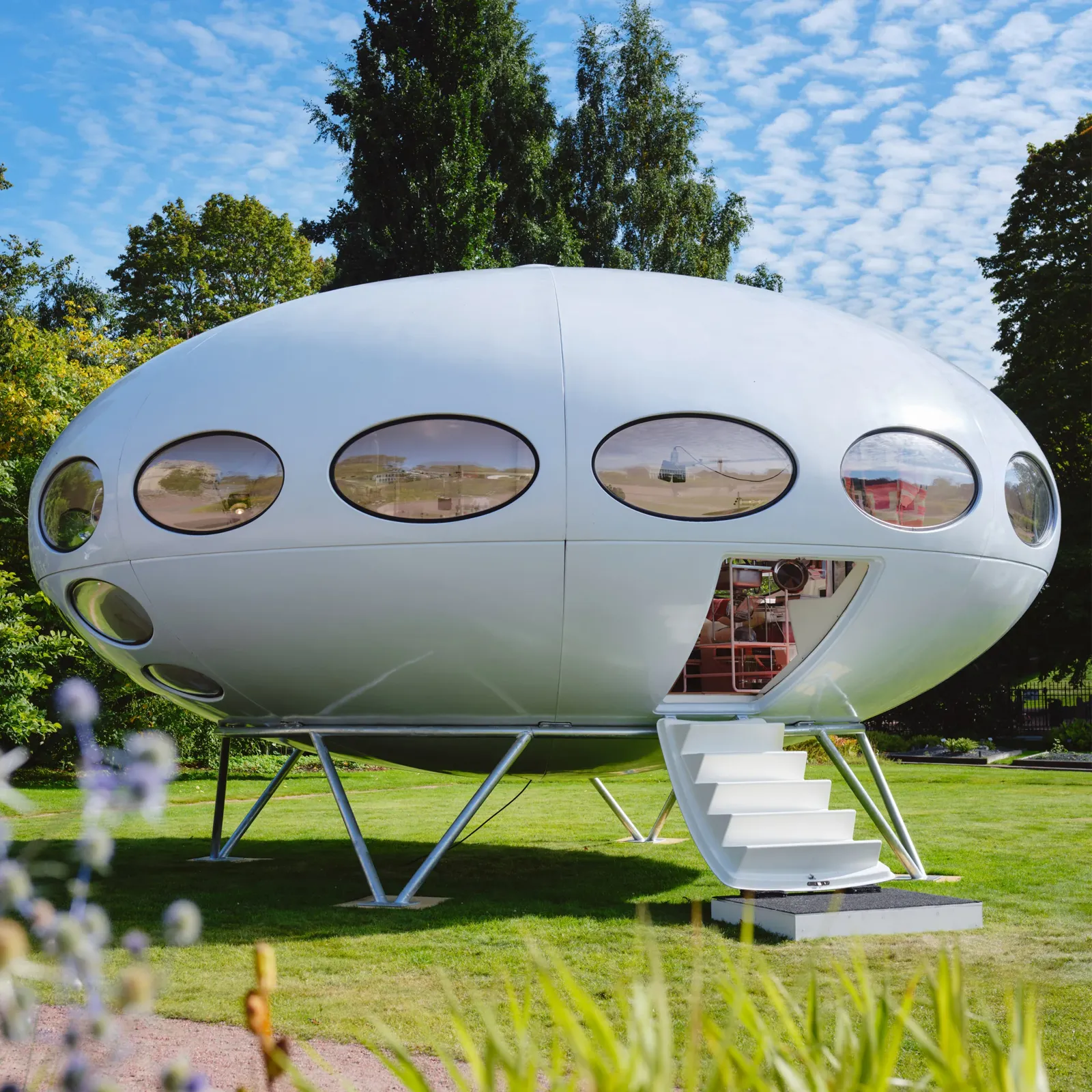
Futuro House Production Revived in Finland After Decades-Long Hiatus
A Facebook listing for abandoned moulds led to the first new Futuro...
illustrarch Editoral Team3 Mins read
How to Fill a Large TV Wall?
A broad living room wall poses an immediate spatial challenge the moment...
illustrarch Editoral Team4 Mins read
Building Your Dream Home in NSW: What You Should Know About Montgomery Homes
Montgomery Homes has been building across Sydney, Newcastle, the Hunter, Wollongong and...
illustrarch Editoral Team4 Mins read


Leave a comment