- Home
- Articles
- Architectural Portfolio
- Architectral Presentation
- Inspirational Stories
- Architecture News
- Visualization
- BIM Industry
- Facade Design
- Parametric Design
- Career
- Landscape Architecture
- Construction
- Artificial Intelligence
- Sketching
- Design Softwares
- Diagrams
- Writing
- Architectural Tips
- Sustainability
- Courses
- Concept
- Technology
- History & Heritage
- Future of Architecture
- Guides & How-To
- Art & Culture
- Projects
- Interior Design
- Competitions
- Jobs
- Store
- Tools
- More
Successful Architectural Presentation Boards #4
Presentation boards require students to organize information, select appropriate images and graphics, and create a coherent and persuasive narrative. These skills are fundamental to the practice of architecture and are essential for creating successful designs.
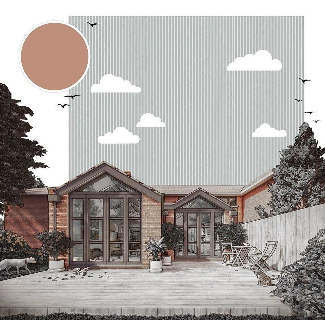
Architectural presentation boards are an essential tool for communicating design ideas and concepts to clients, stakeholders, and other members of the design team. A well-designed presentation board can effectively convey the design intent, key features, and benefits of a building or project in a visually compelling and accessible way. It can also provide an opportunity for architects to showcase their creativity, innovation, and expertise, and to build trust and credibility with clients and stakeholders.
Presentation boards require students to organize information, select appropriate images and graphics, and create a coherent and persuasive narrative. These skills are fundamental to the practice of architecture and are essential for creating successful designs. Through the process of creating presentation boards, students learn how to effectively convey their ideas and visually communicate their design intent.
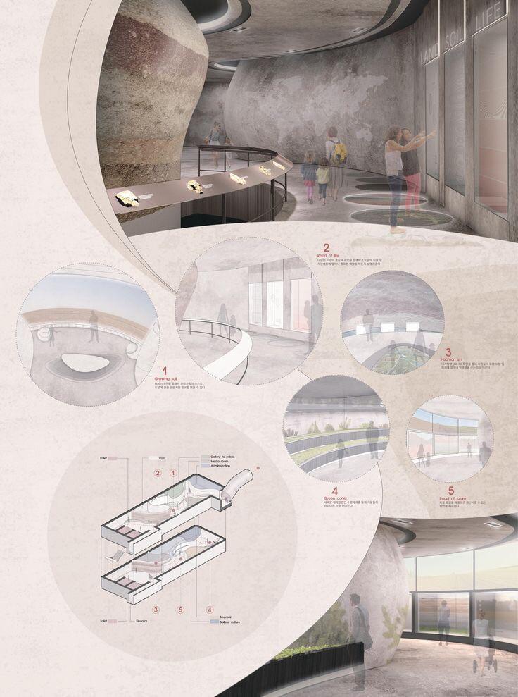
Like in this example, architectural presentation boards that incorporate soft colors and geometric forms can be highly effective in communicating a project’s design intent and creating an emotional connection with viewers. This can be especially effective in a crowded design competition or exhibition, where a presentation board that stands out can help a project get noticed.
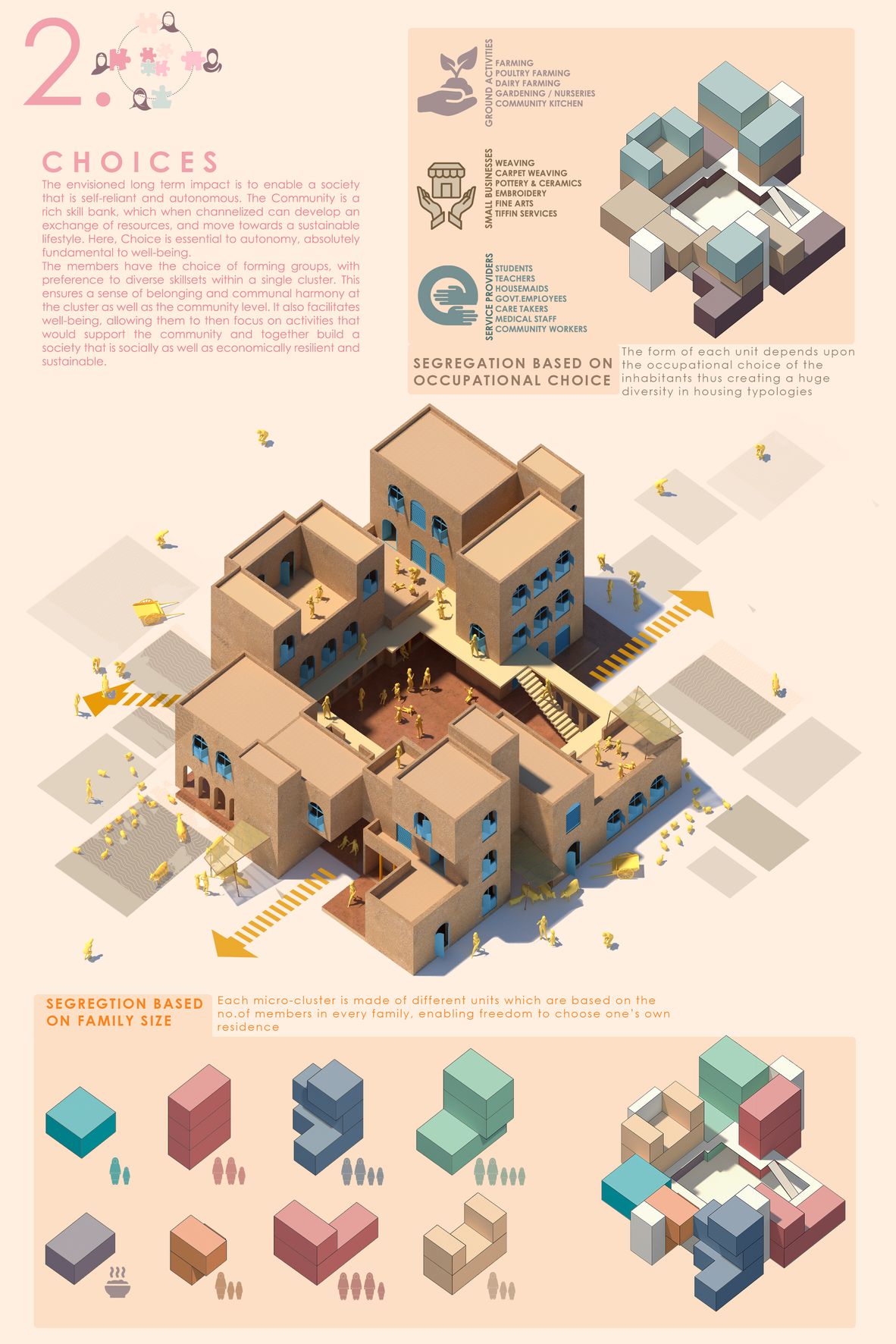
Bold colors and geometric forms can also be used to convey a project’s personality and design intent. For example, a project with a futuristic aesthetic might incorporate angular forms and geometric shapes, while a more traditional project might use muted earth tones and organic forms. By using colors and forms that reflect the project’s design philosophy, the presentation board can help viewers understand the project’s vision and style.
By incorporating a matching color chart, the presentation board can create a consistent color scheme that ties together all of the different elements of the project. This can be especially effective in complex projects with multiple design elements. By using a matching color chart, the presentation board can help viewers understand the relationship between different design elements and how they fit together as part of a larger whole. A matching color chart can also be used to enhance the project’s branding and create a memorable impression on viewers. By using consistent colors throughout the presentation board, architects can create a sense of cohesiveness and professionalism that can help them stand out in a competitive design environment. This can be especially important for firms looking to build a strong brand identity.
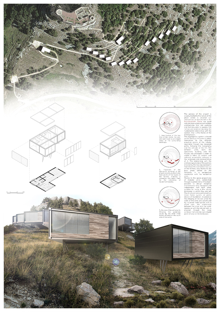
The use of natural renderings and colors can immediately convey a project’s emphasis on sustainability and connection to the environment. For example, a project with a focus on using recycled materials and minimizing environmental impact might incorporate earthy tones and images of natural materials. By using natural renderings and colors, the presentation board can help viewers understand the project’s commitment to sustainability.
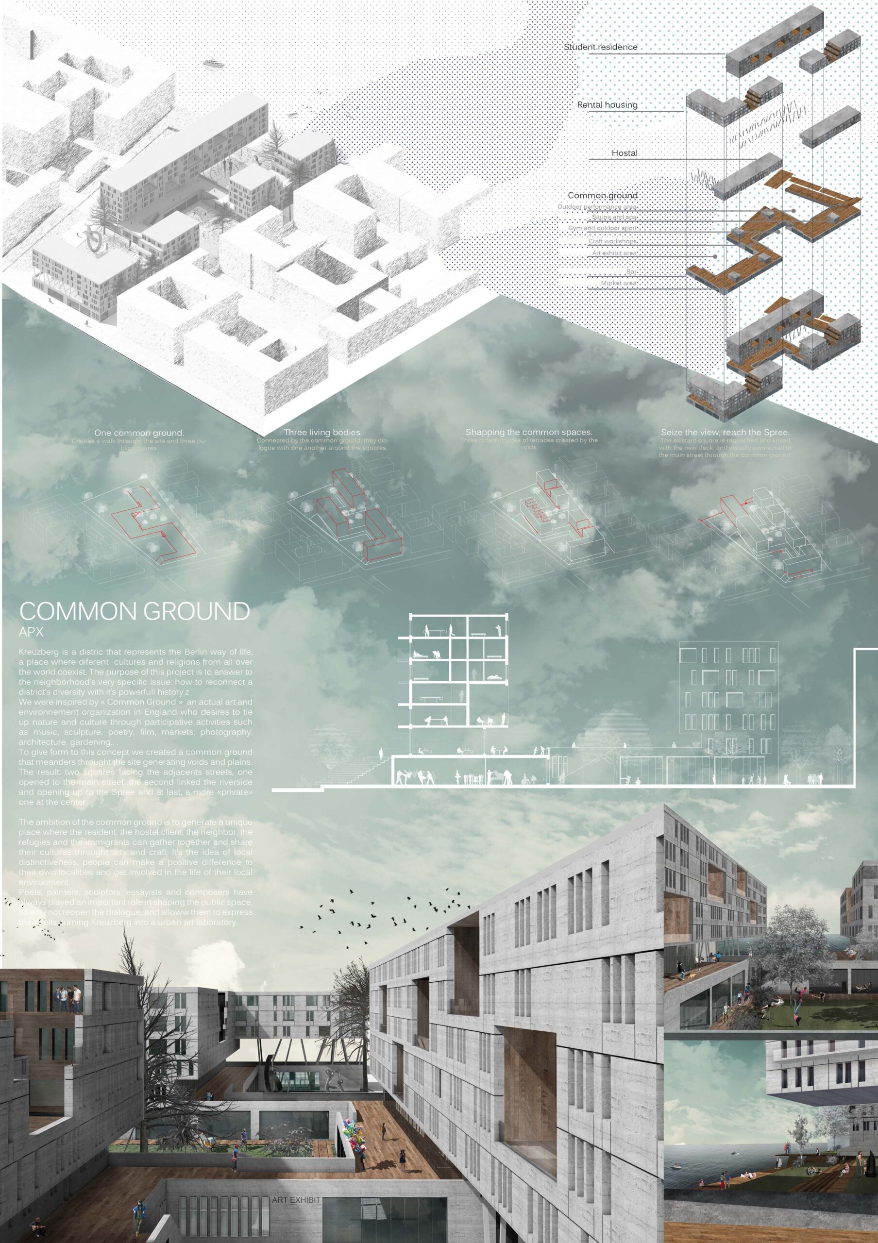
Natural renderings and colors can also be used to create a sense of tranquility and calmness, which can be especially effective in healthcare or residential projects like in these examples. For example, a presentation board for a healthcare facility might incorporate images of natural landscapes and soothing earthy tones to create a calming environment for patients. By using natural renderings and colors strategically, the presentation board can help create a sense of peace and relaxation.
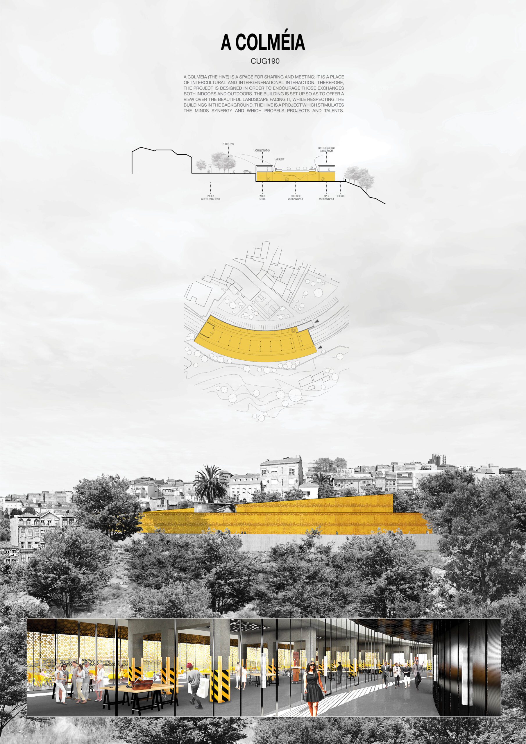
The use of neon colors and highlighted objects can immediately create a sense of vibrancy and energy in a presentation board. This can be especially effective in projects with a focus on innovation and cutting-edge design. By using bright, bold colors and highlighting unique features of the project, the presentation board can help viewers understand the project’s dynamic and exciting qualities.
Highlighted objects and neon colors can also be used to emphasize key design elements of a project. For example, a project with a strong focus on sustainability might use bright green neon colors to highlight sustainable features such as solar panels or rainwater harvesting systems. By using highlighted objects and neon colors strategically, the presentation board can help viewers understand the project’s key selling points and unique features.
- arch projects presentation
- architectural presentation
- Architectural Presentation Boards
- architectural presentation boards guide
- architectural presentation sheets
- Architecture Student Presentation
- Fonts for Presentation
- How to create architectural presentation
- how to prepare jury presentation
- jury presentations
Submit your architectural projects
Follow these steps for submission your project. Submission FormLatest Posts
How to Use Color and Layout in Your Architecture Presentation Board
An architecture presentation board becomes a powerful storytelling tool when color, layout,...
Enhancing Architectural Presentations: Leveraging Visual Storytelling Tools
In architecture, a design’s brilliance is only as effective as its presentation....
Best Portable Projectors for Architectural Presentations
Architects are constantly presenting their ideas, whether it’s showing design concepts to...
Successful Project Presentation: 5 Effective Tools to Try
After you invest time and effort into a project, you probably want...










Leave a comment