

How to Use Color and Layout in Your Architecture Presentation Board
An architecture presentation board becomes a powerful storytelling tool when color, layout, and clarity work together. Choosing the right palette, placing drawings with intention, and using hierarchy help guide the viewer through your concept step by step. With thoughtful organization, your board becomes more professional, readable, and visually compelling.

Table of Contents Show
An architecture presentation board is one of the most important tools for showing your ideas in a clear and professional way. It helps communicate the story behind your design, even when you are not there to explain it. The colors you choose and the way you arrange your drawings, text, and images play a big role in how people understand your project. With the right use of color and a well-planned layout, you can guide the viewer’s eye, highlight key points, and make your board feel organized and easy to follow.

Why Color and Layout Matter in Architecture Presentation Boards
Color and layout shape how people see and understand your design from the very first moment. The right colors can create a mood, highlight key ideas, and make complex information easier to follow. A clear layout helps organize your drawings, text, and diagrams so the viewer can read your project like a story, step by step. When color and layout work well together, your board becomes more engaging, more professional, and much easier to understand.
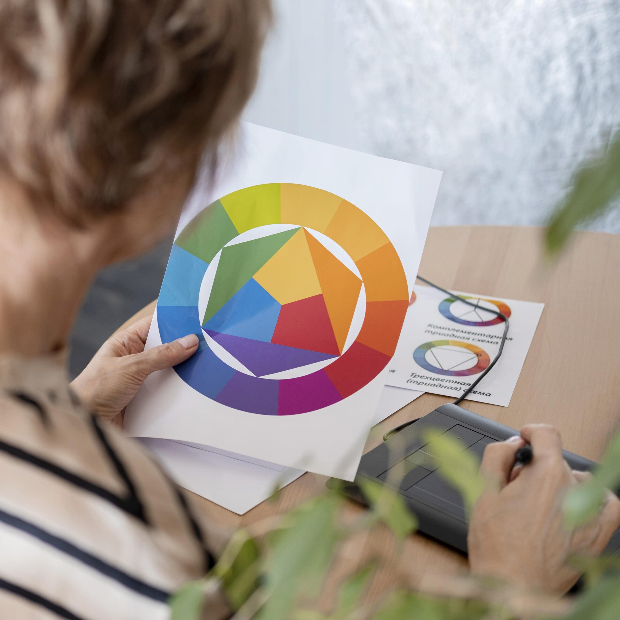
Choosing the Right Color Palette
The color palette sets the tone of your presentation board and helps create a strong visual identity. Limiting your selection to two to four colors keeps the board clean and focused. Soft neutrals like light gray, beige, or off-white work well for backgrounds, allowing drawings and diagrams to stand out. Add one or two accent colors—such as deep blue, terracotta, or mustard yellow—to emphasize key information or guide the viewer’s attention.
Colors should also relate to the character of your project. A nature-based design might use greens and earthy browns to reflect its atmosphere, while a contemporary or high-tech concept may suit cooler tones like charcoal gray, white, and electric blue. When the palette aligns with the story of your work, the board feels more cohesive, expressive, and visually balanced.

Free Online Color Palette Creator
Drag & drop an image or click to upload
Supports JPG, PNG, WebP
Using Color Strategically on Your Board
Color works as a visual guide that helps the viewer understand your board in the right order. Accent colors are especially useful for directing attention to the most important elements, such as circulation diagrams, massing studies, or key concept graphics. For example, a single bold color like red, cobalt blue, or burnt orange can highlight movement lines or structural ideas without overwhelming the layout. When used consistently, these accents create a clear path for the viewer’s eye and make your narrative easier to follow.
Color also helps establish hierarchy and maintain readability. Primary information—like plans, sections, and main diagrams—can use stronger or more saturated tones, while secondary notes and supporting graphics work well with softer variations of the same palette. Text should stay high-contrast, such as black on white, dark gray on light backgrounds, or white on deep charcoal, to ensure clarity. Labels, arrows, and small diagram elements should repeat the same accent color so the board feels unified. With thoughtful placement, color becomes a tool for clarity rather than decoration.

Mastering Layout Principles
A strong layout helps your presentation board read clearly and logically, guiding the viewer through your project without confusion. Start with a simple grid to keep spacing consistent and align drawings, text, and images. Place the most important elements—such as plans, sections, or key diagrams—where the eye naturally lands, usually at the center or upper area of the board. Supporting materials like process sketches, material studies, and smaller diagrams should sit around them in a structured flow. Keep margins even, maintain balanced spacing, and leave enough negative space so the board doesn’t feel crowded. When everything is aligned and visually ordered, the board feels more professional, readable, and convincing.

Placing Architectural Drawings and Visuals
Architectural drawings and visuals should be arranged so the viewer can understand the project at a glance and then explore details step by step. Start by placing your main drawings—such as the site plan, floor plans, sections, and elevations—in positions of highest visibility, usually near the center or aligned along a clean vertical axis. Keep line weights and styles consistent so the board feels unified. Renders and perspective views work best when used as supporting elements, placed near the drawings they relate to or positioned as “hero images” that introduce or conclude the board. Diagrams, icons, and short text labels should sit close to the elements they describe to avoid visual confusion. When everything has a clear purpose and a defined place, the board becomes easier to read and visually stronger.

Common Mistakes to Avoid
Many presentation boards lose their impact because of avoidable design mistakes. Here is the most common mistakes to avoid while designing architectural presentation boards:
-
Using too many colors, which creates visual noise and weakens the concept.
-
Overcrowding the board with too many images, text blocks, or diagrams.
-
Lacking a clear layout, making it difficult for the viewer to follow the project story.
-
Inconsistent fonts or graphic styles, which disrupt the visual unity of the board.
-
Unbalanced line weights in architectural drawings, causing some elements to appear unclear.
-
Poor contrast between text and background, reducing readability.
-
Placing elements randomly, without alignment or a visual hierarchy.
-
Using low-resolution images or renders, which makes the board look unprofessional.
-
Ignoring margins and spacing, leading to a messy or cramped appearance.
-
Adding unnecessary decoration, which distracts from the main architectural idea.

Free Online Paint Calculator
Calculate the amount of paint needed for your project.
Calculation Results
Area Summary
- Gross Area
- 0 m²
- Openings
- -0 m²
- Net Area
- 0 m²
Paint Needed
10% waste included
Primer Needed
Can Recommendation
Cost Estimate
- Economy
- 0
- Mid-Range
- 0
- Premium
Tips
- Drying Time
- 2-4 hours (touch dry), 24 hours (recoat)
- Application Tip
- Ensure surfaces are clean, dry, and dust-free before painting.
Final Tips for a Professional Finish
Before finalizing your presentation board, review every detail with a fresh eye. Do a small print test to check colors, contrast, and image clarity, since screens often display tones differently than paper. Make sure margins are even, text is readable, and all drawings use consistent line weights. A quick alignment check and a final proofreading pass can significantly improve the overall presentation and help your board look precise and professional.

A thoughtful use of color and a well-structured layout can transform your architecture presentation board into a clear and compelling visual story. When each element—drawings, diagrams, text, and images—works together in a balanced way, your idea becomes easier to understand and more memorable. Experiment confidently, refine your style, and always aim for clarity, simplicity, and strong visual communication.
- architectural board design
- architecture board hierarchy
- architecture presentation board
- architecture presentation colors 2025
- architecture presentation mistakes
- architecture presentation trends 2025
- Architecture Student Tips
- color palette for architecture boards
- Concept Diagrams Architecture
- presentation board layout


Successful Architectural Presentation Boards: Design & Layout
Architectural presentation boards are essential visual communication tools for architects and students...

Architecture Presentation Boards: Best Examples & Layout Tips
Discover successful architecture presentation boards featuring landscape layouts, construction detail boards, and...

10 Best Architecture Sheets by Students | Layout Examples 2026
Discover 10 outstanding architectural presentation sheets created by architecture students. From neighborhood...

Guide to Creating Effective Architectural Presentations
A well-crafted architectural presentation can help you communicate your design ideas and...

Leave a comment