

Architectural Presentation Techniques: Tips That Win Juries
Strong architectural presentation comes down to ordered boards, clear visual hierarchy, focused diagrams, and confident delivery, the practical techniques that win over both private clients and review juries.
 Furkan Sen7 September 20247 Mins read643

Table of Contents Show
Architectural Presentation Techniques That Win Over Clients and Juries
A strong architectural presentation translates a design into a clear story that clients, juries, and collaborators can follow in minutes. It combines ordered boards, a readable visual hierarchy, well chosen diagrams, and confident delivery so the idea behind the project lands before the details do. Good presentation work makes complex spatial decisions feel obvious.
Most projects are judged not only on the design itself but on how that design is communicated. Two architects can propose equally good buildings, yet the one who structures the boards clearly, controls color, and walks the room through a single narrative usually leaves the stronger impression. These architectural presentation techniques apply whether you are pitching to a private client, defending a studio project in front of a jury, or sharing schematic work with a planning committee.
This guide covers the general craft of presenting architecture: board layout, visual hierarchy, diagrams, color, the choice between physical and digital formats, and how to speak to a room. For the separate question of AI assisted tools, see our look at AI architectural presentation trends.
What Makes a Strong Architectural Presentation?
A strong presentation answers three questions fast: what is the project, why does it work, and how does it sit in its context. Everything on the board should serve one of those answers. When a viewer has to hunt for the plan or guess which drawing matters most, the message weakens no matter how good the design is.
The work happens in two layers. The first is the static set of boards, sheets, or slides that carry your drawings and renders. The second is the live delivery, where you guide attention and explain the reasoning. Architects who treat these as one connected performance, rather than two separate tasks, tend to hold a room better. The boards set up the story and the spoken walkthrough pays it off.

Before any layout decisions, build the narrative the way you would assemble a project design brief: site conditions, the central idea, the spatial response, and the result. That order gives both your boards and your spoken pitch a backbone.
💡 Pro Tip
Before you design a single board, write the project in one sentence and stick it above your desk. If a drawing or block of text does not support that sentence, it belongs in an appendix, not on the main board. Juries reward focus far more than volume.
Building a Clear Visual Hierarchy on Your Boards
Visual hierarchy is the order in which the eye moves across your work. A reader should land on the hero image first, then the plan, then the supporting diagrams and text. You control that path with size, position, contrast, and white space. The largest, highest contrast element wins attention, so reserve that weight for the drawing that carries your concept.
Keep a consistent grid across every board. Align titles, captions, and drawing frames to the same column structure so the set reads as one document rather than a collection of unrelated sheets. Generous margins and breathing room between drawings signal confidence; cramming the page signals uncertainty. The same layout discipline that shapes strong elevation drawings applies to the full presentation set.
Limit yourself to two typefaces and a small set of sizes: one for titles, one for body, one for captions. Typography that changes from sheet to sheet pulls focus away from the architecture.
Core Elements of an Architectural Presentation
Each part of a presentation has a job. The table below maps the main elements to their purpose and a practical tip you can apply on your next set.
Presentation Elements at a Glance
| Element | Purpose | Practical Tip |
|---|---|---|
| Board layout | Guides reading order across the set | Use one grid for every sheet |
| Visual hierarchy | Directs the eye to the main idea | Make one image clearly dominant |
| Diagrams | Explain logic, flow, and systems | Keep one idea per diagram |
| Color | Codes information and sets mood | Restrict to three or four tones |
| Rendering | Sells atmosphere and material feel | Add people for scale and life |
Using Diagrams, Color, and Layout to Tell a Story
Diagrams are the fastest way to explain a design decision. A circulation diagram, a massing study, or a solar path drawing can carry an argument that would take three paragraphs of text. The rule is one idea per diagram. When a single drawing tries to show program, structure, and environment at once, it explains nothing clearly. Strip each diagram down to the single relationship it needs to prove.
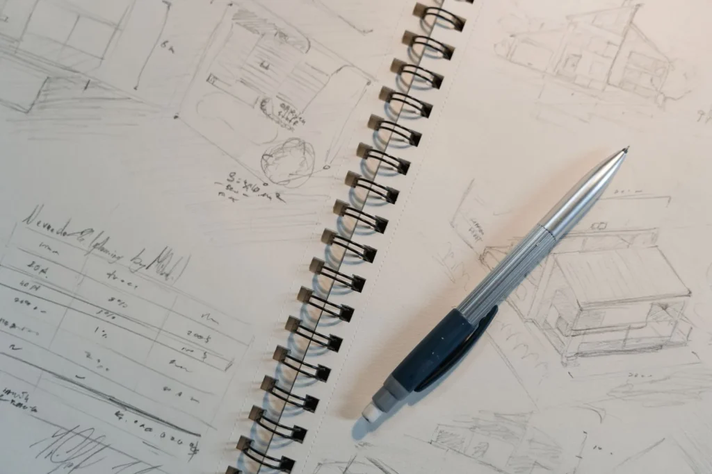
Color works best as a system, not decoration. Assign a meaning to each tone, such as one color for public space and another for private, then hold that code across every board. A restrained palette of three or four colors reads as intentional. Architects who present in print often build their boards in layout software such as SketchUp for the model views, then assemble sheets in a dedicated layout tool to keep type and color consistent.
📐 Technical Note
For printed boards, design at 150 to 300 DPI at final print size and export renders as TIFF or high quality PNG rather than compressed JPEG. Text exported below roughly 12 point on an A1 board tends to read poorly from the typical jury viewing distance of two to three meters.
Layout ties diagrams and color together. Group related drawings so the plan, section, and matching diagram sit near each other, letting the viewer cross reference without scanning the whole board. ArchDaily’s overview of graphs and charts for visual presentations is a useful reference for turning raw data into readable graphics.
Physical vs Digital Presentation Formats
The format you choose shapes how people experience the work. Physical boards and printed booklets give a tactile, fixed sequence and work well in a room where people gather around a table. Digital presentations, whether slides or interactive walkthroughs, allow motion, zoom, and animated diagrams, and they travel easily to remote reviews.
Neither is automatically better. A physical board rewards careful composition because nothing moves or hides. A digital deck rewards pacing because you reveal one point at a time. Many practices now prepare both: printed boards for the room and a digital set for follow up. If your project leans on animation or fly through renders, study how dedicated renderers compare in our breakdown of Twinmotion rendering alternatives.
⚠️ Common Mistake to Avoid
Reading slides word for word is the fastest way to lose a room. Boards and slides should carry images and short labels, not full paragraphs you recite. Put the detail in your spoken delivery and let the visuals support what you say, so the audience watches the architecture instead of reading text.
How Do You Present Architecture to Clients and Juries?
Presenting to clients and presenting to a jury call for different framing. Clients want to know how the design serves their needs, budget, and daily use, so lead with benefits and lived experience. A jury or review panel wants to see design reasoning, so lead with the concept and the evidence behind it. Adjust the same material to the audience rather than building two unrelated stories.
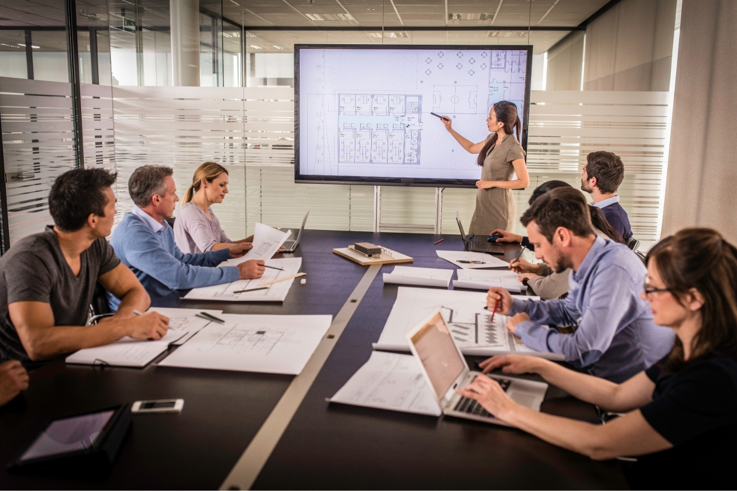
Open with the single strongest idea, not a long site history. Set the context in two or three sentences, then show the move that defines the project. Rehearse out loud and time yourself, because most reviews run shorter than people expect and a rambling opening eats the minutes you need for the design. Standing beside the boards and pointing as you speak keeps attention on the drawings.

📌 Did You Know?
The architectural review, where students defend work before a panel, traces back to the École des Beaux-Arts in 19th century Paris and remains the core teaching format in accredited schools worldwide, including programs documented by MIT Architecture. The skill of defending a design in person predates every digital tool by more than a century.
Prepare for questions as part of the presentation, not an afterthought. Anticipate the two or three weak points a reviewer will probe and have a clear, honest answer ready. Professional bodies such as the Royal Institute of British Architects frame client communication as a core competency, not a soft skill, which is worth remembering when you plan how much rehearsal a presentation deserves.
What This Means for Your Next Project
Strong presentation is a learnable craft built on order, restraint, and rehearsal rather than software or talent. Treat your boards and your spoken delivery as one connected story, control the hierarchy and color, and let diagrams carry the heavy explaining.
Your Next Step: Take your current project, write its single defining sentence, and rebuild your lead board around the one image and one diagram that prove it. Then rehearse the opening two minutes out loud before you touch any more drawings.
Frequently Asked Questions
What are the most important architectural presentation techniques for beginners?
Start with three habits: a single grid across all boards, one dominant hero image per sheet, and a restrained color palette of three or four tones. These three architectural presentation techniques fix the most common readability problems and require no special software. Add diagram clarity and spoken rehearsal once the layout basics feel natural.
How long should an architectural presentation be?
For a studio jury, plan a spoken walkthrough of roughly five to ten minutes and leave time for questions, since reviews often run shorter than expected. For clients, keep the core pitch under fifteen minutes and let discussion fill the rest. A tight, focused presentation almost always beats a long one.
Should I use physical boards or digital slides?
Use physical boards when people gather in one room and you want a fixed, tactile sequence. Use digital slides or walkthroughs for remote reviews, animation, or when you need to reveal points one at a time. Many architects prepare both formats from the same source material.
How do I avoid overloading my presentation boards?
Apply a one idea per element rule. Each diagram proves a single relationship, each board carries one main message, and supporting detail moves to an appendix or your spoken delivery. If a viewer cannot find the main drawing within a few seconds, the board is overloaded and needs editing.
What software is best for architectural presentations?
There is no single best tool. Modeling and view setup often happen in programs like SketchUp or Revit, rendering in dedicated engines, and final board assembly in layout software that controls type and color. Choose tools that let you keep typography and color consistent across the whole set.





Architecture Crit Presentation: How to Present Your Project With Confidence
The crit is where a good project can fall apart and an...
 Sinan Ozen6 Mins read
Why Do Architects Use Architectural Models Instead of Just Drawings?
Physical architectural models remain a core tool even in a digital studio....
Furkan Sen6 Mins read
How to Make an Architecture Mood Board: A Step-by-Step Guide
A practical walkthrough for building an architecture mood board, covering how to...
Furkan Sen6 Mins read
How to Build an Architecture Physical Model From Scratch
Building an architecture physical model from scratch takes the right scale, tools,...
Furkan Sen6 Mins read


Leave a comment