

Successful Architectural Presentation Boards: Design & Layout
Architectural presentation boards are essential visual communication tools for architects and students alike. This comprehensive guide covers everything you need to know about creating successful presentation boards — from architecture board layout principles and template structures to visual hierarchy, software selection, and competition board strategies. Learn how to design clear, professional architectural displays that impress juries, win competitions, and communicate your design intent effectively. Explore different board types including conceptual boards, technical drawing boards, analysis boards, and professional client presentations, with real examples and expert tips for 2026.

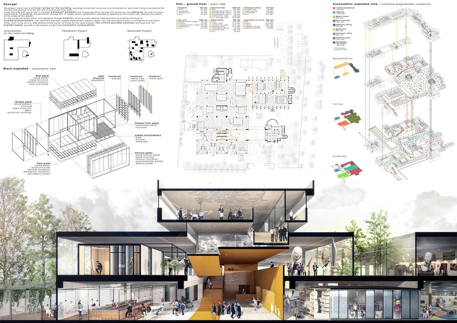

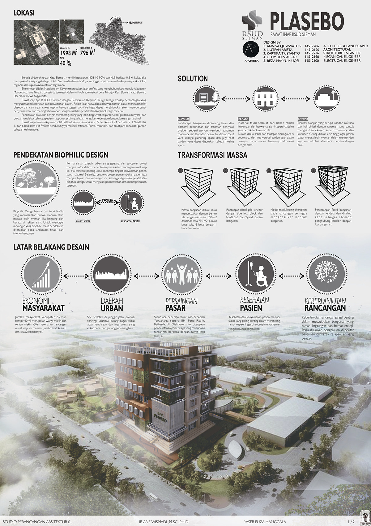

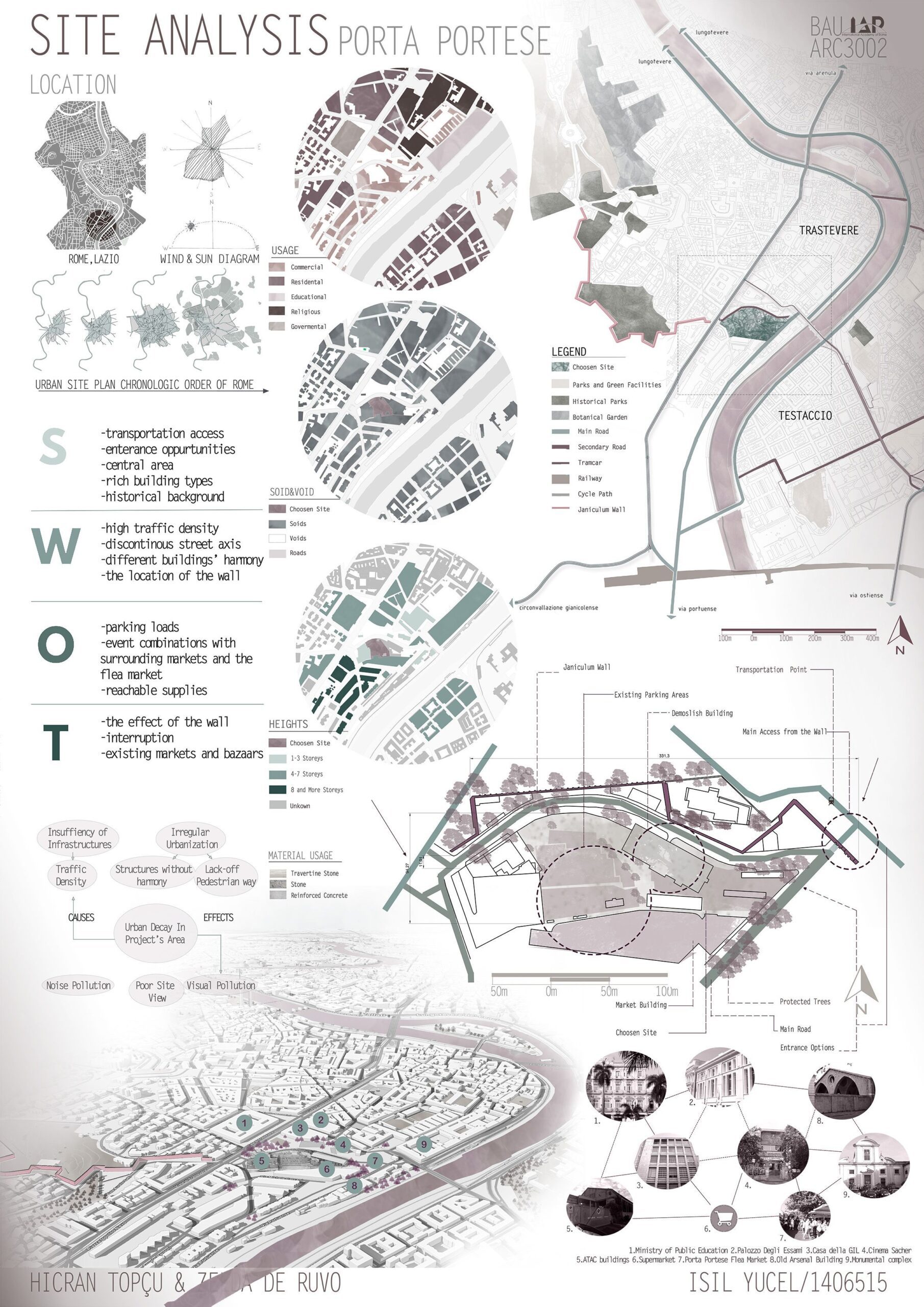

Table of Contents Show
Quick Answer: An architectural presentation board visually communicates a project through drawings, diagrams, renders and text in a single organized layout. Strong boards use clear visual hierarchy, consistent typography, generous white space and a logical reading order, guiding viewers from concept to detail so the design’s story is instantly understandable.
Architectural presentation boards are structured visual layouts that communicate your design intent to juries, clients, or competition reviewers through a combination of drawings, renders, diagrams, and text. A successful board relies on clear hierarchy, consistent typography, and a logical reading flow that allows viewers to understand the project within seconds. This guide covers layout principles, board types, software tools, and practical strategies for creating boards that stand out in academic reviews, professional meetings, and architecture competitions.
Presentations are visual tools that represent your projects and works in architecture for you. Architectural presentations are designed both for juries and submissions during student years and for customers in professional life. Architects present their projects of different scales as architectural presentation boards. Whether you are preparing a presentation board for architecture school, a competition entry, or a client meeting, understanding the principles of effective architecture board layout and design will improve the way your work is perceived. For a step-by-step approach to organizing your content, see our guide on how to organise your presentation board.
Successful Architectural Presentation Boards: 2026 Trends, Common Mistakes & Real Use Case Guide
Architectural presentation boards are no longer just about aesthetics; by 2026, they have become strategic communication tools that translate complex design thinking into instantly understandable visual narratives. One of the strongest 2026 trends is the shift toward story-driven boards, where diagrams, plans, and renders follow a clear hierarchy and visual flow rather than being placed decoratively. Architects and students are increasingly prioritizing clarity, white space, and typographic consistency to guide the viewer’s eye, especially juries and clients who scan boards quickly rather than reading them line by line.
Another major update in best presentation board practices is the integration of hybrid visuals: clean technical drawings combined with minimal AI-assisted renders, simplified diagrams, and subtle annotations. This updated 2026 guide approach avoids visual overload and focuses on explaining why design decisions were made, not just what the final form looks like. Boards that balance conceptual diagrams, spatial logic, and final visuals tend to perform far better in competitions, studio reviews, and client presentations.
🎓 Expert Insight
“My drawing skills probably froze around when I was 18… Now I’m more interested in the story, how the drawings, the layout can help express the stories and communicate them.” — Bjarke Ingels, Founder of BIG (Bjarke Ingels Group)
This perspective from one of the world’s most recognized architects reinforces that presentation boards are not about drawing skill alone. The ability to build a visual narrative through layout and sequencing is what separates a forgettable board from a winning one.
How to Develop Presentation Boards
If you want to prepare your architectural presentation boards in a better version and improve yourself, there are a few steps you need to follow. First of all, no matter the scale of your project, from urban design to presentations of interior design projects, your reference generally comes from the concept. The architectural concept is involved at every stage of the design. Your concept also affects the presentation board’s layouts, color choices, font preferences and design language of your diagrams. For guidance on selecting the right typeface, our article on best fonts for architectural presentation boards covers the most effective options for headings and body text.
Preparing a successful architectural presentation sheet means standing out both for the competition sheets and for the judges at school. In order for the architectural presentations to be appreciated by the juries, your layouts must have clear and understandable designs.
To be successful in this regard, we recommend that you prepare boards with simple and understandable layouts. Also important is the color tones you use to relate to your concept. The colors you choose should be compatible with your projects and should not affect the presentation.
Posters with a simple and understandable layout are not dense in content. The content of the posters may vary according to the layout topics. These topics are analysis sheet, concept sheet, technical drawing sheet or sheets prepared for the presentation of architectural projects to customers in professional life under the headings we have listed below.
In architectural presentation sheets, it is very important to prepare the contents of the posters according to their subjects. We do not want the jury reviewing your presentation to encounter analyzes while reading your project on the concept. In order to present your project in the most effective way with all its phases, you can choose well-designed layouts and sheets separated by simple design language.
💡 Pro Tip
Before placing any drawings on your board, create a rough thumbnail sketch on paper at 1:10 scale. Experienced architects find that spending 15 minutes sketching 3 to 4 layout variations by hand helps identify the strongest composition before opening any software. This avoids hours of rearranging elements on screen.
How Do You Structure an Architecture Presentation Board?
One of the most searched topics by architecture students is the architecture presentation board template. A well-structured template provides a reliable starting point that ensures consistency across multiple boards while saving time during tight deadlines. The best templates follow a modular grid system that divides the board into clearly defined zones for each type of content.
When setting up an architecture board layout, start by deciding on the orientation. Portrait boards are the most common format for jury reviews and architecture competition boards, while landscape formats work well when horizontal diagrams or panoramic renders are involved. Divide the board into three to four horizontal bands: a header zone for the project title and concept statement, a primary zone for the most important drawings or renders, a secondary zone for supporting diagrams and analysis, and a footer zone for legends, credits, and scale bars.
Consistency in font selection, margin spacing, and line weights across all boards creates a unified architectural display that reads as a cohesive story. Programs like Adobe InDesign, Illustrator, and Figma are widely used for creating architecture panel layouts, and many studios also rely on PowerPoint or Canva for quick iterations. The key principle remains the same: guide the viewer’s eye from top-left to bottom-right using visual hierarchy, and never let any single element overpower the overall composition. For a deeper understanding of effective presentation architecture techniques, exploring multiple layout approaches is essential.
What Are the Types of Architectural Presentation Boards?
It is one of the most effective presentation methods to separate the architectural presentation sheets you have designed to present your projects according to their subjects. Below, let’s look at the types of architectural presentation boards and how to present your project in different phases:
Conceptual Board
Concept sheets consist of posters where you present your approach to the project. It includes what concept an architectural project starts with and how mass decisions are made. Concept boards should be submitted before your architectural drawings and render images. While creating concept boards, you must prepare conceptual collages. From your analysis, you can present all the elements that inspire you while developing the concept with a collage. In addition, it is important that you represent your idea in the simplest and most understandable way with conceptual diagrams. As we mentioned in our previous articles, conceptual diagrams can be created through the 3D modeling software you work with or Adobe Photoshop/ Illustrator. Conceptual diagrams are necessary for you to explain the phases of your project to the jury in the simplest way possible. To learn more about creating effective diagrams for your boards, see our detailed guide on architectural diagrams by architects.
Technical Drawing Board
Architectural technical drawings are important for the construction of your project and the representation of its structural elements. Especially in application projects and student projects, you should present your technical drawings completely on technical drawing boards. Technical drawing boards should start with a 1/5000 or 1/1000 scale master plan, include 1/500 scale site plans and floor plans and sections, then 1/200 scale plans and cuts. In addition, detail drawings are required for technical drawing boards. You must add the system sections and detail drawings in 1/20, 1/10, 1/5 scale in these boards.
Analysis Board
Architects make detailed analyzes before starting the project and as a result, they determine the needs, conditions and deficiencies. Even developing a concept begins as a result of the analysis. Site analysis, urban scale (e.g. Lynch) analysis, sociocultural analysis, analysis of physical conditions (e.g. climate, geography etc.), environmental analysis, these can form the content of analysis boards. Most of the time, where the concept comes from depends on the research at the analysis stage. To reinforce the concepts, we recommend doing lots of analysis and designing analysis boards to present those analysis. It is certain that the analyzes presented together with the architectural drawings are not legible by the members of the jury. Understanding the different diagram types in architecture can help you choose the right visual format for each analysis element on your board.
Professional Boards
Student projects and competition projects are examined and evaluated by the members of the jury within a certain period of time. But in professional life, customers are your jury members!
Instead of preparing architectural presentation boards as you do for school and competition projects, you should make presentations that will attract the attention of customers. The most important criterion for a client will be the well-designed living space. Therefore, instead of filling professional drawing boards with technical drawings, you can usually include render images and plain plan drawings. The color harmony of the posters, the atmosphere in the renders and how ready you are verbally for your presentation are very important for these boards to be appreciated. For tips on producing compelling render imagery, our article on 3D rendering software for architects covers the best tools available in 2026.
Architecture Competition Boards
Designing architecture competition boards requires a slightly different approach than academic or professional presentations. Competition juries often review dozens, sometimes hundreds, of entries in a single session, which means your presentation board design must communicate the core idea within seconds. The most successful competition entries use a bold visual anchor, such as a large perspective render or an eye-catching conceptual diagram, positioned prominently to draw immediate attention. Supporting drawings, like plans and sections, are arranged around this focal point in a logical reading order.
Typography plays a heightened role in competition boards. Limit yourself to two typefaces maximum, one for headings and one for body text, and keep all annotations brief and purposeful. Many award-winning presentation sheets by architecture students demonstrate that removing unnecessary text often strengthens the narrative. According to the American Institute of Architects (AIA), clear visual communication remains the most critical factor in how jury members evaluate competition entries.
⚠️ Common Mistake to Avoid
Many students export their board renders at 72 DPI (screen resolution) and only discover the blurriness when printing at full size. Always export renders at 300 DPI at the actual print dimensions. If your board is A1 (594 x 841 mm), the final file should be at least 7016 x 9933 pixels. Test with a small print sample before the final output.
Common Mistakes vs. Before / After Comparison
One of the most common mistakes in architectural presentation boards is treating every element with equal visual weight. Before adopting modern presentation strategies, many boards suffer from dense layouts, inconsistent scales, excessive text, and oversized renders that overshadow the architectural logic. This “everything is important” mindset often results in confusion rather than impact.
In a before / after comparison, successful boards clearly demonstrate how reducing content actually increases communicative power. After applying best practices such as grid systems, limited color palettes, and clear hierarchy, presentation boards become easier to read and more persuasive. A real use case frequently seen in top architecture schools shows that boards redesigned with fewer elements, stronger alignment, and concise captions receive significantly better feedback, even when the architectural project itself remains unchanged. This proves that successful architectural presentation boards are not only about design quality, but about how that design is visually narrated.
What Software and Tools Do You Need for Presentation Boards?
Choosing the right software has a direct impact on the quality of your presentation board design. Each tool offers specific advantages depending on your workflow, and most professionals use a combination of programs to achieve the best architecture board design results.
Adobe InDesign remains the industry standard for architectural presentation layout because it handles multi-page documents, precise grid systems, and high-resolution image placement with ease. For students looking for a free alternative, Figma and Canva both offer template-based workflows that simplify the creation process. Adobe Illustrator is widely used for producing vector-based diagrams, icons, and site plans that maintain crisp quality at any scale. Meanwhile, Photoshop excels in post-production work, adjusting render atmospheres, creating collages, and fine-tuning color palettes.
Rendering software like Lumion, Enscape, and V-Ray produce the visual imagery that forms the centerpiece of most architectural boards. The key is to ensure that renders are exported at a resolution appropriate for print (typically 300 DPI at actual print size) and that their color profile matches the rest of the board. For more detailed guidance on visualization techniques, the Dezeen architecture portal regularly features exemplary competition board entries and rendering approaches.
💡 Pro Tip
When assembling your final board in InDesign or Illustrator, set your color mode to CMYK if the board will be printed, and RGB if it will only be viewed on screen. Mixing color modes is one of the most common reasons renders look washed out on printed boards. Convert all placed images to the same profile before exporting the final PDF.
What Are the Principles of Visual Hierarchy in Presentation Layouts?
Understanding visual hierarchy is the foundation of every effective architecture presentation layout. Visual hierarchy determines the order in which the viewer processes information on your board. Without a clear hierarchy, even the most compelling drawings can get lost in a cluttered composition.
The primary element on your architecture panel, typically a hero render, a key perspective, or a dominant site plan, should occupy the largest area and sit in the most prominent position. Secondary elements like sections, elevations, and exploded axonometrics should be noticeably smaller but still legible. Tertiary elements such as text blocks, material palettes, and detail callouts occupy the smallest zones. This three-tier approach ensures that viewers understand the project’s overall intent before diving into specifics.
Color also drives hierarchy. Using a neutral base palette with one or two accent colors directs attention to critical areas. For a practical guide on how to apply color and hierarchy to your architecture presentation board, our dedicated article on color and layout covers this topic in depth. Research published by the Royal Institute of British Architects (RIBA) also emphasizes that presentation clarity significantly influences project evaluations at all levels. ArchDaily regularly publishes competition-winning boards that demonstrate these hierarchy principles in practice.
📌 Did You Know?
Eye-tracking studies in graphic design show that viewers scan a page in an F-pattern or Z-pattern within the first 2 to 3 seconds. Placing your strongest visual element in the upper-left quadrant of the board takes advantage of this natural scanning behavior, giving your most important content the highest chance of being seen first. Research by the Nielsen Norman Group has documented this reading pattern across multiple visual formats.
What Size Should an Architecture Presentation Board Be?
Board size depends on the context. For most architecture school juries and competitions, the standard sizes are A1 (594 x 841 mm) and A0 (841 x 1189 mm) in portrait orientation. Some competitions specify custom dimensions, such as 100 x 70 cm or 90 x 120 cm, so always check the brief before starting your layout.
For professional client presentations, boards are often smaller (A2 or A3) because they are presented in meeting rooms rather than pinned to a wall. Digital presentations displayed on screens or projectors work best at 16:9 or 16:10 aspect ratios. Regardless of the physical size, maintain consistent margins of at least 15 to 20 mm on all edges. This margin creates visual breathing room and prevents important content from being cut off during printing or mounting.
| Context | Recommended Size | Orientation | Resolution |
|---|---|---|---|
| Architecture School Jury | A1 (594 x 841 mm) | Portrait | 300 DPI |
| Competition Entry | A1 or A0 (check brief) | Portrait or Landscape | 300 DPI |
| Client Presentation | A2 or A3 | Varies | 300 DPI |
| Digital / Screen Display | 1920 x 1080 px or larger | Landscape (16:9) | 150 DPI |
Frequently Asked Questions About Architectural Presentation Boards
What should be included on an architecture presentation board?
A complete architecture presentation board typically includes a project title, concept statement, site plan, floor plans, sections, elevations, at least one perspective render, and supporting diagrams such as circulation or massing studies. The exact content depends on the board type. A conceptual board focuses on diagrams and collages, while a technical board prioritizes scaled drawings and construction details. Keep text blocks short and let the visuals carry the narrative.
How many boards do you need for an architecture presentation?
Most architecture school juries require between 2 and 4 boards. Competition briefs often specify the exact number, usually 1 to 3 boards. For professional client presentations, a single well-designed board or a short series of 2 to 3 boards is typically sufficient. The goal is to tell the full story of your project without repeating information across boards.
What is the best software for making architecture presentation boards?
Adobe InDesign is the most widely used tool for assembling final board layouts because of its precise grid controls and high-resolution export options. Figma and Canva are popular free alternatives, especially for students. Diagrams and vector graphics are usually prepared in Adobe Illustrator, while renders come from tools like Lumion, Enscape, V-Ray, or D5 Render. Most architects combine two or three programs in their workflow.
How do you create visual hierarchy on a presentation board?
Visual hierarchy is achieved by varying the size, placement, and contrast of elements. Place your hero image or most important drawing in the largest and most prominent position, usually the upper or center area of the board. Use secondary and tertiary zones for supporting drawings and text. Limit your color palette to one or two accent colors against a neutral background, and keep font sizes consistent across headings, subheadings, and body text.
Should I use a portrait or landscape orientation for my board?
Portrait orientation is the most common choice for jury reviews and competition entries because it allows viewers to read the board from top to bottom in a natural flow. Landscape orientation works better when your project features wide panoramic renders, horizontal site plans, or when the board is designed for digital screen display. Check competition rules before choosing, as many briefs specify the required orientation.
✅ Key Takeaways
- Start every board with a thumbnail sketch to test layout compositions before opening software.
- Use a modular grid system with clearly defined zones: header, primary content, secondary content, and footer.
- Limit your palette to one or two accent colors and two typefaces maximum for a clean, professional result.
- Export all images at 300 DPI in CMYK for print, and test a small sample before the final output.
- Separate your boards by topic (concept, analysis, technical, render) so each board tells one clear part of the project story.
- Place the strongest visual element in the upper-left area of the board to capture attention during the first few seconds of viewing.
Final Thoughts: What Makes Architectural Presentation Boards Truly Successful
Successful architectural presentation boards are not defined by visual polish alone; they are the result of structured thinking, strategic layout decisions, and a clear narrative that translates architectural intent into an understandable visual language. Beyond aesthetics, a strong presentation board demonstrates how design concepts evolve into spatial solutions, allowing the viewer to quickly grasp the logic, hierarchy, and purpose behind each decision. This clarity becomes especially critical in academic juries, professional reviews, and client presentations where time is limited and first impressions matter.
As presentation standards continue to evolve, architects and students who adopt updated best practices, such as clear grids, controlled color palettes, balanced use of diagrams and renders, and thoughtful typography, gain a significant advantage. Avoiding common mistakes like visual overload, inconsistent scales, and unfocused layouts allows the architecture itself to take center stage. Ultimately, a truly successful presentation board does more than display drawings; it communicates confidence, reinforces the project’s credibility, and leaves a lasting impression that supports both the design and the designer. For further reading on mastering architectural presentations, explore the full guide to creating effective architectural presentations and our curated list of 5 tips for stunning architectural presentations.
Download Architectural Presentation Sheets Templates
Related Guides
- 10 Best Architecture Sheets by Students | Layout Examples 2026
- Best Fonts For Architectural Presentation Boards
- Best Fonts for Architectural Portfolio Design – Top 10 Picks
- Architecture Portfolio Size & Format: The Complete Guide
More Related Guides
- Architectural Technician Portfolio
- Bending Sheet Metal Tips And Techniques With A Brake
- Using Instagram As Your Architectural Portfolio
- 8 Things To Include In Your Academic Portfolio
- How To Build Architecture Cv
- Top Ai Enhanced Presentation Techniques For Architects
- Keeping The Portfolio Up To Date
- How To Create An Effective Architectural Presentation
- The Best Way For Architectural Presentations
- How To Create Presentations
Frequently Asked Questions
A composed layout that presents a project’s drawings, diagrams, renders and text together to tell its story clearly.
Use a clear grid, strong visual hierarchy, consistent typography and white space to guide the viewer from concept to detail.
A title, the key drawings, diagrams, renders and short text, arranged in a logical reading order.
Last updated:
- Architectural presentation board
- Architectural Presentation Boards
- architectural presentation layout
- architecture board design
- architecture board layout
- architecture presentation board
- Architecture Presentation Boards Layout
- How to Design Presentation Boards
- how to make architecture presentation boards in indesign
- presentation board design


5 Comments


Architecture Presentation Boards: Best Examples & Layout Tips
Discover successful architecture presentation boards featuring landscape layouts, construction detail boards, and...

10 Best Architecture Sheets by Students | Layout Examples 2026
Discover 10 outstanding architectural presentation sheets created by architecture students. From neighborhood...

How to Use Color and Layout in Your Architecture Presentation Board
An architecture presentation board becomes a powerful storytelling tool when color, layout,...

Guide to Creating Effective Architectural Presentations
A well-crafted architectural presentation can help you communicate your design ideas and...

I really loved this article! It helped me understand how to make my architectural presentation boards better. The tips about using clear layouts and colors are super helpful. I can’t wait to try making my own boards with these ideas!
I really enjoyed reading this article! The tips on how to create effective architectural presentation boards are super helpful. I never knew that colors and layouts could make such a big difference. I’m excited to try out the ideas for my own projects!
This article talks about architectural presentation boards. It seems like they are important for showing projects. There are different types of boards like conceptual and technical drawing boards. The tips might help people who want to improve their presentations.
This article talks about presentation boards for architecture. It mentions how they are important for showing projects to judges and clients. I think the tips about layout and color are useful.
This article talks about how to make good architecture presentation boards. It says that you should make them clear and easy to understand. It also mentions using colors and designs that match your project. I think it’s helpful information for students.