

Architecture Presentation Boards: Best Examples & Layout Tips
Discover successful architecture presentation boards featuring landscape layouts, construction detail boards, and collage designs. This guide showcases winning architecture competition boards with practical tips on layout architecture presentation, board design, and creating impactful architectural boards for students and professionals.

Table of Contents Show
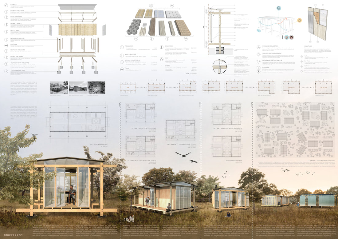
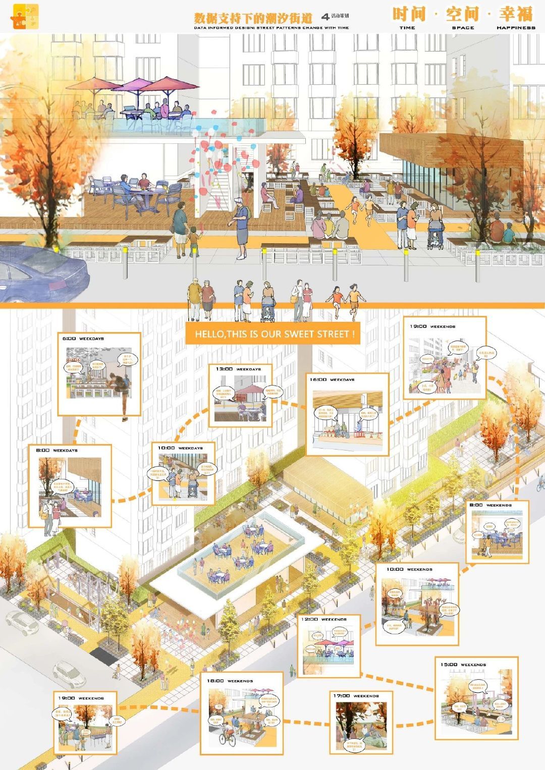
Architecture presentation boards are visual communication tools that combine drawings, renders, diagrams, and text on a single formatted sheet to present a building design to juries, clients, or competition panels. A well-designed board tells the story of your project from concept to construction detail, using visual hierarchy, consistent color palettes, and clean typography to guide the viewer through your design narrative.
Architecture presentation boards are a great way for an architect to present their building concept to the client. Whether you are preparing for an architecture design competition or a school jury, there are a few essential guidelines that need to be followed when designing one. In this article, the third installment of our series showcasing successful architectural boards, we continue to explore outstanding examples that demonstrate effective architecture presentation boards in practice. In the continuation of the article, you will examine examples of successful architectural posters, as in the previous articles of the series. We wish to inspire all students and architects preparing for competitions.

What Makes a Successful Architecture Presentation Board?
An architectural presentation board is a large drawing board on which the architect displays drawings and other visuals (such as renders) to help communicate the design proposal. A strong presentation board layout starts with clear visual hierarchy and a well-organized composition. To begin with the presentation board, it should be two-sided and have a clean layout. The designer needs to ensure that they have enough content in order to keep the audience engaged. In addition, they should avoid using clip art or unnecessary images.
According to the American Institute of Architects (AIA), effective visual communication is central to the architectural profession. The way you arrange content on your architecture board design can significantly influence how a jury or client perceives your project. Successful boards balance technical accuracy with visual storytelling, guiding the viewer through the design narrative from concept to detail.
The strongest boards share a few consistent qualities: they use a modular grid system to organize content, maintain a limited and cohesive color palette drawn from the project itself, apply legible typography at appropriate scales, and create a logical reading flow from top-left to bottom-right. If you are looking for more tips on crafting your visual narrative, our guide on how to make your architectural presentation sheets stand out covers several advanced techniques.
💡 Pro Tip
Before arranging any content, sketch a small-scale thumbnail of your board layout on paper. Test two or three grid variations at thumbnail size first. This 10-minute exercise saves hours of rearranging later and helps you spot hierarchy problems before you commit to a full-resolution file.
How to Create Your Architecture Competition Board
Being an important part of any architectural design development, architecture presentation boards can be created using different software including, for example, Adobe Photoshop, Adobe InDesign, or Revit. Many winning architecture competition boards are assembled using a combination of design tools to achieve professional results. You can create your own presentation board by using following steps:
- Arrange the technical drawings consisting of architectural representations that you have prepared for your projects according to their colors and textures so that they are compatible on your architecture competition board.
- Bring together your drawings in harmonious colors and textures by creating a suitable template. Allocate more space to the content you want and trust to be at the forefront of the layout architecture presentation design.
- Write short and clear texts to explain your drawings, design process and diagrams. Share the texts in different areas on the presentation sheet so that it is easier to read.
For more detailed guidance on organizing your board elements effectively, check out our article on how to organise your presentation board. Additionally, platforms like ArchDaily regularly feature winning competition entries that can serve as excellent references for your own architecture design competition boards.
Using a grid-based template gives your board immediate structure. Start by dividing your board into three to four horizontal bands: a header zone for the project title and concept statement, a primary zone for the most important drawings or renders, a secondary zone for supporting diagrams and analysis, and a footer zone for legends, credits, and scale bars. Keeping this structure consistent across multiple boards creates a unified reading experience for jury members. For ready-to-use layout files, the free template pack by Competitions.Archi offers 20 layouts in both Photoshop and InDesign formats.
Key Elements of Effective Architecture Board Design
Before diving into specific board types, it is worth understanding the core principles behind any successful architecture board design. The most impactful architectural boards share several characteristics: a clear visual hierarchy, a consistent color palette derived from the project itself, legible typography, and a logical flow that tells the story of the design. Whether your board is portrait or landscape, maintaining balance between white space and content density is crucial. As explored in our guide on the 5 things for a successful architectural presentation board, the layout, color selection, image quality, typography, and overall composition all contribute to a board that communicates your design intent effectively.
Understanding how to create effective architectural diagrams is also essential. Diagrams act as the connective tissue of your board, translating abstract concepts into visual shorthand that juries can read at a glance.
📌 Did You Know?
Research from the First In Architecture resource platform shows that most viewers scan a presentation board in an F-shaped or Z-shaped pattern, starting at the top-left and moving right, then down. Placing your strongest render or key perspective in the top-left quadrant ensures it captures attention first.
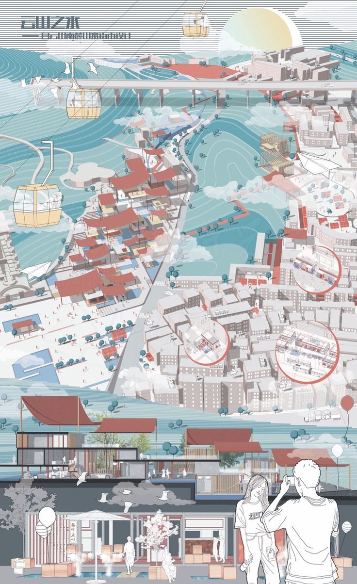
Landscape Presentation Boards
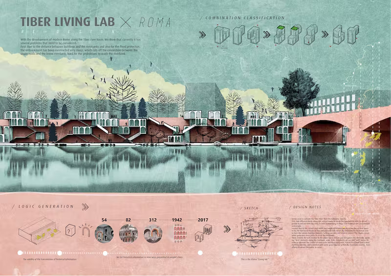
Among the presentation boards, vertical presentations presented as portraits are the most popular. However, using landscape, that is, horizontally designed images, is also a good alternative for your architecture presentation boards. We recommend you to use horizontal posters and presentation board architecture layouts, especially for non-printed digital presentations.
In landscape boards, architects often fit a lot of images and drawings into a small number of posters. Having a lot of content on the horizontal ones compared to the vertical boards makes a positive impact. Because the human eye is more suitable for reading and examining something horizontally. While recommending simplification in vertical boards, you can prepare fuller posters for the boards you design as landscape. This format is particularly favored in architecture design competition boards where projects involve urban-scale or landscape design, as the wider format naturally accommodates site plans, panoramic sections, and contextual diagrams.
Landscape boards also work well for projects that rely on long horizontal sections or panoramic renders. If your design involves a linear building, a waterfront promenade, or a campus-scale masterplan, the landscape orientation lets you show these elements at a readable scale without excessive reduction.
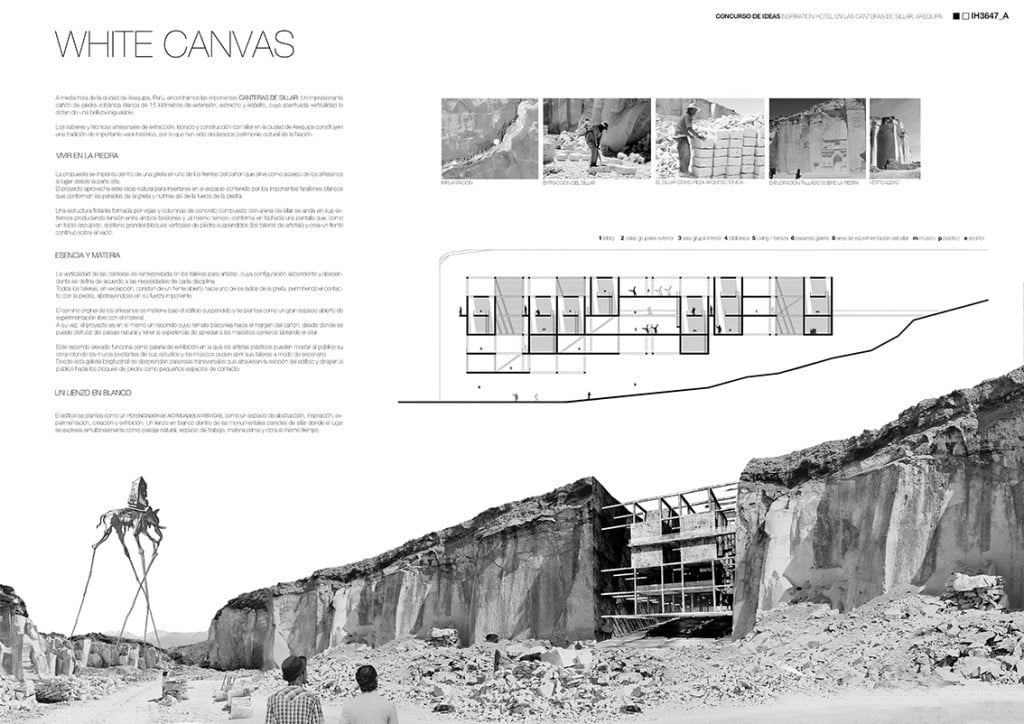
Presentation Boards with Construction Details

When designing a building, architects are responsible for everything from all the building and construction details to their conceptual design, but also to show them in the best possible way. That’s why we need to include presentation boards with construction details among the best examples when we tell you about architectural poster designs. This type of architectural boards are mostly needed by architects for architecture competition boards or for final submissions of architectural students’ project courses. As you can see in the examples, the most important thing in the technical drawing architecture presentation boards where the construction details are shown is clean and clear drawings.
The best alternative for these drawings is always to add the clean drawings to the boards. We recommend that you pay close attention to technical rules and details, as the presentations where you show the construction details will be reviewed by professionals. Organizations like the Royal Institute of British Architects (RIBA) emphasize that clarity in technical documentation is a hallmark of professional architectural practice.
How to Present Technical Drawings on Your Board
When incorporating construction details into your architecture competition board, consider the scale and readability of each drawing. Use consistent line weights and annotation styles across all technical representations. Wall sections, detail callouts, and exploded axonometric views should be clearly labeled with dimensions and material annotations. For students, learning how to produce high-quality 3D renderings alongside technical drawings can raise the overall quality of your board. Pair your construction detail boards with a brief written description explaining the structural logic and material choices; this helps jury members quickly understand your design rationale.
📐 Technical Note
For print-quality architecture presentation boards, export your drawings at 300 DPI at actual print size. For an A1 board (594 x 841 mm), this means your working file should be at least 7016 x 9933 pixels. If you are preparing boards for digital review only, 150 DPI is sufficient and keeps file sizes manageable.
Collage Presentation Boards

Have you ever thought of showing your ideas in an abstract way by displaying your collage skills on presentation boards? Collage-style architectural boards offer a unique opportunity to express conceptual thinking in a visually compelling manner, and they are increasingly popular in contemporary architecture design competition boards.
We advise all architects who rely on their graphic design and collage skills to prepare original presentation board architecture designs, as well as sample posters. Collage techniques can range from purely digital compositions to mixed-media approaches that incorporate hand-drawn elements, photography, and texture overlays. The key to a successful collage board is ensuring that the artistic expression still communicates the architectural idea clearly.
When building a collage board, start with a strong base image or background texture, then layer your architectural elements on top. Use varying opacity levels and blending modes in Photoshop to create depth. Group related elements visually so the viewer can still follow your design logic, even within an abstract composition. The goal is to convey atmosphere and spatial quality while keeping the architectural intent readable.

What Size Should an Architecture Presentation Board Be?
Choosing the right board size depends on the competition brief, the printing method, and whether the board will be viewed physically or digitally. The most common sizes for architecture presentation boards are A1 (594 x 841 mm) and A0 (841 x 1189 mm) in countries that follow ISO paper standards, or 24 x 36 inches and 30 x 40 inches in the United States. Many competition briefs specify the exact dimensions, so always check the requirements before starting your layout.
For student jury presentations, A1 is the standard size in most European and Asian architecture schools. Professional competition boards tend to use A0 or custom dimensions specified in the brief. If you are preparing a digital-only presentation, optimize your board for screen resolution rather than print, and consider using a 16:9 aspect ratio for on-screen viewing.
For guidance on formatting your wider portfolio alongside presentation boards, our architecture portfolio size and format guide covers recommended dimensions, page counts, and file optimization tips.
| Board Size | Dimensions | Best Used For |
|---|---|---|
| A1 Portrait | 594 x 841 mm | Student jury reviews, single-project presentations |
| A0 Portrait | 841 x 1189 mm | Competition entries, detailed multi-drawing boards |
| 24 x 36 in | 610 x 914 mm | US architecture schools, NAAB-accredited programs |
| A1 Landscape | 841 x 594 mm | Urban design, panoramic sections, digital screens |
| Custom (per brief) | Varies | International competitions with specific requirements |
Software and Tools for Architecture Presentation Boards
Creating professional architecture presentation boards requires the right combination of software tools. Adobe InDesign remains the industry standard for layout architecture presentation design, offering precise control over typography, grid systems, and image placement. Adobe Photoshop is ideal for post-processing renders and creating collage compositions, while Adobe Illustrator excels at diagrams and vector graphics. For a deeper look at how InDesign can streamline your presentation workflow, explore our 10 Adobe InDesign tips for presentation boards.
Beyond the Adobe suite, tools like Canva and Figma have gained popularity among architecture students for quick mockups and collaborative board design. For 3D content, programs such as SketchUp, Rhino, and Revit help produce the architectural visualizations that populate your boards. The most effective architecture board design process typically involves modeling in 3D software, rendering with dedicated engines, and then composing the final board in a layout program.
| Software | Primary Use | Skill Level | Cost |
|---|---|---|---|
| Adobe InDesign | Page layout, grid systems, typography | Intermediate | Paid (Creative Cloud) |
| Adobe Photoshop | Render post-processing, collage boards | Intermediate | Paid (Creative Cloud) |
| Adobe Illustrator | Diagrams, vector graphics, icons | Intermediate | Paid (Creative Cloud) |
| Figma | Collaborative layout, quick mockups | Beginner | Free / Paid |
| Canva | Quick poster design, simple layouts | Beginner | Free / Paid |
| PowerPoint / Keynote | Digital presentations, screen-based boards | Beginner | Included with OS/Office |
💡 Pro Tip
Use Adobe InDesign for your final board assembly, even if you create individual elements in Photoshop or Illustrator. InDesign handles linked high-resolution images without bloating your working file size, and its master page feature lets you apply consistent headers, page numbers, and grid lines across multiple boards instantly.
Architecture Competition Boards: What Judges Look For
If you are preparing architecture competition boards, understanding jury expectations is essential. Competition judges typically evaluate boards based on concept clarity, visual impact, technical rigor, and overall presentation quality. Your architecture design competition boards should tell a compelling story, from site analysis and concept development through to detailed design and materiality. Winning entries from competitions featured on platforms like Dezeen often demonstrate a strong design narrative supported by high-quality visuals and clean board composition.
Jury members at major competitions typically spend only two to three minutes reviewing each entry during the first screening round. This means your board must communicate the core idea within seconds. Place a clear concept statement and your strongest visual at the top of the board where it will be seen first. Supporting information like analysis diagrams, process sketches, and technical details can fill the lower sections.
🎓 Expert Insight
“Good design deserves good presentation. The problem with most competition entries is not the quality of the architecture, but the inability to communicate the idea clearly on a single board.” — Alex Hogrefe, Founder of Visualizing Architecture
Hogrefe’s presentation board critique series highlights how even strong projects can fail to impress when the board layout is cluttered or the visual hierarchy is unclear.
To see more examples of successful boards, continue exploring our series: Successful Architectural Presentation Boards #2, #4, #5, and #6.
Common Architecture Presentation Board Mistakes and How to Fix Them
Even well-designed projects can be let down by avoidable board layout errors. Understanding these common mistakes will help you produce cleaner, more effective boards.
Overcrowding is the most frequent issue. When every square centimeter of the board is filled with drawings, text, and diagrams, the viewer’s eye has nowhere to rest, and the hierarchy breaks down. Allow at least 15-20% of your board surface to remain as white space. This breathing room actually makes your content feel more intentional and easier to read.
Inconsistent styling across multiple boards is another problem. If your first board uses one color scheme, font pairing, and margin width, every subsequent board should follow the same rules. Jury members view boards as a set, and inconsistency suggests a lack of attention to detail.
Poor image resolution becomes painfully obvious on large-format prints. A render that looks sharp on your laptop screen may appear pixelated at A0 scale. Always check resolution at 100% zoom before sending files to print.
⚠️ Common Mistake to Avoid
Placing all your text annotations in a single block at the bottom of the board is a common error. Juries rarely read large text blocks in isolation. Instead, place short descriptive labels directly next to the relevant drawing or render. This way, each piece of text is read in context with its visual element.
Other mistakes to watch for include using too many fonts (limit yourself to two: one for headings, one for body text), placing the project title in a hard-to-find location, and using low-contrast color combinations that reduce legibility. Our presentation board checklist can help you verify that all essential elements are included and properly arranged.
✅ Key Takeaways
- Use a modular grid system to organize your board layout, and sketch thumbnails before going full-resolution.
- Choose portrait orientation for jury reviews and landscape for urban-scale or digitally displayed projects.
- Maintain consistent styling (colors, fonts, margins) across all boards in a multi-board presentation.
- Place your strongest visual and concept statement at the top-left, where viewers look first.
- Export at 300 DPI for print and keep at least 15-20% white space for visual breathing room.
- Use Adobe InDesign for final assembly, Photoshop for image editing, and Illustrator for diagrams.
Frequently Asked Questions About Architecture Presentation Boards
What is an architecture presentation board?
An architecture presentation board is a formatted visual display that combines architectural drawings (plans, sections, elevations), 3D renders, diagrams, and explanatory text on a single large-format sheet. It is used to communicate a design proposal to juries, clients, or competition panels. The board tells the story of a project from concept through to final design, using layout, color, and visual hierarchy to guide the viewer.
How do you layout an architecture presentation board?
Start by choosing your board orientation (portrait or landscape) and setting up a grid. Divide the board into zones: header (project title and concept), primary (hero render or key drawing), secondary (supporting diagrams and analysis), and footer (legends, credits, scale bars). Place the most important visual in the top-left area. Keep text short and position labels next to their corresponding drawings rather than in a separate text block.
What software is best for architecture presentation boards?
Adobe InDesign is the industry standard for final board layout because of its precise typography and grid tools. Adobe Photoshop is best for post-processing renders and creating collage boards. For quick collaborative work, Figma and Canva are popular among students. The typical professional workflow involves modeling in 3D software, rendering, and then assembling everything in InDesign.
How many boards should I prepare for an architecture competition?
Most architecture competitions require one to three boards, and the exact number is always specified in the competition brief. Single-board competitions demand tight editing and clear prioritization of content. Multi-board sets allow you to separate content by theme (concept, technical, context) but require consistent styling across all sheets.
Should I use portrait or landscape orientation for my board?
Portrait is the most common orientation for student jury reviews and single-project boards. Landscape works better for urban design projects, panoramic sections, and digital screen presentations. Always check competition requirements first, as some briefs specify the exact orientation.
- Architectural Presentation Boards
- architectural presentation sheets
- architecture competition boards
- architecture presentation boards
- Architecture Student Presentation
- Fonts for Presentation
- How to create architectural presentation
- how to prepare jury presentation
- layout architecture presentation
- presentation board architecture


2 Comments


Successful Architectural Presentation Boards: Design & Layout
Architectural presentation boards are essential visual communication tools for architects and students...

10 Best Architecture Sheets by Students | Layout Examples 2026
Discover 10 outstanding architectural presentation sheets created by architecture students. From neighborhood...

How to Use Color and Layout in Your Architecture Presentation Board
An architecture presentation board becomes a powerful storytelling tool when color, layout,...

Guide to Creating Effective Architectural Presentations
A well-crafted architectural presentation can help you communicate your design ideas and...

I think presentation boards are important for architects. The article gives some good tips on how to design them.
This article talks about different ways to create presentation boards. It’s nice to see examples and advice.