- Home
- Articles
- Architectural Portfolio
- Architectral Presentation
- Inspirational Stories
- Architecture News
- Visualization
- BIM Industry
- Facade Design
- Parametric Design
- Career
- Landscape Architecture
- Construction
- Artificial Intelligence
- Sketching
- Design Softwares
- Diagrams
- Writing
- Architectural Tips
- Sustainability
- Courses
- Concept
- Technology
- History & Heritage
- Future of Architecture
- Guides & How-To
- Art & Culture
- Projects
- Competitions
- Jobs
- Events
- Store
- Tools
- More

This showroom project features Beamy flooring collections and the Italian brand OIKOS, located in the New East Coastal Area of Shantou. In commercial design, the overall space is conceived based on product positioning, aiming to guide the region’s aesthetic preferences. In recent years, AD ARCHITECTURE has consistently led the way in commercial design, achieving numerous successes through innovative design and branding solutions.
Intimate spatial scales and exploratory spatial form transform challenge into enjoyment, converting unfamiliar spaces into intimate ones, and turning a sense of imbalance into a foundation for inclusiveness and harmony. This transformation fosters relationships between people and their environment, as well as the intricate details within it. The overall atmosphere created by these interactions resonates, deeply connecting emotions with commercial value.

“Calculation in design involves a holistic approach that integrates all aspects of planning and execution, including form, psychological behavior, and calculated outcomes.”
– Xie Peihe
Positioning | Exploration of the New Consumer Group
The area is surrounded by high-quality new residential developments and offers easy access to several new schools, mature market resources, shopping malls, and other amenities. This prime location is ideal for real estate purchases and is a hub for the new elite lifestyle in Shantou. Over the past five years, the New East Coastal Area has transformed into a youthful, convenient, and comfortable new urban area, making it a focal point for the new consumer group in Shantou.

In commercial design, the overall space is conceived based on product positioning, aiming to guide the region’s aesthetic preferences. In recent years, AD ARCHITECTURE has consistently led the way in commercial design, achieving numerous successes through innovative design and branding solutions.
AD ARCHITECTURE believes that the needs of clients are paramount. The black-and-white palette and the calm, unobtrusive product display ensure that products are showcased to customers in their best light without distractions.
Design System|Perception of Aura through Sensation
The main challenge of this project is optimizing and overcoming the irregularities of the site.
According to the principles of human aesthetics, irregularly shaped spaces often lead to a sense of complexity and unease, reflecting the client’s concerns and dissatisfaction with the site’s condition. However, AD ARCHITECTURE team thrives on the challenge of flawed spatial environments and boasts a wealth of solutions.

Chief designer Xie Peihe proposed: “Awakening a sense of balance in the imbalance, all human unease stems from the discomfort brought by the five senses. By refining these elements through aesthetic approaches, we can make the slanted surfaces of the space interact dynamically, creating a harmonious sense of balance. Thus, the design system of this space naturally comes into being.”
Design Perception | Order and Balance in Disorder
The complexity and sense of regularity in design convey a minimalist feeling, which in turn reflects comfort.
The facade design breaks free from the constraints of the existing building. This allows triangular elements to extend from the interior to the exterior. A bold architectural design language is incorporated to enhance the architectural space’s sense of power and create new commercial value.
The narrowing entrance seamlessly integrates the exhibition hall with the communication area, creating a well-balanced spatial environment that enhances customer interaction with the products. This compressed entryway provides a subtle and restrained prelude for guests as they enter the hall. Inside the main space, customers can appreciate the complexity and enjoyment of the multi-layered design. AD ARCHITECTURE enriches the space with diversity through a cohesive design language, allowing for an immersive experience of minimalist art.

By deconstructing and reinterpreting the slanted spatial form, a new charm emerges through the organic organization of diagonal lines within various functional areas. The orderly product displays on the black background walls accentuate the warmth and texture of the wood. The central reception tea table serves as a negotiation area during regular times and can also become the focal point for meetings and salons.
Garden Tour|The Perspective of Exploration
The vertical relationships within the space are interconnected by three large sculptural staircases, linking different height levels. By opening the floor at multiple points and employing approaches such as digging, covering, permeating, stacking, and winding, the design enriches the sense of depth and playfulness, infusing the space with endless imagination and charm. This approach maximizes spatial flow, allowing for an extended spatial experience and evoking a sense of leisurely strolling.

Throughout this visiting circulation, an exploratory experience is created. The inverted triangular opening of the mezzanine cleverly introduces the view of outdoor trees into the space, offering a unique visual experience. On the first floor, the visual experience highlights spatial infinity, while the mezzanine provides a perspective that connects the first and second floors, showcasing their contrasting yet integrated relationship. The staircase to the second floor, although linking the mezzanine and the second floor, visually centers on the first floor, providing an unexpected visual delight.
During construction, the concrete structural beams were naturally exposed, resulting in an unintentional yet striking design feature. The triangular relationships within the space naturally form diagonals and slanted surfaces, completing the spatial composition through the flow of people.

The spacious, bright environment, complemented by natural textures and daylight, provides an authentic spatial experience. The interaction and communication between the space and the people within it are central to design. AD ARCHITECTURE significantly transformed the spatial and compositional relationships of the existing building, enhancing the harmony of its structure, materials, and colors, and establishing a new fluid relationship between the building and its site.
Through elegant and simple geometric forms, the space becomes tangible, breathable, and textured, flowing freely with a sense of suspension.
This project successfully empowers a new commercial showroom by infusing contemporary aesthetic elements. It also exemplifies AD ARCHITECTURE’s approach of using Western design principles to evoke Eastern spatial emotions and philosophy.
illustrarch is your daily dose of architecture. Leading community designed for all lovers of illustration and drawing.
Submit your architectural projects
Follow these steps for submission your project. Submission FormLatest Posts
Nordic Office of Architecture Completes Oslo’s New Government Quarter in 2026
Nordic Office of Architecture has completed the first phase of Oslo's New...
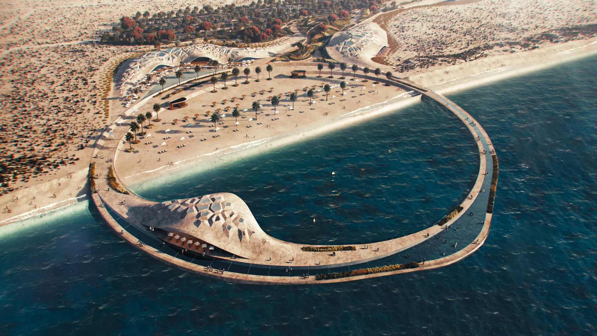
Jebel Ali Beach: Dubai’s Future Longest Public Beach
Dubai is transforming Jebel Ali Beach into its longest public beach, introducing...
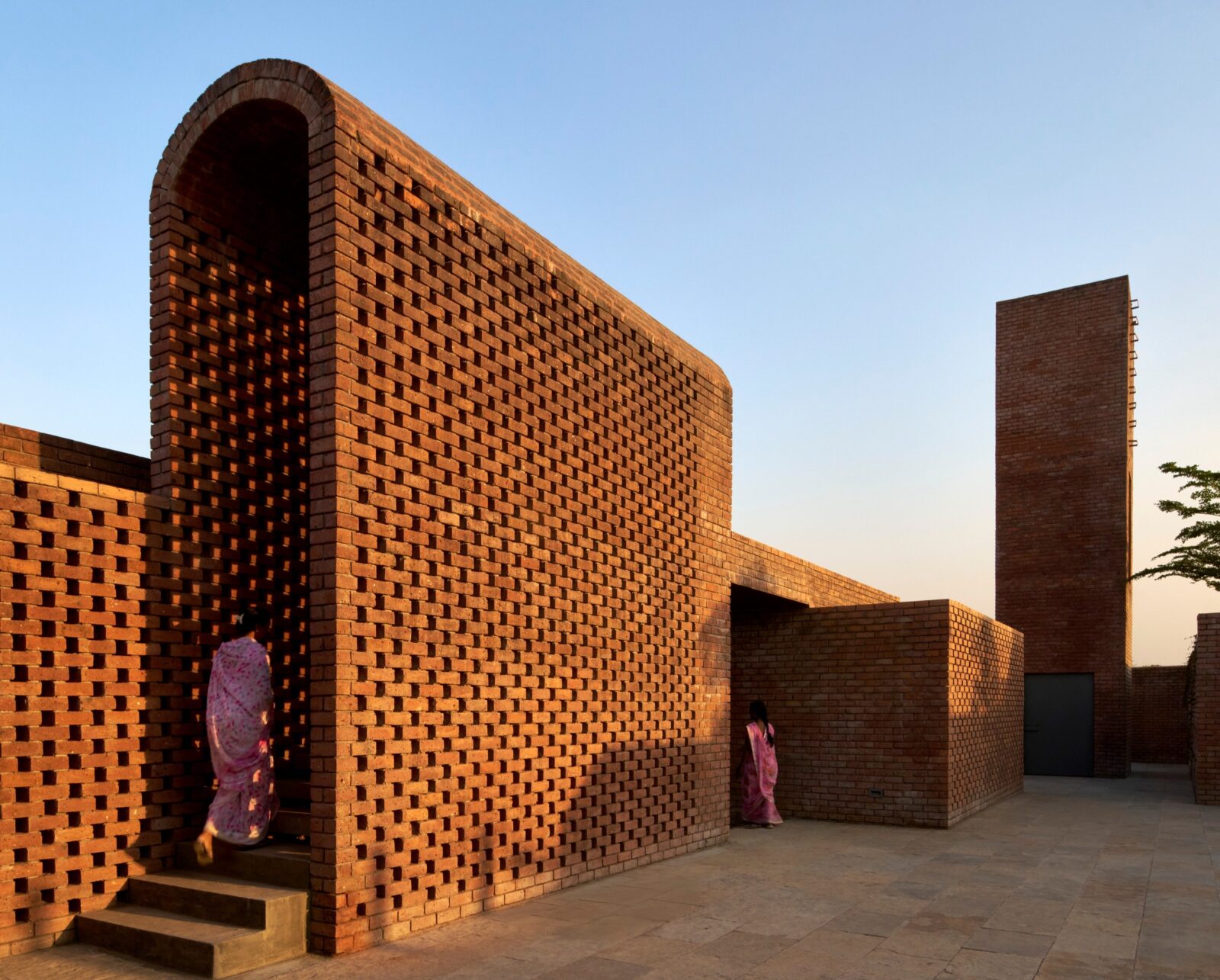
The Street: A Community Clubhouse Inspired by Indian Bylanes
Studio VDGA’s The Street in India reimagines suburban community architecture, blending traditional...
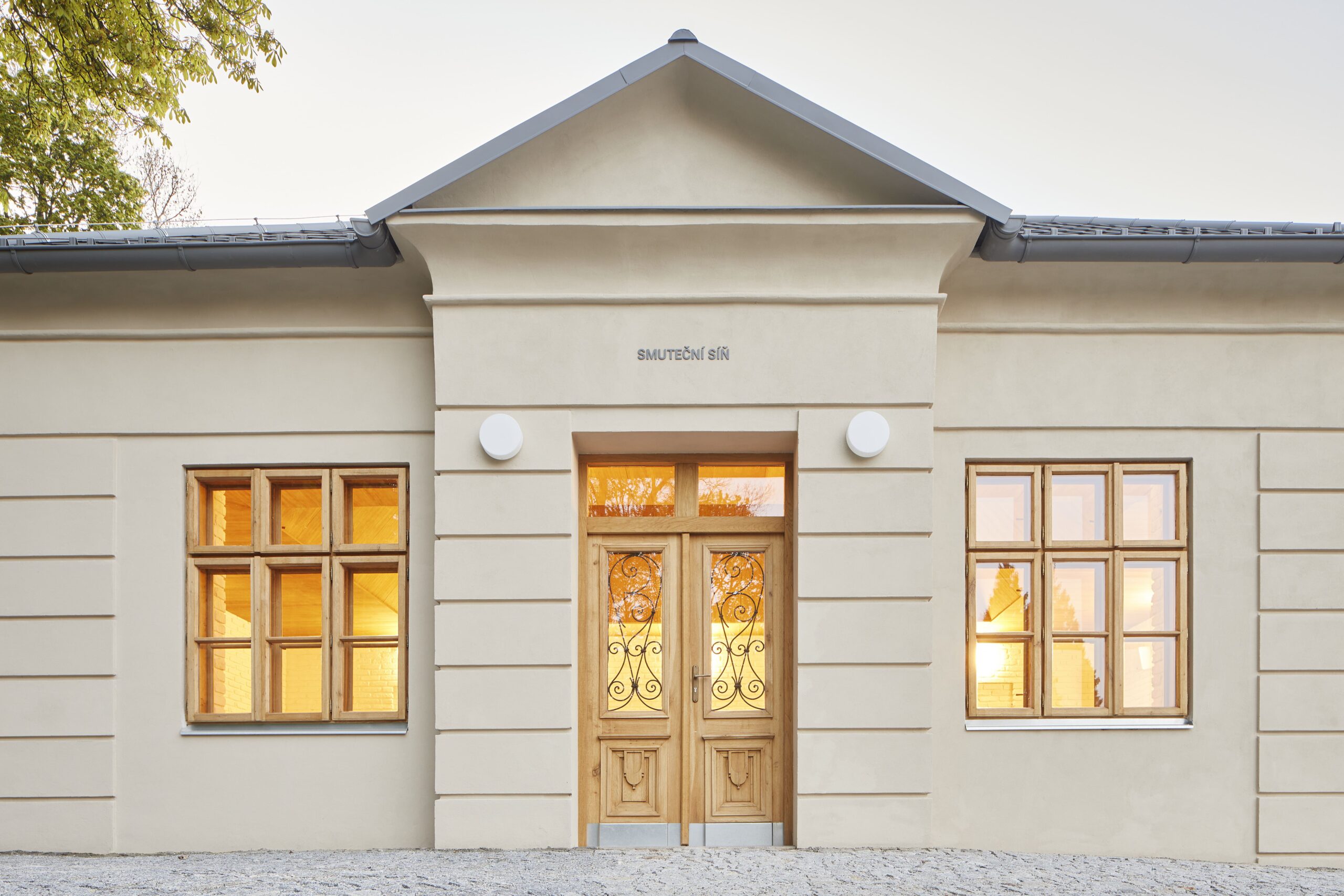
Funeral Hall Vimperk by Jakub Vašek
On the edge of Vimperk cemetery, a historic house has been reborn...




Leave a comment