

How to Fill a Large TV Wall?
A broad living room wall poses an immediate spatial challenge the moment an entertainment screen enters the picture. Left with only a black display panel perched on a narrow lowboard, an expansive surface feels unresolved, as if the furniture arrived from a much smaller apartment and was parked there temporarily.
 illustrarch Editoral Team24 September 20264 Mins read1
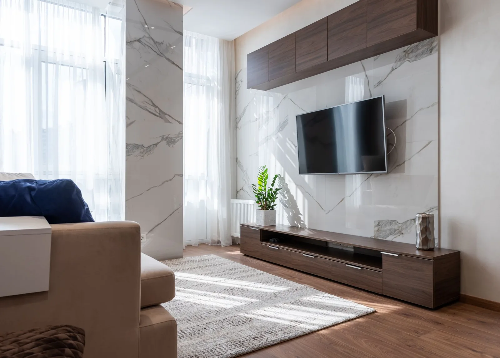
Table of Contents Show
A broad living room wall poses an immediate spatial challenge the moment an entertainment screen enters the picture. Left with only a black display panel perched on a narrow lowboard, an expansive surface feels unresolved, as if the furniture arrived from a much smaller apartment and was parked there temporarily. Yet the urge to solve that emptiness often drives homeowners toward the opposite ditch: commissioning wall-to-wall joinery, installing tiers of open floating shelves, and packing every ledge with framed photography and pottery. The result is a wall that visually overwhelms the seating area, dominating the room long after the screen is turned off.
The useful question is how much furniture the wall actually needs. An idle television is an awkward dark rectangle when turned off. Making the surrounding wall feel settled requires thinking about width, storage, and how people move through the room, rather than adding endless decorative filler.
Start With the Whole Wall
When one wall needs to handle the TV, closed storage and display space together, a modular entertainment center gives you more flexibility than treating the television as the only thing that matters. Instead of committing to a single large cabinet that fixes the layout in one configuration, modular components let you break the overall horizontal span into balanced segments that match your ceiling height and wall length.
Modular pieces make it easier to adjust the overall width and visual weight of the setup. On a very wide wall, a compact TV stand can leave large empty areas on either side, making the screen look tiny and ungrounded. Conversely, a solid wall unit spanning the entire distance can feel boxy and heavy. Combining a low horizontal cabinet with a single storage tower or a low bench extension lets you distribute storage where you need it without overwhelming the wall. Keeping the base unit noticeably wider than the screen establishes a stable horizontal line that anchors the entire composition, while leaving enough clear wall space above and to the sides prevents the installation from boxing in the seating area.
Before purchasing components, map out the fixed boundaries that define the wall. Pay close attention to air supply registers, light switches, and wall receptacles. Centering the TV on the wall can still look wrong if the sofa sits off-center or a nearby window dominates one side. Positioning the screen based on eye level and seating orientation first, and then extending cabinetry outward to balance the remaining drywall, prevents the layout from feeling forced.
Make the TV Wall Work With the Room
The media wall should never feel like an isolated display disconnected from the rest of the living space. If the media wall is part of a larger room update, looking across Belleze furniture can also help you compare how different storage heights, finishes and shapes might relate to the pieces already in the room. Reviewing these relationships early helps you verify whether a low, elongated profile or a split-height system better balances your seating arrangement.
The TV wall should relate to the furniture around it without matching everything exactly. That does not mean buying a matched suite of furniture where every credenza, side table, and bookshelf shares identical stain and panel detailing. Matched retail suites tend to look rigid and commercial, depriving a home of personality. Instead, aim for subtle continuity through shared details.
Repeating one specific design element across the room is usually sufficient. If your dining chairs or side tables incorporate matte black metal frames, echoing that black iron finish in the media cabinet pulls or shelf brackets creates an easy connection. If your flooring is white oak, selecting cabinetry with a similar light wood tone keeps the room grounded without feeling contrived. Leave enough circulation space between the front of the media cabinet and the main seating area so people can walk past comfortably without turning sideways. Take ceiling height into account as well; in rooms with standard eight-foot ceilings, excessively tall media towers can visually pull the ceiling down, making the entire living area feel compressed.
Hide the Things You Don’t Want to See
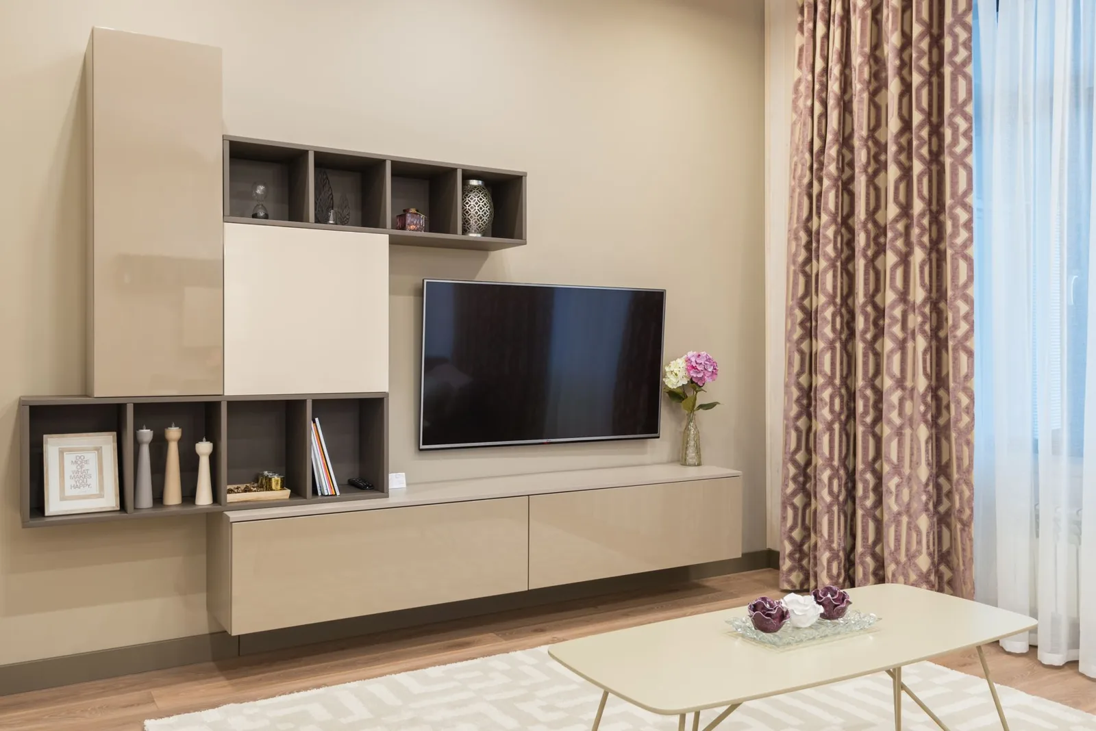
In most homes, visual mess around a television rarely comes from the screen itself. It comes from the clutter of daily living: black power adapters, network routers, coiled HDMI leads, gaming controllers, charging docks, and stray cables. When an entertainment setup relies primarily on open shelving, every piece of plastic casing and tangled cord is exposed to view, making the whole wall look busy.
A media wall feels calm when functional clutter has dedicated, concealed homes behind solid doors or deep drawers. Enclosed lower compartments allow daily electronics to stay plugged in and accessible while keeping their utilitarian mess out of sight. Deep drawers are especially practical for spare cords, extra remotes and gaming gear that never stack neatly. Open shelves work best when they are not asked to hold every cable, controller and accessory. If the unit includes cable openings, use them to keep wiring away from the visible front of the cabinet. That leaves open display zones free to hold a few books or objects that benefit from negative space, rather than acting as catch-alls for household tech.
You Don’t Have to Fill the Whole Wall
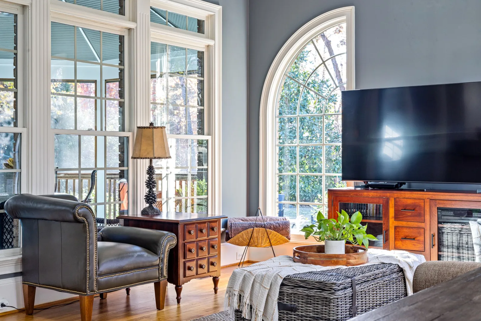
One of the most effective compositional strategies on a long wall is knowing where to leave the plasterboard alone. You do not need matching vertical bookcases flanking both sides of the television, nor do you need to cover every remaining patch of wall with framed prints. Leaving parts of the drywall bare gives the room visual relief and lets both the furniture and the windows stand out.
Asymmetrical arrangements frequently feel more natural than rigid bilateral symmetry. A low credenza can sit off-center with a tall storage piece on one side and a lamp or plant on the other. Leaving the upper wall clear keeps the room feeling open, and keeping cabinetry clear of nearby window openings lets daylight wash across the wall rather than casting heavy shadows behind high cabinets. When storage pieces maintain comfortable clearances from door casings, window trim, and baseboards, the whole living area feels deliberate, spacious, and grounded.
A media wall looks better when the layout solves a real storage or proportion problem rather than simply filling space. Every cabinet or shelf should have a clear reason to be there.






Layout for Kitchen: How to Choose the Right One for Your Space
Choosing the right layout for your kitchen affects how you cook, move,...
 Elif Ayse Sen15 Mins read

Your Dream Bedroom: How to Bring the Outdoors In
Incorporating natural elements like wooden furniture, linen textiles, earth-inspired colors, and indoor...
 Bahattin Duran2 Mins read
Top Modern Fireplace Design Trends for 2024: Stylish, Sustainable, and Tech-Driven Ideas
Discover the defining 2024 fireplace trends transforming modern homes — from sleek...
Bahattin Duran6 Mins read

Stylish Entrance Design Interior Tips for Contemporary Homes
The entrance is more than a functional threshold; it is the first...
 Sinan Ozen4 Mins read


