

Landscape Architecture Drawings: Plans, Sections and Diagrams Explained with Real Examples
Seven real landscape architecture drawings, one for each type: the Emerald Necklace master plan, Gertrude Jekyll's Munstead Wood planting plan, a Governors Island construction detail and more, with what each sheet does well and where it falls short.
 illustrarch Editoral Team15 October 202611 Mins read2
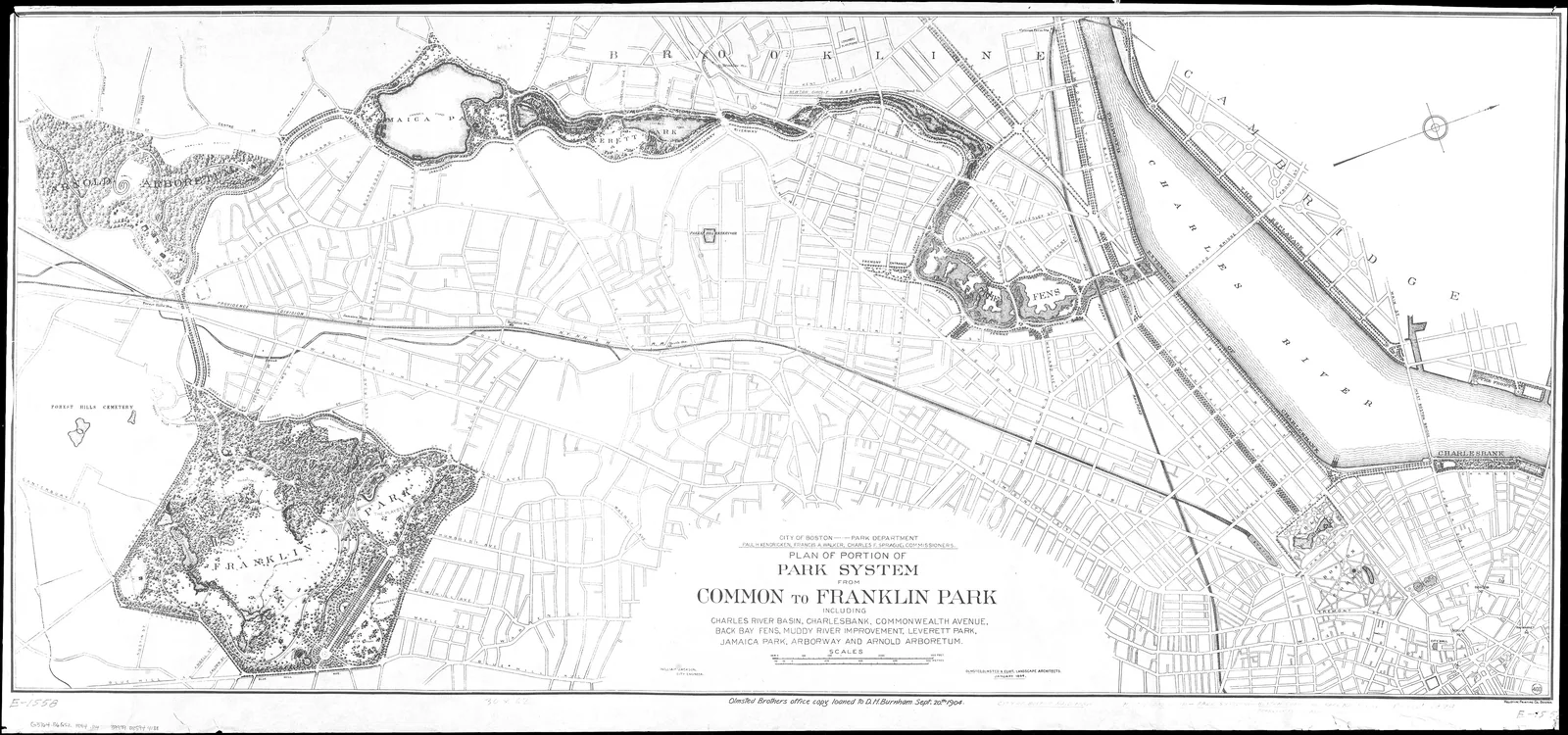
Table of Contents Show
Landscape architecture drawings are the plans, sections, details, diagrams and perspectives that describe an outdoor space before anyone breaks ground. A project usually moves from a master plan and site plan to planting plans and construction details, while sections explain levels, diagrams explain water and movement, and perspectives sell the idea to clients and juries.
Each drawing answers a different question. A master plan asks where the pieces go across a whole district, a planting plan asks which plant goes in which square metre, and a construction detail asks how deep the footing is. Mixing those questions on one sheet is the most common reason student boards and early proposals read as cluttered. The seven examples below are real drawings, from an 1894 Boston park system to a 2026 garden show competition in Lower Saxony, chosen so that each one shows a single drawing type doing its job well, and in a few cases showing where that type falls short.
What Are the Main Types of Landscape Architecture Drawings?
Most landscape projects use the same seven drawing types, at very different scales. The table gives the typical working scale and the question each one answers, so you can see why a drawing set grows from a handful of plans to dozens of sheets.
The Seven Drawing Types at a Glance
| Drawing | Typical scale | Question it answers | Example below |
|---|---|---|---|
| Master plan | 1:1000 to 1:5000 | How do the parts of a large system connect? | Emerald Necklace, Boston |
| Site plan | 1:200 to 1:500 | Where does each element sit on this site? | Moon Estate, Yercaud |
| Planting plan | 1:50 to 1:200 | Which plants go where, and in what quantity? | Munstead Wood, Surrey |
| Section | 1:50 to 1:200 | How do levels, soil and people relate vertically? | Trabzon project, Türkiye |
| Construction detail | 1:5 to 1:20 | How is this built, layer by layer? | Foghorn Alley, Governors Island |
| Diagram | Not to scale | What is the idea, stripped of detail? | Riverside Retreat, Milwaukee |
| Perspective | Not to scale | What will it feel like to stand there? | Landesgartenschau Duderstadt |
Building architects share several of these types, and our guide to the essential types of architectural drawings covers the building side. The difference in landscape work is that the ground itself is the main material, so contours, soil depth and planting carry the weight that walls and floors carry in a building set.
1. Master Plan: Emerald Necklace (1894) – Boston, USA
Designer: Olmsted, Olmsted & Eliot | Area: about 1,100 acres | Length: about 7 miles
The 1894 plan of Boston’s park system is a master plan in the strict sense: it shows how separate parks join into one continuous system, not what any single path looks like. The Emerald Necklace Conservancy describes the result as a chain of parks of about 1,100 acres running for roughly 7 miles, from the Back Bay Fens through the Riverway, Olmsted Park, Jamaica Pond and the Arnold Arboretum to Franklin Park. The firm behind the sheet, led by Frederick Law Olmsted, kept its office in Brookline, now the Frederick Law Olmsted National Historic Site, where the firm’s plans are still archived.
Read the sheet at its own scale and the decision behind it becomes clear. Much of the route followed the marshy Muddy River corridor, and a single sheet let the city see the whole chain, and the land it needed along the water, at once. The detailed design of each park followed later, on separate sheets.
The plan also shows what a master plan cannot promise. According to the Emerald Necklace entry on Wikipedia, the parks have long been subject to flooding from the Muddy River and suffered more than 50 years of neglect before restoration work began, including the spread of invasive Phragmites along the water. A continuous line on paper did not guarantee continuous maintenance on the ground.
2. Site Plan: Moon Estate Front Yard – Yercaud, India
Designer: Seed Design Studio | Setting: coffee estate in the Shevaroy Hills | Altitude: about 1,515 m
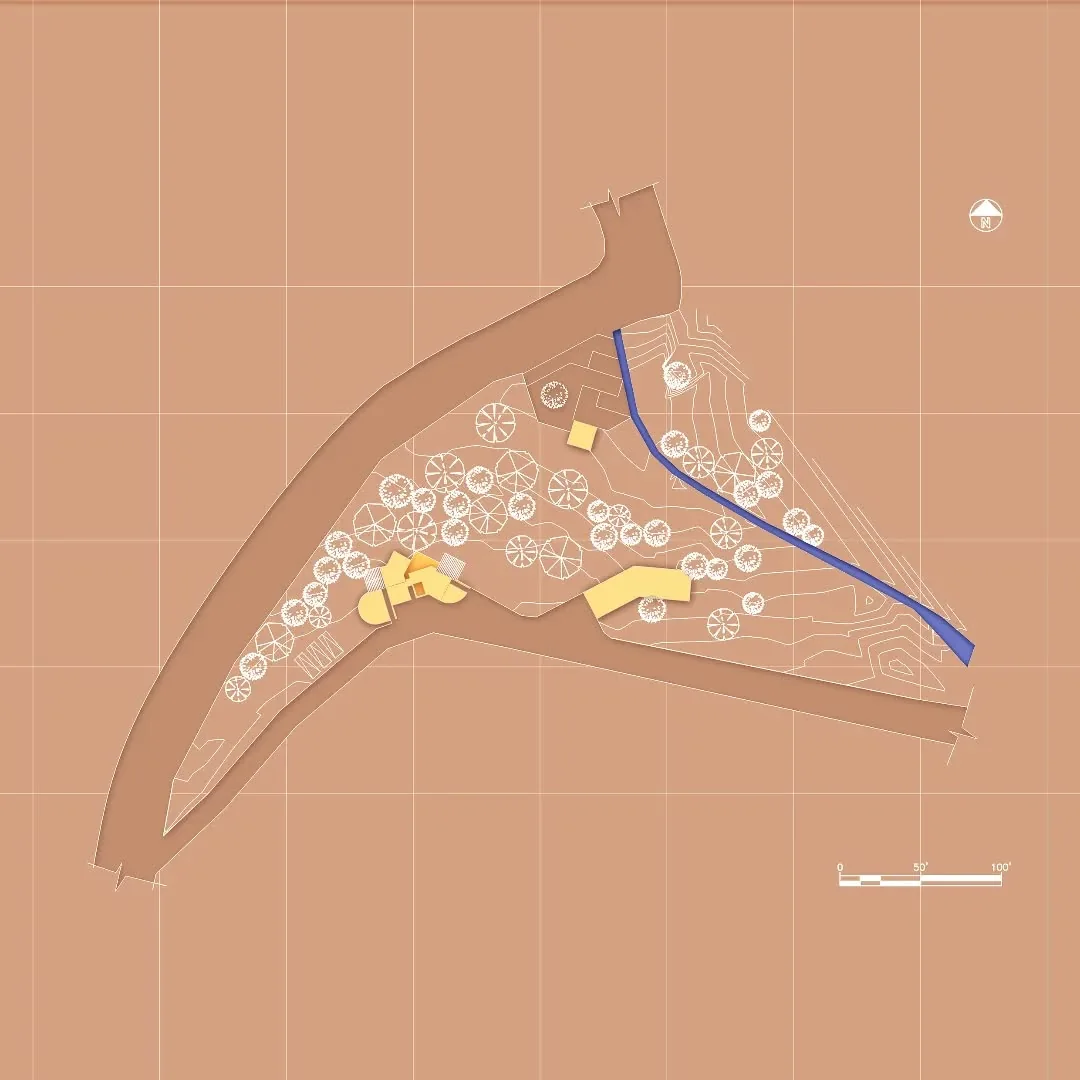
A site plan works one scale closer than a master plan. Seed Design Studio’s drawing of the front yard of the Moon Estate in Yercaud places a guest house and a coffee outlet on a sloping plot, with contour lines, a stream along the front and a blue line for the watercourse. The studio’s own description notes that the site is contoured with coffee plants and silver oak trees twined with pepper, which explains why the plan spends so much ink on tree canopies and so little on hard paving.
Yercaud sits at about 1,515 metres in the Shevaroy Hills of the Eastern Ghats, and the town’s history is tied to coffee plantations established in the 1820s. On a slope like this, the contour lines are not decoration. They tell the builder where the guest house can sit without heavy cut and fill, and where the path has to turn to stay walkable.
The drawing is a good reminder that a site plan is about positions and relationships. Our guide to architectural site plans lists the elements a site plan should carry, and the Moon Estate sheet ticks most of them with a very limited palette: one ground colour, white tree symbols, two yellow buildings and one blue stream.
💡 Pro Tip
On a sloping site, draw the contours first and the buildings last. Placing buildings on a blank plan and adding contours afterwards is how designers end up with a guest house that needs a retaining wall nobody budgeted for.
3. Planting Plan: Munstead Wood Main Border (1908) – Surrey, England
Designer: Gertrude Jekyll | Border size: about 200 ft by 14 ft | Published in: Colour in the Flower Garden (1908)
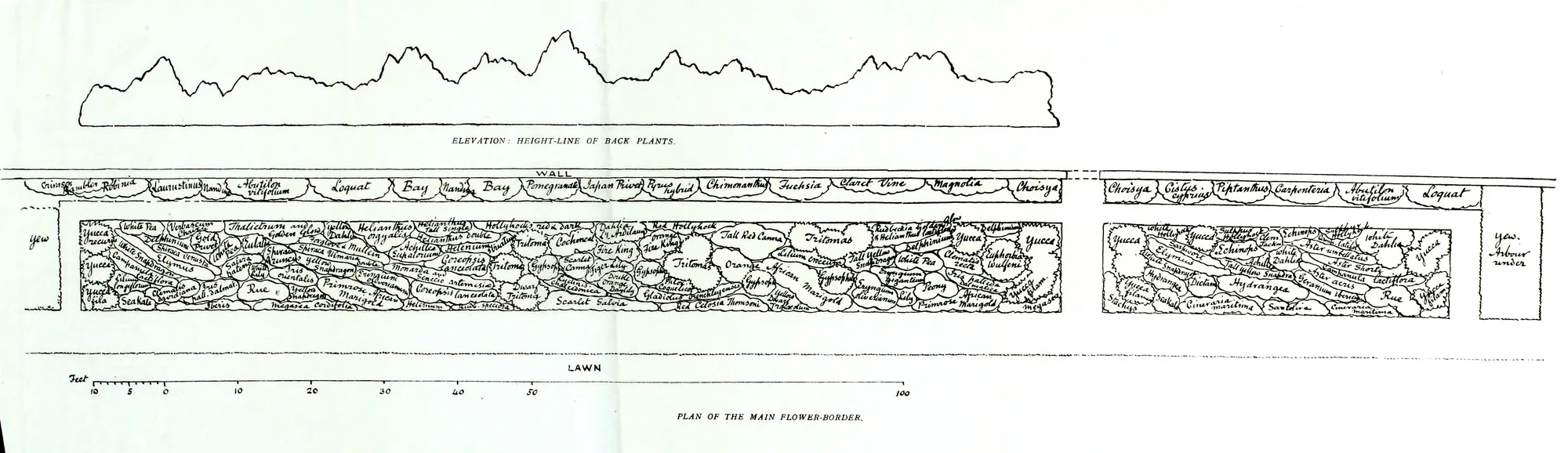
Few planting plans are as widely copied as the fold-out plan of the main flower border at Munstead Wood, Gertrude Jekyll’s own garden in Surrey. In Colour in the Flower Garden, Jekyll describes the border as about two hundred feet long and fourteen feet wide, sheltered by a sandstone wall about eleven feet high. The plan names every plant group in its own drift, and the strip above it draws the height line of the back plants, a small elevation that tells you how the border rises and falls.
The colour scheme is the real content of the drawing. Jekyll explains that the two ends carry grey and glaucous foliage with blue, white and the palest yellow and pink, and that the colour passes through stronger yellows to orange and red in the middle before receding again. The long, interlocking drifts on the plan are how that gradient is built: no plant sits in a neat block, so the transition from cool to hot happens across the border rather than at a hard line.
The same book also admits the limit of the drawing. Jekyll writes that it is impossible to keep any one flower border fully dressed for the whole summer, so this border was planned to peak in late summer. A planting plan fixes positions; it cannot fix timing or maintenance. The garden is now cared for by the National Trust, which keeps 11 acres of the original estate, and if you are choosing plants for your own scheme, our notes on plant selection in garden design pick up where Jekyll’s plan stops.
📌 Did You Know?
Jekyll’s border plan uses no colour at all. The colour scheme lives entirely in the plant names written inside each drift, so a black and white fold-out printed in 1908 carries a full colour scheme that a gardener can still follow plant by plant.
4. Section: Trabzon Landscape Project – Trabzon, Türkiye
Designer: Ay Tasarım | Drawing: two cross sections with labelled elements
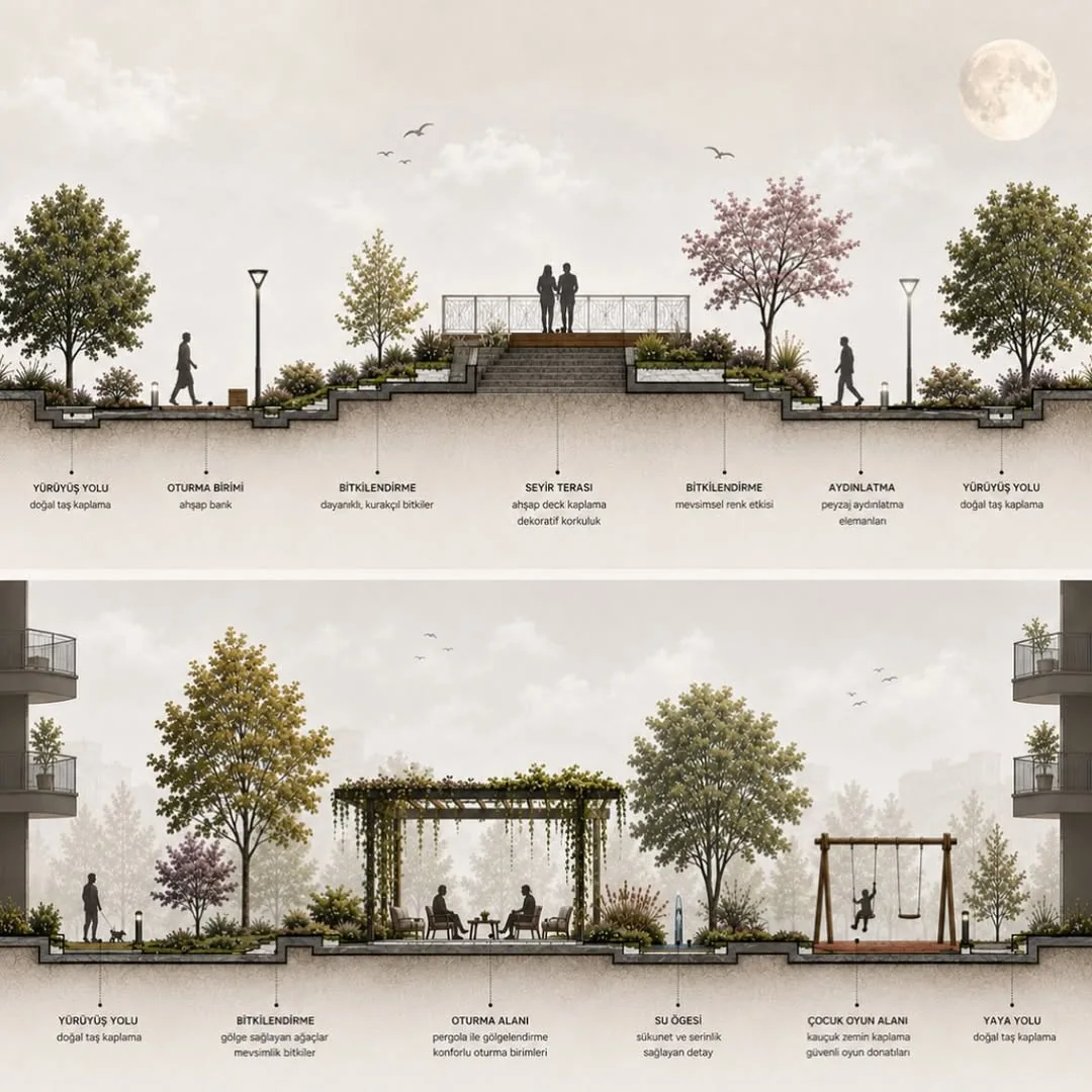
A section cuts vertically through the ground and shows what a plan hides: steps, planters, soil depth and the people using the space. Ay Tasarım’s sheet for a project in Trabzon stacks two sections. The upper one runs across a raised viewing terrace and labels seven elements in order: a walking path in natural stone, a timber bench, drought-tolerant planting, the viewing terrace with a timber deck and decorative railing, planting chosen for seasonal colour, landscape lighting, and a second walking path.
The useful thing about this section is that the ground line is drawn as a solid band, so you can read how the planters step down from the terrace and where the paving sits on top of the soil. That is exactly what a client cannot see on a plan. The office’s caption makes the point itself: the project starts with a good plan and comes to life in section.
Where the drawing is weaker is dimensioning. There are no levels or heights on the sheet, so the section explains the experience but not the build. For a full treatment of how sections carry levels and materials, see our article on architectural section drawings, which covers the building side of the same drawing type.
5. Construction Detail: Foghorn Alley Family Housing (1986) – Governors Island, New York
Landscape architect: Miceli Kulik and Associates | Architect: Castro-Blanco Piscioneri and Feder | Client: U.S. Coast Guard | Sheet: L-2, 13 of 59
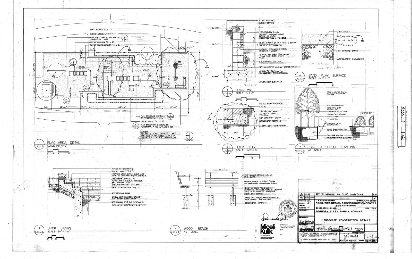
Construction details are the drawings contractors price and build from, and this sheet from the U.S. Coast Guard housing on Governors Island is a textbook set. Titled Landscape Construction Details and held by the U.S. National Archives, it carries seven numbered details: the play area, brick stairs, a wood bench, a brick wall, a brick edge, a sand play surface, and tree and shrub planting. The title block credits Miceli Kulik and Associates for landscape architecture and Castro-Blanco Piscioneri and Feder as architects.
The numbers on the sheet show how a detail differs from a plan. The play area is drawn at 1/8 inch to the foot, while the brick edge and the sand play surface are drawn at 1 1/2 inches to the foot, twelve times larger, because the builder needs to see each layer: sand, filter cloth, crushed stone and compacted subgrade. The stair footing specifies 2,500 psi concrete. The tree planting detail, drawn without scale, shows staking, mulch and how much of the burlap to remove from the root ball, which is the kind of instruction that decides whether a tree survives its first year.
The island itself has changed since. According to the Trust for Governors Island, the Coast Guard closed its facilities in 1995 and relocated personnel by September 1996, ending a residential community of about 3,000 people. The details remain a clear record of how 1980s housing landscapes were specified, and our guide to architectural detail drawings explains the same conventions for buildings.
6. Diagram: Riverside Retreat – Milwaukee, USA
Designer: Beck Iversen, UW-Milwaukee School of Architecture and Urban Planning | Project: student design studio
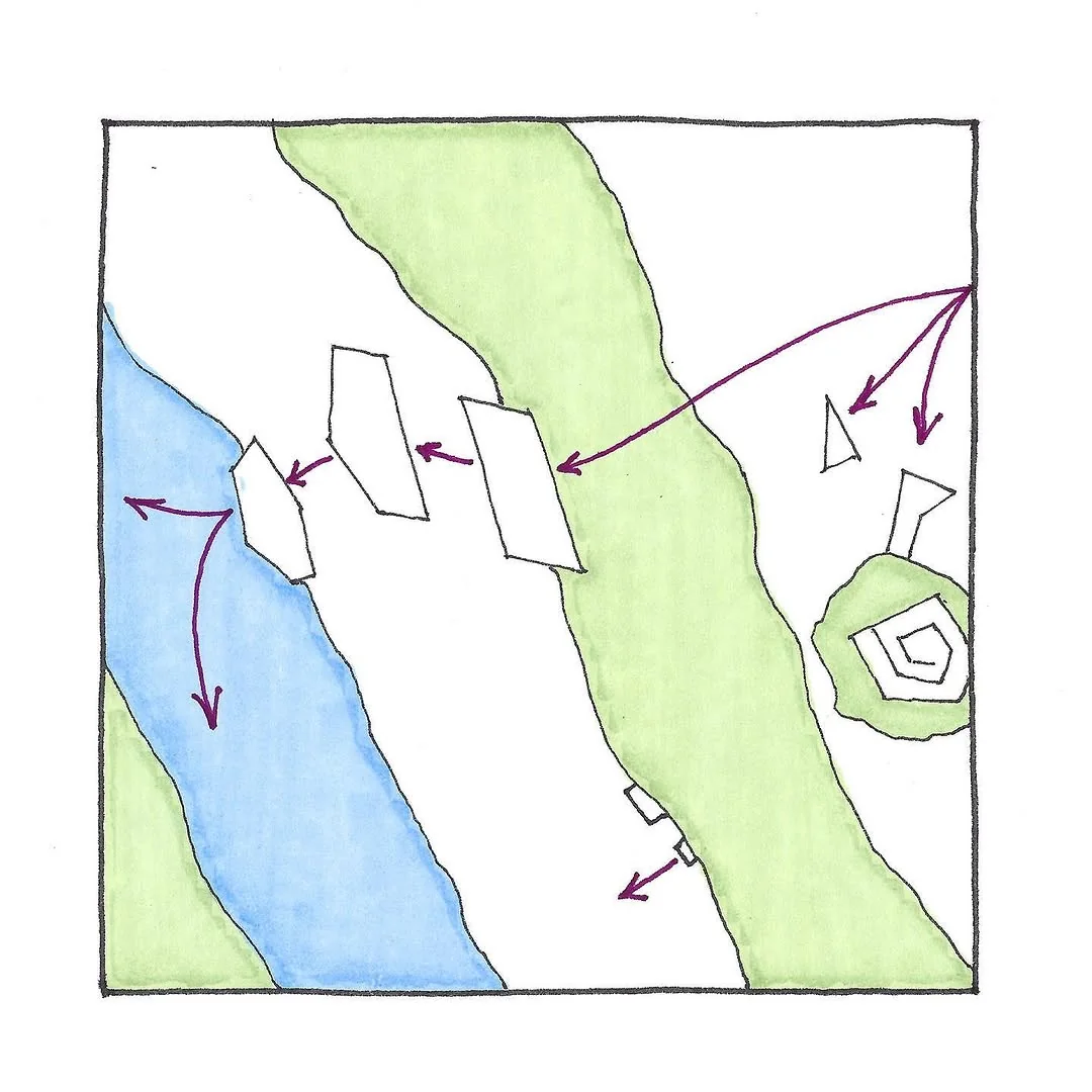
A diagram removes everything except the idea. Beck Iversen’s site diagram for a riverside retreat in Milwaukee, drawn at UW-Milwaukee’s School of Architecture and Urban Planning, uses three flat colours inside a single square frame: blue for the river, green for the vegetated banks and a green knoll, and white for buildable ground. Purple arrows mark views and movement from the buildings towards the water.
That restraint is the point. With only three colours and a few arrows, the diagram tells a reviewer in seconds that the buildings sit in a line between the green bank and the river and turn their views towards the water, which is the decision the rest of the project depends on. Add planting symbols or paving textures and that message disappears.
The limitation is equally plain: the diagram has no scale, no north arrow and no indication of levels, so it cannot be built from or checked against the site. Diagrams are arguments, not instructions. Our collection of architectural diagram examples shows the same trade-off in building projects.
7. Perspective: Landesgartenschau Duderstadt Competition (2026) – Duderstadt, Germany
Designer: Studio Polymorph | Competition area: about 17 hectares | Entries: 23
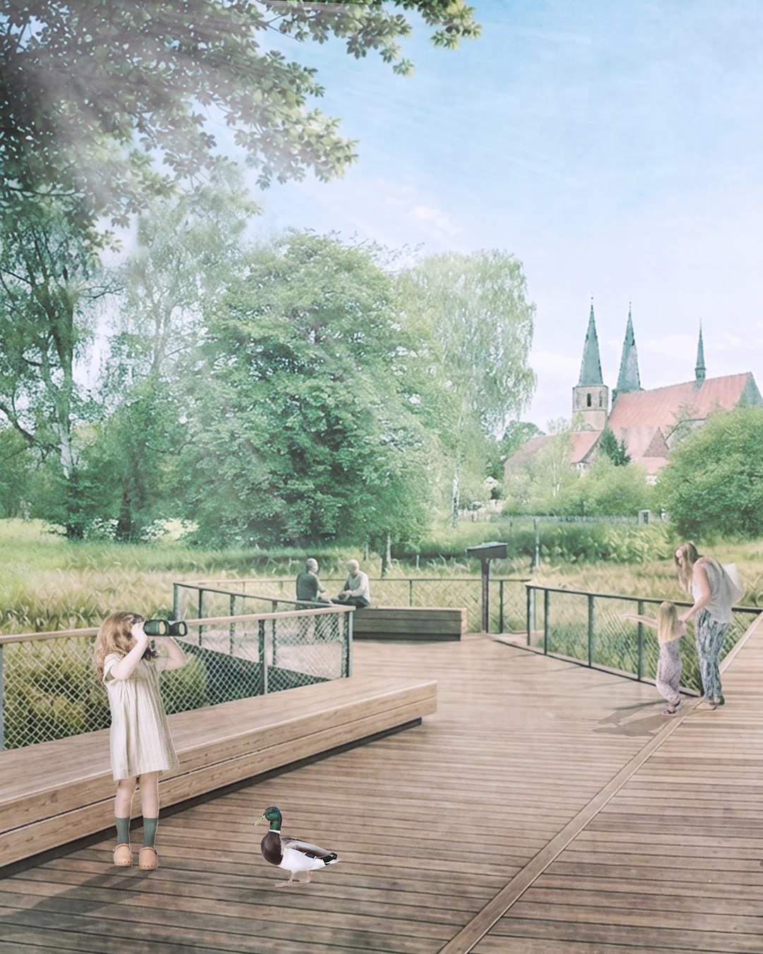
Perspectives show what a place will feel like, and competition renderings are where the type is pushed hardest. Studio Polymorph’s view for the Landesgartenschau 2030 competition in Duderstadt shows a timber boardwalk crossing a wetland, children at the rail, ducks in the foreground and the town’s church towers on the skyline, a deliberate signal that the new park belongs to the historic timber-framed town.
The competition data puts the picture in context. According to wettbewerbe aktuell, the area covered about 17 hectares, with 11 hectares of park plus 0.55 hectares on the town wall as the core working area, and 23 offices entered. The jury met on 15 and 16 September 2026 and awarded first prize to Planorama of Berlin, followed by hutterreimann and Franz Reschke. Studio Polymorph was not among the prize winners, and the office congratulated the winners publicly, describing them as garden show specialists.
That outcome is the honest lesson of the perspective. A strong image wins attention, but juries award plans, phasing and cost. A perspective earns its place on the board only when the plan beside it can deliver the view it promises.
🔢 Quick Numbers
- 23 entries for the Landesgartenschau Duderstadt 2030 competition (wettbewerbe aktuell)
- 1,100 acres in Boston’s Emerald Necklace (Emerald Necklace Conservancy)
- 59 sheets in the Foghorn Alley drawing set, of which the landscape details are sheet 13 (U.S. National Archives)
Honorable Mentions
Greensward Plan (1858) – New York, USA
Frederick Law Olmsted and Calvert Vaux won the Central Park competition against 33 other submissions with the Greensward Plan, famous for its sunken transverse roads. It sits outside the main list only because the Emerald Necklace shows the master plan type at the scale of a whole city system.
Humphry Repton’s Red Books (1788 to 1818) – England
Repton bound watercolour views for clients with overlays that showed the site before and after his proposals. They are presentation drawings more than working drawings, which is why they appear here rather than under perspectives.
Love Kurandza Learning Centre Axonometric (2022)
This aerial axonometric for a competition entry shows courtyard buildings sitting in a planted landscape. Axonometrics are increasingly common on landscape boards, but they remain closer to building drawings, so they did not take one of the seven places.
What These Seven Drawings Have in Common
Each drawing answers one question
The Emerald Necklace plan never tries to show a bench, and the Foghorn Alley details never try to show the whole island. Even the Trabzon section, which looks busy, labels one row of elements along one cut. The drawings that read well are the ones that refuse to answer two questions at once.
Restraint carries the information
Jekyll’s border plan has no colour, the Riverside Retreat diagram has three, and the Moon Estate site plan has four. In all three cases the limited palette is what makes the important layer, plant names, the river edge or the contours, stand out. Rich rendering belongs in the perspective, which is why the Duderstadt view can carry so much atmosphere.
The drawing is not the outcome
Three of the seven come with a gap between paper and ground: the Emerald Necklace with decades of flooding and neglect, the Munstead Wood border with a peak that only lasts late summer, and the Duderstadt perspective with a jury that chose other plans. A drawing set is a promise, and maintenance, timing and judging all happen after the last sheet is printed.
Frequently Asked Questions
Which landscape architecture drawing is produced first?
Usually the diagram or the master plan. In this list, the Riverside Retreat diagram shows the kind of early sheet that fixes the idea, and the Emerald Necklace plan shows the large-scale drawing that secures land and connections before detailed design begins.
Which drawing type here is the most detailed?
The construction detail. The Foghorn Alley sheet draws the brick edge and sand play surface at 1 1/2 inches to the foot, twelve times the scale of its own play area plan, and specifies materials down to the filter cloth and the concrete strength.
Which is the oldest example in the list?
The Emerald Necklace plan from 1894, followed by Gertrude Jekyll’s Munstead Wood border plan published in 1908. The newest is the Studio Polymorph perspective for the Duderstadt competition, judged in September 2026.
The Bigger Picture
It is tempting to think of landscape architecture drawings as a ladder, with the perspective at the top as the finished picture. The examples here suggest the opposite. The drawings that lasted longest, Jekyll’s plant names in their drifts and the Coast Guard’s footing specifications, are the plain ones that told someone exactly what to do, while the most beautiful image in the set did not win its competition. If you are putting together your own drawing set or a first landscape architecture project, give the quiet sheets the same care as the hero image, because they are the ones that end up on site.






Top Rated Landscape Architecture Schools in the US, Europe, and Beyond
From Harvard GSD and UC Berkeley to Wageningen University in Europe, the...
 Sinan Ozen10 Mins read

Top 10 Landscape Architecture Books Every Designer Should Read
A focused guide to ten landscape architecture books covering ecology, planting design,...
 Bahattin Duran6 Mins read

7 Powerful iPad Apps for Modern Landscape Architecture & Garden Design
In 2025, iPad-based workflows have become essential for landscape architects and garden...
Bahattin Duran10 Mins read

The United States’s Most Beautiful Parks and Gardens: Our Essential Guide
Discover the United States’s Most Beautiful Parks and Gardens with expert picks,...
Sinan Ozen4 Mins read


Leave a comment