

Pantone Color of the Year 2026: Cloud Dancer and Its Architectural Resonance
Pantone’s selection of PANTONE 11-4201 Cloud Dancer as the Color of the Year 2026 introduces a soft white that sits at the edge of what we define as color. While white has long held a powerful place in architectural history, its selection as a defining global color raises questions about neutrality, risk, and direction. Viewed through an architectural lens, Cloud Dancer feels less like a new proposition and more like a reflection of contemporary uncertainty.

Table of Contents Show
Pantone’s announcement of PANTONE 11-4201 Cloud Dancer as the Color of the Year 2026 has sparked discussion across design disciplines and not without reason. Defined as a soft, airy white, Cloud Dancer stands at the very edge of what we traditionally consider “color.” In a year where countless warm and cool tones could have been selected to reflect cultural, environmental, or technological shifts, Pantone’s decision to choose a near-white hue raises an important question: is Cloud Dancer a meaningful statement, or simply a safe one?

A White That Avoids Risk
From a chromatic perspective, Cloud Dancer can be interpreted as a kind of weak color choice, not in quality, but in expressive strength. It lacks the emotional clarity of a warm earth tone or the conceptual depth of a cool, atmospheric blue or green. White, by nature, avoids conflict. It does not provoke, it does not challenge, and it rarely divides opinion. In this sense, Cloud Dancer feels less like a bold cultural reflection and more like a neutral pause.
Pantone has historically used the Color of the Year to capture collective emotions and global tensions. Strong reds, grounded browns, energetic purples, or calm yet assertive blues have all carried symbolic weight in previous years. Against this backdrop, choosing a white tone suggests a retreat from narrative complexity rather than an engagement with it.

Free Online Color Palette Creator
Drag & drop an image or click to upload
Supports JPG, PNG, WebP
White in Architecture: Powerful, but Already Established
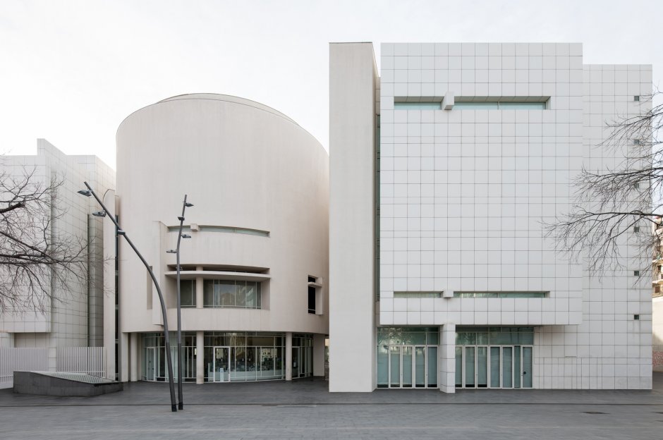
In architecture, white is anything but new. It is deeply embedded in the discipline’s history and identity. From Le Corbusier’s Villa Savoye to Richard Meier’s museums, from Tadao Ando’s light-washed concrete interiors to John Pawson’s minimalist spaces, white has long been a dominant architectural language. It represents purity, rationality, light, and reduction.

Because of this strong architectural legacy, Cloud Dancer does not introduce a new spatial idea. Architects already understand how to work with soft whites. They already use them to amplify daylight, emphasize geometry, and create calm atmospheres. As a result, Cloud Dancer does not expand architectural thinking — it simply aligns with what is already widely practiced.
Missed Opportunities: Warm and Cool Alternatives
What makes the choice feel particularly weak is the missed potential. Contemporary architecture is currently exploring:
-
Warm mineral tones that connect buildings to landscape,
-
Cool, desaturated hues that respond to climate and atmosphere,
-
Nuanced color systems that react to light, material, and movement.
Any of these directions could have offered a richer dialogue between color and architecture. A warm tone could have addressed sustainability and material authenticity. A cool tone might have reflected digital environments or climatic uncertainty. Instead, Cloud Dancer sits safely between all positions agreeable, but non-committal.
Contemporary Architecture and the Rise of Neutral Fatigue
In recent years, architecture has leaned heavily into soft minimalism and neutral palettes. While this has produced elegant and calm spaces, it has also led to a certain visual fatigue. Endless variations of white, off-white, and beige dominate interiors, housing projects, and cultural buildings alike.
Within this context, selecting a white tone as Color of the Year does not push the discipline forward. Rather, it reinforces an already dominant aesthetic. For architects seeking innovation through color, as a spatial, emotional, or cultural tool, Cloud Dancer offers little guidance beyond what is already familiar.
Seen through an architectural lens, Cloud Dancer feels less like a visionary choice and more like a reflection of uncertainty. It is a color that avoids extremes, avoids strong identity, and avoids controversy. While this may resonate with a global desire for calm, it also reveals a hesitation to define a clearer direction for design.
White can be powerful but only when it is intentional, contextual, and paired with strong architectural ideas. As a standalone “Color of the Year,” however, Cloud Dancer risks becoming invisible: present everywhere, yet saying very little.

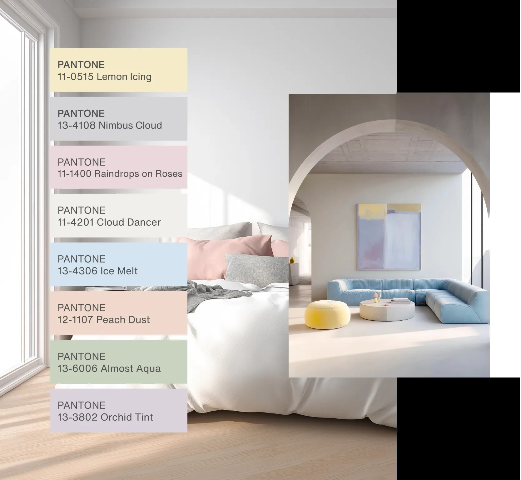
Design Strategies: Using Cloud Dancer in Architecture
Here are practical ways architects can apply the Cloud Dancer sensibility:
-
Exterior surfaces: Soft whites can reflect sunlight while offering subtle warmth, especially when paired with natural materials like limestone or wood.
-
Interiors: Neutral white walls and ceilings act as flexible canvases, allowing furniture, art, or architectural details to take center stage.
-
Light modulation: Using Cloud Dancer on surfaces that capture indirect daylight amplifies spatial depth and serenity.
-
Contrast and texture: Pairing this soft white with tactile materials like wool, stone, or matte finishes enhances sensory richness without visual noise.
Pantone 2026’s Cloud Dancer does not fail as a color, but it fails to lead. In a moment when architecture and design are searching for new narratives — responding to climate, technology, and social change, a near-white tone feels like a pause rather than a proposal. For architects, the challenge remains the same as before: to move beyond safe neutrality and use color as an active design force, not merely a quiet background.
- Architectural Aesthetics
- architectural color trends 2026
- Architectural Criticism
- Architectural Minimalism
- architecture and color theory
- architecture editorial
- Cloud Dancer Pantone
- color as design tool
- color in contemporary design
- color psychology architecture
- color trends in architecture
- contemporary architecture colors
- design trends 2026
- minimalist architecture color
- modern architecture palettes
- neutral color fatigue
- Pantone 11-4201
- Pantone Color of the Year 2026
- trend colors architecture
- white in architecture


Zaha Hadid Architects Rebrand to ZHA: A New Name and a New Chapter
Zaha Hadid Architects has officially become ZHA, ten years after its founder's...

Al Maktoum International Airport: Dubai’s 2032 Aviation Megaproject
Dubai's Al Maktoum International Airport has entered large-scale construction, with Phase 1...

LOHA Founder Architect Lorcan O’Herlihy Dies at 66
Irish-born architect Lorcan O'Herlihy, founder of Los Angeles firm LOHA, has died...

From Water Supply to Tourist Attraction: The Evolution of Istanbul’s Basilica Cistern
Built in 532 AD under Emperor Justinian I, the basilica cistern in...

Leave a comment