

10 Successful Presentation Sheets By Architecture Students #2
Presentation sheets are where architecture students transform their design ideas into compelling visuals. This collection of 10 successful examples highlights how clear layouts, balanced use of diagrams and renders, and creative storytelling can make a project stand out.

Table of Contents Show
Sheet 1 – Gray Stay
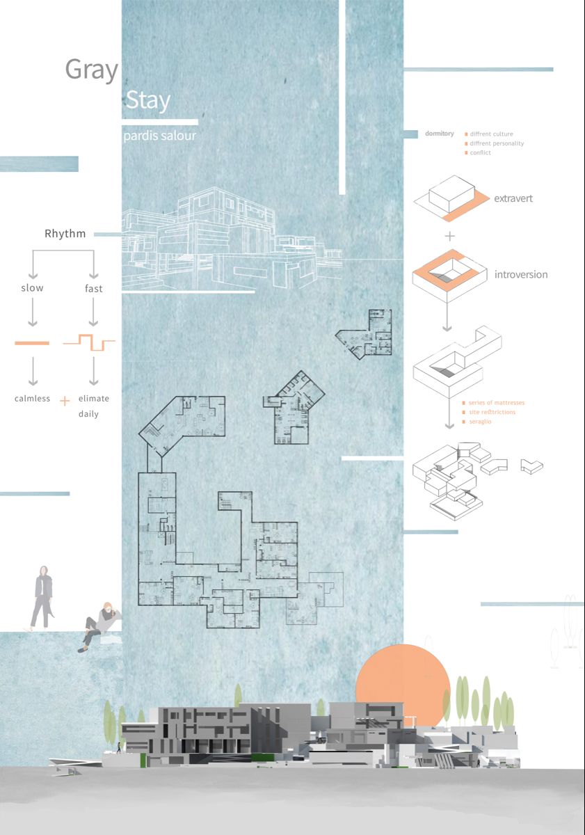
“Gray Stay” is a student project that stands out as one of the most successful architecture presentation sheets thanks to its clear content and well-thought-out layout. The first things that catch the eye are the color selection and visual balance, along with clean drawings and correctly proportioned layout elements. Every section of the sheet communicates the design intent without overwhelming the viewer.
What makes this presentation sheet particularly effective is the restrained use of a gray-toned color palette. By limiting the color range, the designer ensures that the architectural drawings remain the focal point. The hierarchy between the title, drawings, and supporting text is immediately clear, which is a fundamental quality of any well-designed architecture presentation board. Students looking to create impactful presentation sheets can learn a great deal from this approach: sometimes simplicity and consistency in color are far more powerful than a complex, multi-colored layout.
Sheet 2 – Plasebo

“Plasebo” is a presentation sheet that demonstrates a strong sense of graphic composition and visual hierarchy. The layout keeps the viewer’s attention focused on the key architectural drawings while supporting them with subtle diagrams and minimal text. The overall tone of the sheet feels cohesive, and the typography choices complement the drawing style perfectly.
One of the standout qualities of this architecture presentation sheet is the way negative space is handled. Rather than filling every available area with content, the designer allows breathing room between elements. This approach prevents the sheet from feeling cluttered and gives each drawing the space it needs to communicate effectively. The balance between filled and empty areas is a technique that many architecture students overlook, but it plays a critical role in how a presentation board is perceived by reviewers and jury members. “Plasebo” is a great reminder that restraint in graphic design can make an architecture presentation sheet more powerful and readable.
Sheet 3 – Topophilia
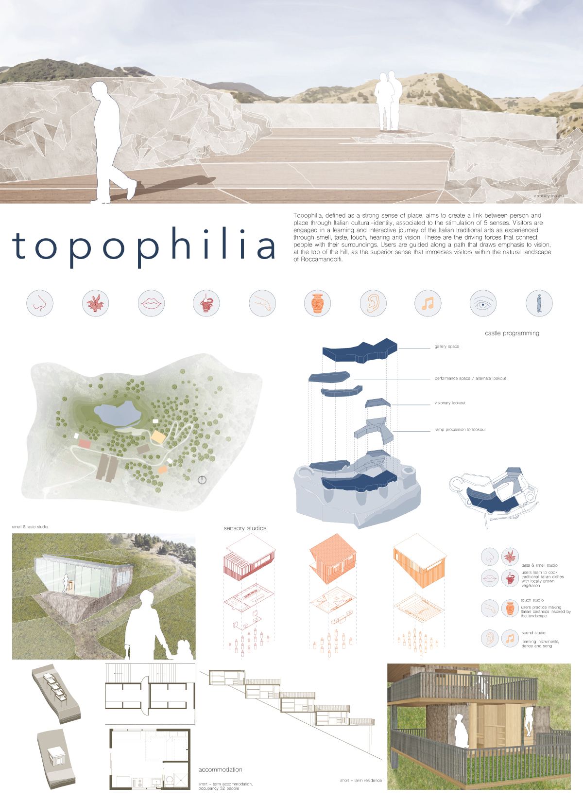
“Topophilia” is a small-scale project presented through highly effective diagrams and precise technical drawings. Every drawing on this presentation sheet is clear and easy to understand at first glance. The color palette remains soft and harmonious throughout, creating a unified visual language that ties all elements together.
What sets “Topophilia” apart from many other student presentation sheets is the clarity of its diagrammatic storytelling. The designer uses diagrams not just as decorative elements but as essential tools for explaining the design process, from site analysis to spatial organization. Each diagram builds upon the previous one, guiding the viewer through the conceptual development of the project step by step. This sequential approach to diagram placement is something every architecture student should consider when designing their own presentation boards. The soft, muted color choices also ensure that no single element overpowers the rest, keeping the overall reading experience smooth and engaging.
Sheet 4 – Torchlights

The design of an architecture presentation sheet should always reflect the character of the project itself. “Torchlights” deals with extreme topography conditions, and the designer made this the focal point. Topography lines and the site concept dominate the composition, giving the viewer an immediate understanding of the project’s relationship with the landscape.
This presentation board is a textbook example of how context-driven design decisions can elevate the quality of a sheet. Instead of applying a generic template, the designer adapted the entire layout to echo the dramatic terrain of the site. The topographic contour lines serve a dual purpose: they explain the site conditions and simultaneously act as a graphic motif that gives the sheet its unique identity. This kind of contextual design thinking is what separates an ordinary architecture presentation sheet from a truly memorable one. When the visual language of the board mirrors the essence of the project, the result is always more compelling.
Sheet 5 – Pano

“Pano” is a compelling project whose presentation sheet instantly communicates its most important features. The concept and design details are conveyed through clear drawings and well-structured diagrams. The realistic renders and clean technical line work complement each other seamlessly. Instead of relying on lengthy paragraphs, the designer uses concise subtitles as explanatory text, keeping the sheet readable and visually organized.
Another noteworthy aspect of this presentation sheet is the hierarchy of information. The most critical visuals, such as the main render and the key plan, occupy the largest portions of the layout, while secondary drawings and diagrams are scaled down accordingly. This deliberate sizing strategy ensures that the viewer’s eye naturally moves from the most important content to the supporting details. The decision to replace traditional paragraphs with short subtitles also speeds up the reading process, which is especially valuable during jury reviews when each project typically receives only a few minutes of attention. “Pano” proves that well-organized content can tell a complete architectural story without a single unnecessary element.
Sheet 6 – InSEASide
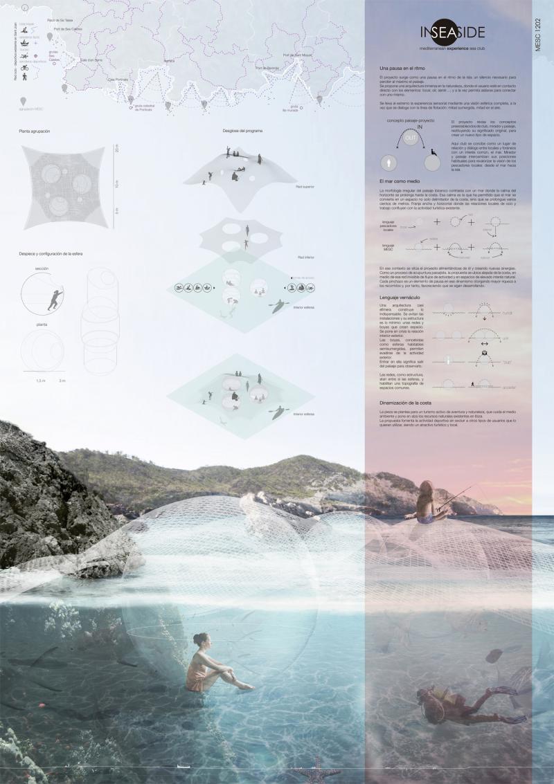
As the name suggests, InSEASide is a project designed for a location surrounded by water. To match this unique context and concept, the designer created a striking render that excels in color, quality, and simplicity. When a render successfully captures the atmosphere of a project, all other drawings can take a supporting role in the background. The key strength of this presentation sheet is how diagrams and drawings are used in a clear, well-organized manner.
The color palette of this architecture presentation board deserves special attention. The blue and turquoise tones used throughout the sheet reinforce the aquatic context of the project without being overly literal. This subtle approach to color storytelling enhances the overall narrative of the design. Additionally, the render acts as the emotional anchor of the entire sheet, immediately drawing the viewer into the spatial experience of the project. The supporting technical drawings and diagrams provide the necessary factual information without competing for attention, which is a sign of a well-balanced presentation layout.
Sheet 7 – Rachut School
Sometimes, being different is the right choice. In this presentation sheet, we see a bold and successful use of a black background. Choosing a dark background for an architecture presentation board is always a risk, but here the black color is well-coordinated with the render’s atmosphere and the supporting drawings. Even the axonometric diagram remains clearly legible against the dark surface. The contrast between the elevation placed at the top of the sheet and the rest of the composition is a strong application of one of the fundamental principles of basic design.
Using a dark background requires careful attention to line weights, text colors, and image brightness. If any of these elements are not properly adjusted, the entire sheet can become difficult to read. In the case of the Rachut School presentation, the designer has managed to balance all of these factors. The white and light-colored elements pop against the black background, creating a dramatic and professional look. This approach works particularly well for projects with strong atmospheric renders, as the dark surround intensifies the visual impact of the images. Architecture students who want to experiment with unconventional background colors can use this sheet as a reliable reference for how to execute the technique effectively.
Sheet 8 – Beyond the Diff

“Beyond the Diff” feels like an enjoyable project from the moment you look at the presentation sheet, thanks to its vibrant colors and well-selected visuals. The proportions of visual elements and the balance between drawings and renders make this sheet highly effective. Using diagrams instead of lengthy explanation texts is an important principle in architecture presentations, and this sheet is an excellent example of that approach in practice.
The playful yet professional quality of this presentation board demonstrates that architecture does not always have to be presented in a rigid, formal manner. The designer uses color as an active storytelling tool, differentiating sections of the sheet and creating visual rhythm across the layout. The diagrams are drawn with enough detail to be informative but remain simple enough to be understood quickly. This balance between information density and visual clarity is one of the hardest things to achieve in presentation design, and “Beyond the Diff” handles it with confidence. Students who struggle with overly text-heavy boards should study this example closely.
Sheet 9 – A Courtyard in Laveno
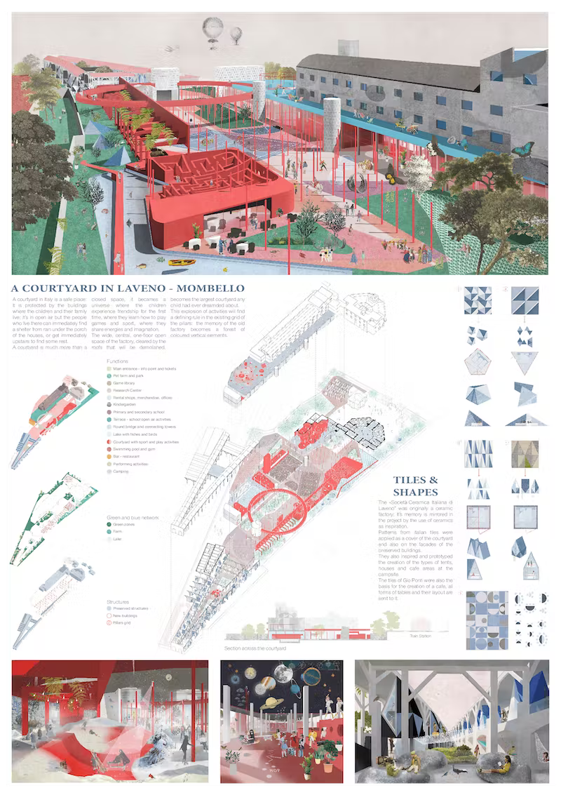
This is undeniably a successful presentation. Projects of this caliber deserve a simple, well-organized layout that lets the design speak for itself. The designer presents “A Courtyard in Laveno” in a unique and effective way, using urban-scale diagrams, an aerial perspective render, interior renders from different spaces, elevations, and carefully selected details. The layout design is clean and confident.
Even though the color choices for texts, titles, and diagrams differ from one another, the overall composition never feels cluttered or complex. Everything works together in harmony. The variety of drawing types included on this single sheet is impressive: the viewer can understand the project at the urban scale, experience the interior spaces through renders, and examine construction details all in one place. This comprehensive approach to content selection is what makes a presentation sheet truly complete. The designer also demonstrates strong typographic skills, using font size and weight variations to create a clear reading order without relying on heavy borders or dividing lines.
Sheet 10 – Back to the Future

In this architecture presentation sheet, the building is showcased through a variety of perspectives and visual approaches. Master plan views, exploded diagrams, urban-scale context drawings, and beautiful realistic renders are all placed together on a single sheet. The relationship between the renders and the technical drawings is remarkably cohesive, even though the explanation texts are slightly long and use small font sizes.
Despite the high density of information, the sheet manages to maintain visual order through a well-structured grid system. The exploded diagrams are particularly effective, as they allow the viewer to understand the spatial relationships between different levels and programmatic zones of the building. The realistic renders add an emotional layer to the presentation, making the project feel tangible and inviting. One area that could be improved is the length of the text blocks; shorter, more focused descriptions would help maintain the visual momentum of the sheet. Nevertheless, “Back to the Future” remains a strong example of how to present a complex architectural project on a single presentation board while keeping the content rich and visually engaging.
- architectural drawings and renderings
- architectural presentation
- Architectural Presentation Boards
- architectural presentation boards guide
- architectural presentation sheets
- architecture board layout tips
- architecture portfolio design inspiration
- architecture portfolio visuals
- architecture poster design ideas
- Architecture Student Presentation
- How to create architectural presentation
- presentation sheet examples for students


1 Comment


Kingdom Centre Tower: Riyadh’s Inverted Parabolic Arch and Sky Bridge Explained
A detailed look at Kingdom Centre Tower in Riyadh, Saudi Arabia, covering...

Architecture Precedent Study: How to Analyze a Building Step by Step
Learn how to conduct an architecture precedent study with a structured, step-by-step...

Reichstag Building: How Norman Foster Turned a War-Scarred Landmark into a Green Parliament
A detailed look at the Reichstag Building in Berlin, covering its turbulent...

Scale and Proportion in Architecture: A Visual Guide to Designing Better Buildings
A focused guide to scale and proportion in architecture covering the difference...

Thank you Elief, you are inspiring my art. I will like to have session with you.