

10 Best Architecture Sheets by Students | Layout Examples 2026
Discover 10 outstanding architectural presentation sheets created by architecture students. From neighborhood analysis to airport design, these architecture sheet examples showcase effective layout strategies, clear visual hierarchy, and compelling storytelling techniques that win competitions and impress juries.

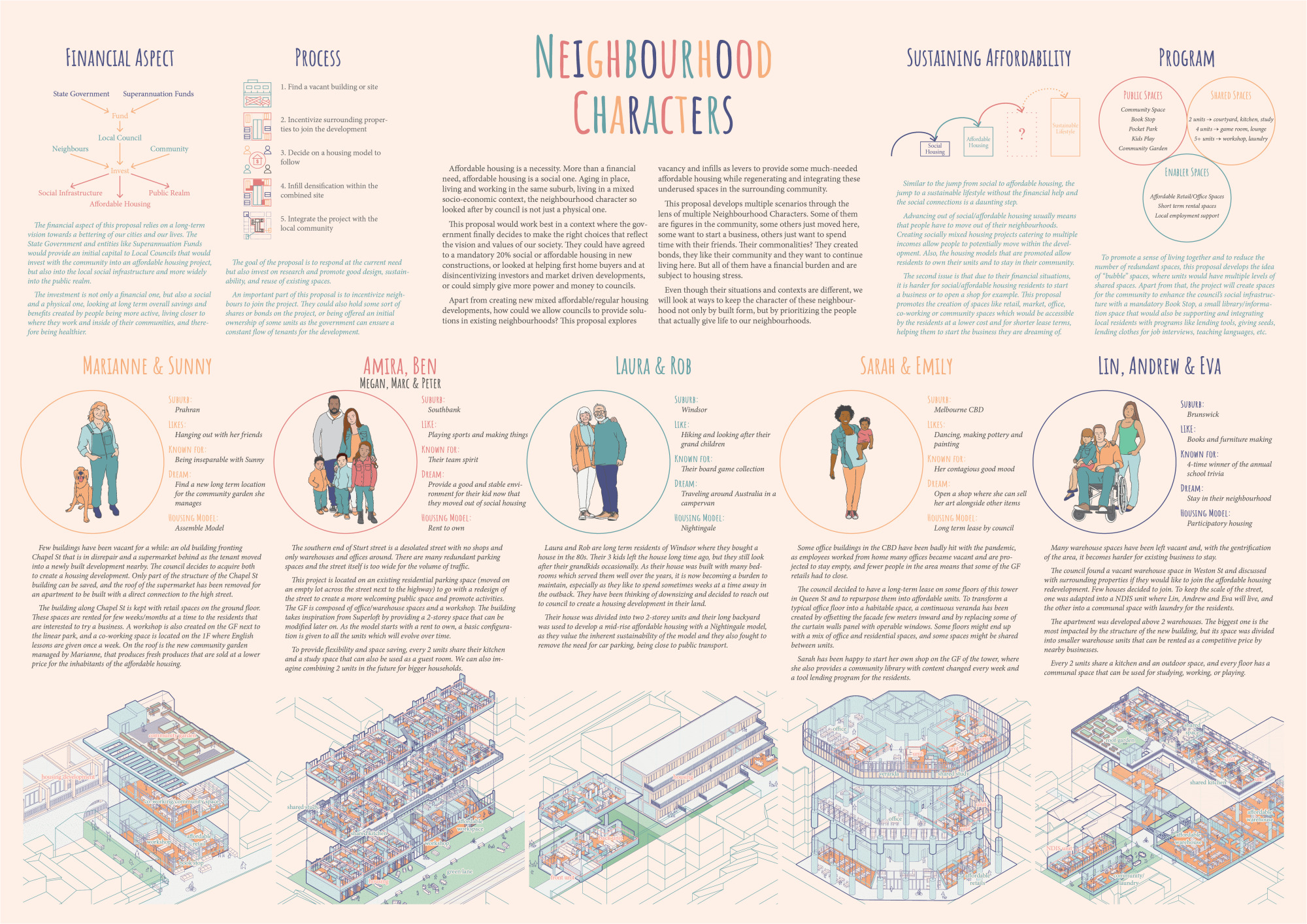
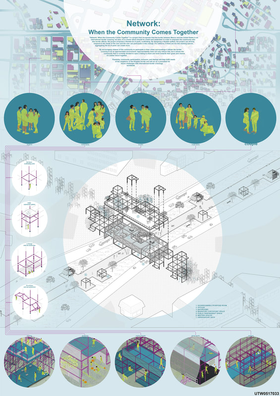
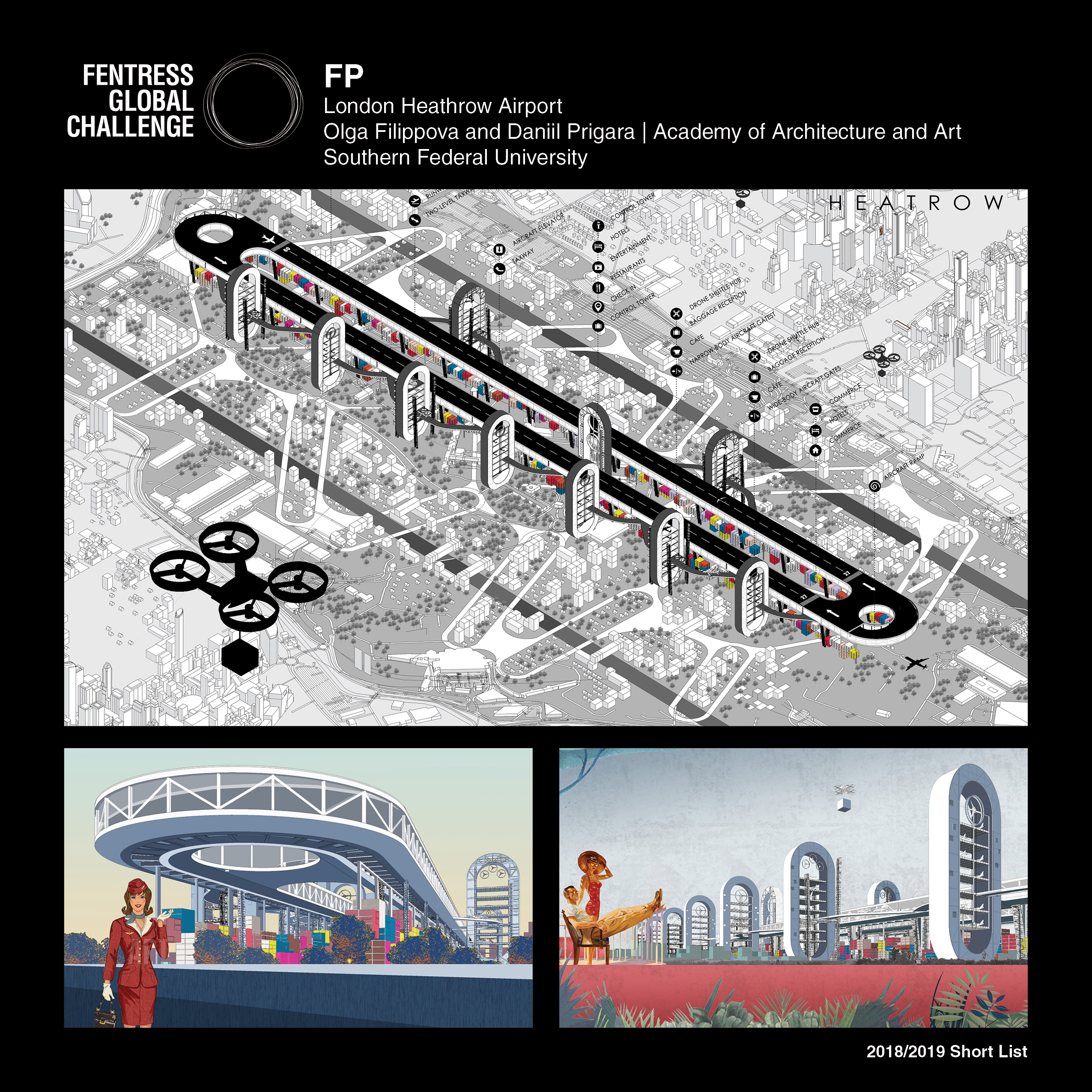
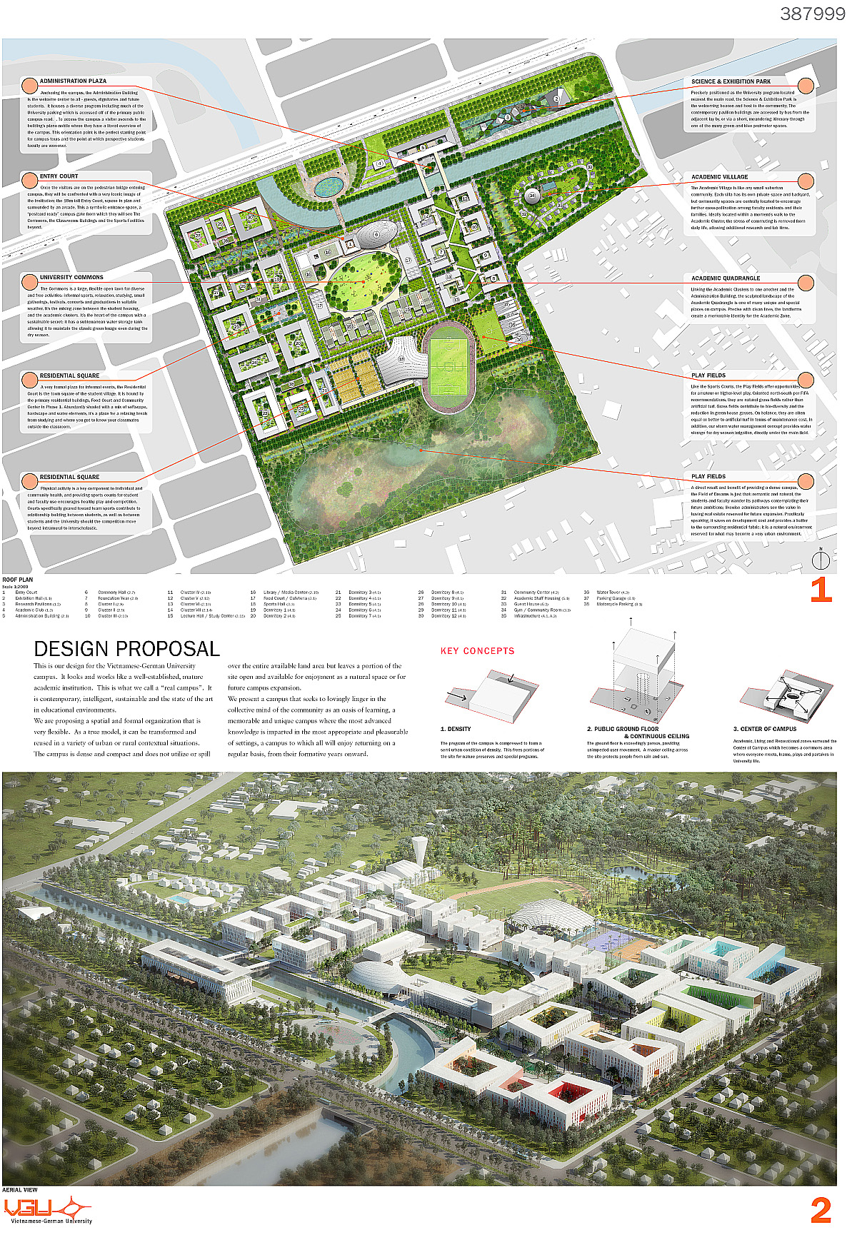
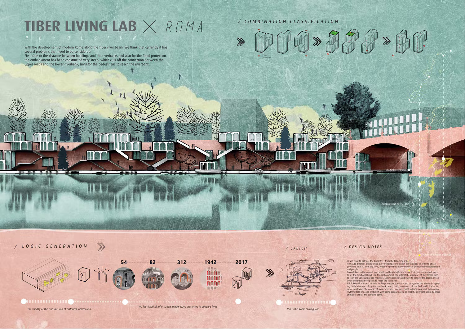
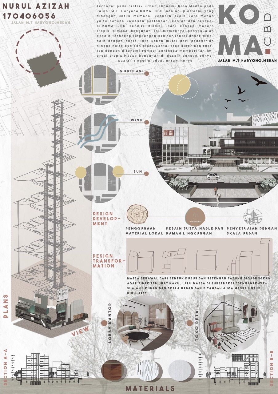
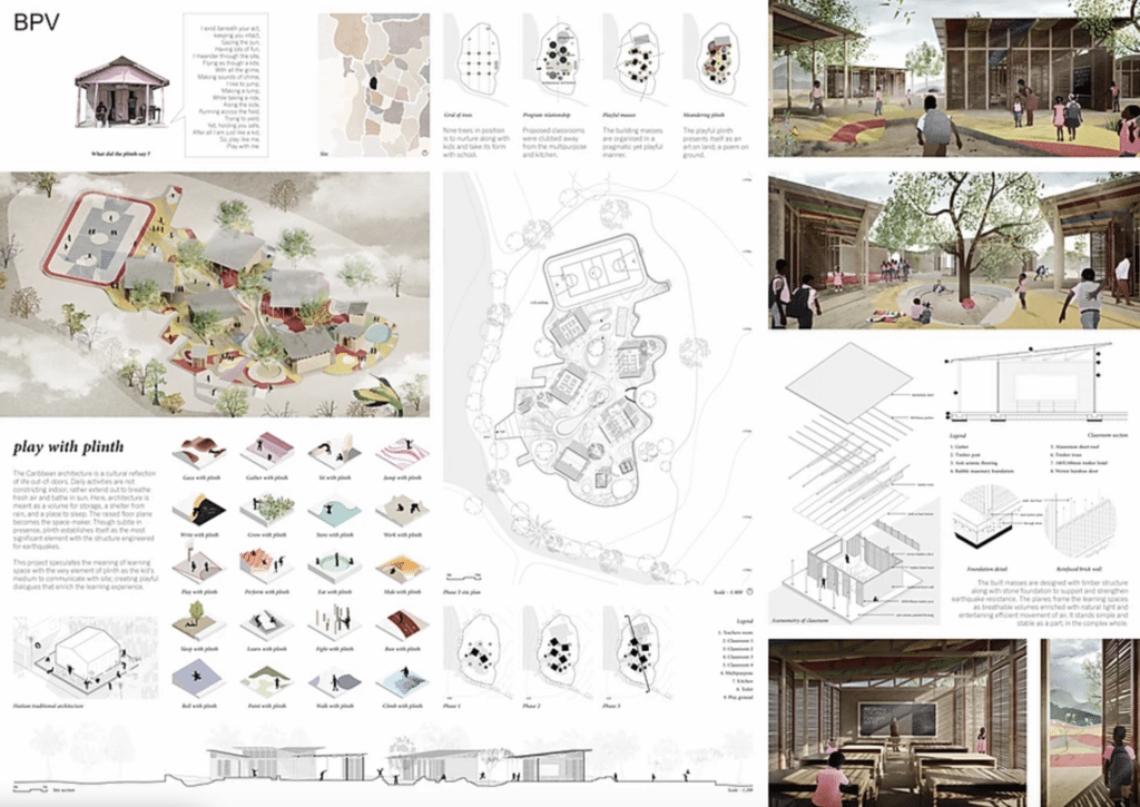
Table of Contents Show
Quick Answer: An architecture sheet is a composed layout that presents a project’s drawings, diagrams, renders and text together. Effective sheets follow a clear grid, strong visual hierarchy and consistent typography, guiding the viewer from concept to detail. Good layout makes even complex projects easy to read and understand at a glance.
Architecture sheets by students are among the most searched topics in architectural education. A successful architecture sheet communicates design intent through clear visual hierarchy, strategic use of white space, and a logical sequence from concept to detail. Whether you are preparing a jury submission, a competition entry, or a portfolio piece, studying real student examples is the fastest way to understand what works and why. Architecture sheets are more than just layouts, they are the visual storytellers of our designs. A well-composed architectural presentation sheet helps us communicate concepts, ideas, and solutions in a way that is both professional and captivating. Whether we are pitching a project to a client or presenting to a panel, these architect sheets are our opportunity to make a lasting impression. We know that creating effective architectural sheets requires a balance of creativity and precision. From organizing content to selecting the right visuals, every detail in your architecture sheet matters. When done right, they not only highlight our design skills but also demonstrate our ability to think critically and present clearly. Below, we break down 10 standout examples, each showing a different approach to layout for architecture presentations, that every student can learn from.What Makes a Great Architecture Sheet?
Before diving into examples, it is worth understanding what separates an effective architecture sheet from a mediocre one. The best architectural sheeting balances three core elements: visual hierarchy, content clarity, and narrative flow. A strong layout for architecture presentations guides the viewer’s eye from concept to detail without confusion. According to the American Institute of Architects (AIA), clear communication of design intent is among the most critical skills for emerging professionals. The key components of successful architect sheets include a well-defined grid system, consistent typography, strategic use of white space, and a logical sequence of information, from site context and concept diagrams to technical drawings and final renders. Students who master the art of architectural presentation early on carry that advantage throughout their careers.🎓 Expert Insight
“Clear visual communication remains the most critical factor in how jury members evaluate competition entries.” — American Institute of Architects (AIA), Portfolio and Presentation Standards
This principle applies directly to student work. Jurors spend an average of seconds per board before forming a first impression, which is why hierarchy and clarity outperform visual complexity every time.
How Should Architecture Sheets by Students Look in 2026?
In 2026, successful architecture sheets are no longer about fitting as much information as possible onto a single board. Top architecture students now prioritize clarity, hierarchy, and storytelling. Presentation sheets function like visual narratives, guiding the jury’s eye step by step from concept to outcome. Strong negative space, limited color palettes, and consistent diagram styles define the most effective boards, making complex ideas easier to read and remember. Another clear trend is the inclusion of process visuals rather than only final renders. Diagrams explaining site logic, environmental response, circulation, or parametric decisions are increasingly placed before photorealistic images. This “before and after” logic helps reviewers understand why a design looks the way it does, not just what it looks like. Students who balance analytical diagrams with atmospheric visuals tend to produce architectural sheets that feel both intellectual and professional. Typography choices have also evolved. Students are moving away from decorative fonts and instead using clean, editorial-style type systems similar to architectural magazines. This shift reinforces credibility and aligns student work with professional architectural standards. Resources like ArchDaily and Dezeen continue to influence how students approach board composition. The most successful architecture sheets of 2026 communicate less, but communicate it far better.⚠️ Common Mistake to Avoid
One of the most frequent errors on student architecture sheets is treating every element with equal visual weight. When everything looks equally important, nothing reads as important. Pick one focal drawing, such as a plan, isometric, or render, and size it to dominate the board. Then build the rest of the content hierarchy around that single anchor.
How to Plan Your Architecture Sheet Before Opening Any Software
Most students open InDesign or Photoshop before they have decided what the sheet is actually trying to say. This is the root cause of cluttered, unfocused boards. Before touching any design software, take 10 minutes with a blank piece of paper and answer three questions: What is the single most important drawing on this sheet? What order should the viewer read the content? What can be removed entirely? Once those decisions are made on paper, the software becomes a production tool rather than a decision-making tool. Students who follow this workflow consistently produce cleaner boards than those who design by filling available space. Start with a rough grid sketch, mark where the focal element sits, then assign supporting content to secondary zones. The full guide to successful architectural presentation boards covers grid systems and spacing principles in more detail. For a reference point on how process diagrams should be structured before they reach the sheet, the guide to successful architectural diagrams by architects is worth reviewing before you start composing.What Are 10 Successful Architecture Sheet Examples?
For more student presentation sheet examples, you can also browse the second collection of 10 successful presentation sheets on illustrarch.com.Sheet 1 – Neighbourhood Characters
Highlighting the neighborhood’s features establishes context for the architectural design. We gather specific data on location, demographics, zoning, and surrounding infrastructure to present a clear narrative on the architecture sheet.Sheet 2 – Network: When the Community Comes Together
This architecture sheet highlights an architectural concept designed for the Fentress Global Challenge, showing innovative solutions for London Heathrow Airport. Our primary focus was on creating an efficient and aesthetically compelling design aligned with the airport‘s operational and environmental needs.Sheet 3 – Fentress Global Challenge: London Heathrow Airport Design
This presentation sheet highlights a proposal for the Fentress Global Challenge, focusing on innovative airport design at its core. The design aims to redefine the passenger experience while prioritizing environmental sustainability.Sheet 4 – Fentress Global Challenge: Airport Design
This architectural sheet presents a proposal for the Fentress Global Challenge, focusing on innovative airport design. The design aims to redefine the passenger experience while prioritizing environmental sustainability.Sheet 5 – Design for Vietnamese-German University
This sheet covers the design proposal for the Vietnamese-German University campus, focusing on cultural integration and sustainable urban development. The approach integrates modern architectural techniques with contextual elements that reflect the university’s goal to promote international collaboration and academic excellence.Sheet 6 – Tulum Plastic School: Archstorming Competition
The Tulum Plastic School submission centers on sustainable design and community engagement. This project repurposes plastic waste into construction materials to create an eco-friendly educational space near Tulum, Mexico. The design addresses environmental challenges while offering functional solutions for local needs.Sheet 7 – KOMA-CBD
The KOMA-CBD Project presents an innovative approach to mixed-use urban development with a focus on sustainability and functional integration. The design balances commercial, residential, and recreational areas in a dense urban core, drawing on sustainable design principles and modern architectural techniques.💡 Pro Tip
For vertical building designs, always use portrait orientation on your architecture sheet and let the exploded isometric run the full height of the board. This immediately communicates the building’s vertical logic and saves space you would otherwise waste trying to rotate a tall building into a landscape layout.
Sheet 8 – Play with Plinth
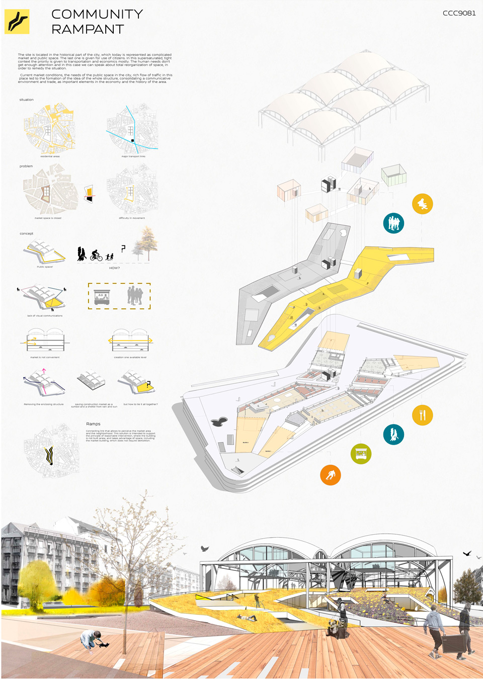
Incorporating the Plinth concept into architect sheets demonstrates creativity and spatial depth. This design approach emphasizes the strategic layering of elements to establish visual hierarchy and dynamism.Sheet 9 – Community Rampant
Sheet 10 – Tiber Living Lab × Roma
📌 Did You Know?
The Fentress Global Challenge, launched in 2011 by Curtis Fentress FAIA RIBA, has received over 1,000 submissions from students in more than 160 countries. Several of the competition’s most praised shortlisted entries, including those shown here, won attention not through elaborate renders but through the clarity and confidence of their architecture sheets.
How Should You Lay Out an Architecture Sheet?
Across all ten examples above, a few common principles define strong architecture sheets. First, visual hierarchy is non-negotiable. The most important drawing or render should occupy the largest area and be placed where the eye naturally lands. Second, consistency in graphic language, covering line weights, color palettes, and font choices, creates a cohesive reading experience. Third, every successful architectural sheet treats white space as a design element, not wasted area. These principles align with portfolio best practices outlined by institutions like the RIBA and leading architecture competitions worldwide. The table below summarizes the layout approaches used across the 10 examples:| Sheet | Key Layout Feature | Orientation | Core Strength |
|---|---|---|---|
| Neighbourhood Characters | Color-coded zoning | Landscape | Illustration-dominant hierarchy |
| Network | Central isometric | Portrait | Minimalism + focus |
| Heathrow (Sheet 3) | City isometric + renders | Square | Scale and context narrative |
| Heathrow (Sheet 4) | Exploded isometric on white | Landscape | Clean single-diagram logic |
| Vietnamese-German Uni | Plan-centered, three-part | Portrait | Large-scale clarity |
| Tulum Plastic School | Three-section cool palette | Landscape | Color palette unity |
| KOMA-CBD | Isometric floor plan stack | Portrait | Vertical logic expressed vertically |
| Play with Plinth | Multi-content density | Landscape | Coherent in spite of complexity |
| Community Rampant | White background, minimal content | Portrait | Clarity through restraint |
| Tiber Living Lab | Two-color split | Landscape | Maximum impact, minimal content |
What Software Do Architecture Students Use for Presentation Sheets?
Knowing which tools to use is just as important as knowing what to put on the sheet. Most students build their architecture sheets using a combination of two or three programs. Adobe InDesign handles the overall layout grid and typography. Adobe Photoshop is used for color correction, background adjustments, and compositing renders. Adobe Illustrator works best for diagrams, icons, and vector-based graphics. For generating the drawings and renders that go onto the sheet, students commonly use AutoCAD and Revit for plans and sections, SketchUp or Rhino for 3D models, and rendering engines such as V-Ray, Lumion, or Enscape for photorealistic output. Some students also use Affinity Publisher as a lighter InDesign alternative for layout work. Whichever tools you choose, the final architecture sheet should always be exported at a minimum of 150 DPI for digital presentation and 300 DPI for print. For a practical breakdown of how these tools fit into the full process, see the guide to mastering architectural presentation sheets. For layout tips from another authoritative source, Archisoup’s presentation board guide and the First in Architecture board tips article are both worth bookmarking.💡 Pro Tip
Before opening any design software, sketch your layout on paper first. Decide the grid, the focal hierarchy, and the reading flow in 10 minutes by hand. Students who plan the narrative before composing the sheet consistently produce cleaner, more readable boards than those who design by filling space.
✅ Key Takeaways
- Visual hierarchy is the single most important factor in any architecture sheet: one focal element should dominate the board.
- White space is not empty, it is a design decision that makes surrounding content more readable and professional.
- Plan the layout by hand before opening design software. Decide grid, flow, and hierarchy first.
- Consistent typography and limited color palettes make architecture sheets look both editorial and credible.
- In 2026, process diagrams and concept visuals are as important as final renders. Show the reasoning, not just the result.
- Match your orientation to your project type: portrait for vertical buildings and tower schemes, landscape for horizontal and campus designs.
Final Thoughts: Why Strong Architecture Sheets Matter More Than Ever
In today’s architectural education landscape, architecture sheets are not just a requirement for final submissions. They are a direct reflection of how an architecture student thinks, analyzes, and communicates design ideas. A well-crafted architectural sheet can elevate an average project into a compelling architectural narrative, while a poorly structured one can weaken even the strongest concept. This is why successful presentation boards consistently balance clarity, intention, and visual discipline rather than relying on excessive graphics or overcrowded layouts. As seen in the most successful student architect sheets, the real strength lies in decision-making. What to show, what to remove, and how to guide the viewer’s eye are just as important as the design itself. Clear hierarchies, readable diagrams, and intentional use of white space help reviewers understand the project within seconds. An architecture sheet is not judged line by line but read at a glance, making structure and storytelling critical. Architecture students who treat architectural sheets as communication tools rather than decorative posters will stand out. Whether the goal is academic success, competition entries, or building a professional portfolio, strong architect sheets demonstrate maturity, architectural thinking, and readiness for practice. Mastering this skill early not only improves studio outcomes but builds a foundation for clearer design expression throughout an architect’s career. For downloadable templates to get started, see the practical guide to architectural presentations on illustrarch.com.Download Presentation Templates
Frequently Asked Questions
An architecture sheet is a composed presentation layout that brings a project’s drawings, diagrams, renders and text together on one page, telling the design’s story clearly and professionally.
Use a clear grid, a strong focal image, consistent typography and generous white space. Guide the viewer from concept to detail with a logical reading order, usually left to right and top to bottom.
A1 and A2 are the most common sizes for printed architecture sheets, though the right size depends on your submission requirements, content density and whether the sheet is printed or viewed digitally.
Last updated:
- Architectural Presentation Boards
- architectural presentation sheets
- architecture final presentation examples
- architecture portfolio examples
- architecture sheets
- Architecture Student Presentation
- layout for architecture
- presentation sheets for architecture students
- rchitecture presentation sheets
- successful architecture presentations


3 Comments


Successful Architectural Presentation Boards: Design & Layout
Architectural presentation boards are essential visual communication tools for architects and students...

Architecture Presentation Boards: Best Examples & Layout Tips
Discover successful architecture presentation boards featuring landscape layouts, construction detail boards, and...

How to Use Color and Layout in Your Architecture Presentation Board
An architecture presentation board becomes a powerful storytelling tool when color, layout,...

Guide to Creating Effective Architectural Presentations
A well-crafted architectural presentation can help you communicate your design ideas and...

I found the article on architectural presentation sheets very informative. It explains how these sheets are important for showing designs clearly and professionally. Each sheet has a different focus, like community features or sustainable design, which helps in understanding the project better. The use of visuals and clear organization is crucial to make a strong impression on clients or panels.
The article talks about architectural presentation sheets. They seem important for showing designs clearly, but I don’t know much about them. It looks like they help in making ideas understandable.
This article talks about architectural presentation sheets. It says they are important for showing designs clearly. I think it’s interesting how students are changing their styles to make things clearer. The examples look nice too.