

Aesthetics in Architecture: 5 Buildings of Form & Function
A look at how aesthetics in architecture and functionality work together, told through 5 landmark buildings that balance striking design with practical everyday performance.
 Elif Ayse Sen29 December 20255 Mins read1.1k
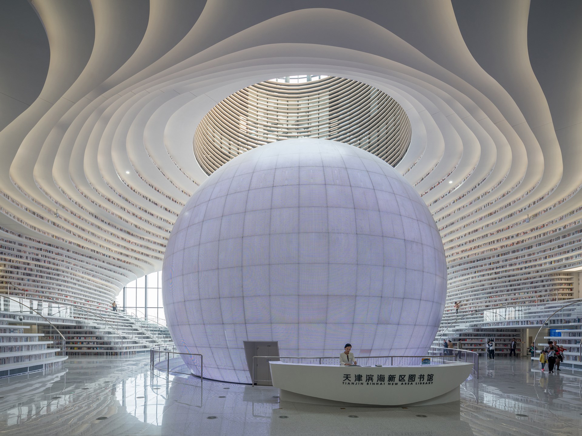
Table of Contents Show
Aesthetics in architecture refers to how a building’s form, proportion, materials, and light create visual and emotional impact, while functionality measures how well that building serves the people who use it. The most memorable structures hold both in balance, showing that beauty and practical performance can reinforce each other rather than compete.
Great buildings rarely force a choice between looking good and working well. From ancient temples to glass towers, architects have searched for the point where structure, purpose, and appearance meet. The five buildings below each solve that problem in a different way, and together they show how aesthetics and functionality can share the same blueprint.
Understanding Aesthetics in Architecture and Functionality
Functionality describes how well a building does its job. It covers how comfortably it holds its occupants, how efficiently it uses space and energy, and how sensibly it responds to structure, materials, and climate. A functional building makes daily life easier, supporting the activities inside it without friction and without wasted resources.
Architectural aesthetics work on a different level. They cover the visual language of a building, its form, rhythm, texture, colour, and the feelings it stirs in the people who see and enter it. The Roman writer Vitruvius framed this balance two thousand years ago with his triad of firmitas, utilitas, venustas, meaning strength, utility, and beauty. That idea still guides the practice of architecture today, and it explains why the two dimensions cannot really be pulled apart. You can read more on this tension in our look at blending form, function, and aesthetics.
💡 Pro Tip
When you study a building that balances beauty and use well, trace one feature that does double duty. Sky Habitat’s sky bridges act as structure, circulation, and shared garden at the same time. On your own projects, look for elements that can carry both an aesthetic and a practical load before adding any detail that only does one job.
Push a design too far toward beauty and you risk a sculpture nobody can live in. Push it too far toward pure function and you get boxes that feel cold and forgettable. The skill lives in the middle, where a single decision answers both the practical brief and the visual one. The buildings that follow all found that middle ground in their own way.

5 Buildings That Balance Aesthetics and Functionality
Each project below pairs a strong visual identity with a clear practical purpose. The table gives a quick reference before the detailed look at each one.
| Building | Architect | Aesthetic principle |
|---|---|---|
| Montreal Biodome (1992) | Roger Taillibert (original velodrome) | Adaptive reuse of an iconic shell |
| Bosco Verticale (2014) | Stefano Boeri Architetti | Biophilic vertical greenery |
| Sky Habitat (2015) | Safdie Architects | Terraced, connected communal form |
| The Twist Museum (2019) | Bjarke Ingels Group (BIG) | Sculptural structural gesture |
| Tianjin Binhai Library (2017) | MVRDV with TUPDI | Function turned into ornament |
1. Montreal Biodome, Canada
The Biodome in Montreal is one of the clearest cases of a building earning a second life. Roger Taillibert designed the sweeping concrete structure as a velodrome for the 1976 Olympic Games, and in 1992 the city converted it into a nature museum that holds four distinct ecosystems under one roof. The conversion demanded careful environmental controls for each habitat, yet the original curved silhouette stayed intact. Its beauty now comes partly from the honesty of that reuse, keeping a landmark shell while giving it a completely new job. The result reads as both a piece of sports heritage and a working sustainable building. You can plan a visit through the official Montreal Space for Life pages.

2. Bosco Verticale, Milan
Bosco Verticale, or Vertical Forest, sits at the heart of Milan’s Porta Nuova district. Designed by Stefano Boeri Architetti and completed in 2014, the two towers wrap their balconies in a dense layer of trees and plants. That greenery is not decoration alone. It filters fine dust, produces oxygen, absorbs carbon dioxide, and shades the facade, which cuts heat gain in summer. The visual drama of a forest climbing a tower and its environmental performance come from the same design move, which is why the project has shaped so many later sustainable architecture trends.
🔢 Quick Numbers
- The two towers rise 80 and 112 metres and hold about 480 large and medium trees plus 300 small ones (Stefano Boeri Architetti).
- Their balconies also carry roughly 5,000 shrubs and 11,000 perennial and ground-covering plants (Stefano Boeri Architetti).
- On flat land that planting would equal around 20,000 square metres of forest, packed onto a footprint near 1,000 square metres (Stefano Boeri Architetti).
3. Sky Habitat, Singapore
Sky Habitat in Singapore, completed in 2015 by Safdie Architects under founder Moshe Safdie, tackles the hard question of dense city living. Two stepped residential towers are linked by three bridging sky gardens. Those bridges look striking from the street, and they also give residents shared outdoor space high above the ground, which encourages people to meet. The terraced form opens each home to airflow and daylight, so the design improves comfort while it creates a memorable profile. It is a strong example of how careful architecture design can turn the constraints of a tight urban site into an advantage.

4. The Twist Museum, Norway
The Twist is a museum that doubles as a bridge across the Randselva river at the Kistefos sculpture park north of Oslo. Designed by Bjarke Ingels Group and finished in 2019, the building rotates ninety degrees along its length, so it shifts from a tall gallery at one bank to a wide, low gallery at the other. That single twisting move solves two problems at once. It carries visitors over the water and it creates gallery spaces with very different proportions and light. The aluminium cladding catches the changing Norwegian sky, and the interior stays flexible enough for shifting exhibitions. You can see full drawings on ArchDaily or plan a visit through the Kistefos Museum.
5. Tianjin Binhai Library, China
The Tianjin Binhai Library, completed in 2017 by MVRDV with the Tianjin Urban Planning and Design Institute, has become one of China’s most photographed interiors. A luminous spherical auditorium sits at the centre, wrapped by white terraced shelving that ripples across the walls and floor. Those contours are not only sculptural. They work as seating, steps, and display surfaces, which lets a single gesture handle circulation, storage, and drama together. The space, often called a canyon of books, pulls in hundreds of thousands of visitors a year and shows how strong building aesthetics can turn a public library into a destination.

Why Aesthetics and Functionality Matter Together
The link between aesthetics and architecture reaches past first impressions. Work in environmental psychology has long connected well-designed space to occupant mood, focus, and behaviour. A building that looks considered tends to feel cared for, and that feeling shapes how people treat and use it. Beauty and function are not rivals here. They feed the same outcome, which is a place that works well and lifts the people inside it.
📌 Did You Know?
Many of the sweeping upper shelves inside the Tianjin Binhai Library do not hold real books. The steep contours reach heights no visitor can safely browse, so MVRDV finished the upper tiers with perforated aluminium plates printed to look like book spines, turning storage into pure visual effect.
A few working principles show up again and again in buildings that get this balance right:
- Material honesty, using materials in ways that respect their nature so the look and the structure agree, an idea explored in our piece on aesthetic oppositions in design.
- Contextual response, shaping a building to its climate, site, and culture rather than dropping in a generic form.
- Sustainable integration, pairing eco-friendly materials and efficient systems with the visual concept.
- Human-centred thinking, keeping the daily experience of occupants at the front of every choice.
The Bigger Picture
The five buildings here look nothing alike, yet each refuses to treat beauty and use as separate problems. A velodrome becomes a rainforest, a tower becomes a forest, a bridge becomes a gallery. Maybe the real lesson is that the split between form and function was always a false one. When a design is working at its best, you stop asking which part is the art and which part is the machine, because they have quietly become the same thing. That is the true definition of architecture worth aiming for on any project.



1 Comment

Overlapping Concrete Walls and One Roof Shape a House in Okinawa
IGArchitects built Overlapping Spaces in Okinawa from reinforced concrete walls, columns and...
 illustrarch Editoral Team1 Mins read
Futuro House Production Revived in Finland After Decades-Long Hiatus
A Facebook listing for abandoned moulds led to the first new Futuro...
illustrarch Editoral Team3 Mins read
Building Your Dream Home in NSW: What You Should Know About Montgomery Homes
Montgomery Homes has been building across Sydney, Newcastle, the Hunter, Wollongong and...
illustrarch Editoral Team4 Mins read
Designing a Home Theater: Where Drapery Fits Into the Plan
In a media room the curtains are a performance layer, not decoration....
illustrarch Editoral Team3 Mins read


This article talks about how architecture combines looks and usefulness. It mentions different buildings like the Biodome and Bosco Verticale that do this well. I think it’s interesting to see how buildings can be both pretty and practical.