

How to Write Architecture Portfolio Text: Tips & Examples
The architecture portfolio text is one of the most important parts of your portfolio because it will decide whether or not someone will read further. Learn how to write compelling portfolio texts including project descriptions, personal statements, and drawing annotations that make your architectural portfolio stand out to employers and admissions committees.

Table of Contents Show
Architecture portfolio text refers to all written content in your portfolio, including project descriptions, personal statements, drawing annotations, and cover page copy. Strong portfolio text supports your visuals, communicates your design process, and helps reviewers understand your work quickly. The tips below cover each text type, with practical examples and formatting guidance for students and professionals.
The portfolio is a professional representation of your work, and it should be created with care. It should not be too long, but it should also not be too short. The best way to make an impression on potential employers is to show the best of your work and explain how you solved the problems you faced in the process.
The architecture portfolio text is one of the most important parts of your portfolio because it will decide whether or not someone will read your other texts. You need to have a clear idea about what you want to say in this text because it needs to represent you as a designer or architect. Whether you are building a undergraduate architecture portfolio or a professional architecture portfolio, the words you use matter just as much as the visuals you present. You may find the contents of architectural portfolio and all about portfolio texts in the rest of the article.
What Should an Architectural Portfolio Include?
The architectural portfolio includes things that will enable the architect to take him one step further in job applications and academic applications. Portfolio content must consist of quality architectural projects. Apart from that, it should have a well-designed cover design that represents its owner. A strong architecture portfolio cover page sets the tone for what reviewers can expect inside. Next, a “content” page is presented, listing the projects in the portfolio content. One of the requirements of the portfolio is an introductory page describing its owner.
An effective architecture portfolio typically contains the following elements: a compelling cover page, a table of contents, a personal statement or bio, project descriptions with supporting visuals, and contact information. According to ArchDaily, the visual composition and presentation of your portfolio is just as important as its content, as it demonstrates your grasp of graphic design, an essential skill for any architect.
The number of projects you include depends on your career stage and target audience. For job applications, 5 to 8 well-presented projects with concise architecture portfolio text typically work better than 15 projects with thin descriptions. Graduate school portfolios can include more conceptual work and process documentation, but the same rule applies: quality always beats quantity.

📌 Did You Know?
According to a 2024 survey by the American Institute of Architects (AIA), hiring managers spend an average of just 90 seconds on an initial portfolio review. This means every word of your architecture portfolio text needs to earn its place on the page.
How to Use Text in Architecture Portfolios
Understanding how to use text in architecture portfolios is essential for creating a cohesive presentation. Text in your portfolio should complement your visuals, not compete with them. The best text for architecture portfolio pages acts as a guide, leading the viewer through your design thinking and process without overwhelming them with paragraphs of prose.
When deciding how to make an architecture portfolio that communicates effectively, keep your text concise and purposeful. Every word should earn its place on the page. Use brief captions, short project overviews, and clear headings to structure your content. This approach ensures that reviewers, who often spend only 15 to 30 seconds per page, can quickly grasp your design intent. For more detailed guidance on structuring your portfolio, explore designing architecturally stunning portfolios.
A practical approach to text placement is the “three-layer” method. The first layer is headings and project titles, visible at a quick glance. The second layer includes brief captions (one to two sentences) near key visuals. The third layer is your detailed project description, usually placed on the opening page of each project section. This hierarchy lets reviewers engage at whatever depth they choose, from a five-second scan to a detailed read.
💡 Pro Tip
When laying out portfolio pages, place your project description text on the left-hand page and your strongest visual on the right. Experienced reviewers tend to scan left-to-right, so this sequence ensures they read your intent before seeing the result. If your portfolio is digital (PDF), the same logic applies to the top-bottom reading flow.
Types of Architecture Portfolio Text
A portfolio text is a brief description of your skills and qualifications. It should be concise, informative and persuasive. It should be able to sell the reader on your skills and show them why you are the best person for the job. Portfolio text is not necessary to have for every project that you do. However, if you are applying for a job or looking for clients then it is important to have one ready. This will help make sure that the person who reads it understands what kind of work you do and what your skills are.

A good way to write a portfolio text is by starting with an introductory sentence about the type of project it was and then following up with any interesting details about how the project turned out. You should also include any other relevant information about yourself such as your education and skill set so that the reader knows more about who they are reading about. If you are learning how to create an architecture portfolio, mastering the art of writing portfolio text is a critical step.
The following tips will help you write a better portfolio text:
– Make it easy to read. Use short sentences and paragraphs, limit jargon, and avoid passive voice.
– Write about your accomplishments with specific numbers that show how much you have achieved in a certain time period.
– Include keywords that are relevant to the position you are applying for in your portfolio text.
You can find the types of portfolio text below. There are texts for the owner’s personal info, project description texts and descriptions of architectural diagram and drawings.
| Text Type | Recommended Length | Purpose | Placement |
|---|---|---|---|
| Personal Statement | 50 to 100 words | Introduce your design philosophy and background | Opening pages, after table of contents |
| Project Description | 50 to 150 words | Explain concept, challenge, and your role | First page of each project section |
| Drawing Annotations | 5 to 25 words each | Label key elements, explain design logic | Adjacent to diagrams and technical drawings |
| Image Captions | 10 to 30 words | Provide context for renders and photos | Below or beside each visual |
| Cover Page Text | 5 to 15 words | Name, title, optional tagline | Front cover |
Personal Info and Design Statement
By designing a Resume or CV page, you should have a page with your own personal information for your portfolio. On this page, there are texts describing your work and internship experiences, and your school and education information. A strong personal statement should articulate your design philosophy and career aspirations in a concise manner. According to the American Institute of Architects (AIA), architects who clearly communicate their professional identity tend to make stronger impressions in job applications.
Your personal info section should include your name, contact details, a brief biography (2-3 sentences), your educational background, relevant software skills, and any professional affiliations or awards. Keep this section clean and scannable. It is one of the first things reviewers will look at.
A common approach for the architecture portfolio personal statement is to answer three questions in 2 to 3 sentences: What drives your design work? What experience or skills define you? What type of opportunity are you pursuing? Avoid vague phrases like “passionate about design.” Instead, be specific. For example: “My work focuses on adaptive reuse of industrial structures, informed by three years of practice at a heritage conservation firm.”
Project Descriptions

Project descriptions are actually the first thing that comes to mind when “portfolio text” is mentioned. The texts that we want to be short and concise actually contain project descriptions. Of course, it is very important to explain your projects to the people who view the portfolio. However, by including too many texts, you prevent the projects from being read. For this reason, let your drawings explain the project descriptions!
When writing project descriptions for your architecture portfolio, consider including these key elements: the project name and location, a one-sentence concept statement, the design challenge you addressed, your specific role and contributions, the project scale and timeline, and any notable outcomes or recognition. This structured approach ensures your architecture portfolio communicates effectively while remaining concise.
Here is a simple template you can follow for each project description: Start with the project name, location, and year. Add one sentence stating the core concept or design idea. Follow with one to two sentences about the challenge or brief you received. Then describe your specific role (if it was collaborative work). Close with the outcome, such as the built area, awards, or recognition.
🎓 Expert Insight
“Less is more when it comes to text in your portfolio. Let the drawings speak.” — Alex Hogrefe, Visualizing Architecture
Hogrefe, whose portfolio tutorials have been referenced by thousands of architecture students, treats text as a design element rather than filler. His approach of using brief, purposeful captions alongside strong visuals is widely regarded as a benchmark for effective architecture portfolio text.
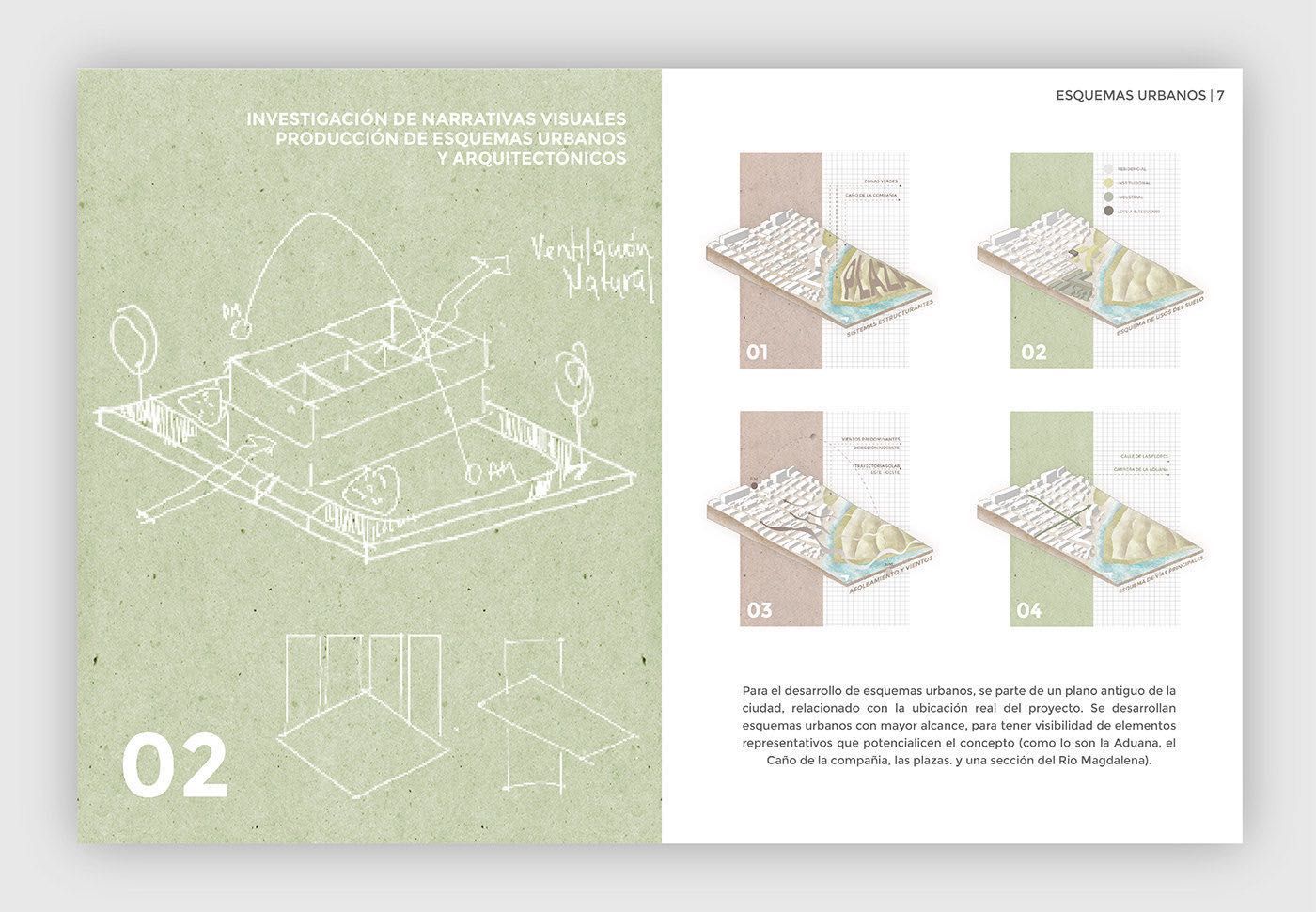
Drawing and Diagram Annotations

Some diagrammatic drawings, function and program diagrams, structural diagrams need text. If you do not write the explanation text, it is possible that your drawings will not be understood. For this reason, you can explain your drawings with short texts.
Effective drawing descriptions should label key elements, explain the design logic behind diagrams, and provide scale or context where needed. Use annotations and callouts rather than long paragraphs to keep the viewer’s focus on the visual content. This is especially important for architecture student portfolio layouts where demonstrating your analytical thinking through well-annotated drawings can set you apart.
When annotating plans, sections, or axonometric views, use a consistent label style throughout the portfolio. Short phrases work better than full sentences. For example, write “Main circulation spine connecting north and south wings” instead of “The main circulation route was designed to connect the north wing to the south wing of the building in order to improve pedestrian flow.” Keeping annotations tight and focused makes your drawings easier to read at a quick glance.
Architecture Portfolio Text Formatting and Typography
How you format your architecture portfolio text matters almost as much as what you write. Typography choices, text sizing, and spacing all affect readability and the overall impression your portfolio creates. Choose one or two clean fonts (sans-serif fonts like Helvetica, Futura, or Arial work well for most architectural presentations) and stick with them throughout the entire document. For a deeper look at font selection, read our guide on best fonts for architectural portfolio design.
Set your body text between 9pt and 11pt for print portfolios. Headings can range from 14pt to 24pt depending on hierarchy. Maintain consistent margins and text alignment across every page. Left-aligned text is generally easier to read than justified text, especially in narrow columns. Use bold sparingly for emphasis, and avoid underlining text, which can look dated in a design context.
For digital PDF portfolios, test your text at 100% zoom on a laptop screen and on a mobile device. If you cannot read the body text comfortably on a 13-inch screen, increase the size. Many reviewers now read portfolios on tablets and phones, so readability at small screen sizes is a practical concern you should not ignore. For more typography insights, see our article on font importance for portfolio.
💡 Pro Tip
Experienced portfolio reviewers at firms like BIG and Foster + Partners have noted that portfolios using more than two typefaces often feel disorganized. Stick to one sans-serif for headings and one for body text (or use different weights of the same font family). This simple rule keeps your architecture portfolio text visually consistent without extra effort.
Architecture Portfolio Examples: How Text Makes a Difference
Looking at successful architecture portfolio examples reveals a clear pattern: the best portfolios use text strategically. They don’t fill every available space with words. Instead, they use typography as a design element that enhances the overall composition.
In the best architecture portfolios, text serves three main purposes: it provides context for the design work, it guides the viewer through the narrative, and it establishes the architect’s professional voice. Whether you are preparing a portfolio for a job application or academic admission, aligning your text with the expectations of your target audience is crucial.
Some practical tips for using text effectively in your architecture portfolio include: choosing one or two clean fonts (sans-serif fonts like Helvetica or Arial work well), maintaining consistent text sizing and spacing throughout, aligning text elements with images and drawings on the page, and using white space generously to let both your text and visuals breathe. For inspiration on layout and presentation, check out these essential elements for a successful architectural portfolio.
Study portfolios that have won recognition, such as those featured on the RIBA President’s Medals student awards. Notice how the winning entries balance image and text. Most use fewer than 100 words per project spread, with clear visual hierarchy guiding the eye from title to concept to supporting detail. You can also explore student work on platforms like Issuu to see how different text strategies work in practice.
How to Create an Architecture Portfolio Cover Page with Text
Your architecture portfolio cover page is the first impression you make. The text on your cover should be minimal but impactful, typically your name, the portfolio title, and possibly a date range or brief tagline. Avoid cluttering the cover with too much information. A clean, well-designed cover with thoughtful typography signals professionalism and attention to detail.
When designing your architecture portfolio cover, consider the relationship between text, imagery, and negative space. The cover should reflect the overall tone and style of the projects inside. For more tips on cover design and portfolio structure, visit the ultimate architecture portfolio guide and the academic portfolio design tips article. You can also explore Dezeen for current design trends and inspiration that can influence your portfolio’s visual language.
Your cover text should use the same typeface you plan to use for headings throughout the portfolio. This creates immediate visual consistency. If you are submitting a digital portfolio by email, remember that the cover also serves as a thumbnail preview, so make sure your name and the word “Portfolio” are legible even at a reduced size. For detailed guidance on size and format decisions, see our article on architecture portfolio size and format.

Common Mistakes in Architecture Portfolio Writing
Even strong design work can be undermined by poorly written or badly placed text. Here are the most frequent errors architects and students make with their portfolio writing, along with how to fix them.
Writing too much is the most common problem. Dense paragraphs on every page signal that you don’t trust your visuals to communicate. Aim for 50 to 150 words per project description and use short annotations for drawings. If your portfolio reads like a thesis, cut it down.
⚠️ Common Mistake to Avoid
Many students copy-paste project briefs directly from their studio assignments into their portfolio. Reviewers can spot institutional language immediately, and it suggests you have not reflected on the project yourself. Rewrite every description in your own voice, focusing on your design decisions and contributions rather than restating the assignment brief.
Other frequent mistakes include inconsistent formatting (changing fonts or text sizes between projects), grammatical errors and typos (always proofread, and ask someone else to review your text), using overly technical jargon that a non-specialist reviewer may not understand, and neglecting to mention your specific role in team projects. According to the Royal Institute of British Architects (RIBA), clarity and professionalism in portfolio presentation are among the top factors hiring managers evaluate. A well-considered approach to portfolio text for architects separates strong candidates from the rest.
✅ Key Takeaways
- Keep project descriptions between 50 and 150 words. Let your visuals carry the narrative.
- Use a “three-layer” text hierarchy: headings, captions, and detailed descriptions placed strategically.
- Write your personal statement in 2 to 3 specific sentences that answer who you are and what you do.
- Stick to one or two sans-serif fonts throughout. Consistency signals professionalism.
- Rewrite all text in your own voice. Never copy-paste studio briefs or institutional language.
- Test your text readability on both print and screen formats before submitting.
Frequently Asked Questions About Architecture Portfolio Text
How long should portfolio text be for an architecture project?
Keep your project descriptions between 50 and 150 words. The goal is to provide enough context for the viewer to understand the project’s concept, your role, and the key design decisions without overwhelming them. Remember that architecture portfolios are visual documents first. Your text should support and enhance your drawings and images, not replace them.
What should I write in my architecture portfolio introduction?
Your portfolio introduction should include a brief personal statement (2-3 sentences) that outlines your design philosophy, your educational and professional background, and what type of work you are seeking. This text should give reviewers a sense of who you are as a designer before they look at your projects. Tailor this introduction to your target audience, whether it is a firm, a university program, or a client. For more portfolio writing strategies and structure advice, visit our portfolio tips for young architects.
How do I write a project description for my portfolio?
Start with a one-line concept statement that captures the essence of the project. Follow with 2-3 sentences explaining the design challenge, your approach, and the outcome. Mention your specific role if it was a collaborative project. Keep the language clear and jargon-free. Use active voice and focus on what makes the project unique or noteworthy.
Should I include text on every page of my architecture portfolio?
Not necessarily. Some pages, especially those featuring large-scale renders, photographs, or detailed drawings, may work better with minimal or no text. Use text where it adds value: on project introduction pages, alongside diagrams that require explanation, and for captions that provide context. The key is balance. Avoid pages that are text-heavy, but also avoid leaving viewers without enough information to understand your work.
What fonts work best for architecture portfolios?
Clean, sans-serif fonts like Helvetica, Arial, Futura, and Gotham are popular choices in architecture portfolios. They offer readability and a modern aesthetic that complements architectural visuals. Use one font for headings and another for body text to create hierarchy, and keep font sizes consistent throughout your portfolio.
- Architectural Portfolio
- architecture portfolio cover
- Architecture Portfolio Design
- architecture portfolio examples
- architecture portfolio text
- how to create an architecture portfolio
- how to make an architecture portfolio
- portfolio text examples
- professional architecture portfolio
- undergraduate architecture portfolio


2 Comments


Hand-Rendered vs Digital Diagrams: What Works Better in a Portfolio?
A practical breakdown of hand-rendered and digital diagrams in architecture portfolios, covering...

Architecture Portfolio Layout: Designing Pages with Grid and Typography
A focused look at architecture portfolio layout, from setting up a column...

How to Present Your Work in an Architecture Portfolio Interview
Reaching the interview means your work earned a closer look, but presenting...

Best Presentation Tools for Architecture Portfolios: A Practical Guide
A breakdown of the top presentation tools used by architects and architecture...

The article talks about portfolios. I think it’s important to show your best work.
I found the tips on writing portfolio texts useful. They seem to help in getting a job.