- Home
- Articles
- Architectural Portfolio
- Architectral Presentation
- Inspirational Stories
- Architecture News
- Visualization
- BIM Industry
- Facade Design
- Parametric Design
- Career
- Landscape Architecture
- Construction
- Artificial Intelligence
- Sketching
- Design Softwares
- Diagrams
- Writing
- Architectural Tips
- Sustainability
- Courses
- Concept
- Technology
- History & Heritage
- Future of Architecture
- Guides & How-To
- Art & Culture
- Projects
- Competitions
- Jobs
- Events
- Store
- Tools
- More
How Open Kitchens Create a Sense of Space Indoors (Without Sacrificing Function)
Open kitchens: see how sightlines, lighting, and smart layouts make rooms feel larger. Get expert tips on flow, storage, and zoning—without major demo.
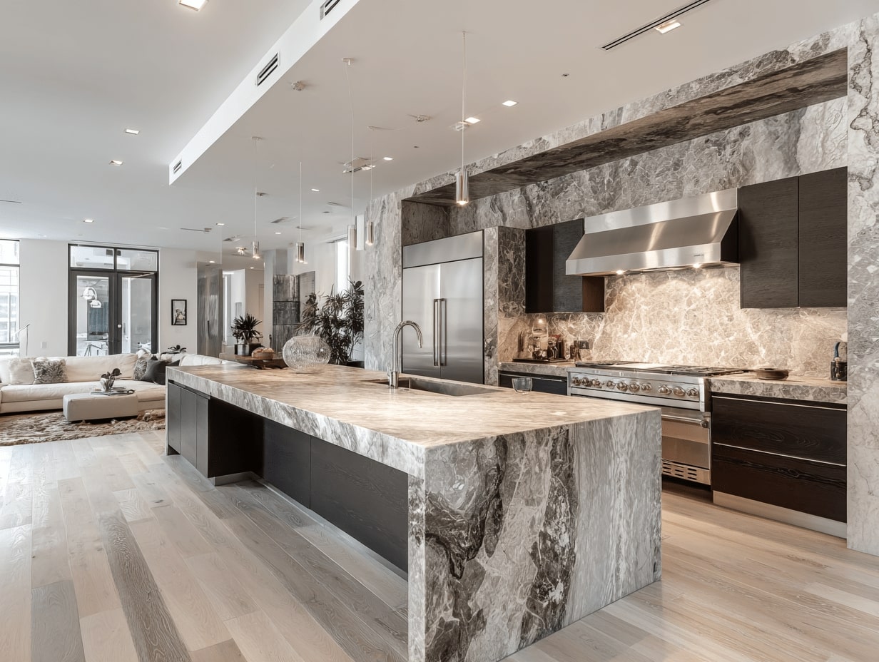
Table of Contents Show
We’ve all walked into a home where the kitchen seems to breathe, where the room feels larger, lighter, and more connected to living areas. That’s the magic behind how open kitchens create a sense of space indoors. Done right, openness isn’t just knocking down a wall: it’s a series of smart design choices that shape perception, improve flow, and keep daily life feeling calm rather than chaotic. Here’s how we approach it.
The Spatial Psychology Behind Openness
Sightlines And Visual Anchors
We read rooms with our eyes first. Long, unbroken sightlines let our brains map more square footage than the tape measure would suggest. We keep tall blocks, like full-height pantries, off primary axes and position a strong visual anchor (an island, a range with a feature hood, or art) at the far end to pull the gaze through. Glass doors to a patio or a window framed by open shelves also extend the view and the perceived volume.
Scale, Proportion, And Negative Space
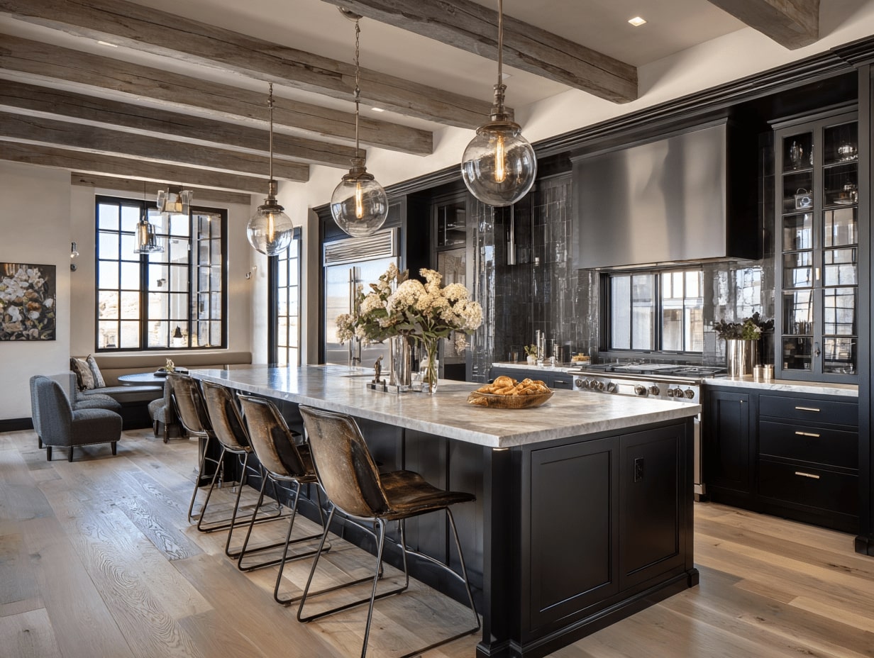
Oversized pieces crammed into tight footprints shrink a room. We right-size elements, slimmer island legs, low-profile hardware, and pendants that don’t overpower. Then we guard negative space: the gaps around seating, breathing room between upper cabinets, and clear counter segments. That intentional emptiness is what makes the open kitchen feel airy rather than under-furnished.
Layout Moves That Expand Perception Of Space
Opening A Galley Or L-Shaped Kitchen
In many remodels, we remove a partial wall at the end of a galley to connect with dining or living. Even a 4–6 foot opening changes everything, light spreads, and circulation options multiply. For L-shaped kitchens, trimming a return wall and extending base cabinets into the adjacent room creates a seamless corner that feels generous.
Islands Vs. Peninsulas As Space Makers
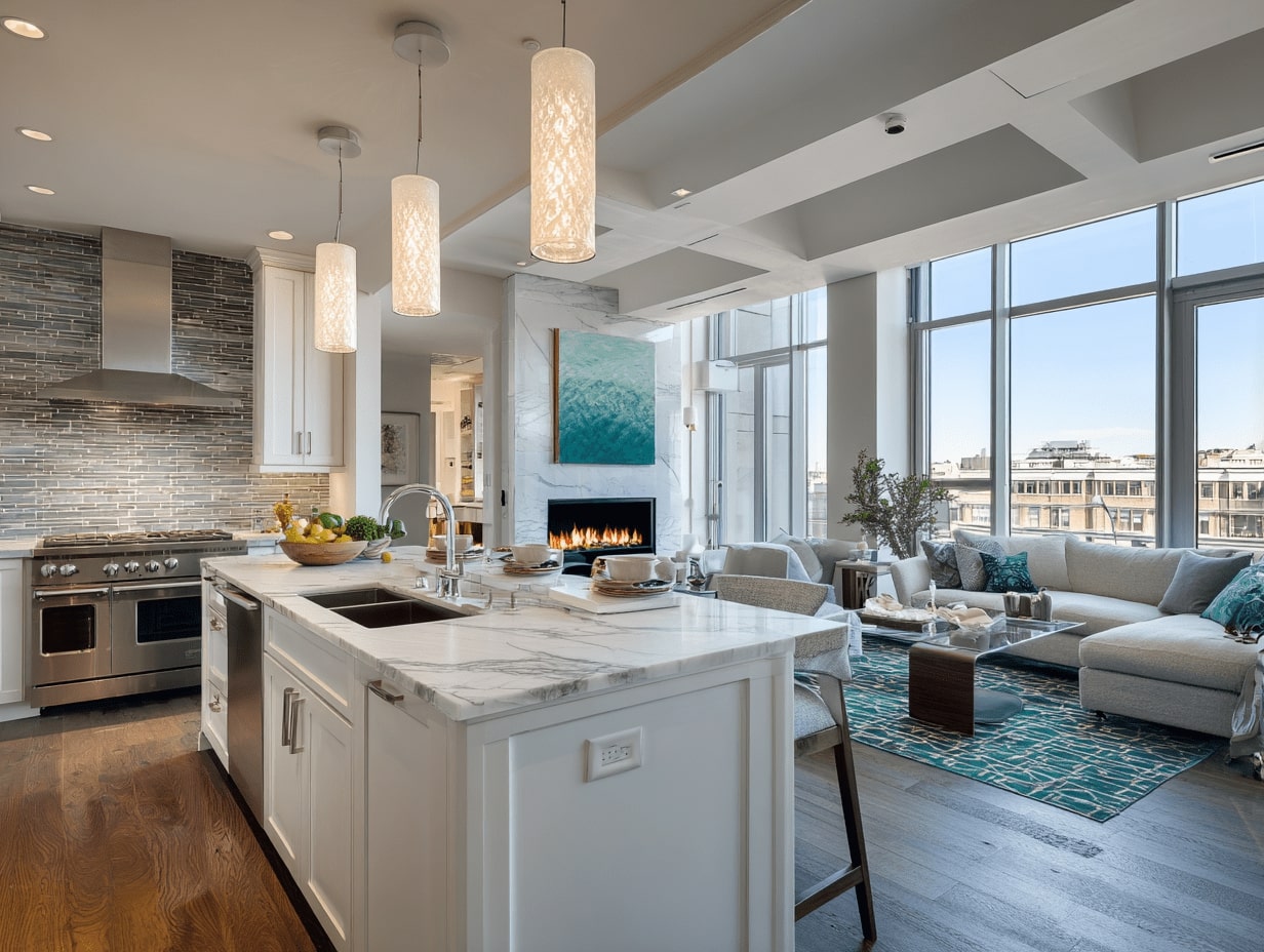
Islands invite movement on all sides: peninsulas define edges. If we’ve got at least 42–48 inches of clearance, an island wins for openness and hosting. In tighter spaces, a peninsula can act like a room divider without blocking sightlines, especially if we keep it waterfall-slim and avoid bulky corbels.
Clear Circulation Paths And Work Zones
We map the work triangle, then layer in actual lifestyle patterns: kids’ snack runs, pets underfoot, guests hovering. A clear 36-inch minimum walkway (wider near appliances) prevents bottlenecks. When traffic glides, the kitchen feels bigger because it functions without friction.
Light, Color, And Continuity That Stretch The Room
Daylight, Task, And Ambient Layers
Daylight does the heavy lifting, but lighting layers seal the illusion of space. We pair ceiling-level ambient light with targeted task lighting under cabinets and soft accent glows inside glass uppers or along toe-kicks. No harsh hotspots, just even illumination that erases shadows in corners.
Unified Palettes And Low-Contrast Transitions
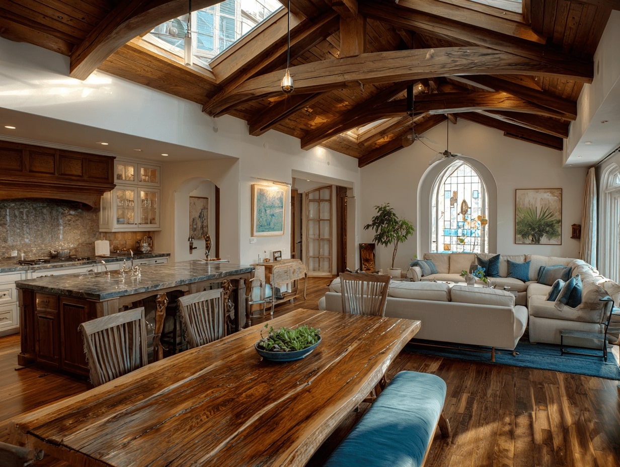
A restrained palette, think warm whites, soft grays, pale woods, lets surfaces recede. We keep contrast low between cabinetry, walls, and backsplashes near the room’s edges, saving bolder tones for a single focal point. Matching sheens and undertones across rooms keeps the eye moving instead of pausing at jarring transitions.
Continuous Flooring And Ceiling Treatments
Run the same flooring from kitchen to living area and the footprint reads larger. Wide planks or large-format tile reduce grout lines and visual breaks. Overhead, consistent ceiling height and simple treatments (yes, even a subtle beam detail that continues across spaces) help stitch the rooms together.
Storage And Clutter Control To Preserve Openness
Concealed And Built-In Storage Strategies
Open kitchens work only if surfaces stay clear. We prioritize deep drawers over doors, add tray dividers, and specify a hidden charging nook. A tall utility cabinet for brooms and bulk goods replaces the old closet and keeps the rest looking sleek.
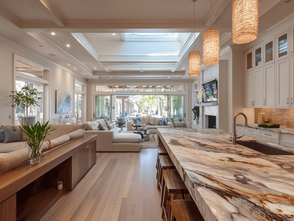
Appliance Choices And Minimal Visual Noise
Panel-ready dishwashers and fridges blend into cabinetry. Counter-depth models maintain clean lines. We corral small appliances in an appliance garage so coffee makers don’t live on display. Fewer visible edges equals a calmer, bigger-feeling room.
Smart Vertical And Corner Utilization
Pull-out pantries, toe-kick drawers for sheet pans, and LeMans or lazy Susan units in corners squeeze value from every inch. When storage is optimized vertically, we can skip extra uppers, and that open wall becomes breathing room.
Zoning Without Walls In An Open Plan
Rugs, Lighting, And Furniture To Define Areas
We use layered rugs to signal where the living zone begins, pendants to crown the island, and a dining fixture centered over the table, not the room. Bar stools with open bases and low backs keep views clear while still marking the boundary.
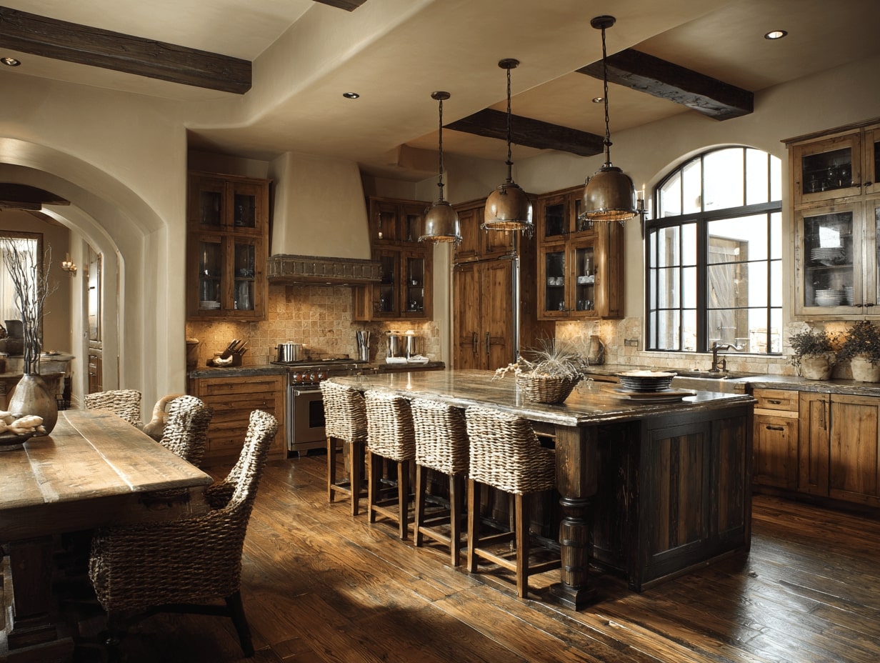
Partial Dividers: Shelving, Slatted Screens, Half Walls
When we need subtle separation, we reach for open shelving, slatted wood screens, or a half wall topped with glass. These soften sightlines without killing the connection. Bonus: shelves double as display and storage.
Acoustics, Ventilation, And Odor Management
Open kitchens share air and sound. We specify a properly sized, quiet range hood ducted outside (capture area wider than the cooktop), soft-close hardware, and sound-absorbing textiles, curtains, rugs, upholstered seating, to tame echo. It’s comfort you can feel and hear.
When Full Open Isn’t Ideal: Practical Alternatives
Semi-Open Concepts: Pass-Throughs And Wider Openings
If the structure or lifestyle asks for boundaries, we widen doorways, add double-pocket doors, or create a countertop pass-through. You still get light and connection while keeping cooking mess or noise partially contained.
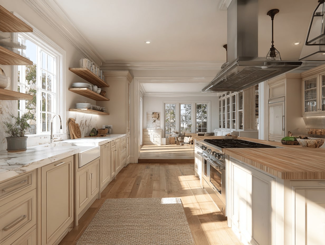
Structural, Safety, And Budget Considerations
Before removing walls, we confirm load paths, utilities, and code clearances. Beams, posts, and rerouting plumbing add cost: sometimes a strategic opening delivers 90% of the effect for a fraction of the budget. We also plan non-slip flooring and clearances for accessibility.
Common Mistakes And How To Avoid Them
- Oversizing the island: aim for realistic reach and walkway clearance.
- Too many finishes: pick a tight material palette.
- Skipping ventilation: odors linger in open plans.
- Ignoring storage: clutter cancels spaciousness fast.
Conclusion
Open kitchens create a sense of space indoors by orchestrating sightlines, light, and flow, then protecting that clarity with smart storage and subtle zoning. We don’t chase emptiness: we design for calm, connected daily life. Start with the biggest lever you can pull, an opening, continuous flooring, or a lighting plan, and let the rest support it. The result is a kitchen that lives bigger than its footprint and welcomes everyone in.
- creating space with open kitchens
- efficiency in open kitchens
- functional kitchen layout
- indoor open kitchen
- integrated kitchen spaces
- kitchen function and design
- kitchen layout without walls
- kitchen space optimization
- kitchen with open shelves
- minimalist open kitchen
- modern open kitchen concepts
- open kitchen advantages
- open kitchen design
- open kitchen floor plan
- open kitchen interior design
- open kitchen space management
- open kitchen vs closed kitchen
- open plan kitchen ideas
- space-saving kitchen ideas
- spacious kitchen design
Submit your architectural projects
Follow these steps for submission your project. Submission FormLatest Posts
Modern Interior Lighting: 7 Design Ideas That Transform Spaces
Lighting is one of the most powerful tools in modern interior design,...
2026 Modern Furniture Trends Interior Designers Are Obsessed With
Modern furniture trends 2026 are moving beyond minimalism into something warmer and...
Japandi Style Guide: Japanese Minimalism Meets Modern Furniture
Learn what japandi style really means and how it brings together Japanese...
Which Style Fits Your Home: Scandinavian vs Mid-Century Modern Design
Compare Scandinavian and mid-century modern design across color palettes, materials, furniture, lighting,...


Leave a comment