

Small Physical Brand Details That Make Architecture Events More Memorable
 illustrarch Editoral Team16 July 20265 Mins read47
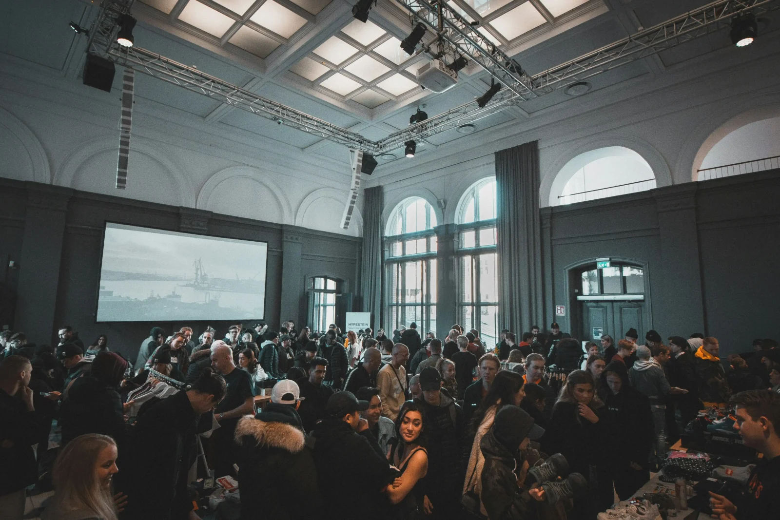
Table of Contents Show
Architecture is often communicated through large formats: exhibition panels, renderings, models, site photographs, portfolios, and presentation decks. These materials matter because they explain the scale and intent of a project. Yet the smaller physical details around an event or studio identity can be just as memorable.
A visitor may not remember every drawing pinned to a gallery wall, but they may remember the feeling of receiving a well-designed card, a small object, or a thoughtful takeaway that reflects the concept of the work. For architects, students, and design studios, these details can extend a project’s story beyond the room where it is presented.
Small brand elements do not need to be expensive or complicated. They simply need to feel considered.
Why Small Physical Details Matter in Design Culture
Architecture is a tactile discipline. Even when the final output is digital, the thinking behind it often begins with sketches, samples, models, paper studies, and material tests. Because of that, physical brand details feel natural in architectural settings.
At a studio open house, a graduation show, or a design conference, people move through space with their hands as much as their eyes. They pick up programs, touch samples, hold postcards, and carry event materials with them. These interactions create small moments of connection.
A well-made object can also slow people down. In a busy exhibition, where many projects compete for attention, a simple physical takeaway can encourage someone to pause and remember a particular studio, theme, or student group.
This is not about filling tables with promotional objects. It is about using physical design with the same care given to a drawing set or model.
Start With the Concept, Not the Object
The strongest physical details begin with a clear idea. Before choosing a format, it helps to ask what the event, project, or studio identity is trying to communicate.
For example, a student exhibition about adaptive reuse might use materials that suggest repair, layering, or memory. The printed program could have a folded format that reveals old and new information gradually. A small takeaway could use a fragment-like shape inspired by the existing building.
A studio presenting residential work might choose warmer textures, softer paper, or simple line drawings that reflect the scale of everyday living. A firm known for urban projects could use map-based graphics, transit-inspired numbering, or small icons related to public space.
When the concept comes first, the object feels connected rather than random. A postcard, pin, bookmark, badge, or folder should act like a small extension of the design language.
Make Event Identity Useful
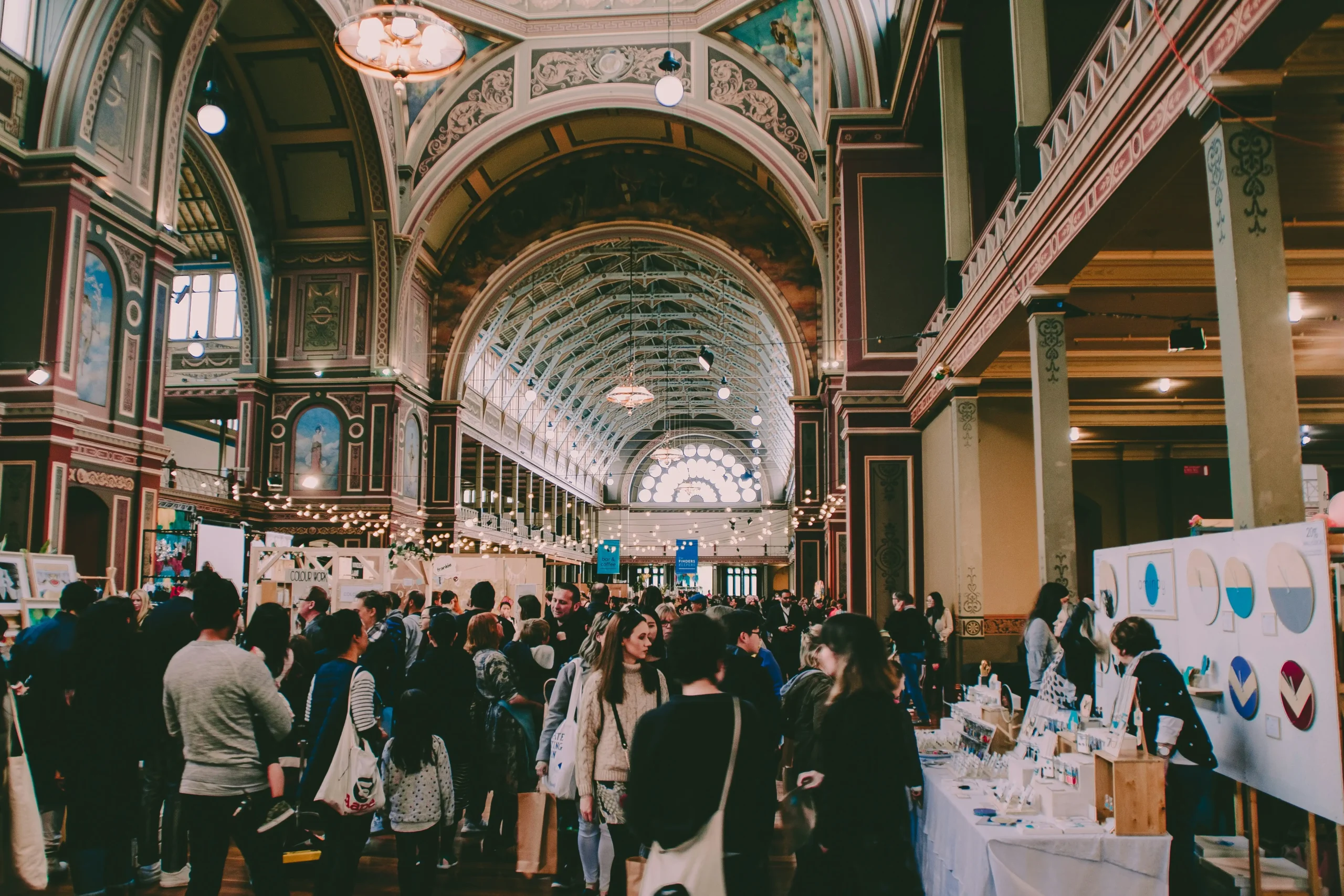
Architecture events often involve a lot of information. Visitors need to know where to go, what they are seeing, who made the work, and how different projects relate to each other. Physical details can help organize that experience.
A simple printed map can turn a gallery into a clear route. Color-coded badges can distinguish speakers, students, exhibitors, and guests. Numbered cards can help visitors follow a sequence of installations. Even a small stamp system can encourage people to move through different sections of an event.
The key is usefulness. If an item helps people navigate, remember names, or understand a theme, it has a purpose beyond decoration.
This is especially valuable for architecture schools and public exhibitions, where audiences may include people outside the profession. Clear, well-designed materials can make complex work easier to approach.
Think Beyond the Logo
A logo is only one part of identity. In architectural communication, form, proportion, color, line weight, texture, and spacing can be equally expressive.
A small physical item does not need to repeat a logo at large scale. It can use a detail from a floor plan, a section line, a façade rhythm, a material pattern, or a simplified silhouette of a building. These subtler references often feel more connected to the design process.
For teams exploring small branded pieces for exhibitions or student showcases, MyEnamelPins shows how a simple mark or building silhouette can translate into an object people keep beyond the event.
This approach works well when the visual idea is reduced carefully. A detailed rendering may not translate well to a small format, but a roofline, arch, grid, column profile, or abstract site boundary can become recognizable at a smaller scale.
Use Materials That Match the Message
Material choice can change how an object is perceived. Heavy paper feels different from lightweight stock. Matte finishes feel different from glossy surfaces. Metal, fabric, wood, and recycled paper each carry their own associations.
For a sustainability-focused event, recycled paper or reusable objects may support the message more clearly than disposable plastic items. For a gallery opening with a refined visual identity, a restrained color palette and clean finish may feel more appropriate. For a student-led workshop, playful formats and bold graphics may better reflect the energy of the event.
The goal is not to make everything expensive. It is to make choices that align with the story. Sometimes a simple black-and-white risograph print has more character than a polished brochure. Sometimes a modest object with a clever concept is more memorable than a larger item with no clear relationship to the work.
Keep the Scale Human
Architecture deals with buildings, cities, and landscapes, but events happen at a human scale. The objects people receive should feel comfortable to hold, wear, fold, store, or take home.
A small card with a thoughtful diagram can fit into a notebook. A compact booklet can be read on the train after a lecture. A badge or pin can become part of the event atmosphere without requiring much effort from attendees.
This human scale matters because it turns a broad design message into a personal interaction. People may not take a large poster home, but they might keep a small item that reminds them of a project or conversation.
Build Consistency Across Touchpoints
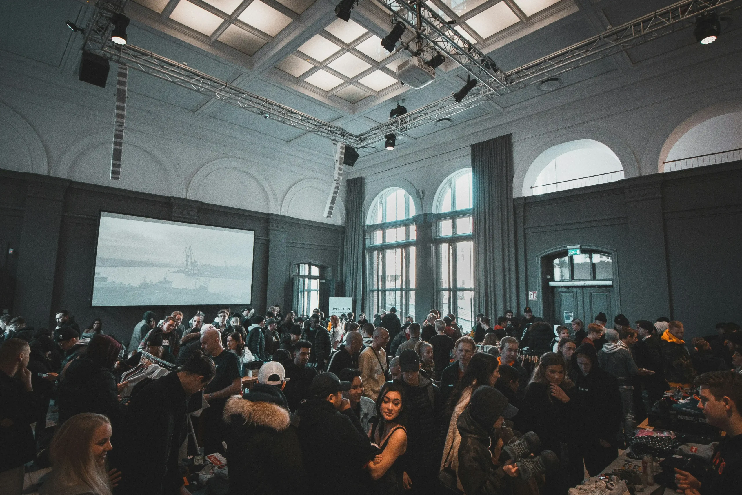
A memorable event identity usually comes from consistency rather than quantity. The invitation, signage, name tags, printed guide, presentation slides, and small takeaways should feel like parts of the same visual system.
This does not mean everything has to match exactly. Variation can make the system feel lively. However, a shared typeface, color palette, graphic motif, or layout principle can create a sense of cohesion.
For example, an exhibition about modular housing could use a grid system across all materials. The event map, wall labels, social graphics, and small takeaways might each use the same modular structure in different ways. Visitors may not consciously notice the system, but they will feel that the event has been carefully designed.
Avoid Clutter and Over-Branding
Small physical details lose impact when they try to say too much. Architecture audiences are often sensitive to visual clutter, so restraint can be more effective than repetition.
A takeaway does not need multiple slogans, long descriptions, and oversized marks. It may only need a name, date, subtle graphic, and web address. In some cases, even less is enough.
Leaving space allows the material, form, and composition to do part of the work. This is similar to architectural drawing: clarity often comes from knowing what to omit.
Conclusion
Architecture events are remembered through conversations, spaces, drawings, and atmosphere. Small physical brand details can support all of these elements when they are designed with care.
Whether it is a printed guide, a badge, a pin, a card, or a material sample, the object should connect to the central idea. It should feel useful, proportionate, and consistent with the visual language of the event or studio.
When treated as part of the design process rather than an afterthought, small details can carry a project’s identity beyond the exhibition wall and into everyday memory.





Sustainable Landscape Design Balancing Artificial Turf Cost, Artificial Grass in Los Angeles, and Turf Installation for Modern Outdoor Spaces
Artificial grass in Los Angeles has become a practical part of sustainable...
illustrarch Editoral Team6 Mins read
Marble Feature Walls: The Interior Design Trend That Turns Any Room Into a Gallery
There is a moment in every renovation where a room stops being...
illustrarch Editoral Team3 Mins read
Planning Large Residential and Commercial Projects with Lowboy Dumpster Rentals, 6 Yard Dumpsters, and Dumpster Rentals for Less
A lowboy dumpster rental can make a surprisingly big difference when a...
illustrarch Editoral Team6 Mins read
Famous Architects and Their Cars: What They Drove and Why It Mattered
Eight documented pairings of famous architects and the cars they owned, designed,...
 Elif Ayse Sen10 Mins read


Leave a comment