

How to Present Architectural Plans: A Practical Guide
A clear plan presentation earns client trust and keeps the build accurate. This guide covers plan types, the elements every sheet needs, the scales and software to use, and the layout choices that make architectural plans easy to read.
 Elif Ayse Sen5 October 20226 Mins read1.3k
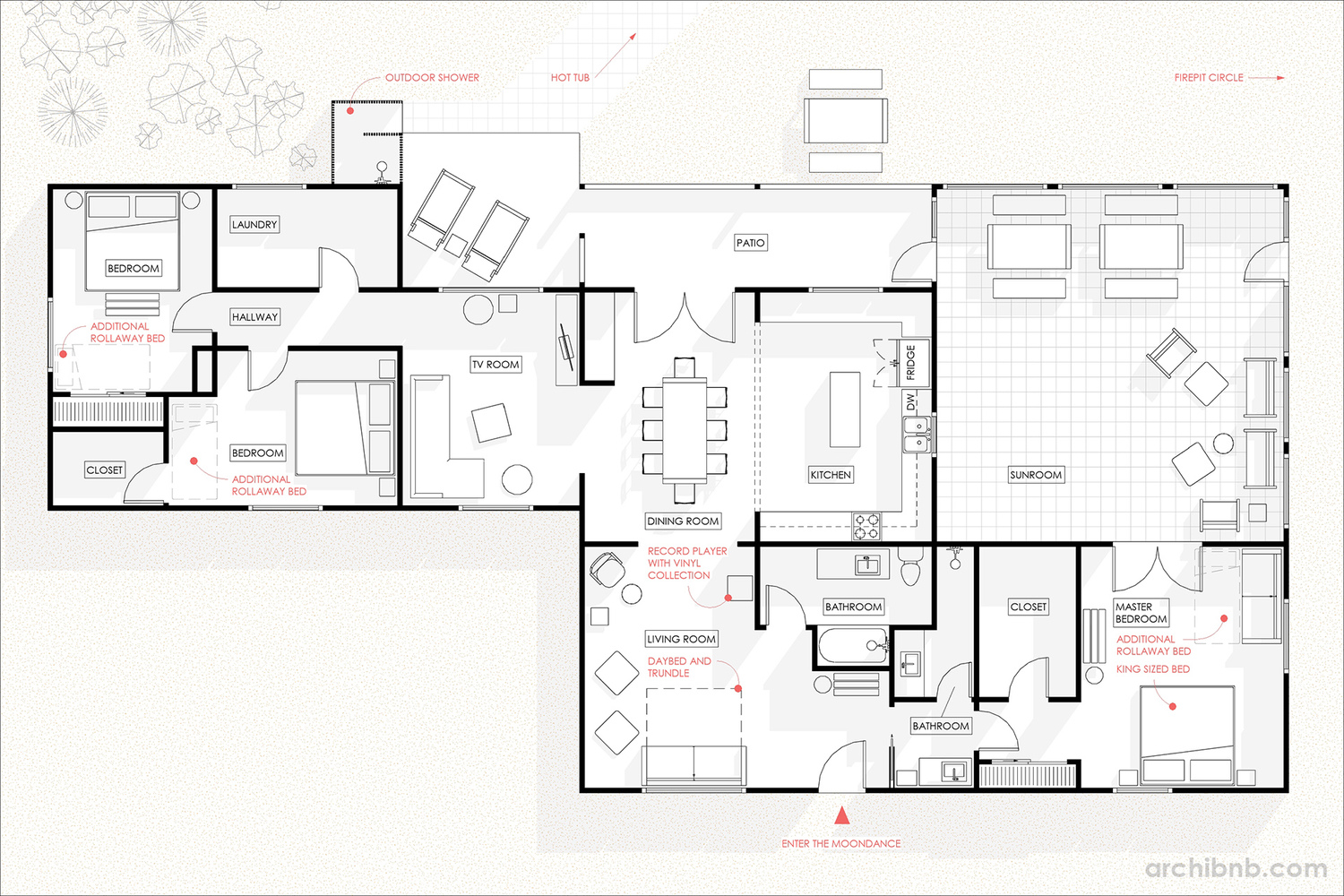
Table of Contents Show
Quick answer: Presenting architectural plans means arranging and rendering a drawing so anyone can read the design at a glance. Strong presentation relies on a clear scale, consistent line weights, labelled rooms, furniture for context, and color or texture that make the layout easy to understand.
Learning how to present architectural plans well separates a drawing that gets approved from one that leaves clients confused. A plan is part of the construction manual and works alongside architectural drawings to record dimensions, materials, and intent. Presenting architectural plans clearly serves two audiences at once: the client who needs to picture the finished space, and the field team that has to build it exactly as drawn.
An architectural master plan carries accurate information about a project’s design and appearance. Architects use plans to communicate concepts, persuade clients of a design’s advantages, and document the finished construction. A plan that reads cleanly on a single sheet does all three jobs without a spoken explanation, which is the real test of good presentation.
Types of Architectural Plans You Present
Before you can present anything well, you need to know which plan you are drawing and what it has to communicate. Each plan type answers a different question about the building, so the graphic emphasis shifts with it. Organizing an architectural plan around its purpose is the first step toward a readable presentation.
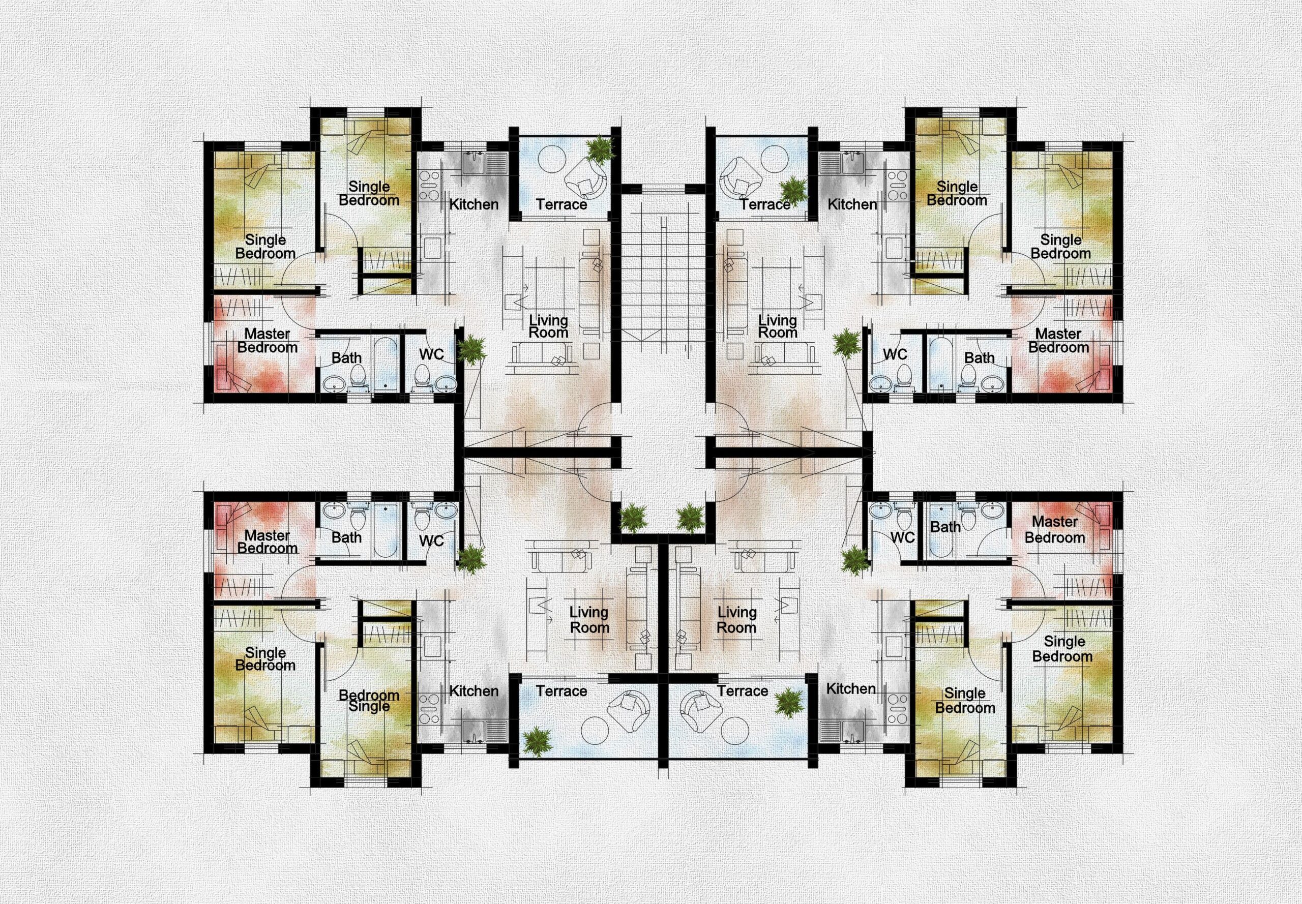
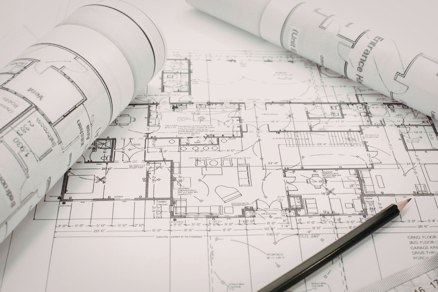
Floor plans describe the dimensions, locations, and measures of walls, doors, windows, rooms, and built-in elements. Stairs, fixtures, cabinets, reference symbols, and notes all appear here, so clarity of line and label matters most.
Ceiling plans hold the material and technical details of the ceiling for each floor, including lighting layout, beams, and mechanical elements viewed from below.
Foundation plans are built from data gathered across the site, floor, and elevation drawings. They show footings, slabs, and load points that the field team relies on.
Site plans record the current layout, property borders, and heights of a plot. Utility lines, topography, building footprints, and paths sit inside the boundaries, sized precisely to show existing and proposed development. A well drawn architectural drawing at site scale ties the building to its surroundings.
Landscaping plans cover the lighting, colors, textures, shading, and depth that shape the outdoor space around the building.
📐 Technical Note
Presentation scales follow recognised conventions. Residential floor plans usually sit at 1:50 or 1:100, detail drawings at 1:20 or 1:10, and site plans at 1:200 or 1:500. Always print a graphic scale bar rather than relying on the ratio note, because plans are often reduced or enlarged after issue.
Why Presenting Architectural Plans Matters
Architectural plans should read as descriptive, understandable, and persuasive. Careful presentation earns client trust and makes sure the field team reads every technical detail and layout correctly.
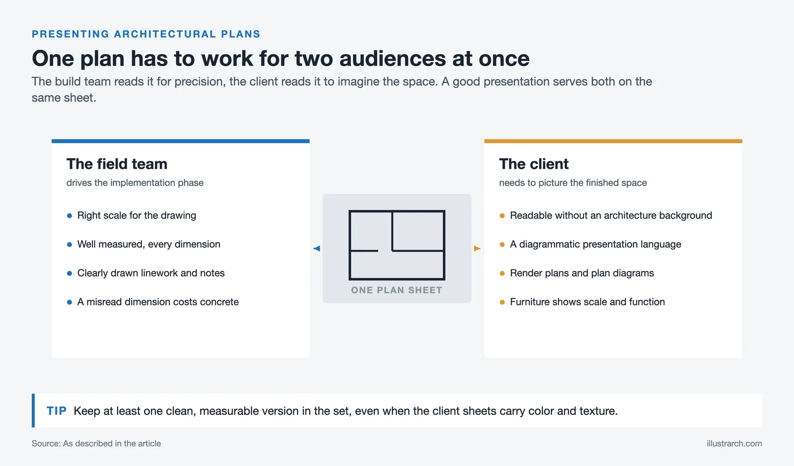
Presentation matters in two directions. First, for the people in the field, a plan drives the implementation phase of the project. The build team brings the design to life on the construction site, so floor plans have to sit at the right scale, be well measured, and be clearly drawn. A misread dimension on paper becomes a costly correction in concrete.
Second, floor plans have to convince clients. A plan should be understandable even by someone without an architectural background, which means developing a diagrammatic presentation language they can follow. If a client stays unsure about the layout, the project stalls. Render plans and plan diagrams help here, translating technical linework into something a non-specialist can picture. This is where presenting architectural plans becomes a communication skill rather than a drafting one.
📌 Did You Know?
The convention of adding furniture to a floor plan is not decoration. Furniture gives the reader an instant sense of scale and function, letting a client judge whether a bedroom actually fits a bed and a wardrobe. Empty rooms read as abstract boxes and are far harder for non-architects to interpret.
Essential Elements of a Plan Presentation
A polished presentation is a checklist as much as an art. Each element carries a specific job, and skipping one usually shows up as a client question later. The table below breaks down what to include and why it earns its place on the sheet.
Presentation Elements at a Glance
| Presentation Element | Why It Matters | Practical Tip |
|---|---|---|
| Scale bar and ratio | Lets anyone measure the plan reliably | Use a graphic bar so it survives resizing |
| Consistent line weights | Separates walls, openings, and furniture | Heaviest lines for cut walls, lightest for fittings |
| Room labels and dimensions | Removes guesswork for clients and trades | Keep text horizontal and a single font family |
| North arrow | Orients the plan to the real site and sun | Place it in the same corner across all sheets |
| Color, texture, or shadow | Adds depth so the space reads quickly | Keep a limited palette to avoid visual noise |
| Title block | Signals a professional, trackable document | Include project, sheet number, scale, and date |
💡 Pro Tip
When you set up a sheet, build a small legend of line weights and hatches and reuse it on every drawing in the set. Experienced architects lock these as layer standards early, so a whole package stays visually consistent even when several people work on it under deadline.
Best Ways to Present Architectural Plans
The best way to present architectural plans rests on three skills working together: solid architectural knowledge, command of the right software, and a trained eye for graphic design. Sharpen these before you worry about styling a single sheet.
Architectural Knowledge
Technical drawing knowledge and a real understanding of how buildings go together are the foundation. You cannot present a plan clearly if you are unsure what a detail means, because the gaps show up as vague linework and missing notes. Guidance from professional bodies such as the American Institute of Architects can help you align drawing standards with accepted practice.

Software Skills
To create, develop, and present architectural plans, you need to handle a few tools well rather than dabble in many. AutoCAD remains the first choice for many architects and is used heavily for 2D drafting. Revit goes further as a BIM tool, keeping plans, sections, and schedules linked so a change updates everywhere. Once you master it, pulling render plans or 3D plans straight from the model enriches your presentations.
Graphic Design Skills
Software gets you an accurate drawing; graphic craft makes it persuasive. Working knowledge of a raster and a vector editor, such as Adobe Photoshop or Illustrator, lets you add texture, entourage, and clean typography to a plan. The same sketching and rendering techniques that shape a hand drawing apply to a rendered plan: hierarchy, contrast, and restraint.
⚠️ Common Mistake to Avoid
Overloading a plan with color, drop shadows, and heavy hatching to look impressive usually backfires. Dense rendering hides the linework a client actually needs to read and buries dimensions the field team depends on. Add graphic layers only where they clarify the space, and keep at least one clean, measurable version in the set.
Turning a Plan Into a Convincing Presentation
Once the drawing is accurate and clean, sequence the story. Lead with a rendered floor plan that gives the overall feel, then support it with clear technical sheets for those who need precision. Keep a consistent sheet layout, the same north arrow position, and one title block style across the whole set so the package feels considered rather than assembled. When you present in person, walk the client through circulation, from entry to main spaces, the way they would move through the building. That narrative turns a static drawing into a space someone can imagine living or working in.

Frequently Asked Questions
How do you present architectural plans professionally?
Use a clear scale bar, consistent line weights, labelled rooms, furniture for context, and a north arrow. Add restrained color, texture, or shadow so depth reads quickly, and finish with a clean title block. Keep annotations legible and align every sheet to the same layout.
What scale is best for a floor plan presentation?
Residential floor plans usually work at 1:50 or 1:100, which balances detail with a manageable sheet size. Larger construction details use 1:20 or 1:10, while site plans sit at 1:200 or smaller. Match the scale to the level of information the reader needs.
What should an architectural plan presentation include?
A strong presentation shows walls, doors, windows, room labels, dimensions, furniture, a scale bar, and a north arrow. A title block with the project name, sheet number, scale, and date makes the drawing easy to track and read as a professional document.
What software is best for presenting architectural plans?
AutoCAD handles precise 2D drafting, while Revit links plans, sections, and schedules for coordinated output and rendered views. Photoshop or Illustrator then adds graphic polish. Most architects combine a drafting or BIM tool with one image editor rather than relying on a single program.
How can you make a floor plan easy for clients to understand?
Add furniture and room labels so non-architects can judge scale and function, keep the palette simple, and highlight circulation. Walking a client through the plan in the order they would move through the building makes the layout far easier to grasp than numbers alone.
What This Means for Your Next Project
Your next step: pick one plan you are working on now and audit it against the six elements in the table above, scale bar, line weights, labels, north arrow, graphic depth, and title block. Fixing whichever one is missing is usually the fastest way to make a plan read more clearly to both your client and your build team.
- 3D visualization in architecture presentations
- Architectural Drawing
- Architectural Floor Plans
- architectural plan
- Architectural plans presentation tips
- Architectural Presentation Techniques
- Architectural rendering for presentations
- Creating compelling architectural presentations
- Digital tools for architectural plans
- Floor Plan Architecture
- floor plan presentation
- How to Design Floor Plan
- presenting architectural plans
- site plan








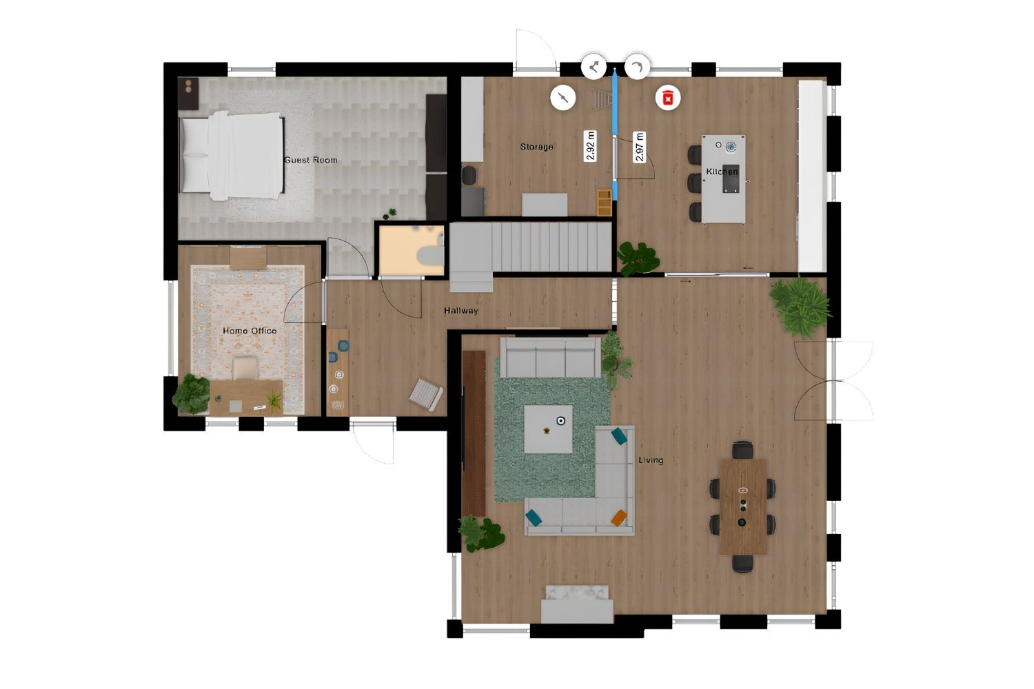
Floorplanner Review: Easy 2D to 3D Floor Plan Creation for Non-Designers
Floorplanner turns a 2D layout into a 3D render in the browser...
Elif Ayse Sen9 Mins read
Open Plan vs Closed Plan: Which Layout Works Better for Modern Living?
Open plan and closed plan layouts each bring distinct advantages to modern...
 Sinan Ozen6 Mins read
Architecture Floor Plan Guide: Types, Elements & How to Read
An architectural floor plan is a scaled, top-down drawing that shows the...
 Furkan Sen10 Mins read

AI Floor Plan Generator: Top 8 Tools for Architects & Designers
This guide compares the top AI floor plan generators available in 2026,...
Furkan Sen12 Mins read


Leave a comment