

Mixing Metal Finishes When You Add a Modern Chandelier to an Older Home
Older homes already have brass, bronze or nickel in place. How to read the dominant finish, keep a room to two metals and choose a modern chandelier that looks deliberate rather than dropped in.
 illustrarch Editoral Team9 October 20264 Mins read2
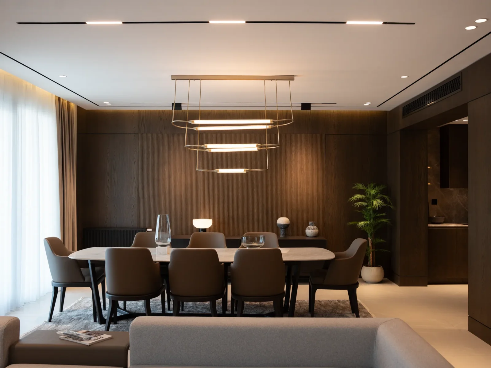
Table of Contents Show
Older homes come with finishes already in place: brass door hardware, oil-rubbed bronze hinges, maybe nickel in the bathroom. A modern chandelier doesn’t have to match all of them, but it does have to make sense next to them.
Start by finding the dominant finish
Walk the room and look at what you touch and see most: door knobs, window latches, cabinet pulls, curtain rods, existing sconces. One finish usually shows up more than the others. That finish is your anchor, and the new chandelier should either share it or sit deliberately beside it.

In many prewar and mid-century houses the anchor is warm, typically aged brass or bronze. In homes renovated in the 2000s it is often brushed nickel.
Knowing which one you are working with narrows the field before you browse anything.
The two-finish rule
Two metals in one room read as a choice. Three or more start to look accidental, especially when they all sit at eye level. If the room already has two strong finishes, pick the chandelier in one of them. If it has just one, you have room to introduce a second through the chandelier, as long as it repeats somewhere else, such as a lamp base or picture frame.
| Existing hardware | Safe match | Deliberate contrast | Usually avoid |
|---|---|---|---|
| Polished chrome | Chrome, polished nickel | Matte black | Bronze |
| Brushed nickel | Satin nickel, chrome | Matte black | Warm brass |
| Aged brass | Brushed brass, gold | Matte black | Chrome |
| Oil-rubbed bronze | Bronze, antique brass | Matte black | Polished nickel |
| Matte black | Matte black, iron | Brushed gold | Polished chrome |
Why matte black works in so many old houses
Black reads as a neutral rather than a metal, so it sits comfortably next to brass, bronze, or nickel without competing. It also echoes the dark iron found in older radiators, window hardware, and stair balusters. That is why a black geometric or branch-style chandelier often looks at home in a 1920s dining room even though its form is completely current.
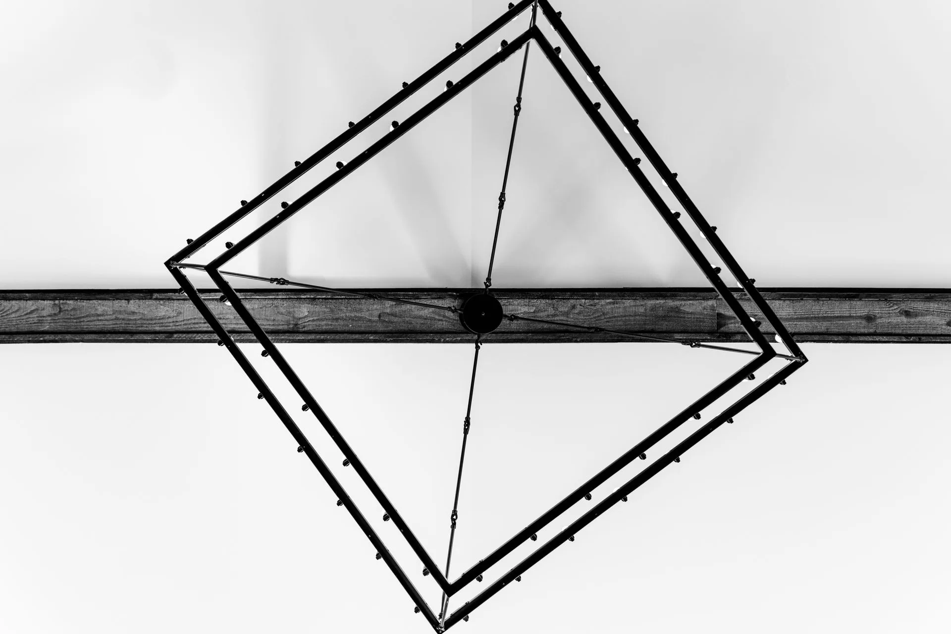
The one place to be careful is a very dark room. Black against a dark ceiling or deep-toned walls can disappear, so either size up slightly or choose a design with glass or crystal that catches light.
Let the form carry the modern part
A useful way to think about it is that the finish connects the chandelier to the house, while the shape signals that it’s new. A clean ring in aged brass bridges a traditional room without feeling like a reproduction. A sputnik in bronze picks up existing hardware while adding a mid-century line. Matching both finish and period style tends to produce something that looks like it came with the house, which is fine, but rarely what people want when they choose a modern piece.
| Room character | Modern form that fits | Finish suggestion |
|---|---|---|
| Crown molding, wood floors | Single or double ring | Aged brass |
| Plaster walls, arched doors | Branch or organic frame | Bronze or black |
| Mid-century ranch | Sputnik or globe cluster | Brushed brass |
| Victorian detailing | Crystal on a slim frame | Gold or black |
| Craftsman bungalow | Linear or box frame | Matte black, iron |
Checking the canopy and chain
The canopy, the plate that covers the ceiling box, is often overlooked. In older homes with ceiling medallions, a canopy finish that matches the chandelier body looks intentional, while a mismatched white or chrome canopy draws the eye straight to it. Ask about canopy finish before ordering, and check whether the chain or rod is finished to match.
Undertones matter as much as the metal
Not all brass is the same brass. Unlacquered brass darkens and goes slightly brown over time, while lacquered or PVD-coated brass stays bright and a little yellow. Antique gold leans orange, champagne gold leans pale. When the chandelier and the existing hardware share the same metal but different undertones, the mismatch can be more noticeable than using two clearly different finishes.
Bring a door knob or cabinet pull with you, or photograph it in daylight next to a white sheet of paper, and compare it with close-up finish photos on the product listing. Many retailers also offer finish swatches on request.
Bulbs and light color change how metal reads
Finish doesn’t exist on its own; it is always seen under light. Warm white bulbs around 2700K make brass look richer and nickel look slightly warmer. Cooler light around 4000K makes brass look flatter and pushes nickel toward chrome. In an older home with warm wood and plaster, warm light usually flatters both the chandelier and the original details.

Room-by-room priorities
In a dining room, the chandelier is the dominant metal object, so it can set the finish and everything else follows. In an entry, door hardware is close by and seen at the same moment, so matching it matters more. In a kitchen, cabinet pulls and faucet finishes are the reference, and a chandelier or island fixture that picks up one of them ties the space together without looking forced.
When to replace hardware instead
Sometimes the existing hardware is the problem. Mismatched replacement knobs, a mix of finishes from different decades, or worn plating can make any new chandelier look out of place. In that case, swapping a handful of visible pieces, such as door knobs and the light switch plates in the same room, is a modest cost that gives the chandelier a clean set of finishes to relate to. It’s often cheaper than compromising on the fixture you actually want.
Bringing it together
Identify the anchor finish, keep the room to two metals, and let the chandelier’s shape do the modernizing. When you browse, filter by finish first and style second. Specialty sellers such as this online lighting store let you sort by finish across designs, which saves a lot of scrolling. The result should feel like a thoughtful update rather than a piece dropped in from a different house.





Modern Interior Lighting: 7 Design Ideas That Transform Spaces
Lighting is one of the most powerful tools in modern interior design,...
 Furkan Sen11 Mins read
How Architects Use Natural Light to Transform Spaces: Techniques & Iconic Examples
Architects have long harnessed natural light to shape spaces that are healthier,...
 Elif Ayse Sen13 Mins read
How to Maximize Natural Light Inside Your Home Through Architectural Design
Natural light is not simply a technical feature of domestic architecture, but...
 Sinan Ozen4 Mins read

Best LED Shop Lights 2026: Brightest Options for Garage & Workshop
In 2026, LED shop lights have become essential for creating safe, efficient,...
illustrarch Editoral Team6 Mins read


Leave a comment